CP

Brown Color Palette — Walnut Reserve

A warm five-color brown scheme layering espresso, walnut and mocha over soft taupe and cream, with every color matched to real paint you can buy.

By David Chen · Formulation Lead & Resident Chemist

Walnut Brown
Dominant
Kompozit Hideaway · 0137
#654637
LRV 7
Espresso Bean
Accent
Kompozit Silent Sea · 0515
#2A2B2C
LRV 2
Soft Mocha
Secondary
Kompozit Cupcake · 0178
#8A6E53
LRV 17
Warm Taupe
Support
Kompozit Apple Pie · 0162
#CAAB94
LRV 44
Pale Cream
Base
Kompozit Tawny Daylilly · 0327
#EEE4D1
LRV 78
View palette in

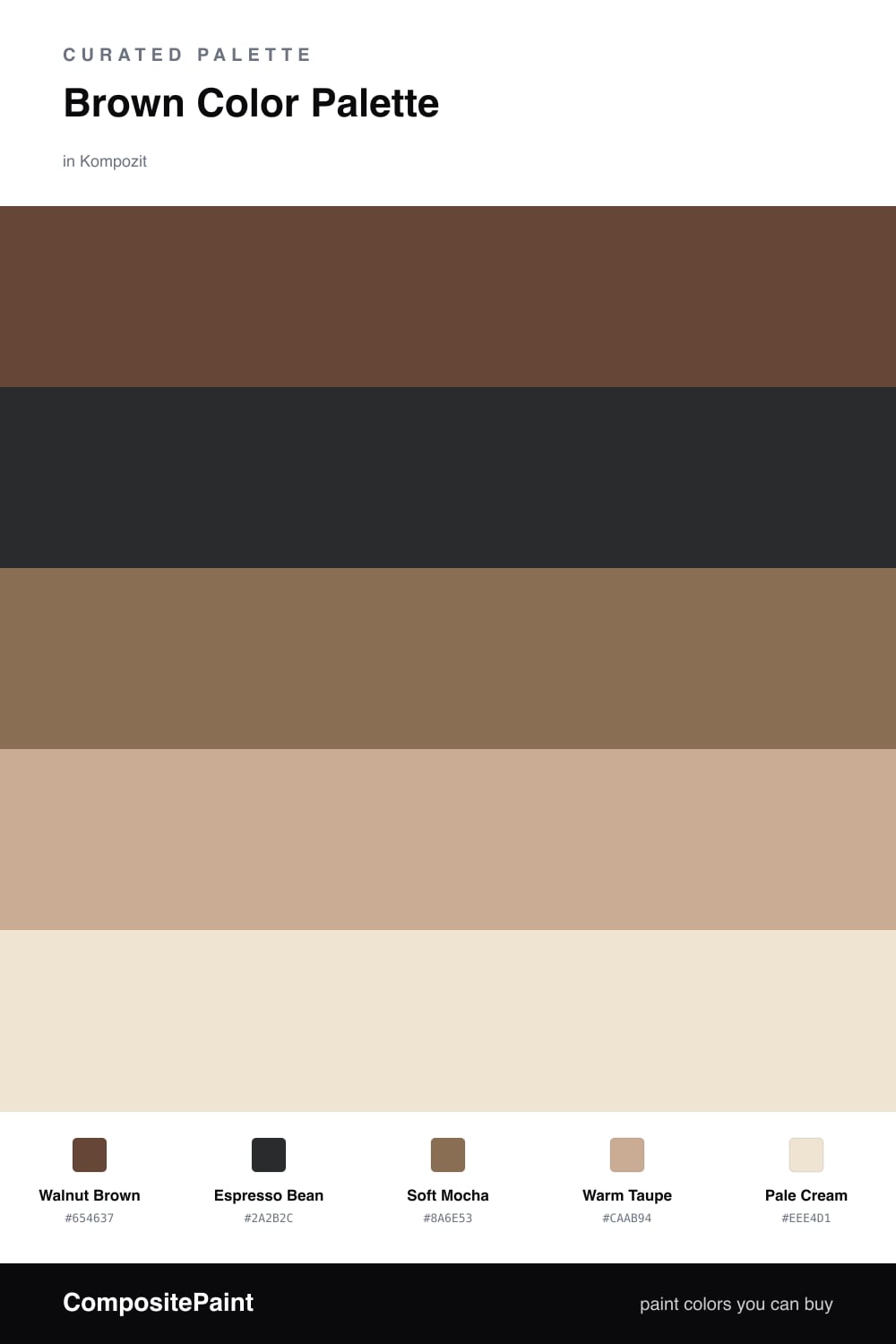
Brown is having a quiet comeback, and this scheme leans into the cozy, lived-in version of it. Walnut Brown sits at the center like a piece of well-oiled furniture, warm and grounded, while Espresso Bean drops in as the near-black accent that keeps everything from going soft.

Soft Mocha bridges the dark tones and the light ones, the way a milky coffee sits between black and cream. Underneath it all, Warm Taupe and Pale Cream open the palette back up so the browns read rich instead of heavy.

Think of it as one color told in five strengths. Let the lighter taupe and cream do the heavy lifting on big surfaces, bring in walnut where you want warmth to land, and use just a touch of espresso to draw the eye and sharpen the edges.

Buy These Colors

Each color matched to the closest real paint in every brand, by ΔE2000. Kompozit first; take any SKU to the store — these mix on demand.

Walnut Brown
#5C4233 · LRV 6 · Dominant
Kompozit Hideaway · 0137 ΔE 2.64
Backdrop It's a Date · BD-IT ΔE 1.05
Behr Breakfast Blend · 280F-7 ΔE 3.55
Benjamin Moore Deep Taupe · 2111-10 ΔE 1.84
Clare Blackish · PNT100-DP-54 ΔE 12.69
Dunn-Edwards Northern Territory · DEA158 ΔE 2.75
Farrow & Ball Mahogany · No. 36 ΔE 7.89
Magnolia Home Wooded Acres · JG-122 ΔE 7.6
PPG / Glidden Racy Raisin · 16-24 ΔE 6.15
Sherwin-Williams Van Dyke Brown · SW 7041 ΔE 4.4
Valspar Soul Chocolate · 2011-9 ΔE 4.17
Espresso Bean
#3A2A20 · LRV 3 · Accent
Kompozit Silent Sea · 0515 ΔE 10.84
Backdrop Hocus Pocus · BD-HP ΔE 12.7
Behr Bitter Chocolate · 790B-7 ΔE 7.4
Benjamin Moore Wenge · AF-180 ΔE 4.86
Clare Blackish · PNT100-DP-54 ΔE 12.42
Dunn-Edwards Black · DEA187 ΔE 10.32
Farrow & Ball Pitch Black · No. 256 ΔE 9.52
Magnolia Home Moments · JG-150 ΔE 5.8
PPG / Glidden Black Magic · 1001-7 ΔE 11.26
Sherwin-Williams Polished Mahogany · SW 2838 ΔE 6.79
Valspar Noblesse Oblige · 8004-2G ΔE 6.77
Soft Mocha
#8A6F5A · LRV 18 · Secondary
Kompozit Cupcake · 0178 ΔE 2.36
Backdrop Old Soul · BD-OS ΔE 14.53
Behr Antiquities · MQ2-43 ΔE 1.81
Benjamin Moore Carob · AF-160 ΔE 1.88
Clare Field Trip · PNT100-DP-66 ΔE 13.59
Dunn-Edwards Big Stone Beach · DE6132 ΔE 2.39
Farrow & Ball London Clay · No. 244 ΔE 7.79
Magnolia Home Elemental · JG-129 ΔE 4.4
PPG / Glidden Caravel Brown · 1079-6 ΔE 1.9
Sherwin-Williams Thatch Brown · SW 6145 ΔE 3.36
Valspar Zanzibar Spice · 2005-9B ΔE 2.29
Warm Taupe
#C2AE97 · LRV 44 · Support
Kompozit Apple Pie · 0162 ΔE 4.58
Backdrop Rosita · BD-RO ΔE 13.45
Behr Vast Desert · UL170-17 ΔE 1.17
Benjamin Moore Truffle · AF-130 ΔE 1.06
Clare Money Moves · PNT100-MD-48 ΔE 11.45
Dunn-Edwards Sandal · DEC715 ΔE 2.44
Farrow & Ball Jitney · No. 293 ΔE 2.95
Magnolia Home Embossed Letter · JG-106 ΔE 2.21
PPG / Glidden Persuasion · 1077-3 ΔE 0.79
Sherwin-Williams Khaki Shade · SW 7533 ΔE 1.62
Valspar Moose Mousse · 3003-10A ΔE 1.4
Pale Cream
#EFE6D6 · LRV 80 · Base
Kompozit Tawny Daylilly · 0327 ΔE 1.21
Backdrop Don't Eat the Yellow Snow · BD-DS ΔE 3.35
Behr Rye Flour · HDC-FL13-5 ΔE 0.99
Benjamin Moore Navajo White · 947 ΔE 1.48
Clare Like Buttah · PNT100-LT-62 ΔE 0.99
Dunn-Edwards Finest Silk · DE6127 ΔE 1.97
Farrow & Ball James White · No. 2010 ΔE 2.63
Magnolia Home Carter Crème · JG-16 ΔE 1.48
PPG / Glidden Elegant Ivory · 1081-1 ΔE 0.97
Sherwin-Williams Restful White · SW 7563 ΔE 1.68
Valspar Double Scoop · V176 ΔE 0

Questions

How do I keep an all-brown scheme from feeling flat?

Spread the browns across a value range. Walnut Brown carries the weight, Espresso Bean adds a near-black edge, and Pale Cream lifts the whole thing. The gap between dark and light is what gives the palette depth instead of a single muddy tone.

Which brown should I use on the largest surface?

Lean on Warm Taupe or Pale Cream for the big areas and save Walnut Brown for the pieces you want to stand out. Reversing that, dark on everything, can close a space in fast unless you have a lot of natural light.

Similar Palettes

Closest schemes by color — not by label.