CP

Burgundy Color Palette — Slate & Wine

A burgundy-led five-color scheme grounded by cool slate and warm neutrals with a brass accent — every color matched to real paint you can buy.

By Maya Patel · Reviews Editor & Product Tester

Deep Burgundy
Dominant
Kompozit Purple Shadow · 1215
#493843
LRV 5
Slate Gray
Secondary
Kompozit Greybeard · 0528
#626869
LRV 14
Warm Greige
Base
Kompozit Power Lunch · 0572
#D4D1C7
LRV 64
Soft Oatmeal
Support
Kompozit Hint of Vanilla · 0001
#EEE8DC
LRV 81
Antique Brass
Accent
Kompozit Golden Cadillac · 0879
#AC864B
LRV 26
View palette in

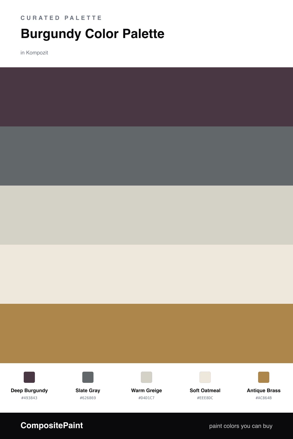
Burgundy is having a real moment in 2026, and this scheme shows why it earns the spotlight. Deep Burgundy leads with a wine-dark warmth that feels confident without tipping into heavy, and it carries a whole room on its own.

To keep it from feeling stuffy, I lean on Slate Gray as the secondary. The cool gray pulls the temperature down a notch and makes the burgundy look intentional instead of dramatic. Warm Greige and Soft Oatmeal do the quiet work, giving your eye somewhere soft to land between the two stronger tones.

The spark here is Antique Brass, used sparingly — a frame, a fixture, a lamp base. It picks up the warmth in the burgundy and ties the cool and warm halves together. Keep it to small doses and the whole palette stays modern and balanced.

Buy These Colors

Each color matched to the closest real paint in every brand, by ΔE2000. Kompozit first; take any SKU to the store — these mix on demand.

Deep Burgundy
#5C2330 · LRV 4 · Dominant
Kompozit Purple Shadow · 1215 ΔE 12.73
Backdrop Stage Beauty · BD-SB ΔE 11.18
Behr Cimarron · BXC-69 ΔE 1.99
Benjamin Moore Bewitched · CSP-450 ΔE 5.93
Clare Blackish · PNT100-DP-54 ΔE 22.18
Dunn-Edwards Mulberry · DEA194 ΔE 10.99
Farrow & Ball Brinjal · No. 222 ΔE 8
Magnolia Home By The Fireplace · JG-29 ΔE 6.02
PPG / Glidden Gooseberry · 1048-7 ΔE 9.5
Sherwin-Williams Rookwood Red · SW 2802 ΔE 6.47
Valspar Royal Garnet · 1011-5 ΔE 3.96
Slate Gray
#5A6470 · LRV 12 · Secondary
Kompozit Greybeard · 0528 ΔE 5.96
Backdrop Mom Jeans · BD-MJ ΔE 4.77
Behr Curtain Call · N570-5 ΔE 4.45
Benjamin Moore Andes Summit · CSP-600 ΔE 0.81
Clare Goodnight Moon · PNT100-DP-42 ΔE 3.17
Dunn-Edwards Pencil Lead · DE5922 ΔE 4.3
Farrow & Ball Inchyra Blue · No. 289 ΔE 7.26
Magnolia Home Texas Storm · JG-142 ΔE 4.74
PPG / Glidden Blue Zephyr · 1042-6 ΔE 2.02
Sherwin-Williams Needlepoint Navy · SW 32 ΔE 3.99
Valspar Smoky Pitch · 4007-4B ΔE 3.03
Warm Greige
#D8CFC2 · LRV 63 · Base
Kompozit Power Lunch · 0572 ΔE 2.87
Backdrop Real Real · BD-RR ΔE 2.3
Behr Aged Beige · PPU7-09 ΔE 0.79
Benjamin Moore Cedar Key · 982 ΔE 0.93
Clare Flatiron · PNT100-LT-17 ΔE 1.31
Dunn-Edwards Fine Grain · DE6213 ΔE 0.45
Farrow & Ball Shaded White · No. 201 ΔE 2.35
Magnolia Home Stoneware Pieces · JG-55 ΔE 4.41
PPG / Glidden Cool Concrete · 1023-2 ΔE 0.91
Sherwin-Williams Modern Gray · SW 7632 ΔE 0.89
Valspar Gentle Shadows · 8005-5A ΔE 1.02
Soft Oatmeal
#EDE7DA · LRV 80 · Support
Kompozit Hint of Vanilla · 0001 ΔE 0.5
Backdrop Don't Eat the Yellow Snow · BD-DS ΔE 4.1
Behr Exclusive Ivory · HDC-MD-11 ΔE 1.57
Benjamin Moore White Down · 970 ΔE 1.15
Clare Like Buttah · PNT100-LT-62 ΔE 2.53
Dunn-Edwards Ball of String · DE6190 ΔE 1.07
Farrow & Ball James White · No. 2010 ΔE 2.18
Magnolia Home Antique Rose · JG-23 ΔE 0.22
PPG / Glidden Enduring Ice · 1102-1 ΔE 1.48
Sherwin-Williams Futon · SW 7101 ΔE 1.17
Valspar Dover White · 7007-1 ΔE 0.53
Antique Brass
#A8854E · LRV 26 · Accent
Kompozit Golden Cadillac · 0879 ΔE 1.19
Backdrop Anita · BD-AN ΔE 12.47
Behr Temple Tile · N280-6 ΔE 1.62
Benjamin Moore Deep Ochre · 1048 ΔE 2.59
Clare Dirty Chai · PNT100-DP-52 ΔE 14.63
Dunn-Edwards Walnut Shell · DE5363 ΔE 1.87
Farrow & Ball Mouse's Back · No. 40 ΔE 10.84
Magnolia Home Vintage Crown · JG-152 ΔE 3.9
PPG / Glidden Pumpkin Spice · 16-13 ΔE 1.34
Sherwin-Williams Chamois · SW 6131 ΔE 2.5
Valspar Hawk Feather · V090-4 ΔE 2.15

Questions

Why does burgundy work with slate gray?

Burgundy is a warm, saturated red, and cool slate gray calms it down without competing. The contrast reads rich and grown-up rather than loud, which is why the pairing feels current.

How much burgundy is too much?

Let burgundy lead but not take over — think one full wall or a single big piece, with slate and the neutrals filling the rest and brass showing up only in small metal touches.

Similar Palettes

Closest schemes by color — not by label.