Burgundy Color Palette — Cellar & Moss
A grounded five-color scheme led by deep burgundy and softened with mossy green, warm stone, and a clean off-white — every color matched to real paint you can buy.
By David Chen · Formulation Lead & Resident Chemist
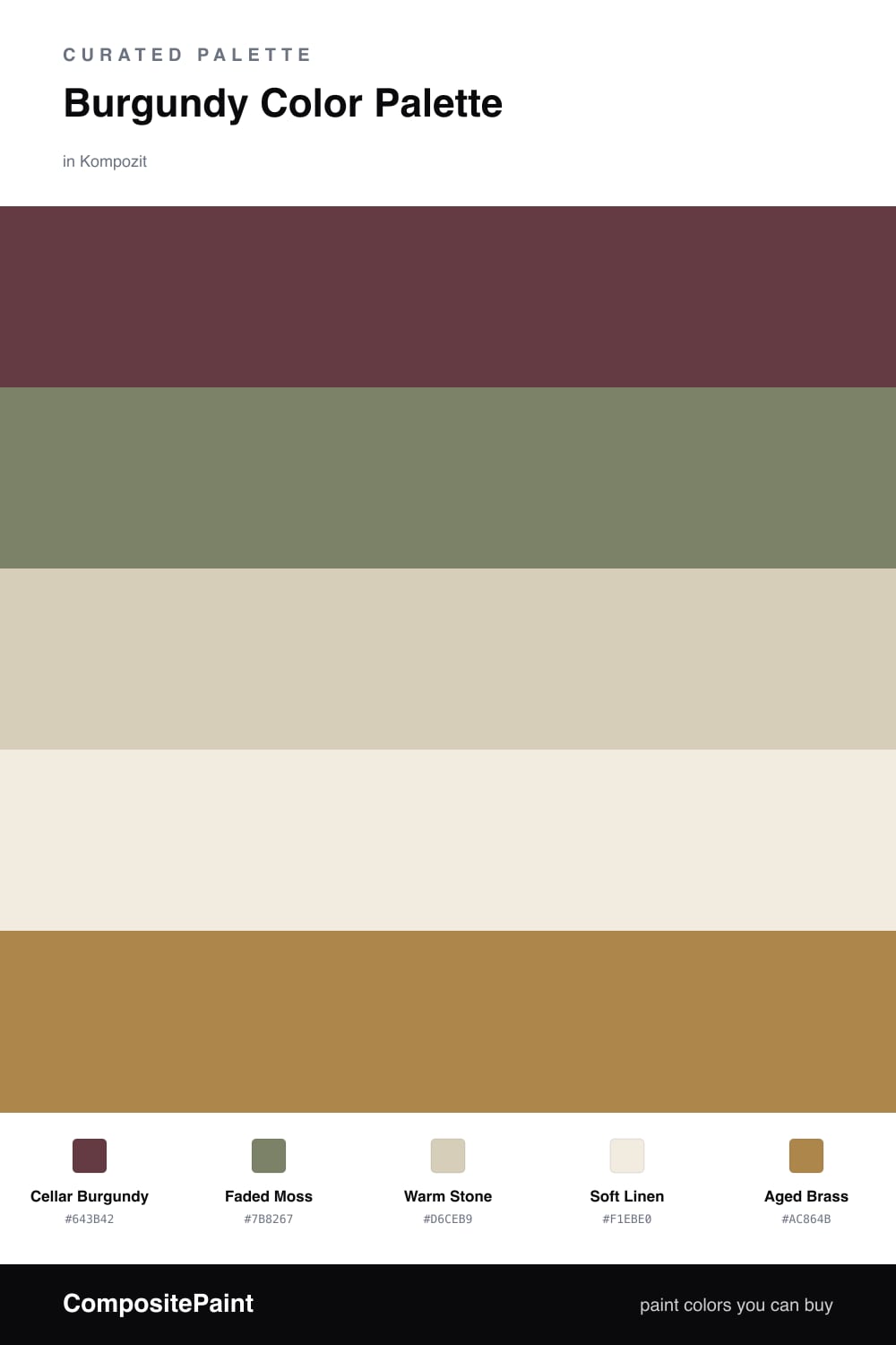
Burgundy is one of those colors that feels expensive the moment it lands on a wall. Here I built the whole scheme around Cellar Burgundy, a deep wine red with just enough brown in it to stay warm rather than purple. It does the heavy lifting and sets the mood.
To keep it from feeling heavy, I leaned on Faded Moss, a soft grayed green that cools the red down and gives your eye somewhere to rest. Warm Stone and Soft Linen are the quiet base layers that let the two bolder colors breathe, which matters in a smaller or low-light room.
The spark is Aged Brass, a muted gold I would use in small doses on hardware, a frame, or a single piece of trim. It is the 2026 move I keep coming back to — one warm metallic note that ties moody and earthy together without tipping into flashy.
Buy These Colors
Each color matched to the closest real paint in every brand, by ΔE2000. Kompozit first; take any SKU to the store — these mix on demand.
Questions
Burgundy and green sit near opposite sides of the color wheel, so they sharpen each other. Because both are muted and a little dusty, the contrast reads rich and calm instead of loud.
Let burgundy lead but not flood the space. A rough 60/40 split, with burgundy dominant and the neutrals carrying the rest, keeps the depth without turning the room dark.
Similar Palettes
Closest schemes by color — not by label.