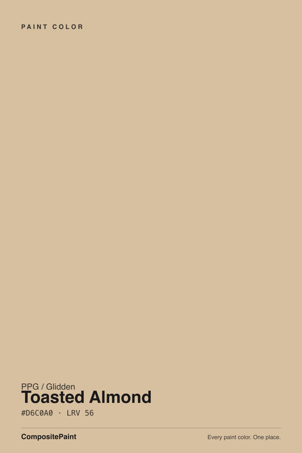
Toasted Almond
A mid-depth warm beige from Glidden's everyday paint-and-primer lines, reviewed honestly: where the honey warmth glows, the light that turns it muddy, and what to pair it with.

Jessica has spec'd whites and neutrals for more than 300 rooms and keeps a sample wall of painted drawdowns in her studio. Every color review is checked against real reader rooms in the comments and re-tested when a formula changes. About the testing process →
- 1Light French Gray53
- 2Accessible Beige58
- 3Toasted Almond63
- 4Pale Oak69
- 5Shoji White74
The Fast Verdict
Toasted Almond is exactly what the name promises: a mid-depth, honey-warm beige with enough color to read as a real choice, not enough to tip into deep tan. At LRV 63 it sits right in the middle of the beige family — deeper than the whisper-neutrals people default to, lighter than the clay tones that need real commitment. It is not a designer-blog darling; it is a dependable, budget-friendly color that shows up across Glidden's paint-and-primer lines at Home Depot and Walmart, and it earns that job by behaving predictably in good light and warm company.
Living rooms and dens with real daylight · oak, pine, and other honey wood tones · budget whole-house or rental repaints · exteriors that want warmth without going full tan
Your room faces north and stays dim · your counters are cool gray quartz or marble · you want a crisp, modern, cool-toned neutral · you're chasing a specific viral designer color
- A genuine mid-depth warm beige — reads as a real color, not a whisper-neutral
- Flatters honey oak, pine, and other warm wood tones
- Widely available across Glidden's interior and exterior paint-and-primer lines
- No confusing undertone flip — it stays warm, it just loses saturation in bad light
- Budget-friendly workhorse for whole-house and rental repaints
- Goes muddy and flat in dim, north-facing rooms
- Clashes with cool gray quartz, marble, or tile
- Looks dingy next to a stark, cool white trim
- Thin design-world documentation — few curated designer rooms to reference before you buy
What Color Is Toasted Almond, Really?
A mid-depth warm beige — closer to almond than to cream. At LRV 63 it reflects roughly half the light that hits it, which puts it in the same depth band as colors people describe as 'a real color on the wall,' not a barely-there off-white. That depth is the whole personality: it never goes chalky or thin the way LRV 80-plus whites can, but it also never disappears into the walls the way a true near-white does.
Inside PPG's own deck it sits between two familiar neighbors: Best Beige (LRV 47), a deeper amber-clay tone, and the pale near-whites up around LRV 85-plus. Toasted Almond splits that difference — enough depth to read as a genuine warm neutral, not so much that it needs the confidence a true beige-tan demands. Benjamin Moore's Manchester Tan sits almost exactly where it does, which tells you the depth band is well-trodden territory, not an outlier.
Undertone in one line: straightforward warm honey-tan, no complicated push-pull. It doesn't flash green or pink the way some mid-tone beiges do — the risk with this color isn't a surprise undertone, it's losing its warmth entirely in flat, cool light.
Where It Shines
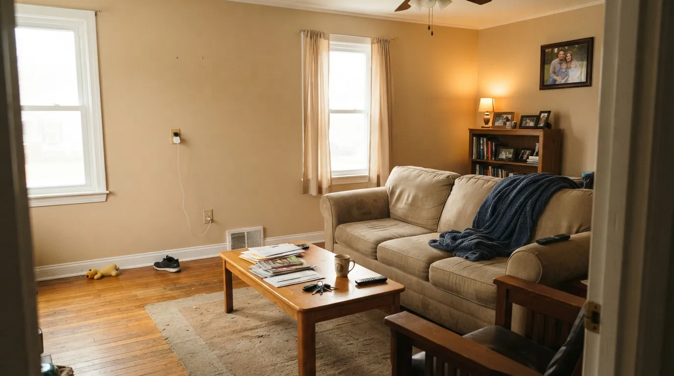
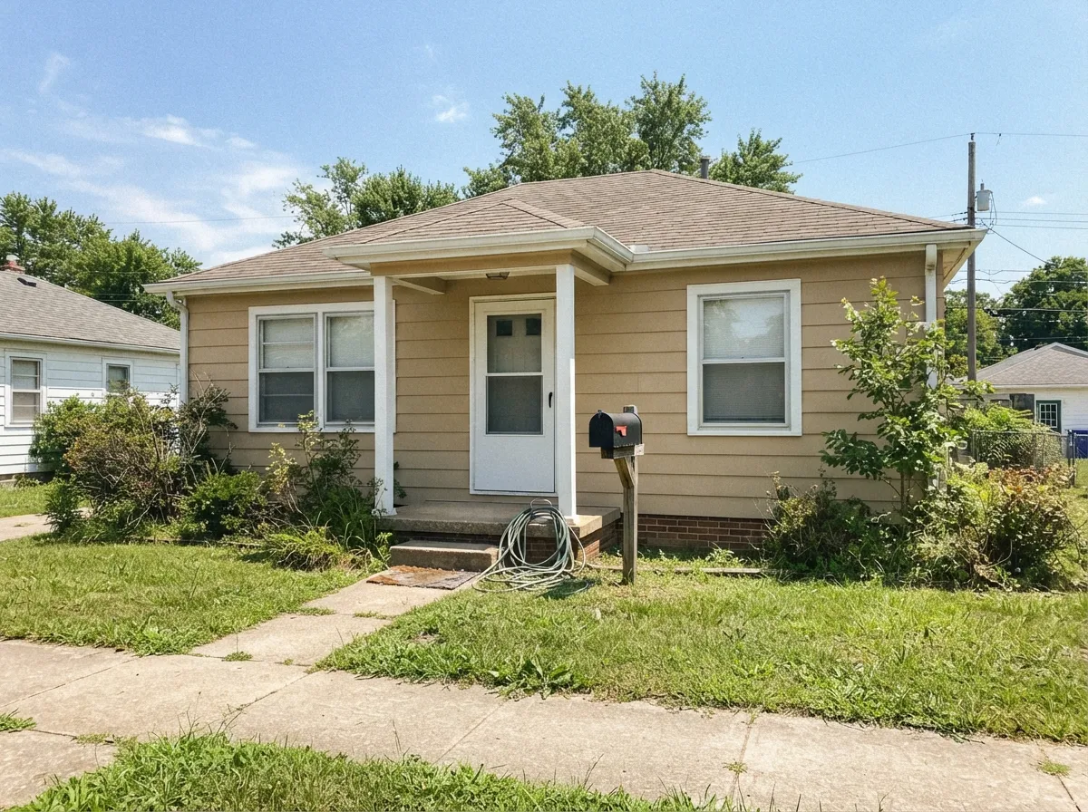
Give it real daylight and it does exactly what a warm beige should: it makes a room feel settled and lived-in without shouting for attention. It is at its best with honey oak, pine, and other warm wood — floors, trim, furniture — because the wood and the wall are working the same warm register instead of fighting. It also earns its keep outdoors: Glidden sells this exact SKU across several exterior product lines, and full sun brings out the honey without the chalkiness cheaper tans can get.
Where It Fails
The complaints that follow this color are the same three that follow every mid-depth warm beige, and all three are predictable before the first coat goes on. None of them are a defect in the paint — but if your room matches one, this isn't your color.
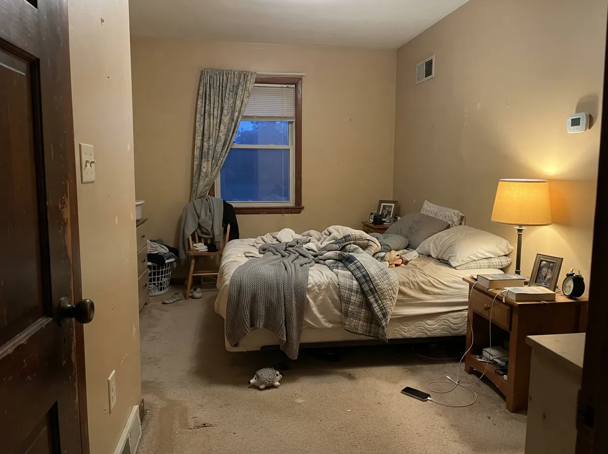
North light is cool and flat, and at LRV 63 there isn't enough reflectance to fight it. The honey warmth drains out and what's left reads muddy, slightly gray-tan — the classic 'looked warm on the chip, looked dingy on the wall' story. Add warm lamps or pick a paler, warmer color instead.
Toasted Almond is unmistakably warm; cool gray stone is the opposite temperature. Put them side by side and the counter looks slightly ashy while the wall looks slightly yellow — both sides lose. This pairing needs a warm-toned stone or a painted island to referee.
A bright, cool white trim (Chantilly Lace or Extra White territory) makes a mid-depth beige look dingy by contrast — the trim wins and the wall looks tired. Use a warm off-white trim instead, or keep the contrast gentler than you'd think.
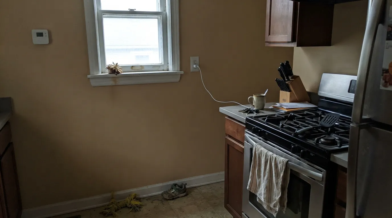
Room by Room
With real daylight and any warm wood furniture, it settles a room instead of decorating it. Eggshell on the walls, semi-gloss on trim, and let the honey tone do the quiet work.
Honey oak cabinets, butcher block, and brass hardware all sit comfortably against it. Cool gray quartz is the one combination to test big before committing.
Under 2700K lamplight it turns cozy and slightly deeper at night. In a north-facing bedroom with cool LEDs, it will read flatter than the sample promised — swap the bulbs before you swap the paint.
A warm, low-key backdrop for wood tables and brass fixtures. It photographs better under warm dimmed light than under bright overhead cans.
Mid-depth beiges are forgiving in transitional spaces because they don't have to compete with any one piece of furniture. Works well carried from room to room in a whole-house repaint.
This is where the SKU shows up most often at retail: Glidden sells it across multiple exterior lines. Full sun keeps it honest and warm; pair with white trim for a classic look or a warm dark door for more contrast.
Your Light Is the Risk
The honey warmth stays even and settled all day, indoors or on an exterior wall. This is the light the color was built for.
Cool, flat daylight drains the warmth and leaves a muddy gray-tan. Sample it on the actual wall before committing to a north room.
Warmest and most honey-toned during the sun hours, quieter and more neutral the rest of the day — a gentle shift, not a mood swing.
2700K warm bulbs deepen it toward cozy almond. Cool white LEDs flatten it toward gray-beige — keep the bulbs warm if you want the color you sampled.
Most complaints about Toasted Almond are a light mismatch. Upload a photo of your actual room and see it on your walls — then ask for the same wall in north light or evening lamps before you buy a single sample.
Need It From Another Brand?
Any paint counter can custom-tint PPG / Glidden PPG1097-3 directly. If you would rather stay in one brand's own deck, these are the closest stock matches, measured as ΔE2000. Under 2 is a difference you will not see on the wall.
| Brand | Closest color | ΔE | LRV | |
|---|---|---|---|---|
| Sherwin-Williams | Wool SkeinSW 6148 · Sherwin-Williams | 1.0 | 63 | Color page → |
| Behr | Bell TowerMQ3-15 · Behr | 0.5 | 62 | Color page → |
| Benjamin Moore | Temporal Spirit965 · Benjamin Moore | 0.9 | 62 | Color page → |
| Valspar | Parlour Taupe7003-1 · Valspar | 1.5 | 62.8 | Color page → |
| Glidden | Toasted AlmondPPG1097-3 · Glidden | 0.5 | 63 | Color page → |
| Dutch Boy | Sugar Scrub419-1DB · Dutch Boy | 1.0 | 63 | Color page → |
Similar PPG / Glidden Colors
The nearest shades to Toasted Almond within PPG / Glidden's own range, ranked by perceptual color distance — useful when you want the same look a touch lighter, darker, or warmer.
WCAG 2.1: AA is 4.5 : 1 for normal text, 3 : 1 for large text, AAA is 7 : 1.
Toasted Almond vs the Colors You're Also Considering
Every Toasted Almond sample board has the same rivals on it. The numbers show the real lightness gap — then it comes down to which risk you would rather live with.
Pick this if you're already committed to a PPG or Glidden gallon and want to stay in that deck.
Benjamin Moore HC-81 · LRV 53Manchester TanPick this if you want the same depth and warmth from a brand with far more real-world documentation and photos to sample against.
Pick this when Best Beige feels like too much color and you want the lighter, gentler version.
PPG / Glidden PPG1085-4 · LRV 47Best BeigePick this for a deeper, more committed clay-beige in the same PPG family — no greige hedge.
Golden Ecru (PPG1095-4, LRV 56) is almost a twin, with the same lightness and a very close hex. The practical difference is tiny; Golden Ecru reads a hair more yellow-gold, so choose it if you want a touch more sunshine and Toasted Almond if you want the slightly softer almond tone.
Pony Tail (PPG1086-4, LRV 52) sits in the same color family one step darker. It gives you the same warmth with a bit more depth, which is useful if Toasted Almond looks too light on your walls or you want a stronger presence in a bright room.
Stylish (PPG1101-3, LRV 54) is the quiet outlier. Its hex leans slightly cooler and more muted, so it reads a touch grayer and less golden. Pick Stylish if the pure warmth of Toasted Almond feels like too much, and pick Toasted Almond when you want the tan to clearly show.
Toasted Almond Coordinating Colors
Stay warm and it behaves. Toasted Almond pairs best with warm whites, warm woods, and warm darks — it argues with cool grays the same way every mid-depth beige does. These are the partners that keep it looking deliberate rather than accidental:
A Workhorse Color, Not a Trend Pick
Worth saying plainly: Toasted Almond is not a color you'll find styled in a hundred Pinterest boards. This exact SKU shows up across Glidden's practical, budget-friendly product lines — the all-in-one paint-and-primer gallons sold at Home Depot and Walmart, in both interior and exterior formulas, across several different Glidden sub-lines. That's a different kind of resume than a Color of the Year pick, and it comes with a real trade-off: fewer curated photos to sample against, but a color that's cheap, easy to find, and predictable once you understand its light behavior.
If you're weighing this against a heavily documented designer color, know what you're trading: you'll do more of your own testing and less scrolling through other people's finished rooms. The upside is a dependable warm beige at a workhorse price point.
Toasted Almond With Wood Tones and Floors
This is the pairing that makes or breaks the color, and the rule is simple: match the temperature. Honey oak, pine, and other warm-toned wood floors sit comfortably against it because both are working the same warm register — the wall doesn't fight the floor for attention. Butcher block and warm-stained trim do the same job in a kitchen.
The floors and counters to test carefully first are anything cool: gray-washed or gray LVP flooring, cool gray quartz, and blue-gray tile. None of them are a hard no, but each one pulls the color's warmth into contrast rather than harmony, and a large sample on the actual wall — next to the actual floor — is the only reliable way to know before you commit to gallons.
Three Ready Palettes Built on Toasted Almond
A color is never alone on the wall. These are complete combinations in the 60-30-10 pattern, with the reason each one holds together. Every one opens in the visualizer.
Delicate White stays soft enough not to make Toasted Almond look dingy, and a warm deep brown for built-ins gives the room the one grounding dark note it needs without going cold.
Try this palette in your roomWhite trim keeps the honey warmth from reading heavy on a whole facade, and a warm charcoal door supplies contrast without turning the scheme cold — this is the pairing behind most of the SKU's real-world exterior sales.
Try this palette in your roomBest Beige on the island reads as a deeper shade of the same wall color, so the room feels tonal and deliberate instead of decorated — a same-family palette that's easy to color-match at the same counter.
Try this palette in your roomToasted Almond FAQ
Is Toasted Almond warm or cool?
Warm — a straightforward honey-tan with no green or pink surprises hiding in it. Its risk isn't a shifting undertone, it's losing warmth entirely in cool, flat north light, where it reads muddy instead of honey.
Is Toasted Almond a good exterior color?
Yes, and it's one of the color's most common real-world jobs — Glidden sells this SKU across several exterior paint-and-primer lines. Full sun keeps the warmth honest; pair it with white trim for a classic look or a warm dark door for contrast.
What trim color goes with Toasted Almond?
A warm off-white, not a stark cool white. A bright cool trim makes the mid-depth beige look dingy by contrast — the same problem every warm beige runs into next to the wrong white.
Does it work with gray countertops or floors?
It's a genuine risk. Cool gray quartz, marble, or LVP sit at the opposite temperature and each side makes the other look slightly off — the counter reads ashy, the wall reads yellow. Warm-toned stone or wood is the safer partner.
How is Toasted Almond different from PPG's Best Beige?
Best Beige (LRV 47) is deeper and more committed — a real clay-beige with no attempt to soften it. Toasted Almond (LRV 63) is a lighter, gentler version of the same warm family, easier to live with if you want less color on the wall.
Why isn't there much written about this color online?
It's a practical, budget paint-and-primer color sold across Glidden's everyday retail lines rather than a curated designer pick, so it hasn't collected the same body of blog posts and styled photos that trend colors get. That doesn't make it a worse color — it means you should lean more on a real in-room sample and less on other people's photos before committing.
Have you painted with Toasted Almond?
Rate it — one tap helps the next reader decide.
Ask a Question