CP

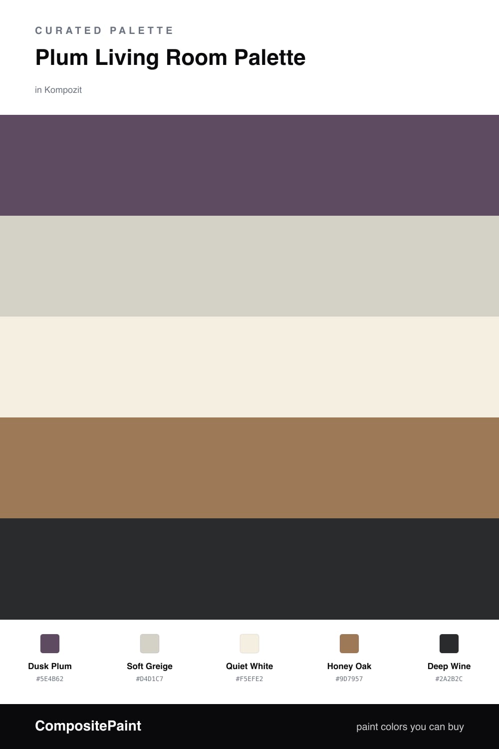
Plum Living Room Palette — Dusk Plum & Soft Greige

A warm five-color living room scheme led by a soft plum wall, balanced by greige, a clean white, oak, and a deep wine accent — every color matched to real paint you can buy.

By David Chen · Formulation Lead & Resident Chemist

Dusk Plum
Walls
Kompozit Vivid Vision · 1227
#5E4B62
LRV 8
Soft Greige
Trim & Ceiling
Kompozit Power Lunch · 0572
#D4D1C7
LRV 64
Quiet White
Cabinets or Vanity
Kompozit Bunny Cake · 0012
#F5EFE2
LRV 87
Honey Oak
Wood & Floors
Kompozit Prince Paris · 0241
#9D7957
LRV 22
Deep Wine
Accent
Kompozit Silent Sea · 0515
#2A2B2C
LRV 2
View palette in

Think of this room the way I think of a good blend — one star pigment, then quiet partners that let it sing. Dusk Plum leads on the walls. It is muted enough to live with every day, yet it still carries that soft red-blue glow that makes a living room feel grown-up and warm.

Around it, Soft Greige on the trim and ceiling keeps the edges crisp without going stark, and Quiet White brightens any built-ins or shelving so the plum does not feel heavy. Honey Oak for floors and wood frames ties the whole thing to something natural and warm, which is where 2026 rooms keep heading — softer, more lived-in, less gray.

Save Deep Wine for the accent moments — a single panel, a frame, a throw. Used in small doses it deepens the plum and gives the eye somewhere to rest. Lead with the plum, lean on the neutrals, and let the wine do the quiet heavy lifting.

Buy These Colors

Each color matched to the closest real paint in every brand, by ΔE2000. Kompozit first; take any SKU to the store — these mix on demand.

Dusk Plum
#6E5468 · LRV 11 · Walls
Kompozit Vivid Vision · 1227 ΔE 4.61
Backdrop Buenos Aires · BD-BA ΔE 20.81
Behr Plum Shade · 100F-6 ΔE 4.42
Benjamin Moore Kalamata · AF-630 ΔE 2.95
Clare Night Groove · PNT100-DP-77 ΔE 5.43
Dunn-Edwards Purple Trinket · DE5979 ΔE 3.05
Farrow & Ball Stiffkey Blue · No. 281 ΔE 19.02
Magnolia Home Autumn Gray · JG-143 ΔE 12.25
PPG / Glidden Positively Purple · 13-08 ΔE 2.72
Sherwin-Williams Plummy · SW 6558 ΔE 5.64
Valspar Forge · 8004-48F ΔE 9.69
Soft Greige
#D8CFC4 · LRV 63 · Trim & Ceiling
Kompozit Power Lunch · 0572 ΔE 2.92
Backdrop Real Real · BD-RR ΔE 3.17
Behr Mineral · UL170-15 ΔE 0.94
Benjamin Moore Sea Froth · 2107-60 ΔE 1.46
Clare Flatiron · PNT100-LT-17 ΔE 0.97
Dunn-Edwards Fine Grain · DE6213 ΔE 1.38
Farrow & Ball Shaded White · No. 201 ΔE 3.2
Magnolia Home Stoneware Pieces · JG-55 ΔE 4.71
PPG / Glidden River Rock · 18-02 ΔE 1.67
Sherwin-Williams Modern Gray · SW 7632 ΔE 0.57
Valspar Rabbit's Foot · 8004-9B ΔE 1.94
Quiet White
#F3EEE6 · LRV 86 · Cabinets or Vanity
Kompozit Bunny Cake · 0012 ΔE 2.15
Backdrop Jane · BD-JA ΔE 2.02
Behr Flurries · HDC-WR14-1 ΔE 0.82
Benjamin Moore Alabaster · 876 ΔE 0.97
Clare Wing It · PNT100-LT-24 ΔE 1.8
Dunn-Edwards Light Beige · DE6211 ΔE 0.85
Farrow & Ball Pointing · No. 2003 ΔE 2.61
Magnolia Home Silos White · JG-107 ΔE 1.43
PPG / Glidden Cow's Milk · 1053-1 ΔE 0.56
Sherwin-Williams Arcade White · SW 7100 ΔE 0.48
Valspar Wooly Lamb · V156 ΔE 0.48
Honey Oak
#A07B52 · LRV 22 · Wood & Floors
Kompozit Prince Paris · 0241 ΔE 2.22
Backdrop Old Soul · BD-OS ΔE 14.11
Behr Butter Caramel · HDC-CL-18A ΔE 2.07
Benjamin Moore Graham Cracker · 1113 ΔE 1.3
Clare Dirty Chai · PNT100-DP-52 ΔE 12.97
Dunn-Edwards Pyramid · DE6153 ΔE 2.1
Farrow & Ball Mouse's Back · No. 40 ΔE 9.58
Magnolia Home Vintage Crown · JG-152 ΔE 4.19
PPG / Glidden Caramelized Pecan · 1089-7 ΔE 1.34
Sherwin-Williams Cardboard · SW 6124 ΔE 1.57
Valspar Haute Hickory · 8004-17F ΔE 1.57
Deep Wine
#3E2433 · LRV 3 · Accent
Kompozit Silent Sea · 0515 ΔE 15.47
Backdrop Hocus Pocus · BD-HP ΔE 14.54
Behr Deep Garnet · 110F-7 ΔE 3.41
Benjamin Moore Velvet Cloak · CSP-480 ΔE 5.68
Clare Blackish · PNT100-DP-54 ΔE 18.15
Dunn-Edwards Black · DEA187 ΔE 15.27
Farrow & Ball Pitch Black · No. 256 ΔE 15.2
Magnolia Home Blackboard · JG-05 ΔE 15.51
PPG / Glidden Black Magic · 1001-7 ΔE 15.98
Sherwin-Williams Raisin · SW 7630 ΔE 8.06
Valspar Rare Wine · 1011-9 ΔE 2.72

Questions

Why does plum work as a living room wall color?

Plum is a quiet mix of red and blue, so it reads warm without going hot. On a large wall it feels calm in daylight and turns cozy under lamps, which suits the way a living room is used.

How much of the deep wine should I use?

Keep it small — think one accent wall, a built-in back panel, or cushions and art. The deep wine is there to add depth, not to compete with the plum.

Similar Palettes

Closest schemes by color — not by label.