CP

Plum Dining Room Palette — Dawn Plum & Soft Oat

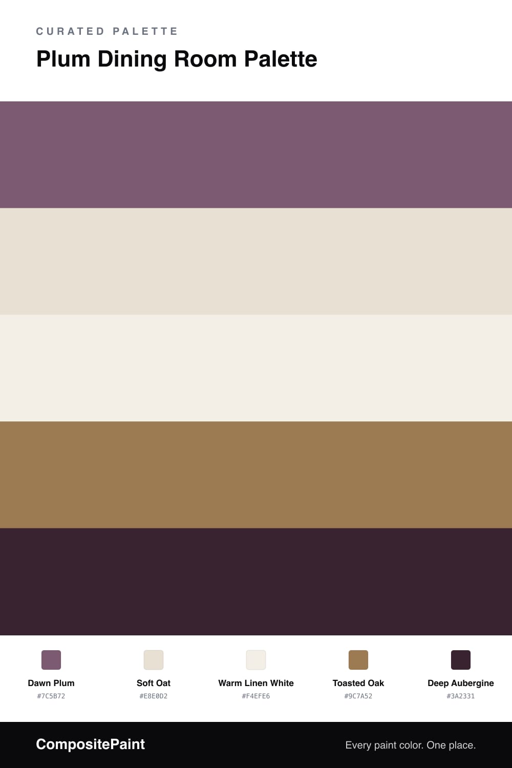
A refined five-color dining room scheme led by a soft dawn plum on the walls, grounded by warm oat, crisp white, oak, and a deep aubergine accent — every color matched to real paint you can buy.

By David Chen · Formulation Lead & Resident Chemist

Plum is one of those colors people are nervous about until they see it in the right room. Think of it as a red and a blue holding hands — it carries the warmth of one and the calm of the other. On dining room walls, Dawn Plum reads soft and grown-up in daylight, then deepens beautifully once the candles come out.

To keep the room breathing, I pair it with Soft Oat on the trim and ceiling and a Warm Linen White on any cabinetry. These two neutrals are warm rather than stark, so they sit with the plum instead of fighting it. The lighter tones are doing the quiet work, letting the wall color stay the star.

For grounding, Toasted Oak on the floor or table adds a natural, honeyed contrast, and a small dose of Deep Aubergine — on chair backs, a sideboard, or framed art — pulls the whole scheme together. Use the plum across the walls, keep the aubergine as a sparing accent, and you land somewhere modern, moody, and genuinely inviting.

View palette in
Dawn Plum
Walls
Sherwin-Williams Grape Harvest · SW 6285
#7E5A6D
LRV 13
Soft Oat
Trim & Ceiling
Behr Hazelnut Cream · 750C-2
#E7DFD2
LRV 74
Warm Linen White
Cabinets or Vanity
Glidden Floral White · 61YY 85/050
#F4EFE6
LRV 85
Toasted Oak
Wood & Floors
Dunn-Edwards New Cedar · DESS18
#997852
LRV 20
Deep Aubergine
Accent
Valspar Rare Wine · 1011-9
#382534
LRV 2

Buy These Colors

Each color matched to the closest real paint in every brand, by ΔE2000. Tap a swatch for its full guide or + to save it — take any SKU to the store, they mix on demand.

Dawn Plum
#7C5B72 · LRV 13 · Walls
Sherwin-Williams · SW 6285 · ΔE 1.87
Behr · M110-7 · ΔE 2.28
Benjamin Moore · CSP-460 · ΔE 6.35
Valspar · V077-5 · ΔE 3.62
PPG / Glidden · PPG13-20 · ΔE 4.87
Glidden · PPG13-20 · ΔE 4.97
Dutch Boy · 346-6DB · ΔE 6.01
HGTV Home by Sherwin-Williams · HGSW 2432 · ΔE 1.87
Dunn-Edwards · DE5978 · ΔE 3.94
Magnolia Home · JG-147 · ΔE 15.05
Farrow & Ball · NO. 244 · ΔE 15.36
Diamond Vogel · 1227 · ΔE 5.5
Hirshfield's · 1214 · ΔE 2.66
Rodda · R118 · ΔE 9.65
C2 Paint · BD21 · ΔE 6.07
Clare · PNT100-DP-33 · ΔE 7.8
Portola Paints · CARMINE · ΔE 7.11
Annie Sloan · RODMELL · ΔE 8.98
Backdrop · BD-MJ · ΔE 23.68
Rust-Oleum · 329207 · ΔE 24.77
Kompozit · 1214 · ΔE 2.66
Soft Oat
#E8E0D2 · LRV 75 · Trim & Ceiling
Sherwin-Williams · SW 7042 · ΔE 0.86
Behr · 750C-2 · ΔE 0.48
Benjamin Moore · CSP-335 · ΔE 1.19
Valspar · 7006-9 · ΔE 0.49
PPG / Glidden · PPG1074-2 · ΔE 1.58
Glidden · 45YY 74/073 · ΔE 0.52
Dutch Boy · 016W · ΔE 0.97
HGTV Home by Sherwin-Williams · HGSW 4014 · ΔE 0.86
Dunn-Edwards · DEC765 · ΔE 1.51
Magnolia Home · JG-103 · ΔE 2.97
Farrow & Ball · NO. 2004 · ΔE 1
Diamond Vogel · 0006 · ΔE 0.8
Hirshfield's · 0215 · ΔE 0.52
Rodda · CA017 · ΔE 0.9
C2 Paint · C2-916 · ΔE 1.49
Clare · PNT100-LT-19 · ΔE 2.16
Portola Paints · MARIPOSA · ΔE 2.22
Annie Sloan · OLD OCHRE · ΔE 8.74
Backdrop · BD-CC · ΔE 3.94
Rust-Oleum · 398641 · ΔE 8.64
Kompozit · 0215 · ΔE 0.52
Warm Linen White
#F4EFE6 · LRV 87 · Cabinets or Vanity
Sherwin-Williams · SW 7102 · ΔE 0.46
Behr · PPH-18 · ΔE 0.54
Benjamin Moore · 876 · ΔE 1.13
Valspar · 7007-4 · ΔE 0.47
PPG / Glidden · PPG0998-1 · ΔE 1.9
Glidden · 61YY 85/050 · ΔE 0
Dutch Boy · 020W · ΔE 0.99
HGTV Home by Sherwin-Williams · HGSW 4053 · ΔE 0.46
Dunn-Edwards · DE6218 · ΔE 0.59
Magnolia Home · JG-107 · ΔE 1.5
Farrow & Ball · NO. 2003 · ΔE 1.58
Diamond Vogel · 0012 · ΔE 1.35
Hirshfield's · 0012 · ΔE 1.68
Rodda · CA013 · ΔE 0.91
C2 Paint · C2-932 · ΔE 0.56
Clare · PNT100-LT-24 · ΔE 2.07
Portola Paints · ORIGAMI · ΔE 1.87
Annie Sloan · OLD OCHRE · ΔE 12.35
Backdrop · BD-TR · ΔE 2.01
Rust-Oleum · 329598 · ΔE 5.41
Kompozit · 0012 · ΔE 1.68
Toasted Oak
#9C7A52 · LRV 22 · Wood & Floors
Sherwin-Williams · SW 6124 · ΔE 1.26
Behr · N270-6 · ΔE 2.19
Benjamin Moore · 1042 · ΔE 1.73
Valspar · 8004-17F · ΔE 1.26
PPG / Glidden · PPG1089-7 · ΔE 1.87
Glidden · PPG1089-7 · ΔE 1.83
Dutch Boy · 316-6DB · ΔE 1.26
HGTV Home by Sherwin-Williams · HGSW 2182 · ΔE 1.26
Dunn-Edwards · DESS18 · ΔE 0.99
Magnolia Home · JG-152 · ΔE 4.61
Farrow & Ball · NO. G6 · ΔE 5.19
Diamond Vogel · 0893 · ΔE 2.92
Hirshfield's · 0241 · ΔE 2.31
Rodda · R130 · ΔE 6.02
C2 Paint · C2-631 · ΔE 1.99
Clare · PNT100-DP-52 · ΔE 12.4
Portola Paints · MIEL · ΔE 5.32
Annie Sloan · COCO · ΔE 7.71
Backdrop · BD-OS · ΔE 13.17
Rust-Oleum · 391446 · ΔE 14.39
Kompozit · 0241 · ΔE 2.31
Deep Aubergine
#3A2331 · LRV 2 · Accent
Sherwin-Williams · SW 7630 · ΔE 7.34
Behr · 110F-7 · ΔE 4.41
Benjamin Moore · CSP-480 · ΔE 4.81
Valspar · 1011-9 · ΔE 1.77
PPG / Glidden · PPG0995-7 · ΔE 15.95
Glidden · 00NN 05/000 · ΔE 14.34
Dutch Boy · 438-7DB · ΔE 13.87
HGTV Home by Sherwin-Williams · HGSW 1441 · ΔE 13.87
Dunn-Edwards · DEA002 · ΔE 14.6
Magnolia Home · JG-05 · ΔE 14.63
Farrow & Ball · NO. G18 · ΔE 15.29
Diamond Vogel · H101 · ΔE 15.37
Hirshfield's · 0515 · ΔE 14.54
Rodda · CA210 · ΔE 14.48
C2 Paint · BD42 · ΔE 5.72
Clare · PNT100-DP-54 · ΔE 17.67
Portola Paints · STORY TELLER · ΔE 15.87
Annie Sloan · NAPOLEONIC BLUE · ΔE 17.33
Backdrop · BD-HP · ΔE 13.4
Rust-Oleum · 285144 · ΔE 17.62
Kompozit · 0515 · ΔE 14.54

Questions

Why does plum work so well in a dining room?

Plum is a muted mix of red and blue, so it feels warm and calm at once. In a room built for slow evening meals, that quiet richness flatters candlelight and skin tones without shouting.

How do I keep plum from feeling too dark?

Lean on the lighter neutrals. Soft Oat on the trim and ceiling and a warm linen white on the cabinets lift the room, while the oak and aubergine add depth only where you want it.

KEEP EXPLORING

Similar Palettes

Closest schemes by color — not by label.