CP

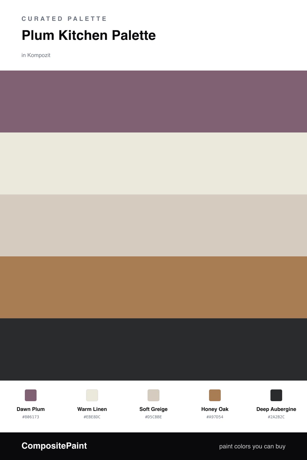
Plum Kitchen Palette — Dawn Plum & Warm Linen

A contemporary five-color kitchen scheme led by soft dawn plum, balanced with warm linen, crisp white, oak brown, and a deep aubergine accent — every color matched to real paint you can buy.

By Maya Patel · Reviews Editor & Product Tester

Dawn Plum
Walls
Kompozit Majestic Plum · 1214
#806173
LRV 14
Warm Linen
Trim & Ceiling
Kompozit Onion Skin · 0418
#EBE8DC
LRV 81
Soft Greige
Cabinets or Vanity
Kompozit Awakening · 0560
#D5CBBE
LRV 61
Honey Oak
Wood & Floors
Kompozit Butterscotch Mousse · 0249
#A97D54
LRV 24
Deep Aubergine
Accent
Kompozit Silent Sea · 0515
#2A2B2C
LRV 2
View palette in

Plum is having a quiet moment in kitchens right now, and Dawn Plum is the easy way in. It is dusty and soft rather than bold, so it behaves like a warm neutral with just enough violet to feel intentional. On the walls it flatters both daylight and evening light.

Warm Linen keeps the trim and ceiling fresh, while Soft Greige on the cabinets bridges the plum and the wood without competing. The greige is the workhorse here — calm, slightly warm, and forgiving against everyday kitchen wear.

For depth, Honey Oak on floors or a butcher-block counter adds warmth from below, and Deep Aubergine brings the drama. Keep that darkest shade to an island or lower run and let the plum stay in charge. The result feels current, soft, and lived-in.

Buy These Colors

Each color matched to the closest real paint in every brand, by ΔE2000. Kompozit first; take any SKU to the store — these mix on demand.

Dawn Plum
#7C6478 · LRV 15 · Walls
Kompozit Majestic Plum · 1214 ΔE 2.55
Backdrop Mom Jeans · BD-MJ ΔE 20.97
Behr Showstopper · MQ5-34 ΔE 4.28
Benjamin Moore Cupid's Dart · 1385 ΔE 4.05
Clare Prince · PNT100-DP-33 ΔE 4.96
Dunn-Edwards Plum Wine · DE5978 ΔE 2.82
Farrow & Ball London Clay · No. 244 ΔE 12.89
Magnolia Home Salvaged · JG-147 ΔE 12.88
PPG / Glidden Grape Jelly · 1177-6 ΔE 2.03
Sherwin-Williams Wood Violet · SW 6557 ΔE 4.51
Valspar Purple Sunset · 8003-2F ΔE 2.49
Warm Linen
#EDE6D8 · LRV 80 · Trim & Ceiling
Kompozit Onion Skin · 0418 ΔE 1.91
Backdrop Don't Eat the Yellow Snow · BD-DS ΔE 3.81
Behr Exclusive Ivory · HDC-MD-11 ΔE 1.59
Benjamin Moore White Down · 970 ΔE 1.2
Clare Like Buttah · PNT100-LT-62 ΔE 2.01
Dunn-Edwards Antique White · DEW351 ΔE 1.49
Farrow & Ball James White · No. 2010 ΔE 2.24
Magnolia Home Carter Crème · JG-16 ΔE 1.65
PPG / Glidden China White · 1101-1 ΔE 1.4
Sherwin-Williams Ivory Lace · SW 7013 ΔE 0.48
Valspar Cozy White · 3008-10C ΔE 0.88
Soft Greige
#D6CCBC · LRV 61 · Cabinets or Vanity
Kompozit Awakening · 0560 ΔE 1.34
Backdrop Real Real · BD-RR ΔE 1.79
Behr Almond Wisp · PPU5-12 ΔE 1.29
Benjamin Moore Rocking Chair · CSP-400 ΔE 1.34
Clare Flatiron · PNT100-LT-17 ΔE 2.11
Dunn-Edwards Porous Stone · DE6220 ΔE 1.91
Farrow & Ball Cromarty · No. 285 ΔE 4.31
Magnolia Home Plaster · JG-156 ΔE 1.15
PPG / Glidden In The Buff · 1019-2 ΔE 2.06
Sherwin-Williams Sedate Gray · SW 6169 ΔE 2.83
Valspar Desert Fortress · 2008-10B ΔE 2.73
Honey Oak
#A9794E · LRV 23 · Wood & Floors
Kompozit Butterscotch Mousse · 0249 ΔE 1.58
Backdrop Old Soul · BD-OS ΔE 17.06
Behr Butter Caramel · HDC-CL-18A ΔE 1.54
Benjamin Moore Glazed Pear · 1092 ΔE 1.26
Clare Fire Sign · PNT100-DP-74 ΔE 11.88
Dunn-Edwards Driftwood · DE5328 ΔE 3.4
Farrow & Ball Mouse's Back · No. 40 ΔE 11.71
Magnolia Home Work Worn Wood · JG-35 ΔE 8.45
PPG / Glidden Caramelized Pecan · 1089-7 ΔE 3.57
Sherwin-Williams Smokey Topaz · SW 6117 ΔE 2
Valspar Leather Satchel · 3003-7B ΔE 0.62
Deep Aubergine
#3A2533 · LRV 2 · Accent
Kompozit Silent Sea · 0515 ΔE 13.92
Backdrop Hocus Pocus · BD-HP ΔE 12.83
Behr Deep Garnet · 110F-7 ΔE 4.53
Benjamin Moore Velvet Cloak · CSP-480 ΔE 4.24
Clare Blackish · PNT100-DP-54 ΔE 16.97
Dunn-Edwards Black · DEA187 ΔE 13.9
Farrow & Ball Pitch Black · No. 256 ΔE 13.86
Magnolia Home Blackboard · JG-05 ΔE 13.82
PPG / Glidden Black Magic · 1001-7 ΔE 14.7
Sherwin-Williams Raisin · SW 7630 ΔE 6.92
Valspar Rare Wine · 1011-9 ΔE 0.99

Questions

Will plum make a kitchen feel dark?

Not at this softness. Dawn Plum is muted and dusty rather than saturated, so it reads as a warm neutral with a violet undertone. Pair it with the linen trim and plenty of natural light and the room stays bright.

Where should the deep aubergine go?

Use it in small doses for contrast — a single island, the lower cabinets, or open shelving brackets. Let the plum walls lead and keep the aubergine to roughly one-fifth of the room so it grounds rather than overwhelms.

Similar Palettes

Closest schemes by color — not by label.