Burgundy Color Palette — Burgundy Horizon
A burgundy-led five-color scheme pairing a deep wine red with warm putty, soft oatmeal, and a slate accent — every color matched to real paint you can buy.
By Emily Roberts · DIY Editor & First-Timer's Guide
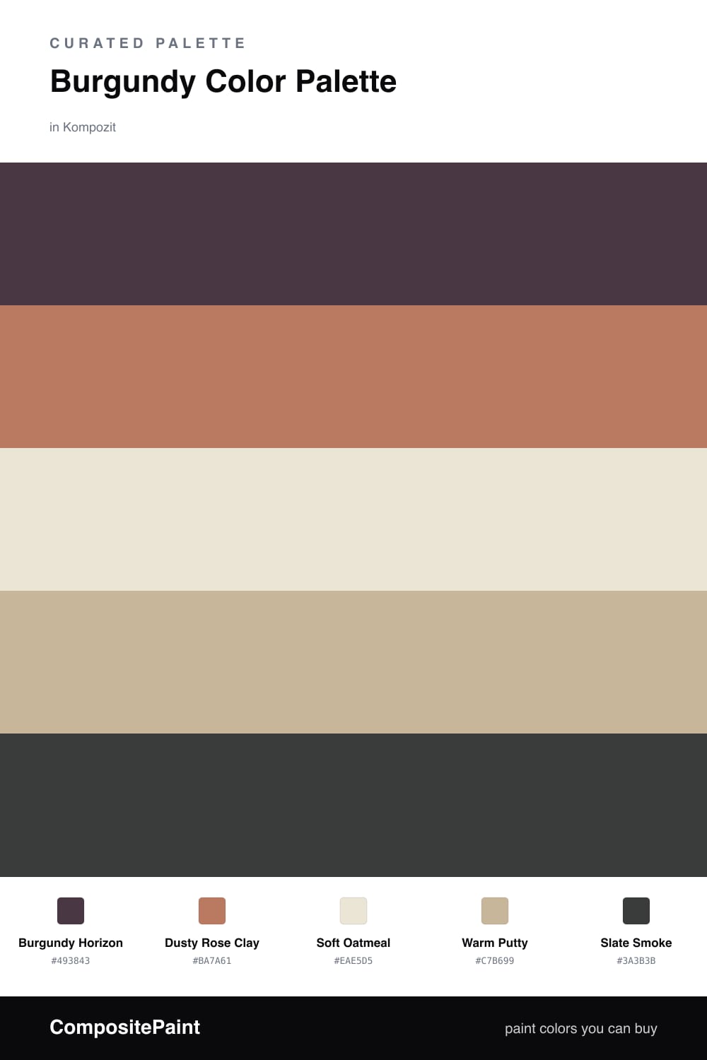
Burgundy is having a real moment right now, and for good reason. It gives you the drama of a dark color but with a warmth that feels welcoming. In this scheme, Burgundy Horizon leads the way as a deep wine red you can wrap a whole wall in.
To keep it from feeling too serious, I leaned on soft, warm neutrals. Dusty Rose Clay picks up the pink hiding inside the burgundy, while Soft Oatmeal and Warm Putty sit quietly underneath as the calm base. They keep everything light and easy on the eyes.
The little spark here is Slate Smoke, a cool gray that grounds the warmth and stops it from going too sweet. Use it in small doses — a lamp base, a frame, the legs of a table — and the whole palette snaps into focus.
Buy These Colors
Each color matched to the closest real paint in every brand, by ΔE2000. Kompozit first; take any SKU to the store — these mix on demand.
Questions
Burgundy is rich but a little quieter than bright red, so it can carry a whole room without overwhelming you. The warm neutrals around it soften the depth and let it feel cozy instead of heavy.
Let burgundy lead on the biggest surface, about two-thirds of the space, then use the oatmeal and putty as the calm middle. Save the slate for small touches like a frame or a chair.
Similar Palettes
Closest schemes by color — not by label.