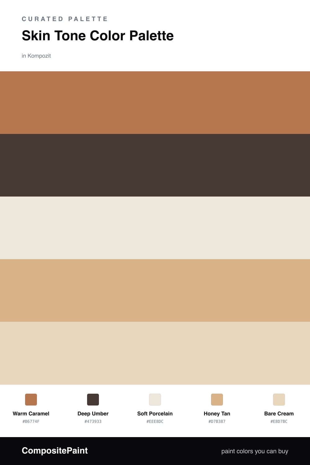
Skin Tone Color Palette — Caramel & Umber
A warm five-color scheme that runs from soft porcelain through caramel to deep umber, balanced by tan and cream — every color matched to real paint you can buy.
By Emily Roberts · DIY Editor & First-Timer's Guide
Skin-tone palettes are having a real moment right now, and it is easy to see why. These are the colors that flatter everyone, the soft caramels and warm tans that feel calm and lived-in without going beige and boring. This scheme stacks them from light to deep so you get warmth and depth in one go.
A rich Warm Caramel leads the way, with Deep Umber giving it that grounded, contemporary edge — think of it as the eyeliner of the palette, used sparingly. Underneath, Soft Porcelain and Bare Cream keep everything light and breathable so the warmer tones never feel heavy.
Honey Tan is the quiet bridge that ties it all together, the shade that makes the jump from pale cream to deep brown feel natural instead of abrupt. Lead with the caramel, sprinkle in the umber, and let the lighter three carry the rest.
Buy These Colors
Each color matched to the closest real paint in every brand, by ΔE2000. Kompozit first; take any SKU to the store — these mix on demand.
Questions
Not at all. The whole point of a skin-tone scheme is that it reads as neutral and flattering on almost everything. The cooler your light, the more you can lean on the soft porcelain and bare cream so the caramel does not go orange.
Let the deep umber do the heavy lifting. One darker color gives your eye something to land on, so use it on a single feature and let the caramel and tans build up around it in roughly a 60/30/10 split.
Similar Palettes
Closest schemes by color — not by label.