Sandy Beige
Behr's quiet, unmarketed warm sandy neutral, reviewed honestly: where the peach glows, the light that turns it pink, and what to pick instead.

Jessica has spec'd whites and neutrals for more than 300 rooms and keeps a sample wall of painted drawdowns in her studio. Every color review is checked against real reader rooms in the comments and re-tested when a formula changes. About the testing process →
- 1Revere Pewter55
- 2Agreeable Gray60
- 3Sandy Beige70
- 4Pearly White77
- 5Dover White83
The Fast Verdict
Sandy Beige is Behr's quiet answer to a genuinely warm beige — not gray-leaning like most modern greiges, not butter-yellow either, but built on an honest peach undertone that Behr's own color page admits to outright. In real daylight, next to warm wood and a warm-white trim, it reads sandy, calm, approachable. Put it under cold light or beside a crisp white, and the peach shows up fast — this is a dependable, unglamorous neutral with one real, predictable risk.
Whole-house warm neutral in rooms with real daylight · exteriors with warm stone, brick or terracotta · rooms with honey oak or golden wood · anyone who wants beige without any gray in it
Your room is a dim north-facer · your trim, counters or floor run crisp cool white or gray · you want zero pink risk · you're chasing a specific viral or Color-of-the-Year shade
- A genuinely warm, peach-based beige — not another gray-leaning greige
- Flatters honey oak and golden wood better than most modern neutrals
- LRV 70 keeps it bright without tipping into stark white
- Sold across Behr's full interior and exterior line, so any sheen or grade is easy to get
- Part of a matched three-depth strip (Mushroom Bisque, Sandy Beige, Almond Wisp) for easy wall-to-trim-to-accent layering
- Peach undertone reads pink fast in cold or north light
- Clashes with crisp white trim and cool white quartz — the classic dated-beige complaint
- Not a marketed or featured Behr color, so real-room photos and reviews are thin online
- Fights cool gray floors, cabinets and roofs instead of blending with them
What Color Is Sandy Beige, Really?
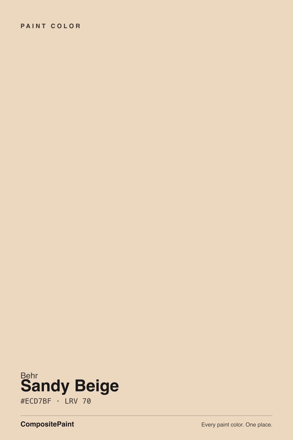
Behr files Sandy Beige in its own "Yellow" color-family bucket, but on the wall it does not read yellow — it reads peach. Behr's own product page describes it as a light neutral with a dusting of peach, and that phrase is more precise than most paint-brand copy: this is not a gray-beige and not a straight yellow-beige, it is built on a real pink-peach base, which is a rarer undertone among big-box neutrals than the greige everyone already knows. It sits in Behr's PPU4 strip alongside Mushroom Bisque (PPU4-07, a deeper tan-brown one step darker) and Almond Wisp (PPU4-13, a lighter cream one step up) — three depths of essentially the same peachy-warm base, which matters if you're standing at the fan deck trying to decide how far to commit.
At LRV 70 it is a light-to-mid neutral: brighter than a typical greige like Accessible Beige (LRV 58) or Even Better Beige (LRV 60), but visibly deeper than a true off-white like Almond Wisp (LRV 75) or Swiss Coffee (LRV 80). That puts it in an unglamorous middle zone — light enough to feel airy, dark enough that it never reads as a white. It is sold across Behr's full range (Premium Plus, Dynasty, Marquee, Ultra), interior and exterior, which is really a statement about the color: nobody built a marketing campaign around Sandy Beige, but Behr keeps it in every product line because it does the ordinary job well.
Undertone in one line: peach first, a touch of pink second — never gray, never straight yellow. If your sample looks dull or faintly dirty-pink, that is cold light doing what cold light does to every peach-based neutral; it is not a flaw in the can.
Where It Shines
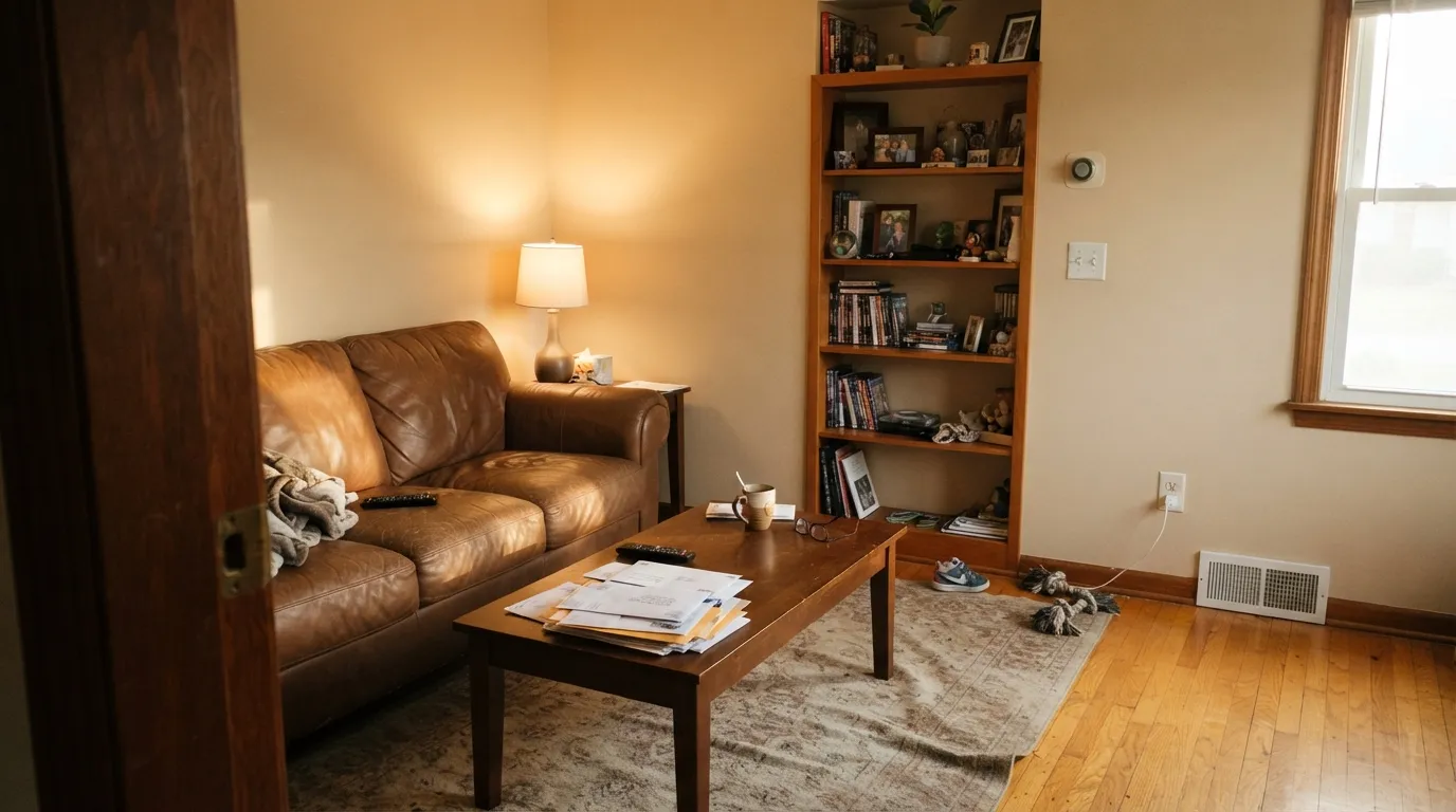
Give it warm daylight and it does the job a lot of beiges promise and fail to deliver: calm, sandy, unfussy, and genuinely happy next to golden and orange-toned wood. That is its real edge over most modern beiges — greiges like Repose Gray or Agreeable Gray fight honey oak because their base runs cool, while Sandy Beige's peach undertone sits on the same warm side of the wheel as orange-gold oak, so the two agree instead of arguing. It is also a legitimate exterior color, sold in Behr's all-weather Marquee and Ultra lines, and it pairs naturally with warm stone, brick, and terracotta without needing a design plan.
Where It Fails
The complaint pattern here is short and predictable, because Sandy Beige only really has one real risk and it shows up the same way every time. None of it is the paint's fault — but if your room or your trim runs cold, this is not the neutral for you, and no extra coat fixes an undertone mismatch.
North light is blue-grey and it has nothing warm to offer a peach undertone. Without afternoon sun or warm bulbs, Sandy Beige goes dull and faintly dirty-pink instead of sandy. The paint did not change; the light removed the one thing that was flattering it.
A stark, blue-white trim or countertop is the classic move that exposes the peach — the cool white makes the wall look dated and slightly pink by comparison, the same way old builder-grade peachy beiges got their bad reputation in the 90s. Warm the trim (Swiss Coffee, White Dove) instead of fighting the wall.
Gray LVP, gray-washed wood, or white-oak-with-a-gray-cast pull against the peach the same way cool trim does — the wall reads pinker and the floor reads colder. Sandy Beige wants a warm floor partner, not a gray one.
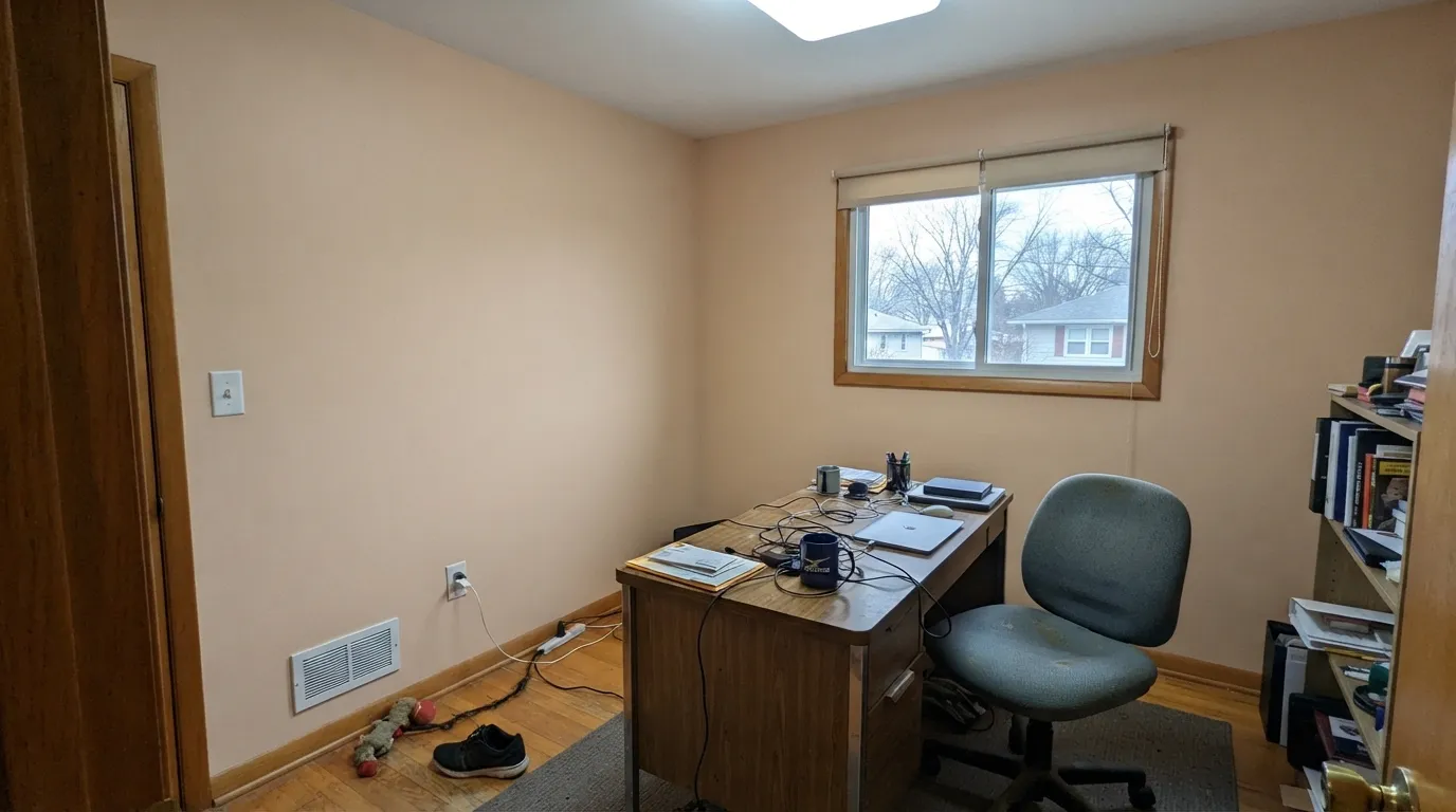
Room by Room
South or west light keeps it sandy and calm against warm wood furniture. Eggshell on the walls, and keep the trim warm rather than bright white.
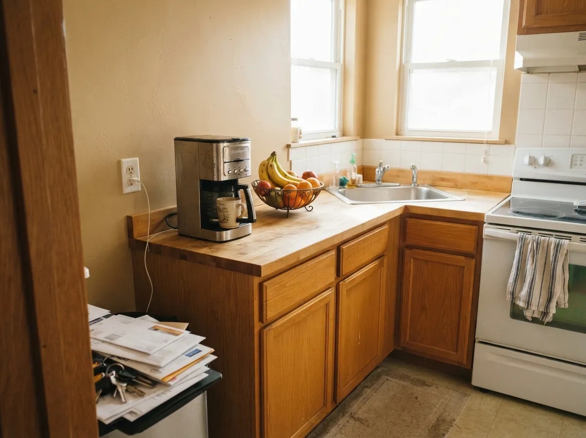
Golden oak cabinets and butcher block are genuinely flattered by the peach undertone. A cool white quartz counter is the one pairing to sample first — it can push the wall pink by contrast.
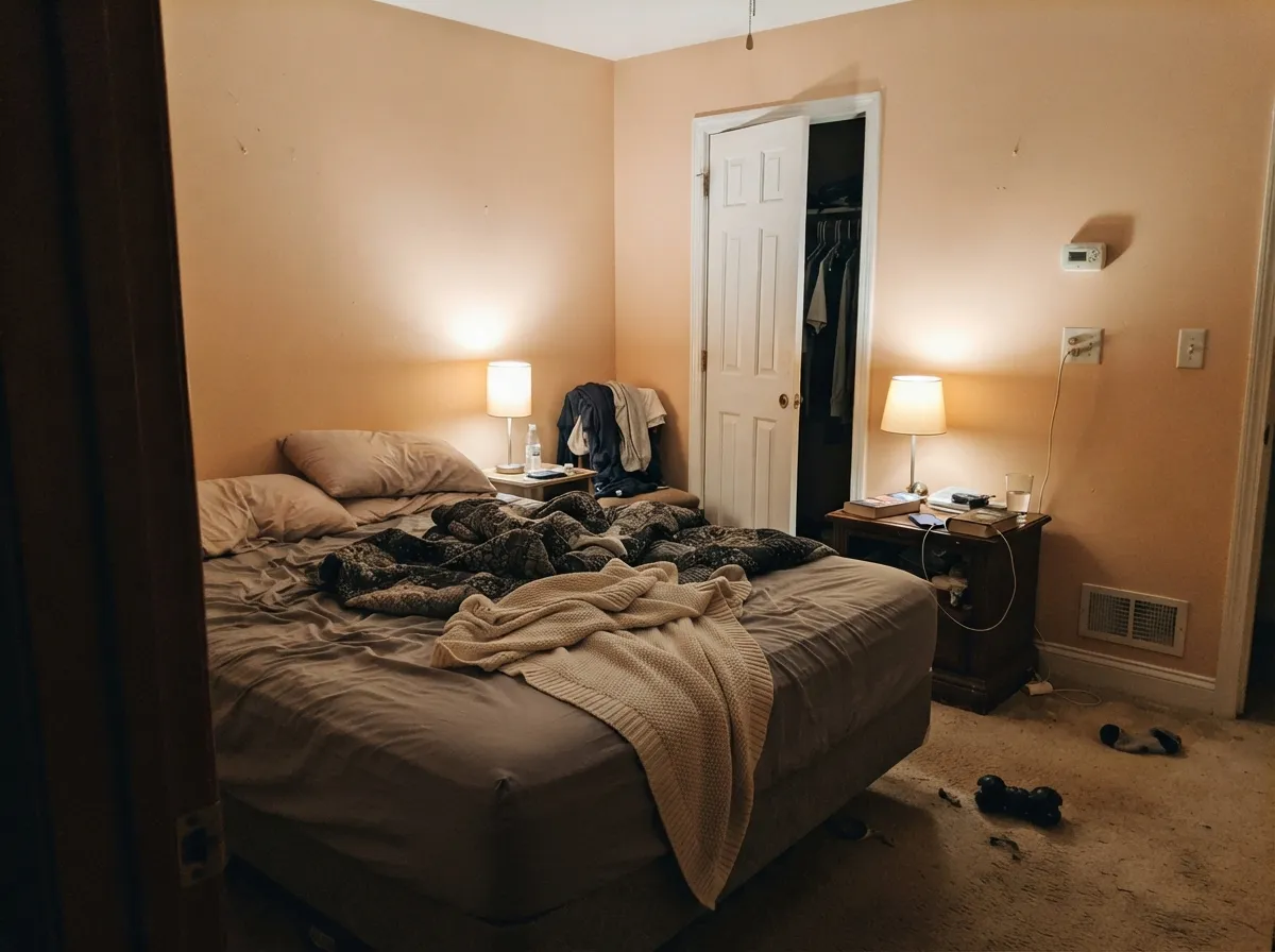
2700K bulbs bring out the warmth at night and the room feels genuinely relaxed. In a north-facing bedroom with no lamps, expect it to look flatter than the chip promised.
Warm travertine, beige tile, brass fixtures: it disappears into the room in the best way. Cool gray or blue-white tile: it argues, and a straight gray-beige like Wheat Bread reads calmer there.
Sold across Behr's exterior lines (Marquee, Ultra) with full weather protection. It reads warm and sandy against brick, stone or a warm roof; a cool gray roof or slate-blue shutters will make it look slightly washed out rather than intentional.
It can work as a trim white against a deeper warm wall, but a crisp bright white does the trim job with less undertone risk. Save Sandy Beige for the walls or siding, not the woodwork.
Your Light Is the Risk
Warm sun keeps the peach reading sandy and calm all day. Its safest, most flattering light.
Cold blue-grey daylight strips the warmth out and the wall goes dull, faintly dirty-pink. Test a large sample before committing a dim room.
Soft and quiet in the morning, noticeably more peach-golden by late afternoon. Most owners like the shift; it is not subtle.
2700K warm bulbs deepen the sandy warmth and it feels cozy at night. Cool white LEDs flatten it back toward the pink it shows in bad daylight — swap the bulbs, not the paint.
Most complaints about Sandy Beige are a light mismatch. Upload a photo of your actual room and see it on your walls — then ask for the same wall in north light or evening lamps before you buy a single sample.
Need It From Another Brand?
Any paint counter can custom-tint Behr PPU4-10A directly. If you would rather stay in one brand's own deck, these are the closest stock matches, measured as ΔE2000. Under 2 is a difference you will not see on the wall.
| Brand | Closest color | ΔE | LRV | |
|---|---|---|---|---|
| Sherwin-Williams | Eaglet BeigeSW 7573 · Sherwin-Williams | 2.4 | 71 | Color page → |
| Benjamin Moore | Painted Sands1142 · Benjamin Moore | 0.4 | 69 | Color page → |
| Valspar | Drumskin7003-10 · Valspar | 2.9 | 70.2 | Color page → |
| PPG / Glidden | Antique ParchmentPPG1087-3 · PPG / Glidden | 0.8 | 70 | Color page → |
| Glidden | Antique ParchmentPPG1087-3 · Glidden | 1.2 | 70 | Color page → |
| Dutch Boy | Breadcrumb315-2DB · Dutch Boy | 2.1 | 70 | Color page → |
Similar Behr Colors
The nearest shades to Sandy Beige within Behr's own range, ranked by perceptual color distance — useful when you want the same look a touch lighter, darker, or warmer.
WCAG 2.1: AA is 4.5 : 1 for normal text, 3 : 1 for large text, AAA is 7 : 1.
Sandy Beige vs the Colors You're Also Considering
Every Sandy Beige sample board has the same rivals on it. The numbers show the real lightness gap — then it comes down to which risk you would rather live with.
Pick this when you want the sandier, more visibly warm version, not just another off-white.
Behr PPU4-13 · LRV 75Almond WispPick this for the lighter, creamier version from the same strip — barely any visible peach, an easier off-white.
Pick this for the lighter, easier-to-live-with depth of the same undertone.
Behr PPU4-07 · LRV 47Mushroom BisquePick this for a deeper tan-brown from the same strip — same peach base, one real step darker for an island or accent wall.
Within Behr, the field is crowded. Porcelain Skin PPU4-10 at #ECD7C1 and LRV 70 differs from Sandy Beige only in the last two digits of the blue channel, so on a wall they are the same. Plantation Tan S260-1 at #ECD8C2 and LRV 71 is a fraction lighter and a fraction less orange. Writer's Parchment N280-2 at #E9D6C0 and LRV 69 is a touch deeper. None of these are worth agonizing over.
Across brands, Benjamin Moore Painted Sands 1142 at #EBD7BF and LRV 69 has a deltaE of 0.44, which is a genuine match. PPG Antique Parchment PPG1087-3 at deltaE 0.85 is the same story, and the Glidden version at deltaE 1.19 is visually identical in normal room light.
Step a little further and the differences show. Sherwin-Williams Eaglet Beige SW 7573 at LRV 71 and deltaE 2.44 is very close but worth sampling first, and Farrow and Ball Ringwold Ground No. 208 at LRV 73 and deltaE 3.44 is close but visibly different side by side, being lighter and slightly greener.
Sandy Beige Coordinating Colors
The rule for coordinating with Sandy Beige is the same rule that governs every peach-based neutral: stay warm, and keep true cool whites and cool grays away from it. It flatters warm off-whites, deep warm browns, and near-blacks, and it argues with crisp blue-whites and gray-toned neutrals. These are the partners that keep it looking intentional instead of dated:
The Behr PPU4 Strip: Three Depths, One Undertone
Sandy Beige is not a standalone color so much as the middle rung of a three-color strip Behr sells under the PPU4 code: Mushroom Bisque (PPU4-07) below it, Almond Wisp (PPU4-13) above it. All three share the same peach-leaning warm base — they are the same recipe at different lightness levels, not three unrelated beiges that happen to look similar.
That makes them genuinely useful together rather than as competitors. Walls in Sandy Beige, trim or ceiling a step lighter in Almond Wisp, and cabinets or an accent a step darker in Mushroom Bisque reads as one deliberate warm palette instead of three separately chosen colors that happen to be in the same room — because they are, technically, the same color at three depths.
Sandy Beige With Wood Tones and Floors
This is where Sandy Beige earns its keep against fussier modern neutrals. Golden and honey-toned oak, red oak, and orange-leaning builder floors sit on the same warm side of the wheel as the paint's peach undertone, so the two support each other instead of the wall amplifying the floor's orange the way a cool greige would.
The pairing that needs a sample first is anything cool: gray-washed floors, white oak with a gray cast, or true gray LVP. Against those, the peach in Sandy Beige becomes the more obvious feature in the room, and it can read pink rather than sandy. Walnut and espresso floors are a safer middle ground — dark enough that the undertone conversation matters less.
Three Ready Palettes Built on Sandy Beige
A color is never alone on the wall. These are complete combinations in the 60-30-10 pattern, with the reason each one holds together. Every one opens in the visualizer.
A warm off-white trim keeps the peach from reading pink the way a stark white would; the near-black door and shutters give the facade one modern anchor without fighting the warmth of the siding.
Try this palette in your roomWhite Dove's own warmth means the trim never exposes the wall's peach; Taupe deepens the same warm family for one grounding dark note instead of introducing a competing undertone.
Try this palette in your roomSame peach undertone at three depths reads as one deliberate plan, not a mismatch — genuinely useful when you're standing at the paint counter trying to decide how much darker to go on cabinets than walls.
Try this palette in your roomSandy Beige FAQ
Is Sandy Beige warm or cool?
Warm — specifically peach-based, which is different from the yellow-beige or gray-beige most big-box neutrals use. Behr's own color page describes it as carrying a dusting of peach, and that undertone is the whole story of how this color behaves.
Does Sandy Beige look pink?
It can, in cold north light or next to a crisp white trim or cool white countertop. In warm daylight with a warm-toned trim it reads sandy, not pink. Sample it in your actual room before committing a whole house.
What trim white goes with Sandy Beige walls?
A warm off-white — Swiss Coffee or a warm white like White Dove — rather than a stark, blue-white trim. A cold trim white is the single most common way this color gets a bad review.
Is Sandy Beige good for exterior siding?
Yes — it is sold in Behr's all-weather exterior lines (Marquee, Ultra). It reads best against brick, warm stone or terracotta, and against a warm-toned roof; a cool gray roof or slate-blue shutters will make it look faded rather than intentional.
Does it work with honey oak floors?
Better than most modern beiges. Because the peach undertone sits on the warm side of the wheel with orange-gold oak, the two agree instead of clashing the way a cool greige would.
What's the difference between Sandy Beige, Mushroom Bisque and Almond Wisp?
All three are Behr's PPU4 strip — the same peachy-warm base at three depths. Mushroom Bisque (LRV 47) is the deepest tan-brown, Sandy Beige (LRV 70) is the mid-depth beige, and Almond Wisp (LRV 75) is the lightest, creamiest version. Pick the depth for the job, not a different color family.
Have you painted with Sandy Beige?
Rate it — one tap helps the next reader decide.
Ask a Question