CP

Skin Color Palette — Cocoa & Bare

A warm five-color nude scheme moving from soft porcelain through tan and caramel into deep umber, every color matched to real paint you can buy.

By Jessica Williams · Color Stylist & Interior Editor

Warm Caramel
Dominant
Kompozit Butterscotch Mousse · 0249
#A97D54
LRV 24
Toasted Tan
Secondary
Kompozit Cinnamon Toast · 0246
#CAA272
LRV 40
Soft Porcelain
Base
Kompozit Hint of Vanilla · 0001
#EEE8DC
LRV 81
Bare Beige
Support
Kompozit Candle Light · 0168
#DDC1A6
LRV 56
Deep Umber
Accent
Kompozit Film Noir · 0144
#473933
LRV 5
View palette in

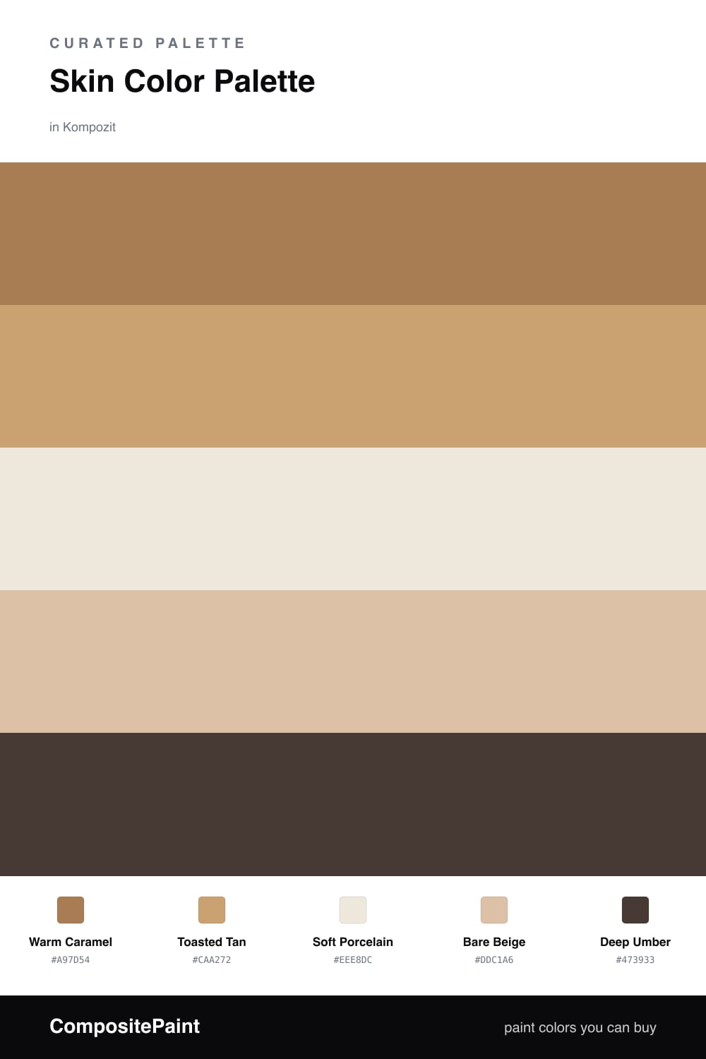
There is something deeply calming about a palette pulled straight from skin. Warm Caramel leads here, that lived-in golden brown that feels like late afternoon light, and Toasted Tan sits just beneath it as a softer echo.

Soft Porcelain and Bare Beige are the breath in the room — barely-there nudes that keep everything feeling open and undone rather than heavy. They let the warmer browns glow instead of crowding them.

Then Deep Umber grounds the whole thing. Used sparingly on trim, a door, or one piece of furniture, it gives this gentle scheme a spine. It is the look I keep reaching for in 2026 — quiet, tactile, and unmistakably warm.

Buy These Colors

Each color matched to the closest real paint in every brand, by ΔE2000. Kompozit first; take any SKU to the store — these mix on demand.

Warm Caramel
#B07B4F · LRV 24 · Dominant
Kompozit Butterscotch Mousse · 0249 ΔE 2.4
Backdrop Old Soul · BD-OS ΔE 18.39
Behr Almond Brittle · S270-6 ΔE 3.94
Benjamin Moore Dark Mustard · 2161-30 ΔE 2.5
Clare Fire Sign · PNT100-DP-74 ΔE 10.65
Dunn-Edwards Saddle Brown · DE5264 ΔE 2.35
Farrow & Ball Red Earth · No. 64 ΔE 11.03
Magnolia Home Vintage Crown · JG-152 ΔE 6.39
PPG / Glidden Cowboy Hat · 1082-6 ΔE 0.75
Sherwin-Williams Tigereye · SW 6362 ΔE 3.6
Valspar Leather Satchel · 3003-7B ΔE 1.78
Toasted Tan
#C9A47A · LRV 40 · Secondary
Kompozit Cinnamon Toast · 0246 ΔE 1.64
Backdrop Rosita · BD-RO ΔE 14.23
Behr Butter Nut · HDC-AC-13 ΔE 0.7
Benjamin Moore Roxbury Caramel · HC-42 ΔE 0.61
Clare Good as Gold · PNT100-DP-59 ΔE 4.19
Dunn-Edwards Medallion · DEC729 ΔE 3.16
Farrow & Ball India Yellow · No. 66 ΔE 6.28
Magnolia Home Juniper Tree · JG-166 ΔE 9.86
PPG / Glidden Outback · 1088-5 ΔE 1.1
Sherwin-Williams Vintage Gold · SW 9024 ΔE 1.35
Valspar Roasted Cashew · M147 ΔE 0.94
Soft Porcelain
#F2E6D8 · LRV 80 · Base
Kompozit Hint of Vanilla · 0001 ΔE 2.69
Backdrop Don't Eat the Yellow Snow · BD-DS ΔE 5.09
Behr Spooky Ghost · HDC-FL14-1 ΔE 0.79
Benjamin Moore Antique White · 909 ΔE 1.6
Clare Like Buttah · PNT100-LT-62 ΔE 1.98
Dunn-Edwards Finest Silk · DE6127 ΔE 0.22
Farrow & Ball James White · No. 2010 ΔE 4.53
Magnolia Home Antique Rose · JG-23 ΔE 2.78
PPG / Glidden Elegant Ivory · 1081-1 ΔE 1.17
Sherwin-Williams Crisp Linen · SW 6378 ΔE 1.58
Valspar Antique White · 7002-20 ΔE 0.96
Bare Beige
#DCC4A8 · LRV 58 · Support
Kompozit Candle Light · 0168 ΔE 1.92
Backdrop August · BD-AU ΔE 5.96
Behr Plateau · PPU4-08 ΔE 1.39
Benjamin Moore Cocoa Sand · 1122 ΔE 1.25
Clare Meet Cute · PNT100-LT-60 ΔE 7.3
Dunn-Edwards Cliff's View · DEC720 ΔE 0.46
Farrow & Ball Savage Ground · No. 213 ΔE 1.72
Magnolia Home Plaster · JG-156 ΔE 5.86
PPG / Glidden My Love · 1081-3 ΔE 1.22
Sherwin-Williams Croissant · SW 7716 ΔE 1.36
Valspar Gardenia · 3005-10B ΔE 1.49
Deep Umber
#4A3526 · LRV 4 · Accent
Kompozit Film Noir · 0144 ΔE 5.18
Backdrop After Hours · BD-AH ΔE 15.41
Behr Wild Horse · S-G-770 ΔE 6.2
Benjamin Moore Tarpley Brown · CW-170 ΔE 3.74
Clare Blackish · PNT100-DP-54 ΔE 12.32
Dunn-Edwards Black · DEA187 ΔE 11.83
Farrow & Ball Pitch Black · No. 256 ΔE 11.07
Magnolia Home Moments · JG-150 ΔE 7.29
PPG / Glidden Black Magic · 1001-7 ΔE 12.04
Sherwin-Williams French Roast · SW 6069 ΔE 3
Valspar Thoroughfare · 8004-6G ΔE 5.38

Questions

Why do these skin-tone colors work together?

They all come from the same warm family, so they shift gently from light to dark instead of clashing. Keeping one rich caramel as the lead and one deep umber as the anchor gives the soft middle tones somewhere to land.

How do I use this palette in a room?

Let the caramel and tan do most of the work on walls, keep the porcelain and beige as your quiet breathing space, and save the umber for trim or a single grounding piece — roughly a 70/30 split between warm and neutral.

Similar Palettes

Closest schemes by color — not by label.