Skin Color Palette — Amber Skin
A warm five-color scheme of porcelain, tan, caramel, and deep umber that reads like real skin in golden light — every color matched to real paint you can buy.
By Jessica Williams · Color Stylist & Interior Editor
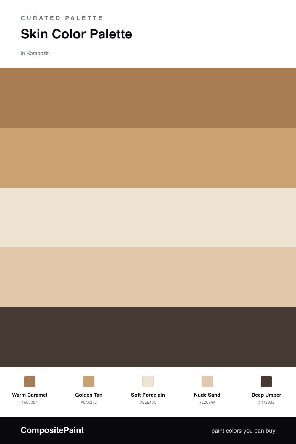
There is a reason we keep coming back to skin tones on the wall. They flatter everything, the way good light flatters a face. This scheme builds from a Warm Caramel dominant, the shade of honey held up to a window, with a softer Golden Tan beside it to keep things from going too rich.
Soft Porcelain is the breath in the room — the pale, milky base that lets the warmer tones feel intentional rather than heavy. Nude Sand bridges the gap, a quiet support color that reads as bare skin in afternoon sun. It is the kind of in-between tone that looks expensive without trying.
Then the Deep Umber. Every nude palette needs one true dark, and this one grounds the rest like eyeliner finishes a soft face. Use it sparingly in 2026 — a single trim line, a console, a length of cabinetry — and the whole room warms up around it.
Buy These Colors
Each color matched to the closest real paint in every brand, by ΔE2000. Kompozit first; take any SKU to the store — these mix on demand.
Questions
They share the same warm, golden undertone and step gently from light to dark, so the whole scheme feels like one face seen in soft light rather than five separate colors.
Lean on the deep umber as your grounding note — a door, a frame, a single chair — and let the porcelain breathe as open wall space so the caramel in the middle has room to glow.
Similar Palettes
Closest schemes by color — not by label.