CP

Skin Color Palette — Sable & Porcelain

A warm five-color skin-tone scheme moving from soft porcelain through tan and caramel to deep umber, every color matched to real paint you can buy.

By Emily Roberts · DIY Editor & First-Timer's Guide

Warm Tan
Dominant
Kompozit Cinnamon Toast · 0246
#CAA272
LRV 40
Soft Caramel
Secondary
Kompozit Butterscotch Mousse · 0249
#A97D54
LRV 24
Pale Porcelain
Base
Kompozit Eugenia · 0285
#F2E8D4
LRV 81
Sandy Nude
Support
Kompozit Candle Light · 0168
#DDC1A6
LRV 56
Deep Umber
Accent
Kompozit Film Noir · 0144
#473933
LRV 5
View palette in

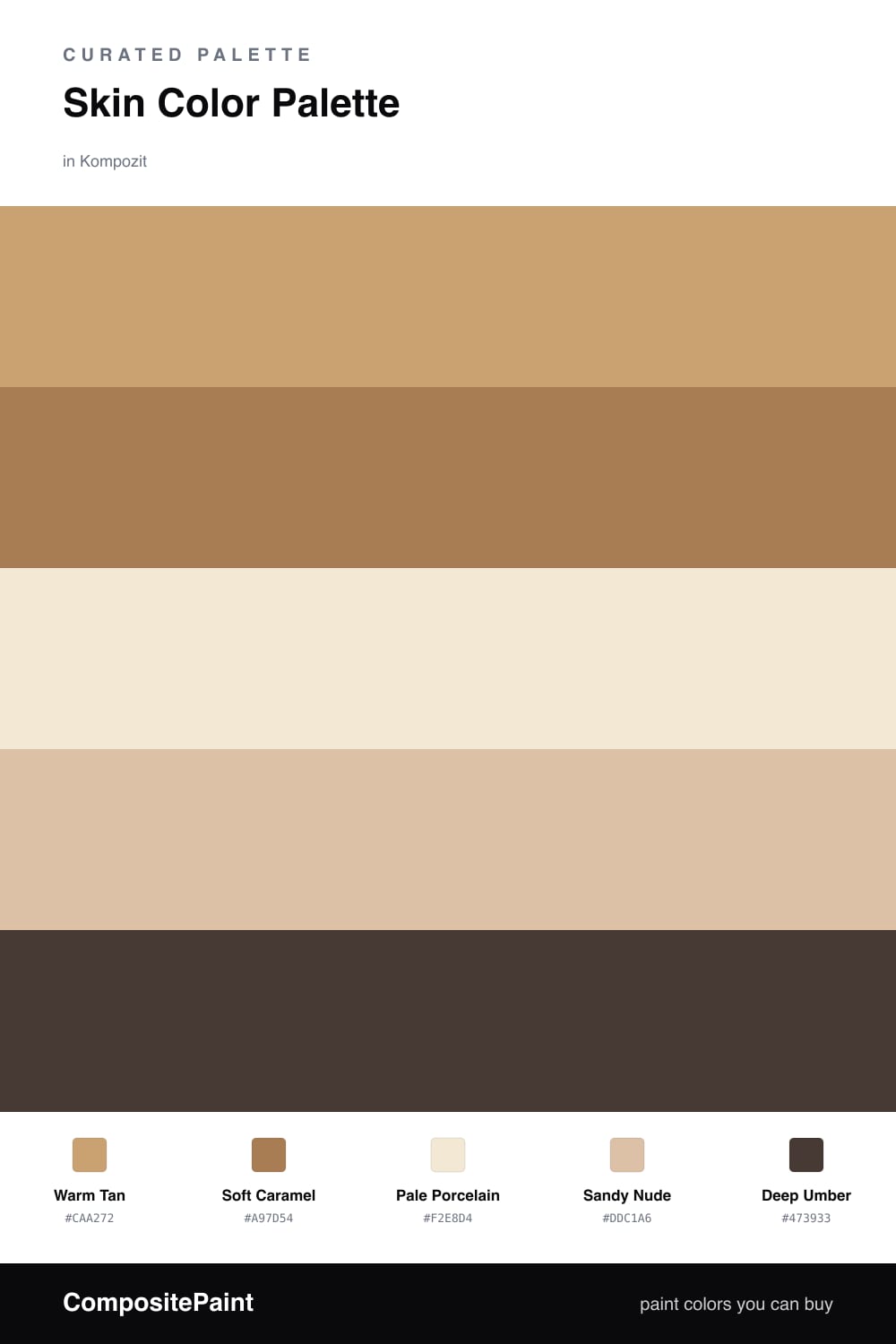
Skin tones are having a real moment in 2026, and it is easy to see why. These are the colors that feel like a deep breath the second you walk in. This scheme starts with a Warm Tan as the anchor, then leans on a Soft Caramel to add a little richness right beside it.

To keep things from feeling heavy, Pale Porcelain opens everything up like morning light, and Sandy Nude bridges the gap so nothing looks abrupt. They are the quiet, easy middle of the palette.

Then comes the part that makes it feel intentional — a Deep Umber used in small doses on a door, a frame, or a single piece of trim. Just a touch is enough to make the warmer tones glow instead of going flat.

Buy These Colors

Each color matched to the closest real paint in every brand, by ΔE2000. Kompozit first; take any SKU to the store — these mix on demand.

Warm Tan
#C9A77C · LRV 42 · Dominant
Kompozit Cinnamon Toast · 0246 ΔE 2.19
Backdrop Rosita · BD-RO ΔE 15.15
Behr Pelican Tan · S260-4 ΔE 0.69
Benjamin Moore Guesthouse · 1117 ΔE 0.53
Clare Good as Gold · PNT100-DP-59 ΔE 3.93
Dunn-Edwards Medallion · DEC729 ΔE 2.1
Farrow & Ball India Yellow · No. 66 ΔE 6.29
Magnolia Home Juniper Tree · JG-166 ΔE 8.98
PPG / Glidden Siesta Dreams · 1080-4 ΔE 2.82
Sherwin-Williams Stonebriar · SW 7693 ΔE 0.56
Valspar Roasted Cashew · M147 ΔE 0.67
Soft Caramel
#B07D4F · LRV 24 · Secondary
Kompozit Butterscotch Mousse · 0249 ΔE 2.03
Backdrop Old Soul · BD-OS ΔE 17.85
Behr Gold Plated · UL160-2 ΔE 2.56
Benjamin Moore Dark Mustard · 2161-30 ΔE 1.68
Clare Fire Sign · PNT100-DP-74 ΔE 11.62
Dunn-Edwards Saddle Brown · DE5264 ΔE 3.19
Farrow & Ball Red Earth · No. 64 ΔE 11.88
Magnolia Home Vintage Crown · JG-152 ΔE 5.61
PPG / Glidden Cowboy Hat · 1082-6 ΔE 0.76
Sherwin-Williams Chamois · SW 6131 ΔE 4.1
Valspar Gleaming Tan · 3002-7B ΔE 2.18
Pale Porcelain
#F3E7D8 · LRV 81 · Base
Kompozit Eugenia · 0285 ΔE 2.62
Backdrop Don't Eat the Yellow Snow · BD-DS ΔE 4.66
Behr Spooky Ghost · HDC-FL14-1 ΔE 0.48
Benjamin Moore Candle White · 2164-70 ΔE 1.66
Clare Like Buttah · PNT100-LT-62 ΔE 1.57
Dunn-Edwards Alabaster · DEW310 ΔE 1.36
Farrow & Ball James White · No. 2010 ΔE 4.27
Magnolia Home Antique Rose · JG-23 ΔE 2.69
PPG / Glidden Parchment Paper · 1095-1 ΔE 1.67
Sherwin-Williams Crisp Linen · SW 6378 ΔE 1.18
Valspar Grow · 8003-25A ΔE 1.96
Sandy Nude
#DCC3A3 · LRV 57 · Support
Kompozit Candle Light · 0168 ΔE 2.64
Backdrop Boy Meets Girl · BD-BG ΔE 10.65
Behr Soft Wheat · BXC-40 ΔE 0.87
Benjamin Moore Arizona Tan · 2162-50 ΔE 0.39
Clare Meet Cute · PNT100-LT-60 ΔE 8.56
Dunn-Edwards Cliff's View · DEC720 ΔE 1.75
Farrow & Ball Savage Ground · No. 213 ΔE 1.91
Magnolia Home Plaster · JG-156 ΔE 6.55
PPG / Glidden Birch Beige · 1094-3 ΔE 1.65
Sherwin-Williams Buckram Binding · SW 36 ΔE 1.2
Valspar Turbo Tan · 8003-20C ΔE 0.74
Deep Umber
#4A352A · LRV 4 · Accent
Kompozit Film Noir · 0144 ΔE 3.93
Backdrop After Hours · BD-AH ΔE 15.32
Behr Wild Horse · S-G-770 ΔE 4.17
Benjamin Moore Tarpley Brown · CW-170 ΔE 2.31
Clare Blackish · PNT100-DP-54 ΔE 11.8
Dunn-Edwards Black · DEA187 ΔE 11.08
Farrow & Ball Pitch Black · No. 256 ΔE 10.36
Magnolia Home Moments · JG-150 ΔE 6.37
PPG / Glidden Black Magic · 1001-7 ΔE 11.3
Sherwin-Williams French Roast · SW 6069 ΔE 2.67
Valspar Thoroughfare · 8004-6G ΔE 3.5

Questions

Why do these skin-tone colors work together?

They all share the same warm, golden undertone, so they blend like shades of the same fabric. Going from light porcelain to deep umber gives you contrast without any color fighting another.

How much of each color should I use?

Let the soft tan lead and the porcelain do the breathing room — roughly a 60/30/10 split, with caramel and sand filling the middle and just a touch of umber to ground everything.

Similar Palettes

Closest schemes by color — not by label.