Skin Color Palette — Bare Skin Study
A five-color skin-tone scheme moving from soft porcelain through warm tan and caramel into deep umber, every color matched to real paint you can buy.
By David Chen · Formulation Lead & Resident Chemist
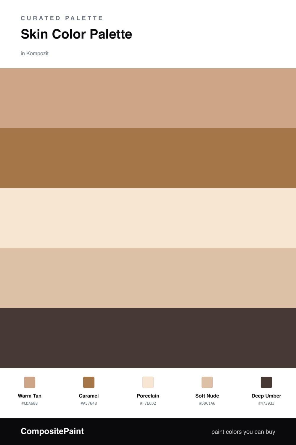
Skin tones are some of the hardest colors to get right because they live so close together on the wheel. The trick is to treat them like a gradient. Here a soft Warm Tan leads, sitting right in the middle of the range where it feels lived-in and easy.
Porcelain opens everything up as the lightest layer, and Soft Nude bridges the gap so nothing jumps. Think of it like the way light falls across an arm — pale where it catches, warmer in the turn.
For depth, Caramel and Deep Umber do the quiet structural work, the umber especially in trim or a single grounding piece. It reads contemporary and warm for 2026, the kind of palette that feels skin-soft without ever going beige-boring.
Buy These Colors
Each color matched to the closest real paint in every brand, by ΔE2000. Kompozit first; take any SKU to the store — these mix on demand.
Questions
They all share the same warm undertone and step evenly from light to dark, so the eye reads them as one family rather than five separate picks. That shared base is what keeps a nude palette calm instead of muddy.
Let the warm tan lead and keep porcelain as your breathing space, roughly a 60/30 split, then use caramel and umber in small doses to add depth and edges.
Similar Palettes
Closest schemes by color — not by label.