CP

Skin Color Palette — Dune Nude

A five-color scheme of natural skin tones — porcelain, warm tan, caramel, and deep umber — gathered into a soft nude palette, with every color matched to real paint you can buy.

By Jessica Williams · Color Stylist & Interior Editor

Warm Tan
Dominant
Kompozit Cinnamon Toast · 0246
#CAA272
LRV 40
Caramel Glow
Secondary
Kompozit Gold Metal · 0998
#B17743
LRV 23
Porcelain
Base
Kompozit Hint of Vanilla · 0001
#EEE8DC
LRV 81
Soft Sand
Support
Kompozit Muslin Tint · 0287
#E0CDB1
LRV 63
Deep Umber
Accent
Kompozit Film Noir · 0144
#473933
LRV 5
View palette in

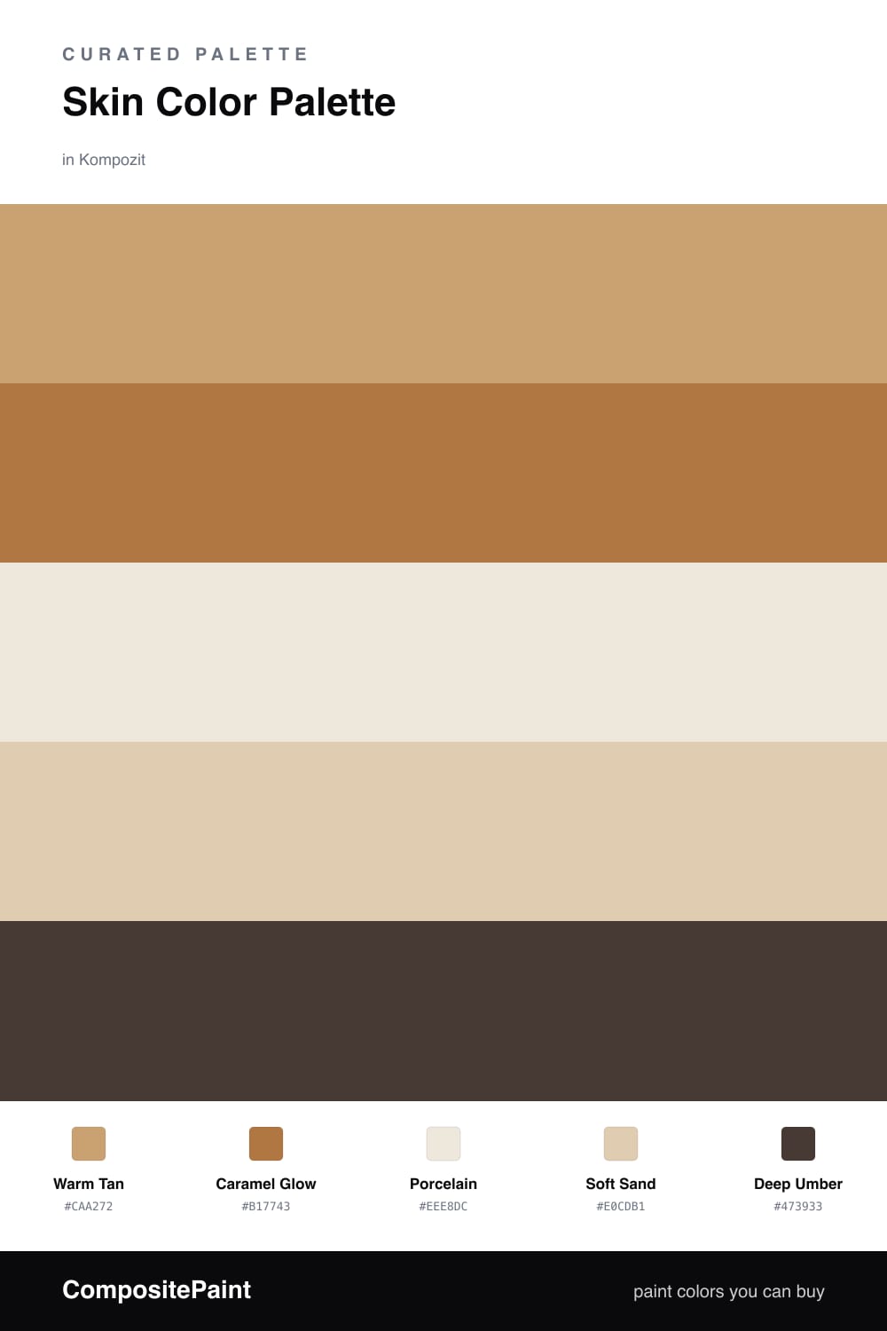
There is something quietly modern about a room built entirely from skin. This palette leans on a Warm Tan as its dominant tone — soft, sun-touched, the color of bare arms in late summer — with a deeper Caramel Glow sitting just beneath it for warmth.

Porcelain and Soft Sand open the whole thing up, the way morning light does, so the space never feels heavy. They are the breathing room between the richer notes, and they keep the scheme feeling fresh rather than dusty.

Then comes Deep Umber, used sparingly. A little goes a long way here — one umber door or a single dark frame is enough to give all that warmth a place to land. This is the kind of nude palette that feels grown-up and calm, very 2026, and easy to live in for years.

Buy These Colors

Each color matched to the closest real paint in every brand, by ΔE2000. Kompozit first; take any SKU to the store — these mix on demand.

Warm Tan
#C9A27E · LRV 40 · Dominant
Kompozit Cinnamon Toast · 0246 ΔE 3.47
Backdrop Rosita · BD-RO ΔE 12
Behr Peanut Butter · 270F-4 ΔE 0.56
Benjamin Moore Roxbury Caramel · HC-42 ΔE 2.19
Clare Good as Gold · PNT100-DP-59 ΔE 6.17
Dunn-Edwards Graham Cracker · DE6144 ΔE 3.87
Farrow & Ball London Stone · No. 6 ΔE 7.25
Magnolia Home Juniper Tree · JG-166 ΔE 10.98
PPG / Glidden Siesta Dreams · 1080-4 ΔE 0.8
Sherwin-Williams Deer Valley · SW 7720 ΔE 1.68
Valspar Vienna Beige · 2004-8A ΔE 3.08
Caramel Glow
#B07A4E · LRV 24 · Secondary
Kompozit Gold Metal · 0998 ΔE 2.13
Backdrop Old Soul · BD-OS ΔE 18.58
Behr Roasted Cashew · S250-5 ΔE 3.89
Benjamin Moore Dark Mustard · 2161-30 ΔE 2.82
Clare Fire Sign · PNT100-DP-74 ΔE 10.39
Dunn-Edwards Saddle Brown · DE5264 ΔE 2.3
Farrow & Ball Red Earth · No. 64 ΔE 10.9
Magnolia Home Work Worn Wood · JG-35 ΔE 7.49
PPG / Glidden Cowboy Hat · 1082-6 ΔE 1.07
Sherwin-Williams Tigereye · SW 6362 ΔE 3.34
Valspar Leather Satchel · 3003-7B ΔE 1.91
Porcelain
#F2E6D8 · LRV 80 · Base
Kompozit Hint of Vanilla · 0001 ΔE 2.69
Backdrop Don't Eat the Yellow Snow · BD-DS ΔE 5.09
Behr Spooky Ghost · HDC-FL14-1 ΔE 0.79
Benjamin Moore Antique White · 909 ΔE 1.6
Clare Like Buttah · PNT100-LT-62 ΔE 1.98
Dunn-Edwards Finest Silk · DE6127 ΔE 0.22
Farrow & Ball James White · No. 2010 ΔE 4.53
Magnolia Home Antique Rose · JG-23 ΔE 2.78
PPG / Glidden Elegant Ivory · 1081-1 ΔE 1.17
Sherwin-Williams Crisp Linen · SW 6378 ΔE 1.58
Valspar Antique White · 7002-20 ΔE 0.96
Soft Sand
#E0CBAF · LRV 62 · Support
Kompozit Muslin Tint · 0287 ΔE 0.96
Backdrop August · BD-AU ΔE 6.75
Behr Almond Latte · N260-2 ΔE 1.14
Benjamin Moore Harmony · AF-90 ΔE 1.64
Clare Turbinado · PNT100-LT-21 ΔE 4.79
Dunn-Edwards Cochise · DEC761 ΔE 2.02
Farrow & Ball String · No. 8 ΔE 2.83
Magnolia Home Tapestry Thread · JG-105 ΔE 6.49
PPG / Glidden Seriously Sand · 1085-3 ΔE 2.04
Sherwin-Williams Interactive Cream · SW 6113 ΔE 1.93
Valspar Peasant Bread · 8003-22B ΔE 1.01
Deep Umber
#4A372A · LRV 4 · Accent
Kompozit Film Noir · 0144 ΔE 3.97
Backdrop After Hours · BD-AH ΔE 14.26
Behr Chocolate Coco · S-G-760 ΔE 3.31
Benjamin Moore Tarpley Brown · CW-170 ΔE 2.62
Clare Blackish · PNT100-DP-54 ΔE 11.1
Dunn-Edwards Black · DEA187 ΔE 10.7
Farrow & Ball Pitch Black · No. 256 ΔE 9.95
Magnolia Home Moments · JG-150 ΔE 6.17
PPG / Glidden Black Magic · 1001-7 ΔE 10.85
Sherwin-Williams Turkish Coffee · SW 6076 ΔE 2.53
Valspar Deep Earth · 6010-2 ΔE 3.28

Questions

Why do these skin tones work together?

They all share the same warm, sandy undertone, so they read like one family rather than five separate colors. Going from pale porcelain up to deep umber gives you contrast without ever clashing.

How do I balance them in a room?

Let the warm tan lead on the big surfaces, keep porcelain and sand for trim and ceilings, and save the deep umber for one small grounding moment — a door, a frame, or a single piece of furniture.

Similar Palettes

Closest schemes by color — not by label.