CP

Skin Color Palette — Pearl & Umber

A warm five-color scheme of natural skin tones — soft porcelain, golden tan, rich caramel, and deep umber — with every color matched to real paint you can buy.

By Emily Roberts · DIY Editor & First-Timer's Guide

Golden Tan
Dominant
Kompozit Cinnamon Toast · 0246
#CAA272
LRV 40
Warm Caramel
Secondary
Kompozit Dodge Pole · 0157
#A37355
LRV 21
Soft Porcelain
Base
Kompozit Hint of Vanilla · 0001
#EEE8DC
LRV 81
Pearl Nude
Support
Kompozit Flan · 0237
#E2C8AA
LRV 60
Deep Umber
Accent
Kompozit Film Noir · 0144
#473933
LRV 5
View palette in

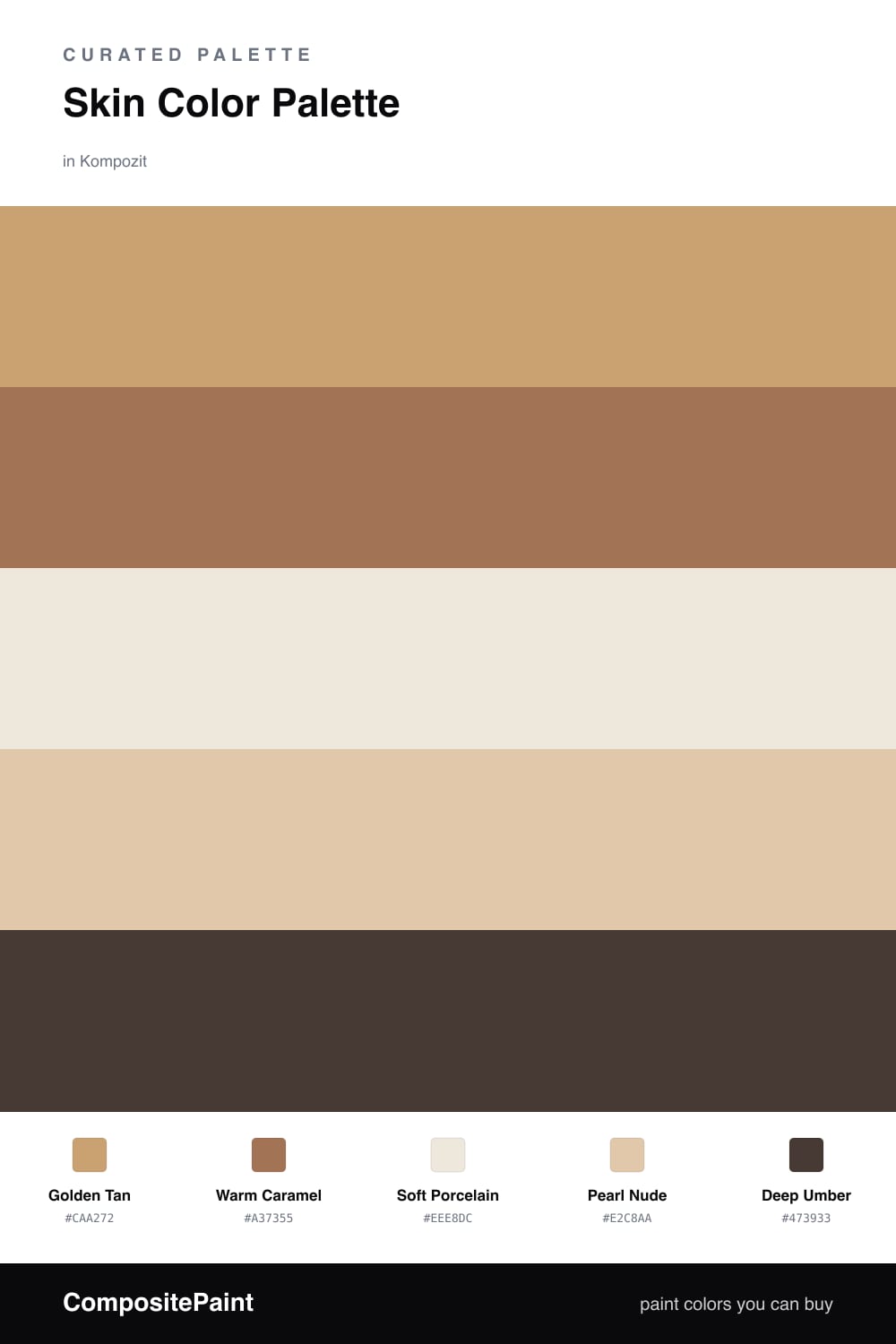
There is something instantly calming about a palette built from skin tones. These are the colors we are surrounded by every day, so a room wearing them feels welcoming before you can even say why. Here a soft Golden Tan leads, warm and sunlit, with Warm Caramel stepping in to add depth.

Soft Porcelain is your quiet base — think walls and ceilings that keep everything light and airy. Pearl Nude bridges the gap between the pale base and the deeper tones, so nothing feels like too big a leap.

For 2026 this kind of warm, lived-in neutral is everywhere, and the trick is restraint. Let Deep Umber show up only in small doses — a doorframe, a chair, a shelf — and the whole scheme suddenly looks grounded and intentional.

Buy These Colors

Each color matched to the closest real paint in every brand, by ΔE2000. Kompozit first; take any SKU to the store — these mix on demand.

Golden Tan
#C8A47C · LRV 40 · Dominant
Kompozit Cinnamon Toast · 0246 ΔE 2.16
Backdrop Rosita · BD-RO ΔE 13.86
Behr Albuquerque · QE-21 ΔE 2.2
Benjamin Moore Roxbury Caramel · HC-42 ΔE 1.01
Clare Good as Gold · PNT100-DP-59 ΔE 4.57
Dunn-Edwards Medallion · DEC729 ΔE 3.28
Farrow & Ball London Stone · No. 6 ΔE 7.27
Magnolia Home Juniper Tree · JG-166 ΔE 9.67
PPG / Glidden Siesta Dreams · 1080-4 ΔE 1.46
Sherwin-Williams Vintage Gold · SW 9024 ΔE 1.87
Valspar Roasted Cashew · M147 ΔE 1.21
Warm Caramel
#A9744F · LRV 21 · Secondary
Kompozit Dodge Pole · 0157 ΔE 2.33
Backdrop Old Soul · BD-OS ΔE 18.87
Behr Burnt Toffee · S230-6 ΔE 1.32
Benjamin Moore Cappuccino Muffin · 1155 ΔE 1.84
Clare Fire Sign · PNT100-DP-74 ΔE 9.62
Dunn-Edwards Burnt Almond · DE5258 ΔE 2.15
Farrow & Ball Red Earth · No. 64 ΔE 10.04
Magnolia Home Work Worn Wood · JG-35 ΔE 5.61
PPG / Glidden Fresh Praline · 16-21 ΔE 2.42
Sherwin-Williams Smokey Topaz · SW 6117 ΔE 2.7
Valspar Rustic Oak · 2007-7B ΔE 2.26
Soft Porcelain
#F2E6D8 · LRV 80 · Base
Kompozit Hint of Vanilla · 0001 ΔE 2.69
Backdrop Don't Eat the Yellow Snow · BD-DS ΔE 5.09
Behr Spooky Ghost · HDC-FL14-1 ΔE 0.79
Benjamin Moore Antique White · 909 ΔE 1.6
Clare Like Buttah · PNT100-LT-62 ΔE 1.98
Dunn-Edwards Finest Silk · DE6127 ΔE 0.22
Farrow & Ball James White · No. 2010 ΔE 4.53
Magnolia Home Antique Rose · JG-23 ΔE 2.78
PPG / Glidden Elegant Ivory · 1081-1 ΔE 1.17
Sherwin-Williams Crisp Linen · SW 6378 ΔE 1.58
Valspar Antique White · 7002-20 ΔE 0.96
Pearl Nude
#E2C9AE · LRV 61 · Support
Kompozit Flan · 0237 ΔE 1.01
Backdrop August · BD-AU ΔE 5.12
Behr Pumpkin Seed · S260-2 ΔE 0.24
Benjamin Moore Yellow Squash · 2161-50 ΔE 1.32
Clare Meet Cute · PNT100-LT-60 ΔE 6.74
Dunn-Edwards Travertine · DEC738 ΔE 0.84
Farrow & Ball String · No. 8 ΔE 4.73
Magnolia Home Tapestry Thread · JG-105 ΔE 8.4
PPG / Glidden Pumpkin Cream · 1080-2 ΔE 1.78
Sherwin-Williams Interactive Cream · SW 6113 ΔE 0.7
Valspar Holmes Cream · 3004-10B ΔE 1.03
Deep Umber
#4A3526 · LRV 4 · Accent
Kompozit Film Noir · 0144 ΔE 5.18
Backdrop After Hours · BD-AH ΔE 15.41
Behr Wild Horse · S-G-770 ΔE 6.2
Benjamin Moore Tarpley Brown · CW-170 ΔE 3.74
Clare Blackish · PNT100-DP-54 ΔE 12.32
Dunn-Edwards Black · DEA187 ΔE 11.83
Farrow & Ball Pitch Black · No. 256 ΔE 11.07
Magnolia Home Moments · JG-150 ΔE 7.29
PPG / Glidden Black Magic · 1001-7 ΔE 12.04
Sherwin-Williams French Roast · SW 6069 ΔE 3
Valspar Thoroughfare · 8004-6G ΔE 5.38

Questions

Why do these skin-tone colors work so well together?

They all share the same warm, earthy base, so they blend the way real skin tones do — light to deep with no jarring jump. Keeping one pale, one rich, and one very dark gives you contrast without anything clashing.

Where should I use the darkest color?

Save Deep Umber for the small stuff — a door, trim, or a single piece of furniture. A little of it makes the warmer tans and caramels look richer instead of muddy.

Similar Palettes

Closest schemes by color — not by label.