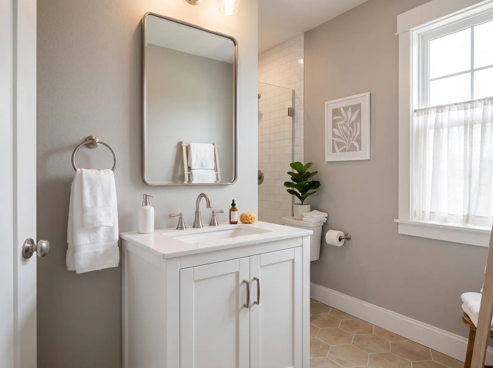
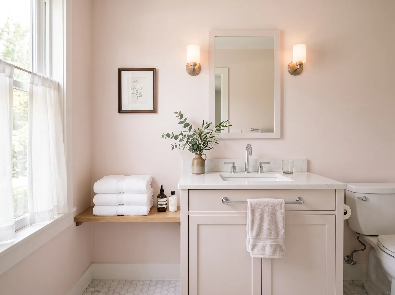
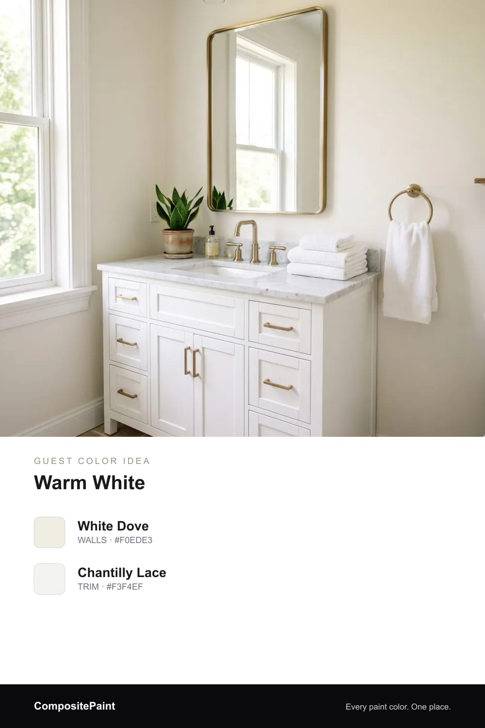
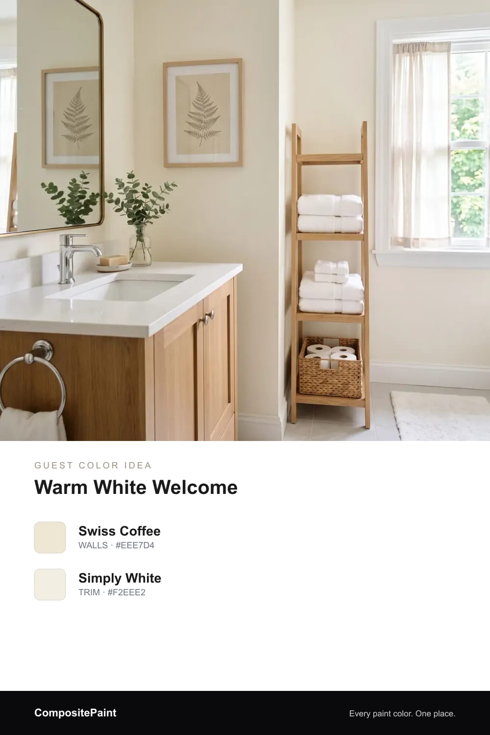
1. Warm White
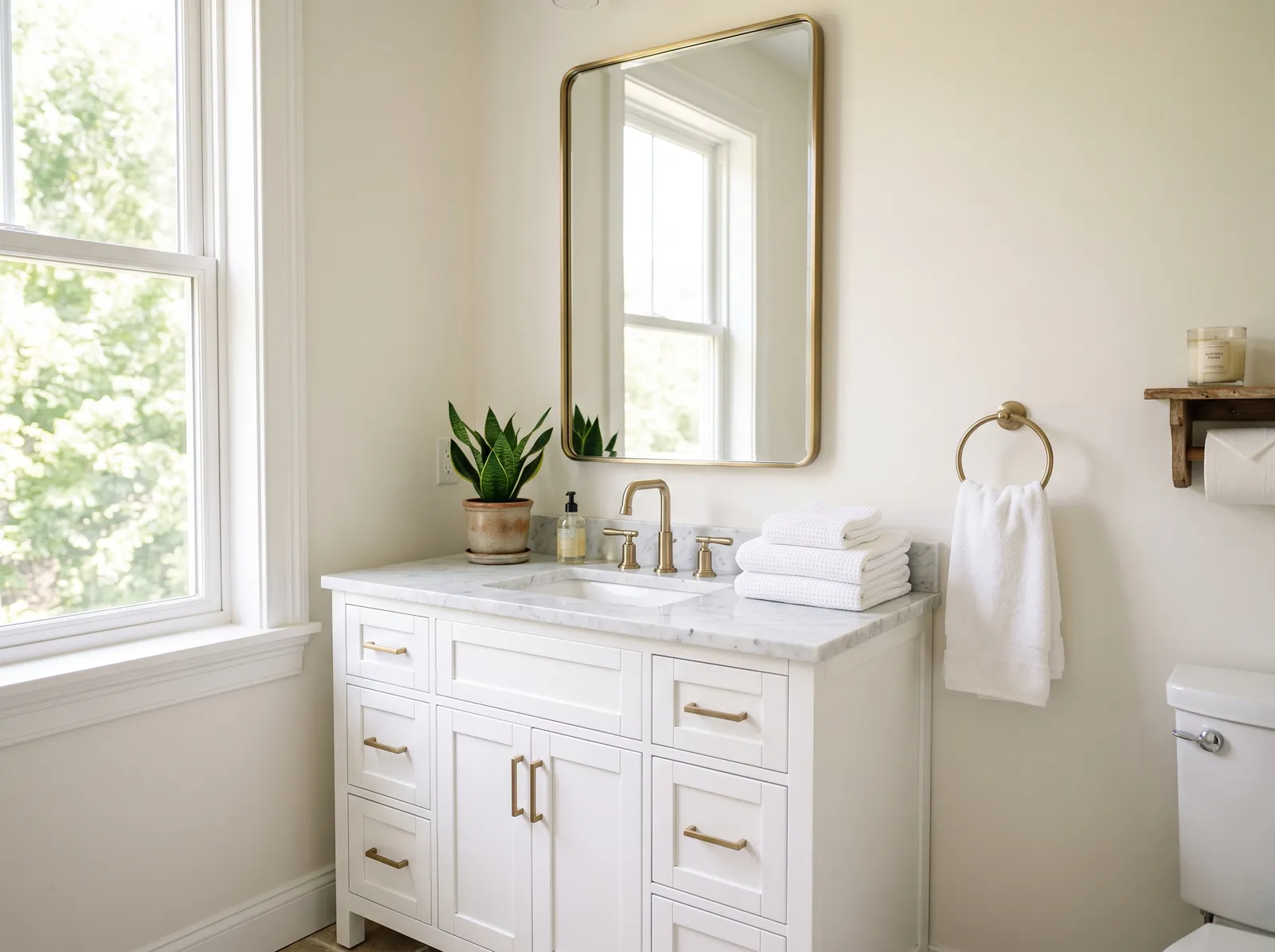
A soft warm white that keeps a guest bath bright, fresh, and easy to like.
A guest bathroom is a small room with a big job. It should feel like a kind welcome, the way a nice hotel bath does, calm and fresh and easy to like. The right color does most of that work, so let us find a shade that makes everyone who steps inside feel at home.
By Jessica Williams · Color Stylist
A soft warm white that keeps a guest bath bright, fresh, and easy to like.
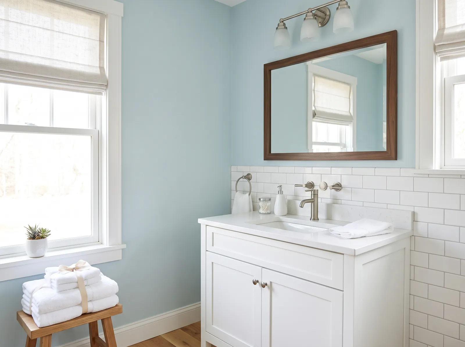
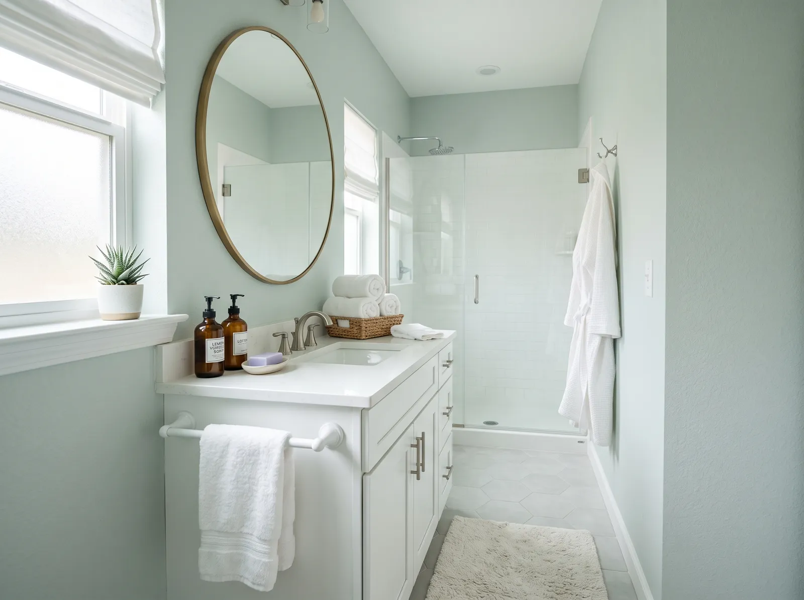
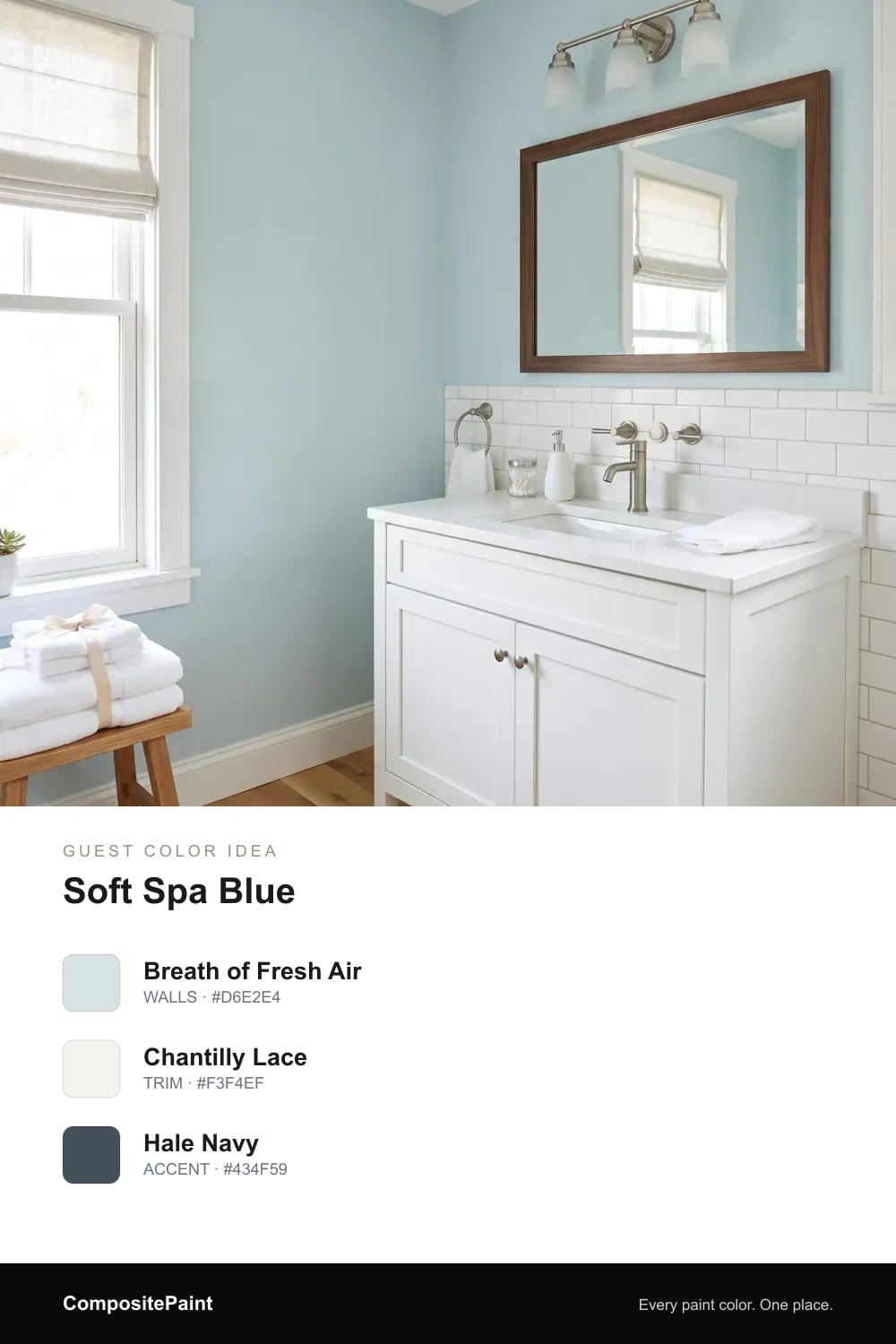
A clean, watery blue that feels like a fresh hotel bath.
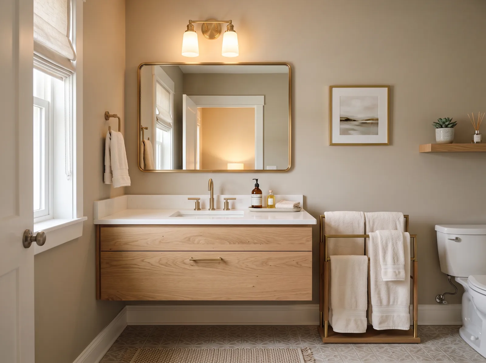
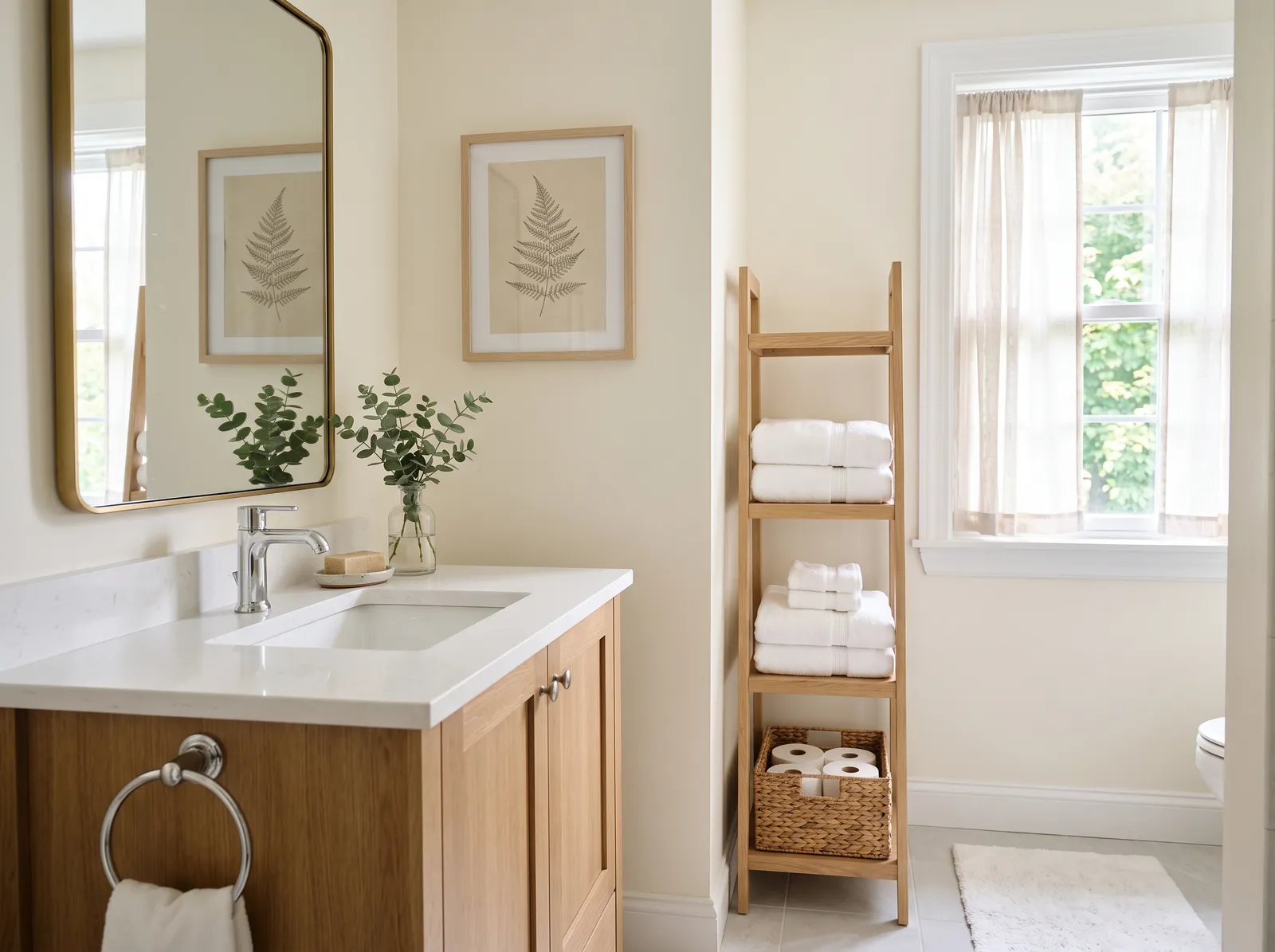
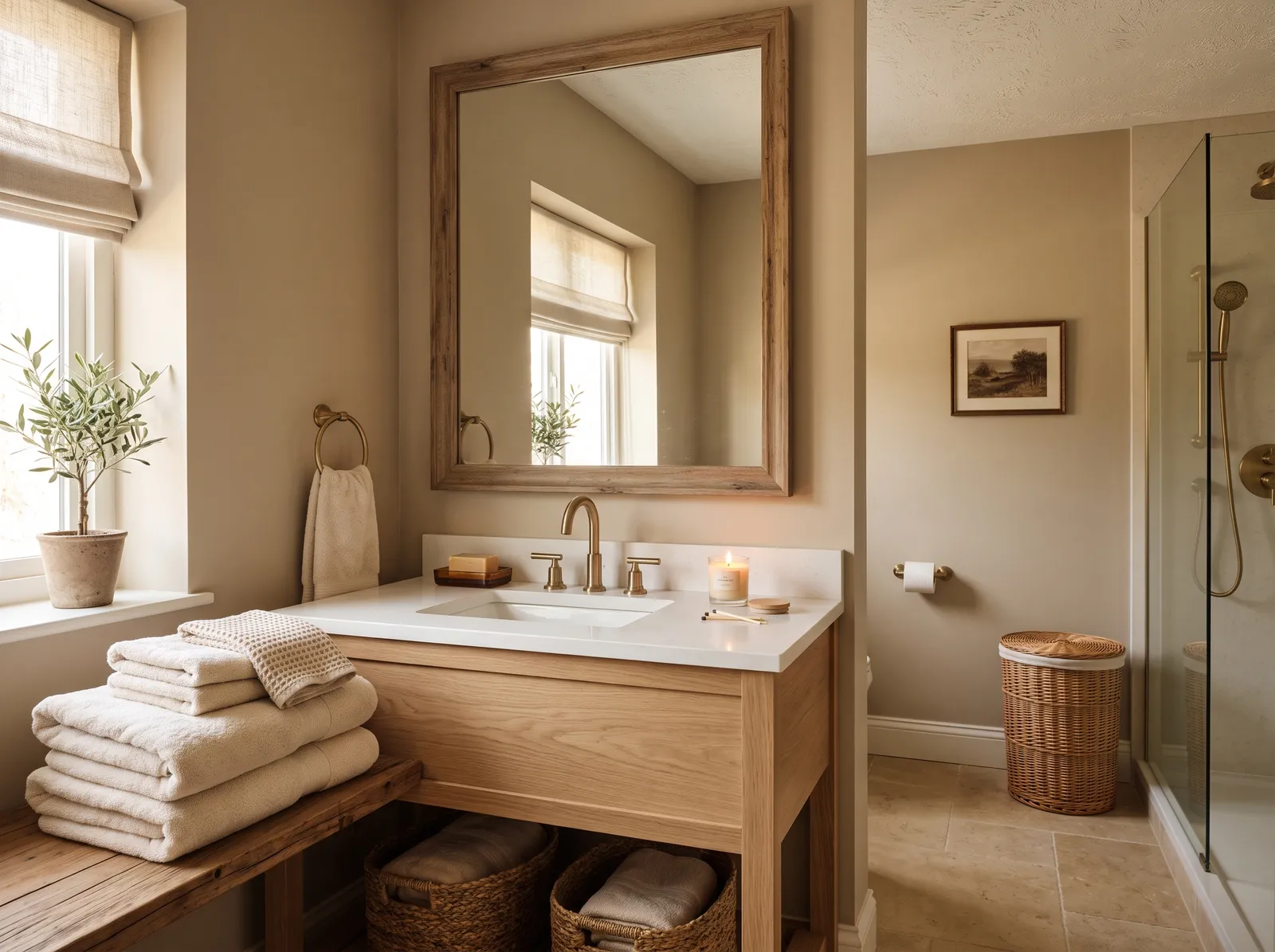
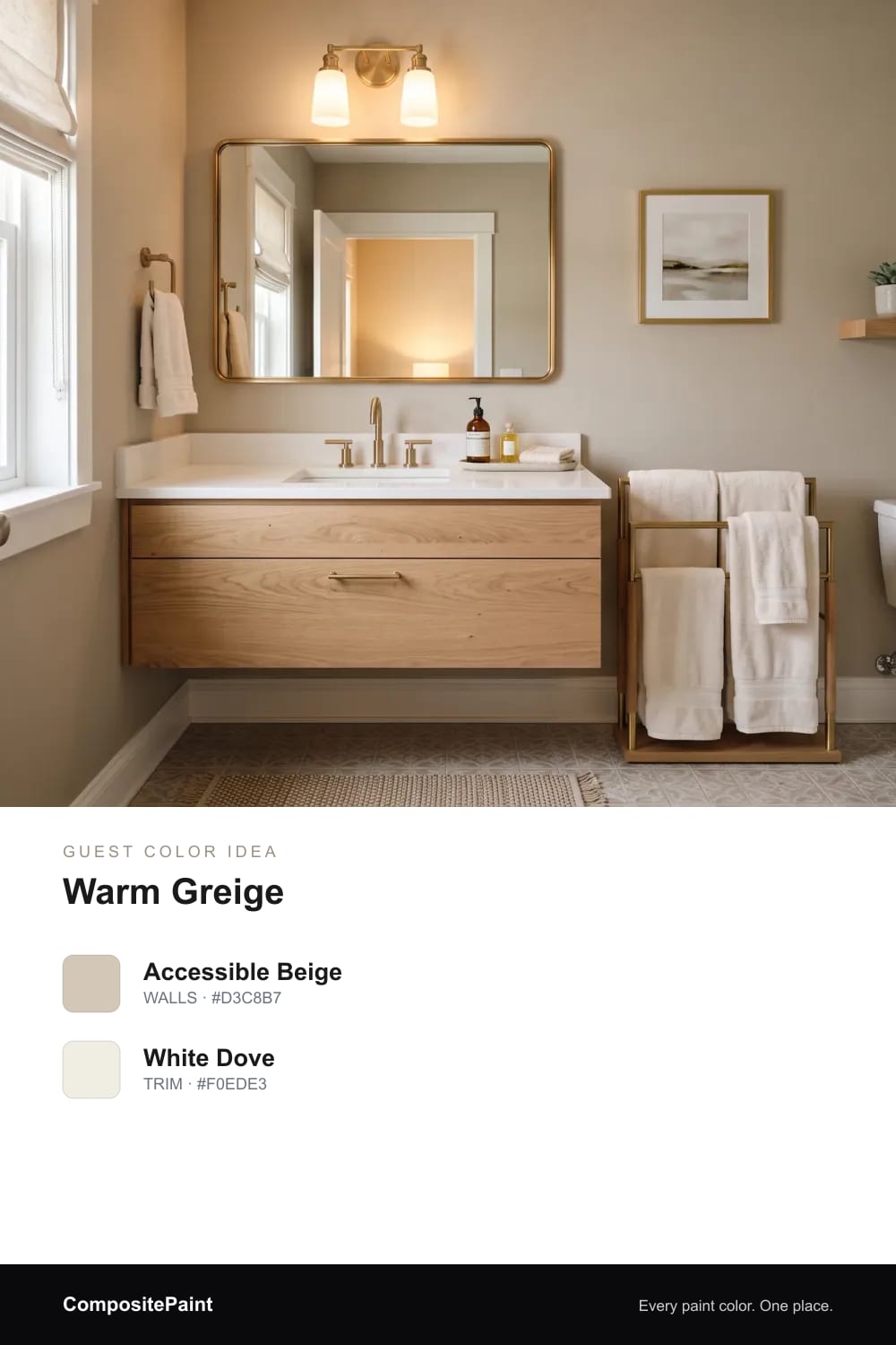
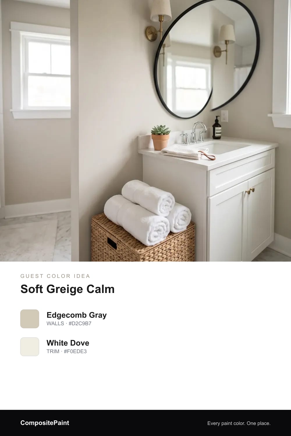
A cozy greige that flatters any tile and welcomes every guest.
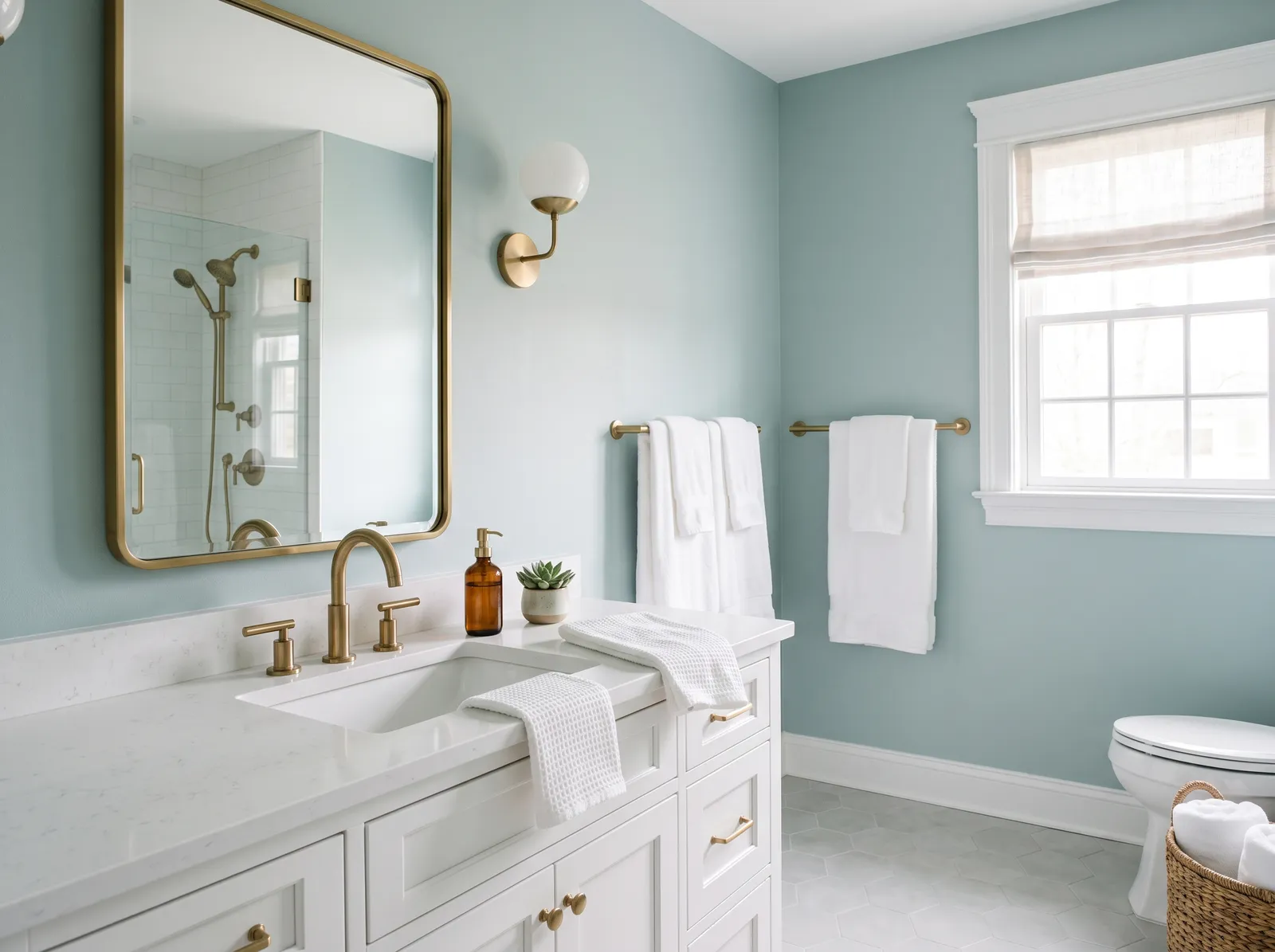
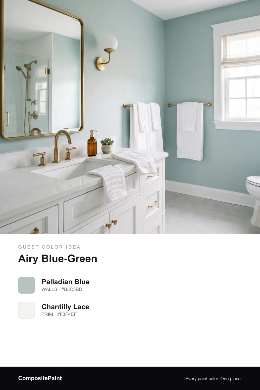
A soft blue-green like sea glass — calm and broadly likeable.
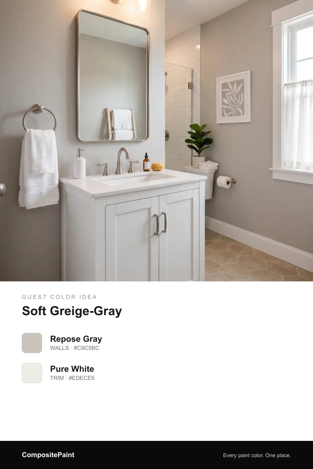
A balanced greige-gray that stays warm and welcoming, never cold.
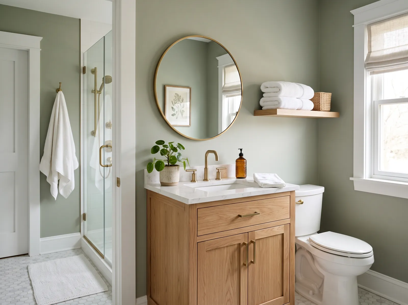
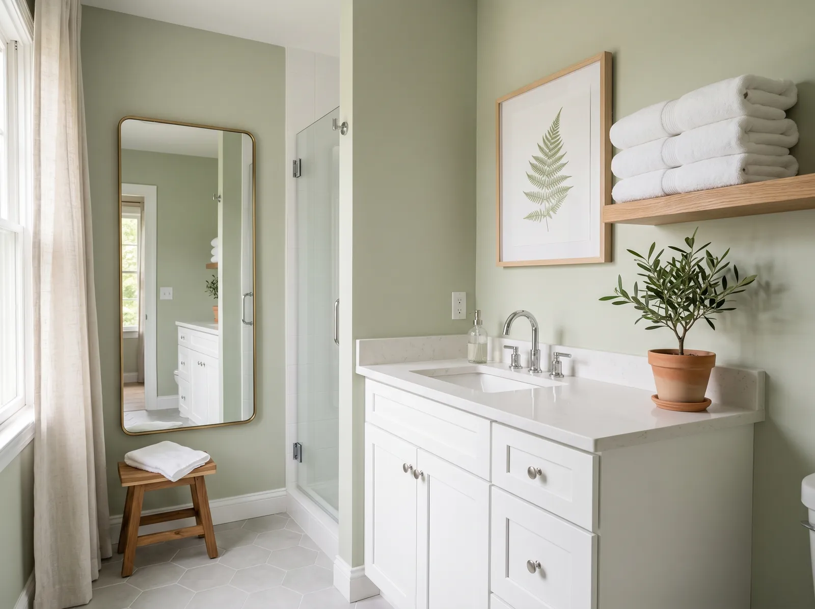
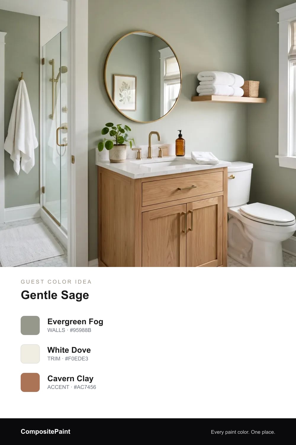
A green so soft it reads almost neutral — a little garden calm for guests.
A soft, creamy white that makes the guest bath feel bright and fresh, like stepping into a clean little hotel room.
A gentle greige that warms the walls and flatters any tile, so every guest feels instantly at home.
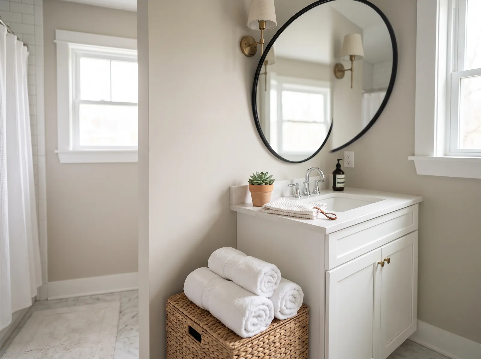
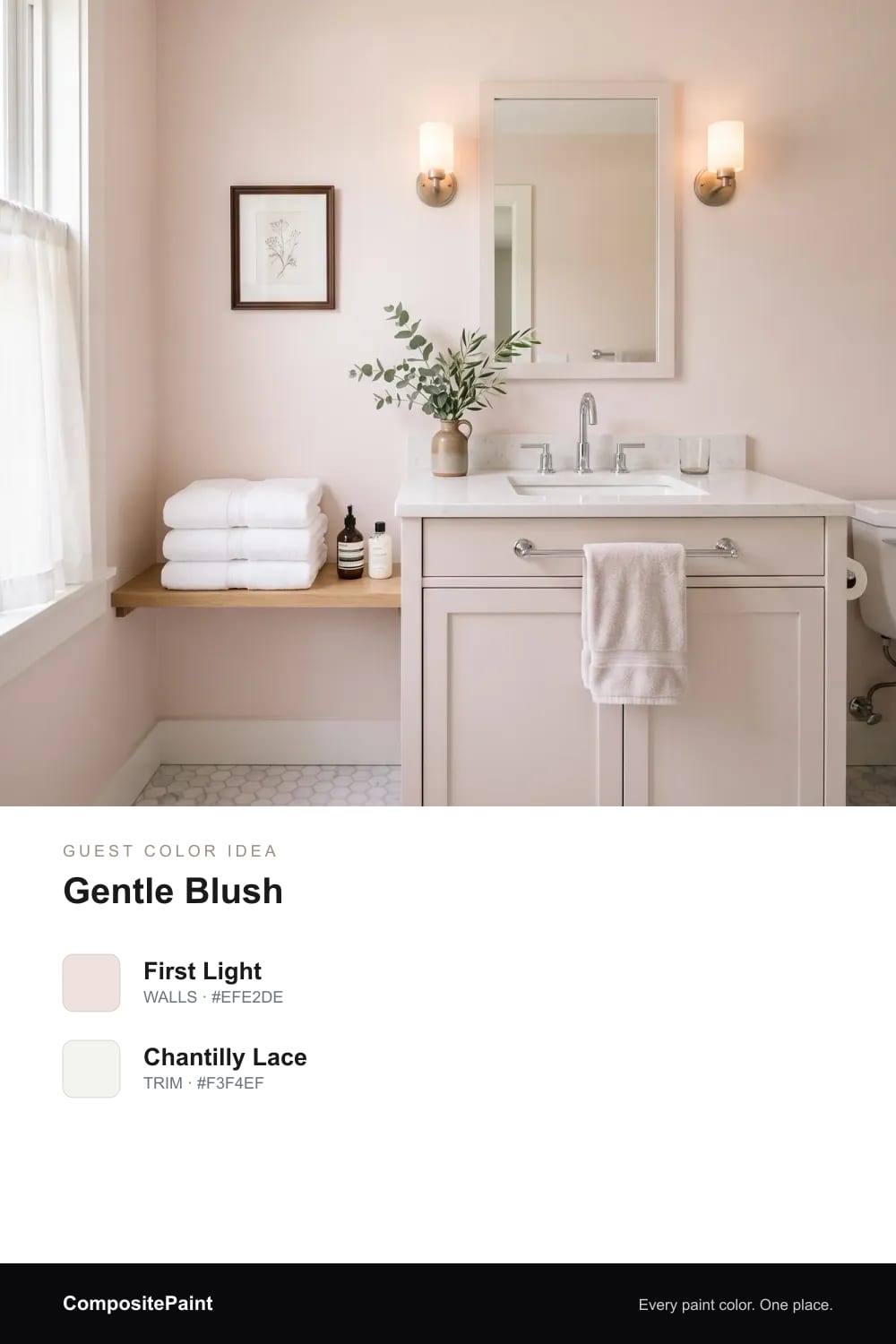
A barely-there blush that gives the guest bath a soft, rosy glow and a quiet, welcoming feel.
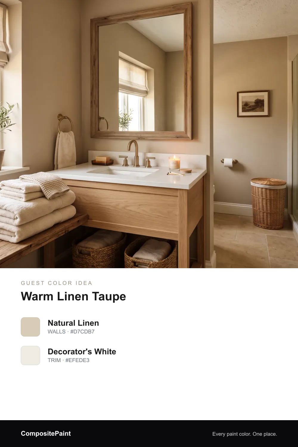
A warm linen taupe that wraps the room in cozy comfort and makes overnight guests feel cared for.
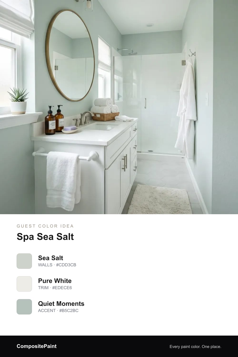
A soft sea-salt green-blue that feels calm and spa-like, turning an ordinary guest bath into a little retreat.
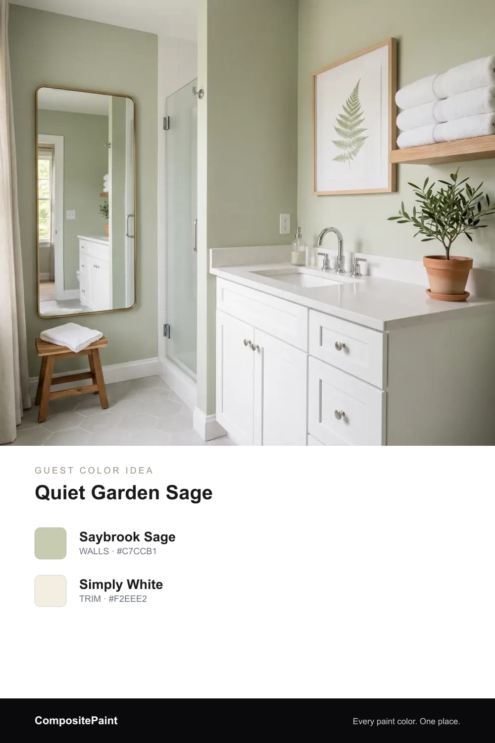
A soft, gentle sage that reads almost neutral and brings a touch of garden calm to the guest bath.
Upload a photo of your guest and the visualizer paints your walls in any of these colors — in seconds.
UPLOAD YOUR PHOTO →Think of how you feel walking into a clean, quiet hotel bathroom. The color is soft, warm, and a little bit dressy, never loud.
That is the feeling to chase here. Pick a shade that pleases a wide range of people, soothes after a long day, and still looks pulled together. Warm and welcoming beats bold and risky in a room your guests only visit for a few minutes.
When in doubt, lean on a warm neutral. A warm white keeps the room bright and clean, like fresh towels and morning light. A warm greige sits halfway between beige and gray, so it feels cozy without going cold.
These colors are the quiet heroes of a guest bath. They flatter almost any tile, any towel, and any face in the mirror, and nobody ever walks out thinking the color was wrong.
If plain neutrals feel a touch flat to you, reach for a color that whispers instead of shouts. A soft spa blue brings a clean, just-bathed freshness. An airy blue-green feels like sea glass and calms the room down.
Gentle sage is another easy win. It is a green so soft it reads almost neutral, and it brings a little of the garden indoors without ever feeling busy.
Cool, gray-blue rooms can feel a bit chilly when someone is standing there in the early morning. A warm undertone fixes that fast.
Look for shades with a hint of warmth baked in, like a soft greige-gray instead of a true steel gray. Warm light bulbs help too. Together they make the room glow a little, so guests feel cared for the moment they flip the switch.
You can show some style without making anyone uncomfortable. The trick is to keep the wall color gentle and let the small things carry the fun.
Add a pretty hand towel, a framed print, a wood stool, or a vase of greenery. A soft sage or spa blue on the walls gives you a calm backdrop, and the little touches let your taste shine through without ever feeling too personal for a guest.
Tight, dark powder rooms love light, soft color. A warm white or pale greige bounces what little light there is and makes the walls feel like they step back.
If you crave a bit of color, keep it airy, like a faint spa blue or the lightest sage. Good lighting matters even more here, so add a warm bulb or two and let the soft color do the rest. The room will feel roomier and friendlier than its size suggests.
Bathrooms get steamy and splashed, so choose a finish that wipes clean. A satin or eggshell sheen handles moisture and fingerprints far better than a flat finish, and it still looks soft on the wall.
For color, let your tile lead. Hold a paint chip right next to it in the real light of the room. Warm tile loves greige and warm white, cool tile sings with spa blue or sage, and a gentle neutral plays nicely with almost anything already there.
A warm neutral like a soft greige or warm white is the safest, most welcoming choice, since it flatters everyone and works with nearly any tile. If you want a little color, a soft spa blue or gentle sage stays calm and crowd-pleasing.
Warm, soft shades feel the most welcoming, like warm greige, airy blue-green, or gentle sage. They glow under warm lighting and give the room that calm, just-cleaned hotel feeling.
Warm greige and warm white are both excellent, easy neutrals. They keep the room bright and clean while staying cozy, and they pair well with almost any towel or tile.
Light, warm shades work best in a small or dark bathroom, such as a warm white or pale greige that bounces light around. A barely-there spa blue or soft sage also keeps the space feeling open.
Usually it is better to keep the walls soft and save the personality for towels, art, and small touches. A gentle color pleases more guests and still looks put-together.
A satin or eggshell finish is ideal because it stands up to steam and wipes clean easily. It also keeps the wall looking soft rather than shiny.