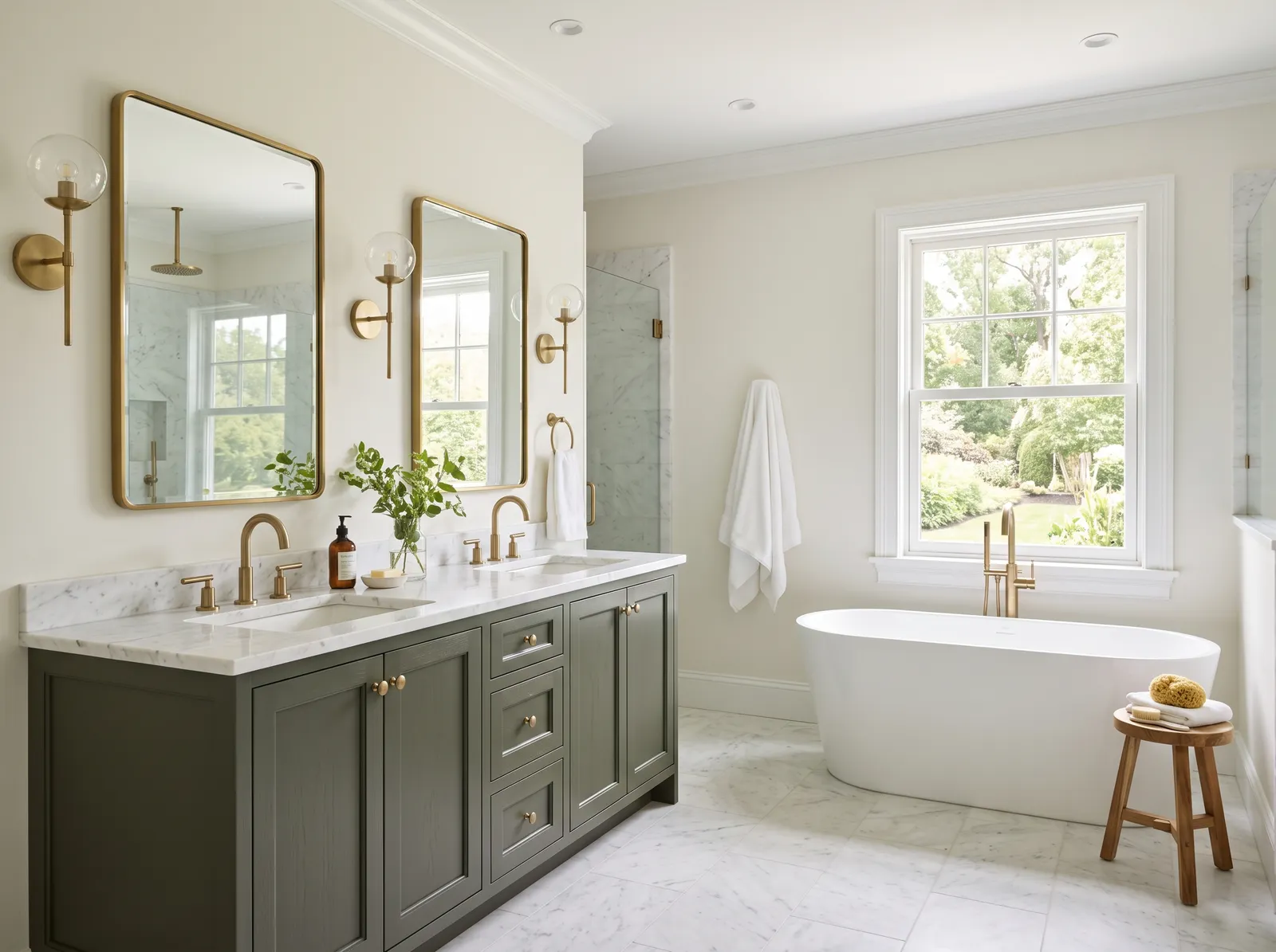
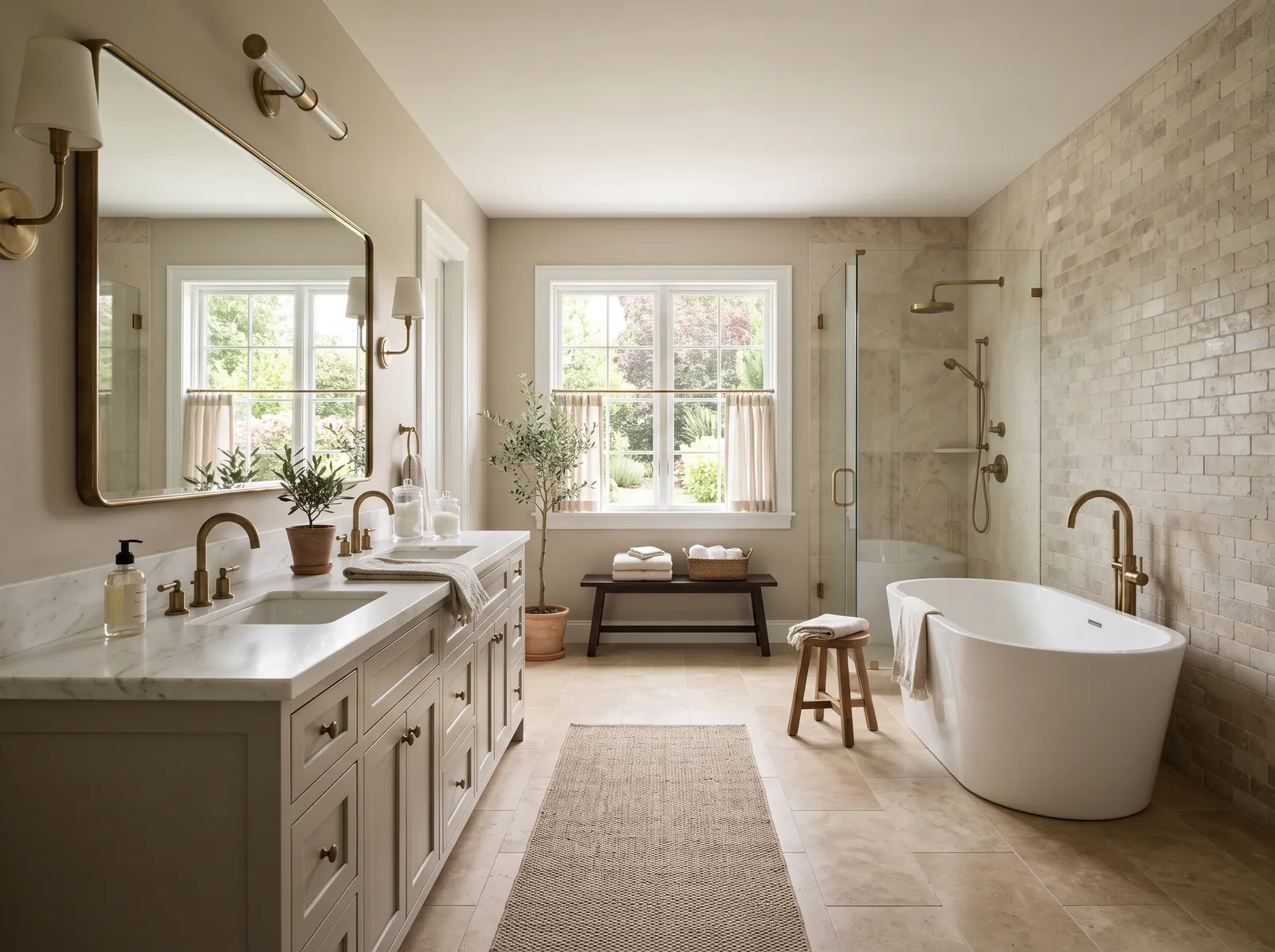
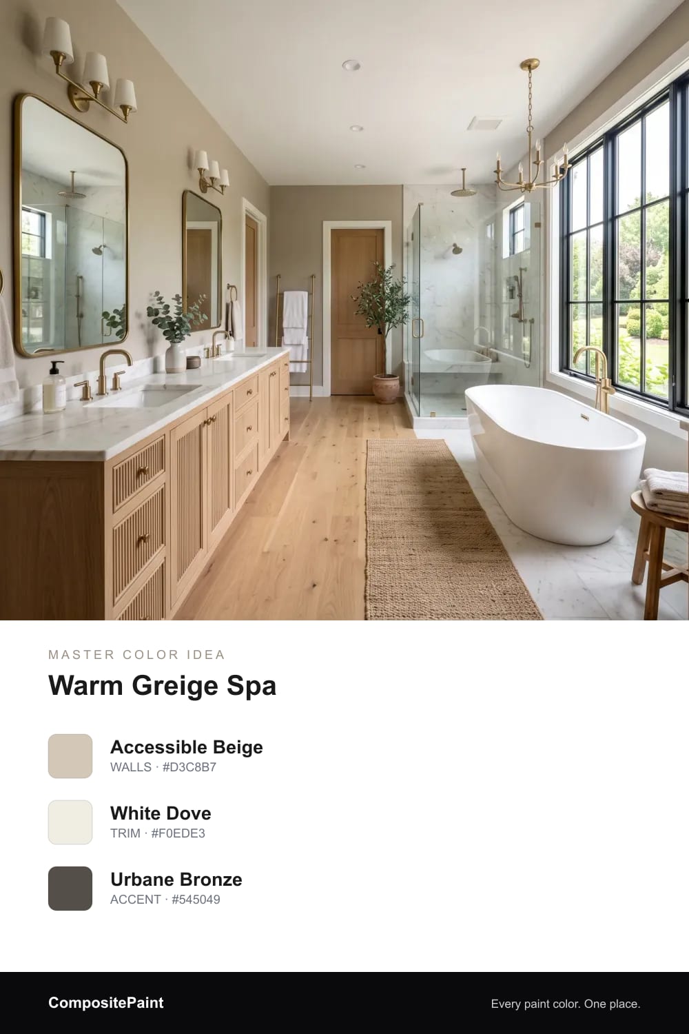
1. Warm Greige Spa
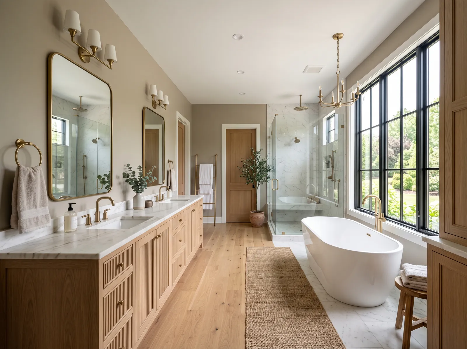
A soft greige that feels grounded and restful — the easy backdrop for a spa-like master bath.
A master bath is the one room that's just for you. It tends to be bigger and brighter than the rest of the house, with room to soak, slow down, and breathe. The right color turns it from a place you rush through into a soft landing at the start and end of every day.
By Jessica Williams · Color Stylist
A soft greige that feels grounded and restful — the easy backdrop for a spa-like master bath.
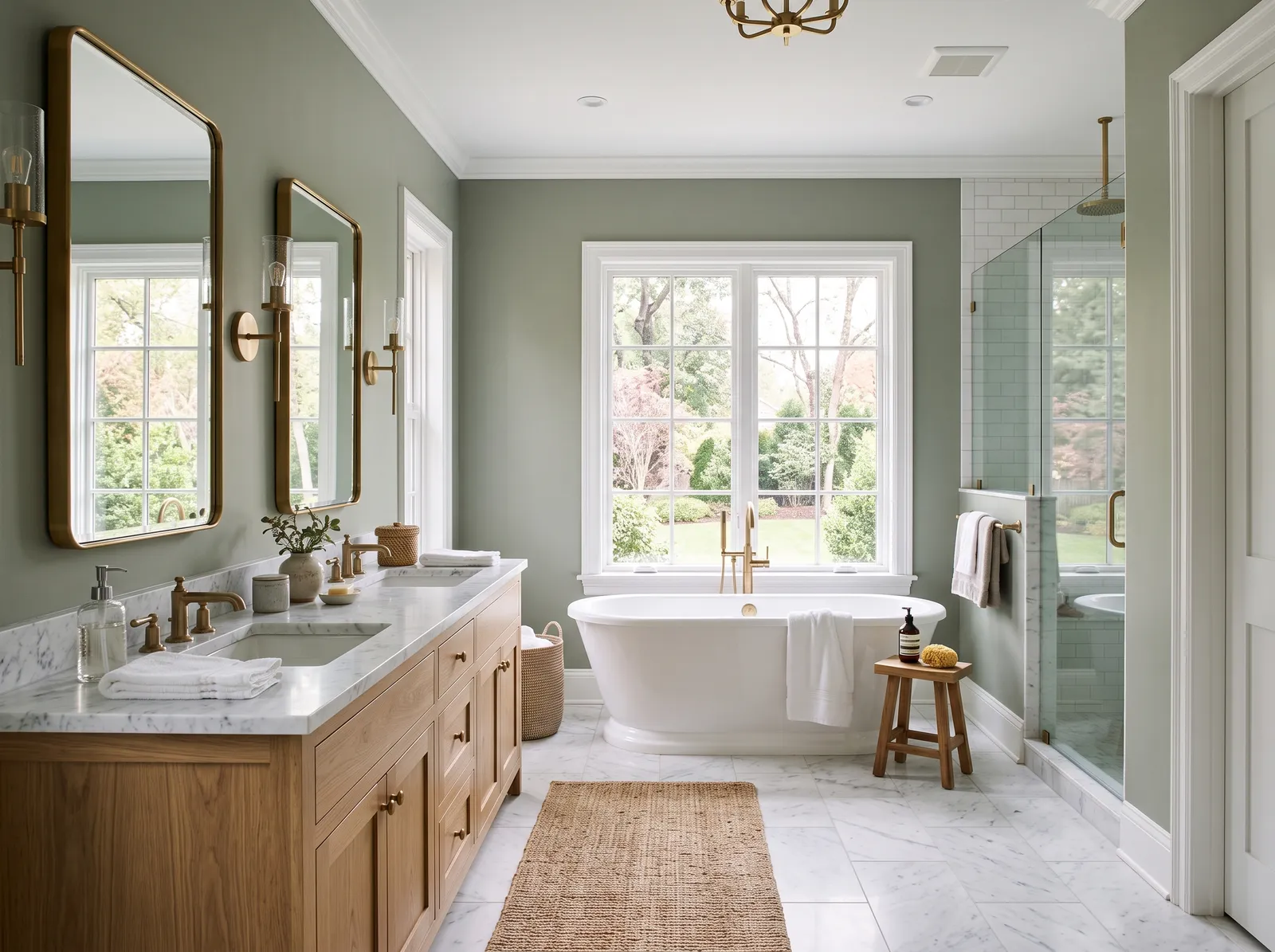
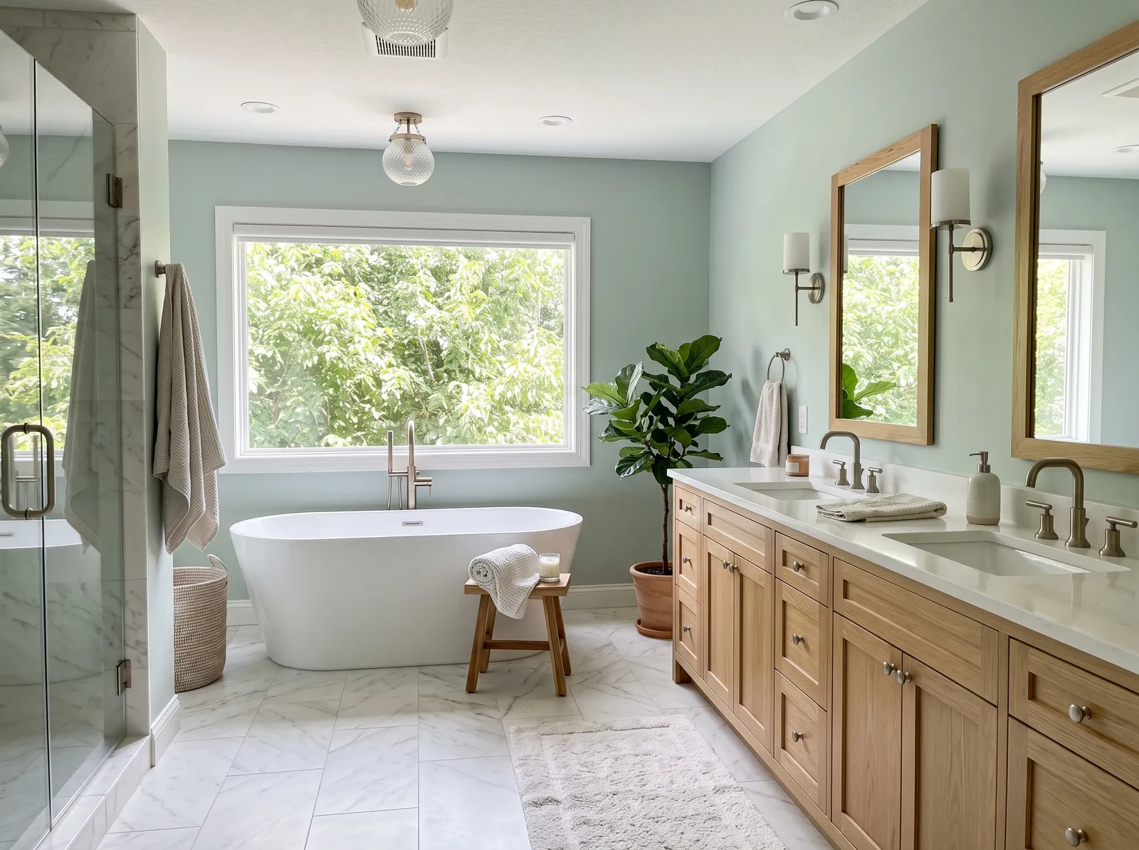
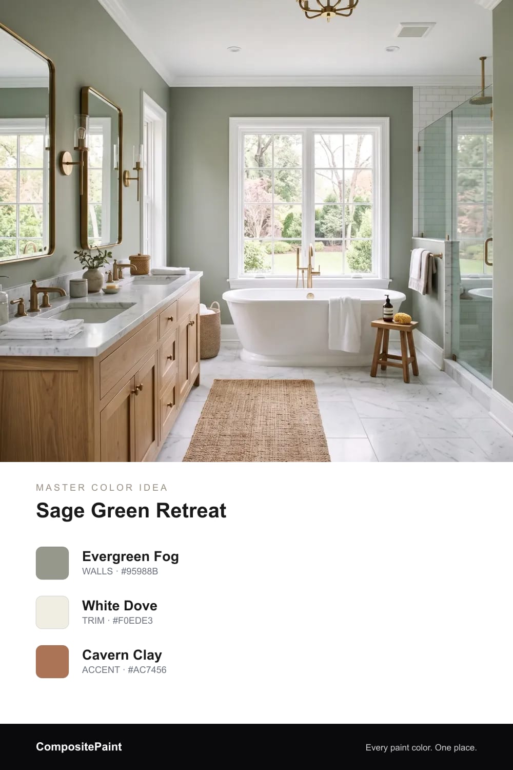
A muted grey-green that calms a big bathroom and glows next to oak and warm brass.
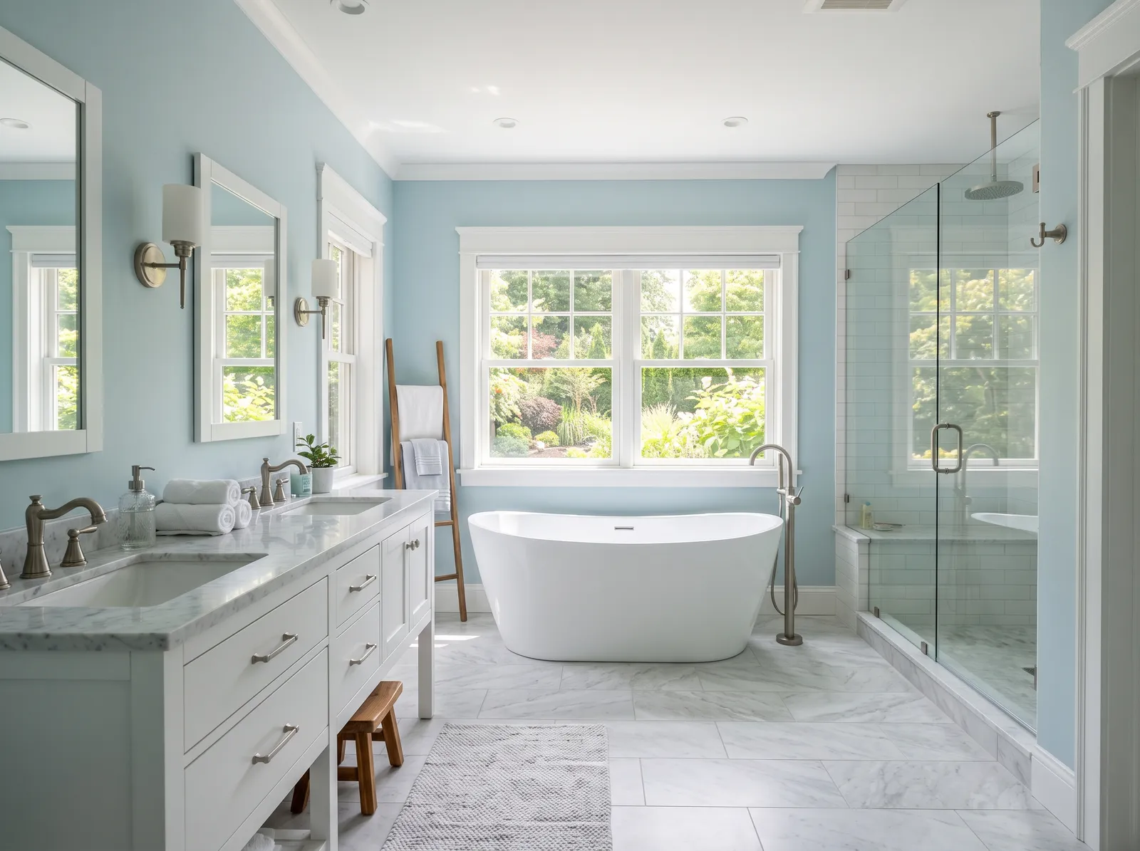
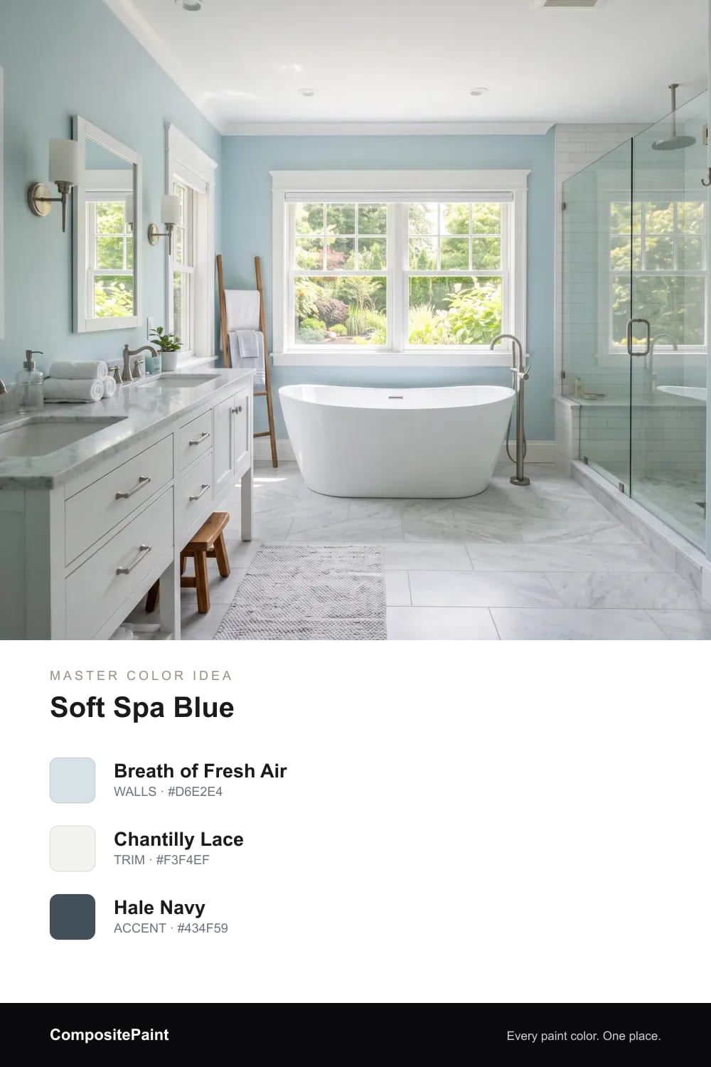
A clean, watery blue that makes a master bath feel fresh and serene all day.
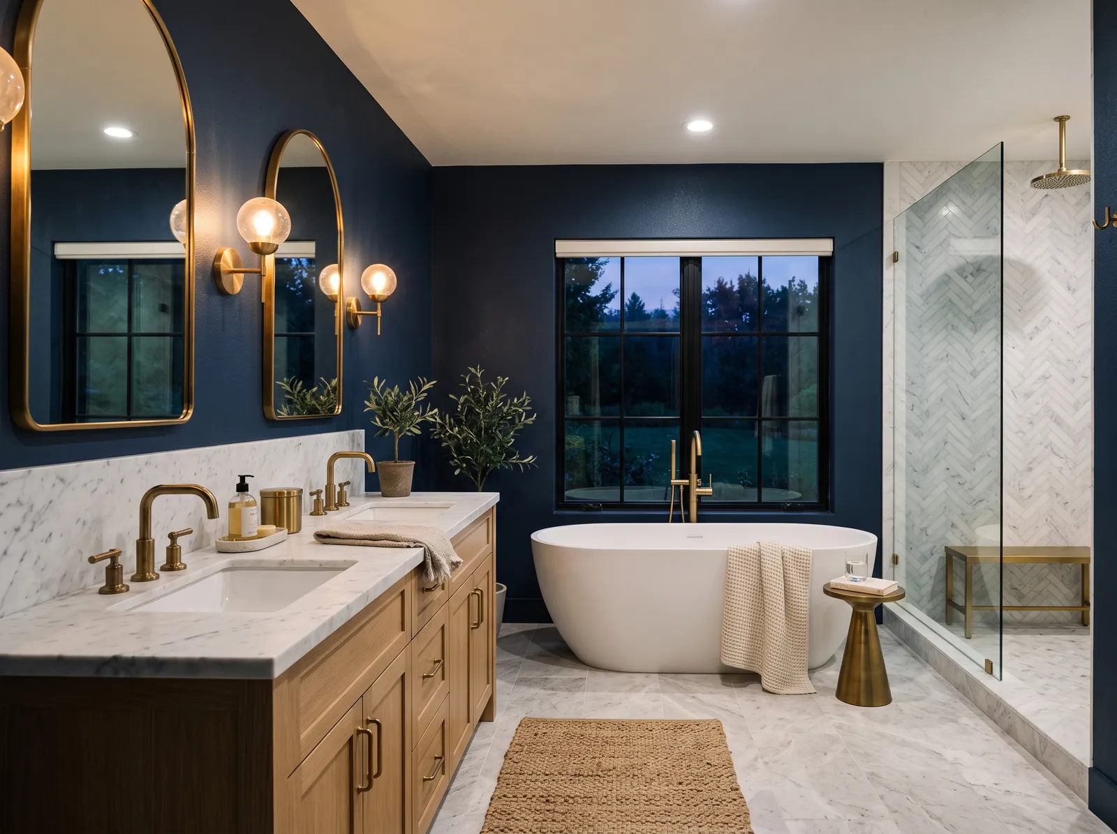
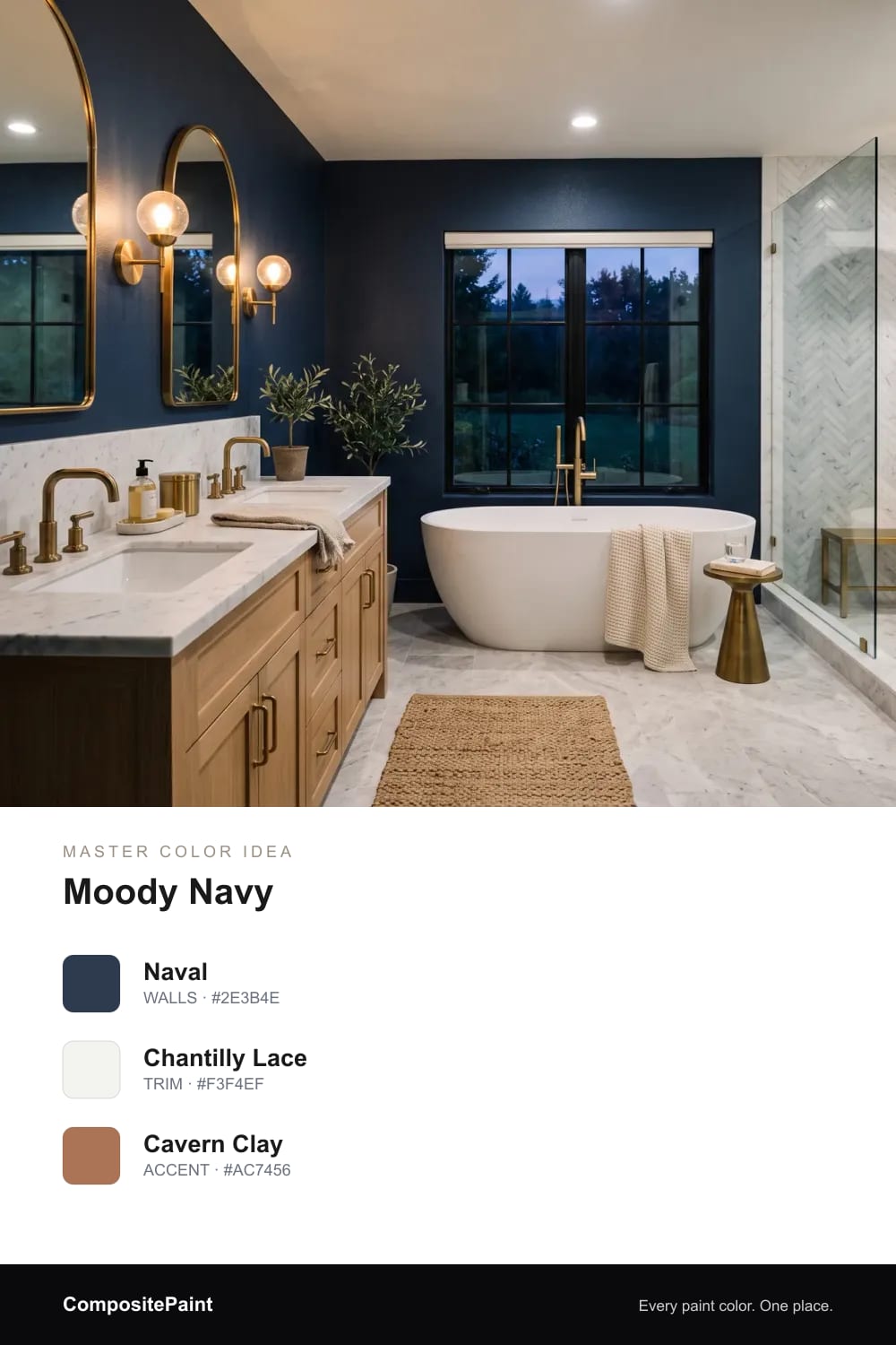
Deep navy gives a larger bath a grown-up, glamorous mood — beautiful by lamplight.
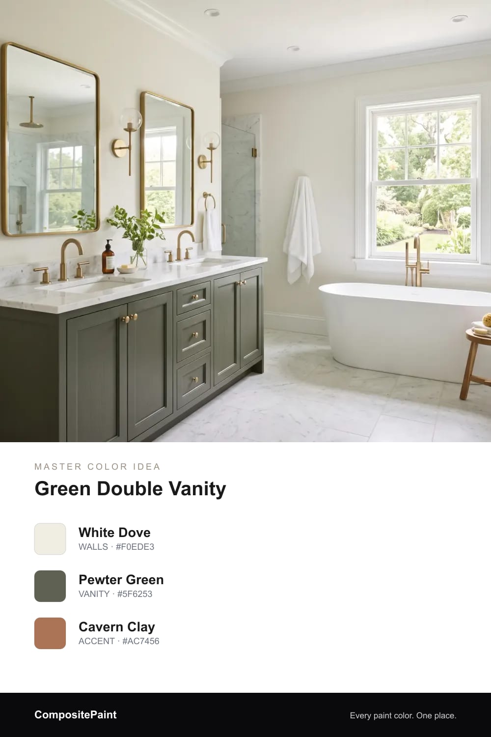
A deep green double vanity under pale walls feels rich without taking over the room.
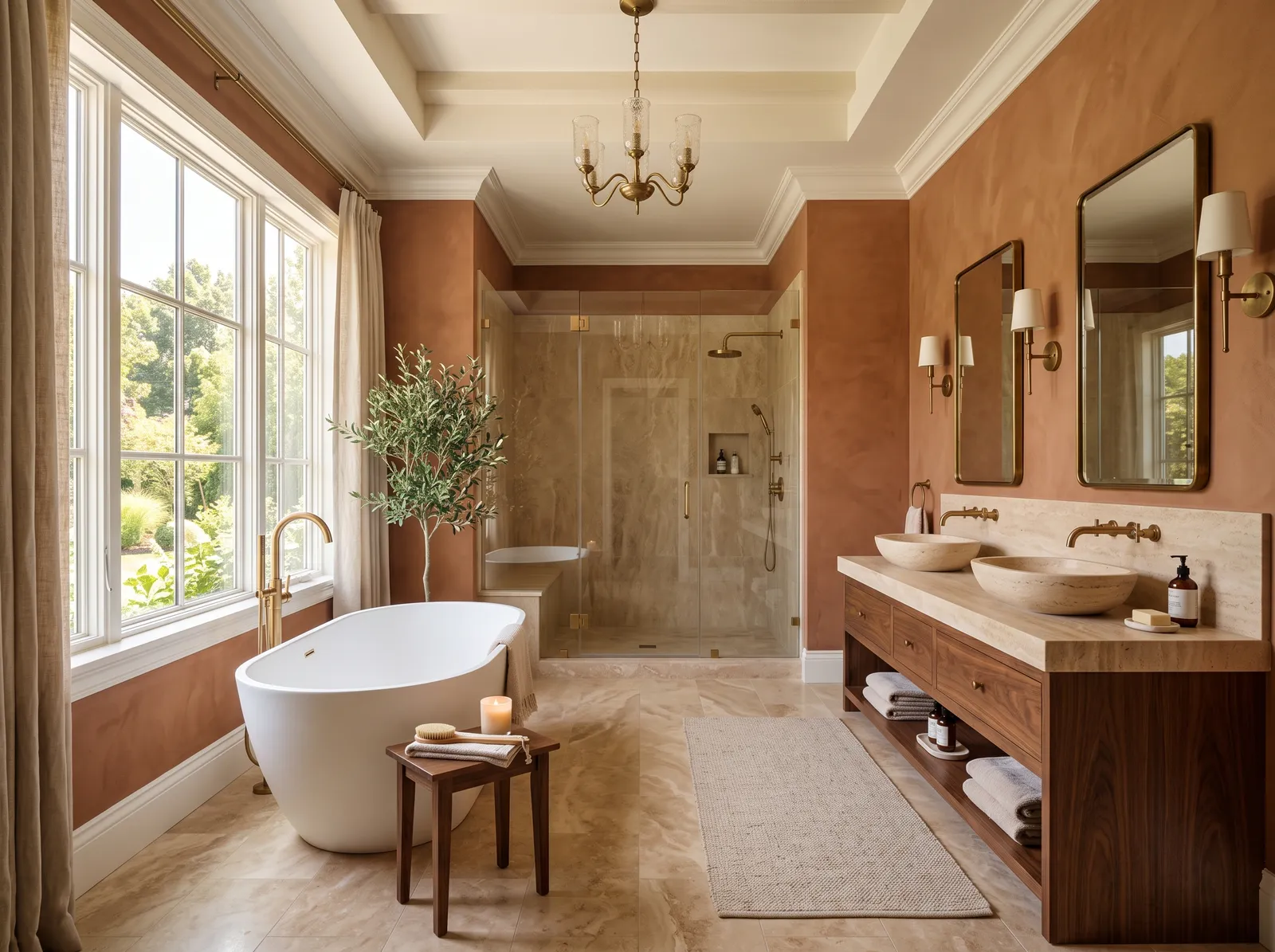
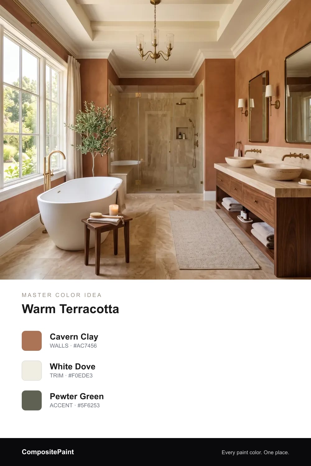
A warm clay that wraps a spa bath in cozy, organic warmth against stone and brass.
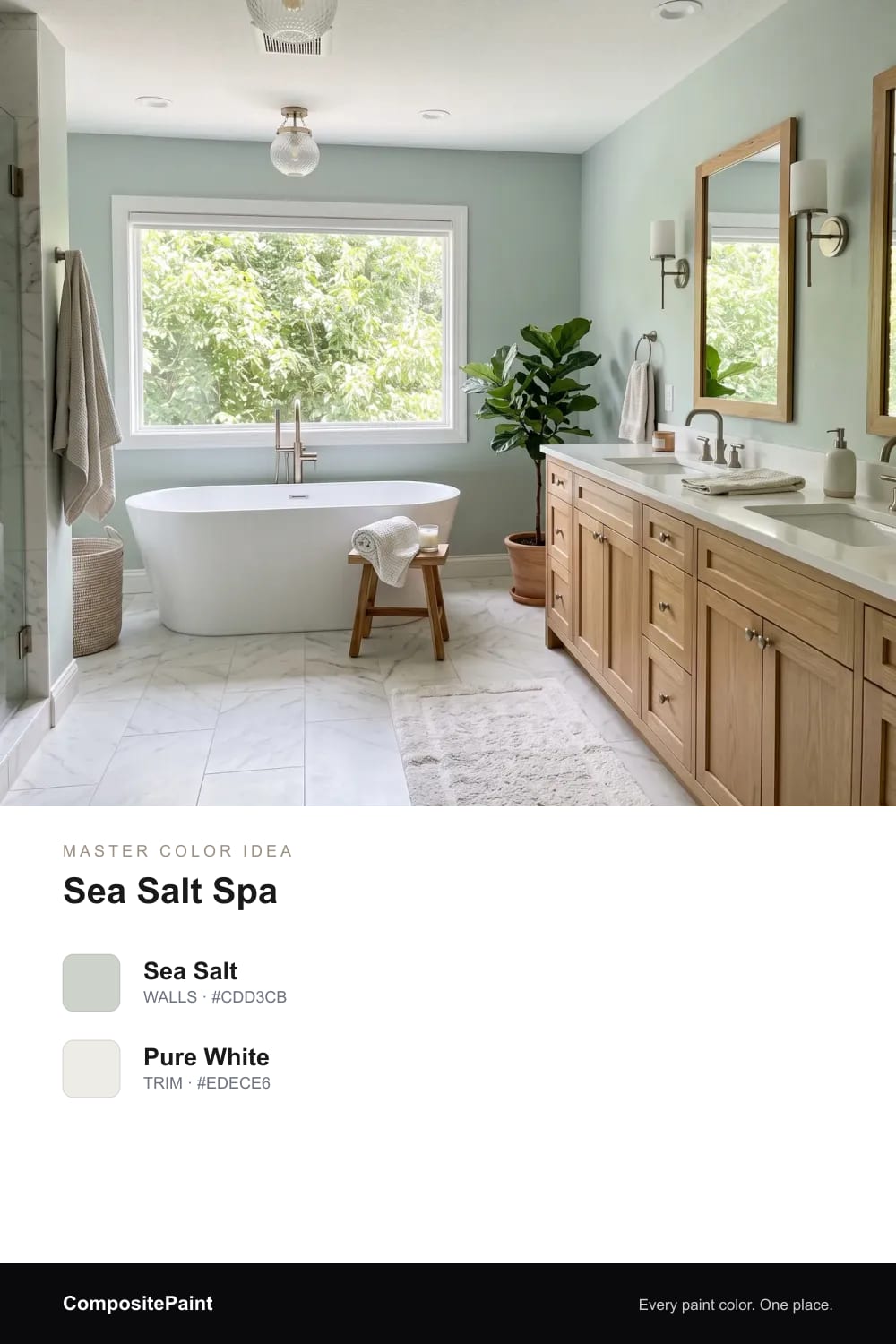
Soft sea-salt green wraps a primary bath in spa calm, so a long soak at the end of the day feels effortless and restful.
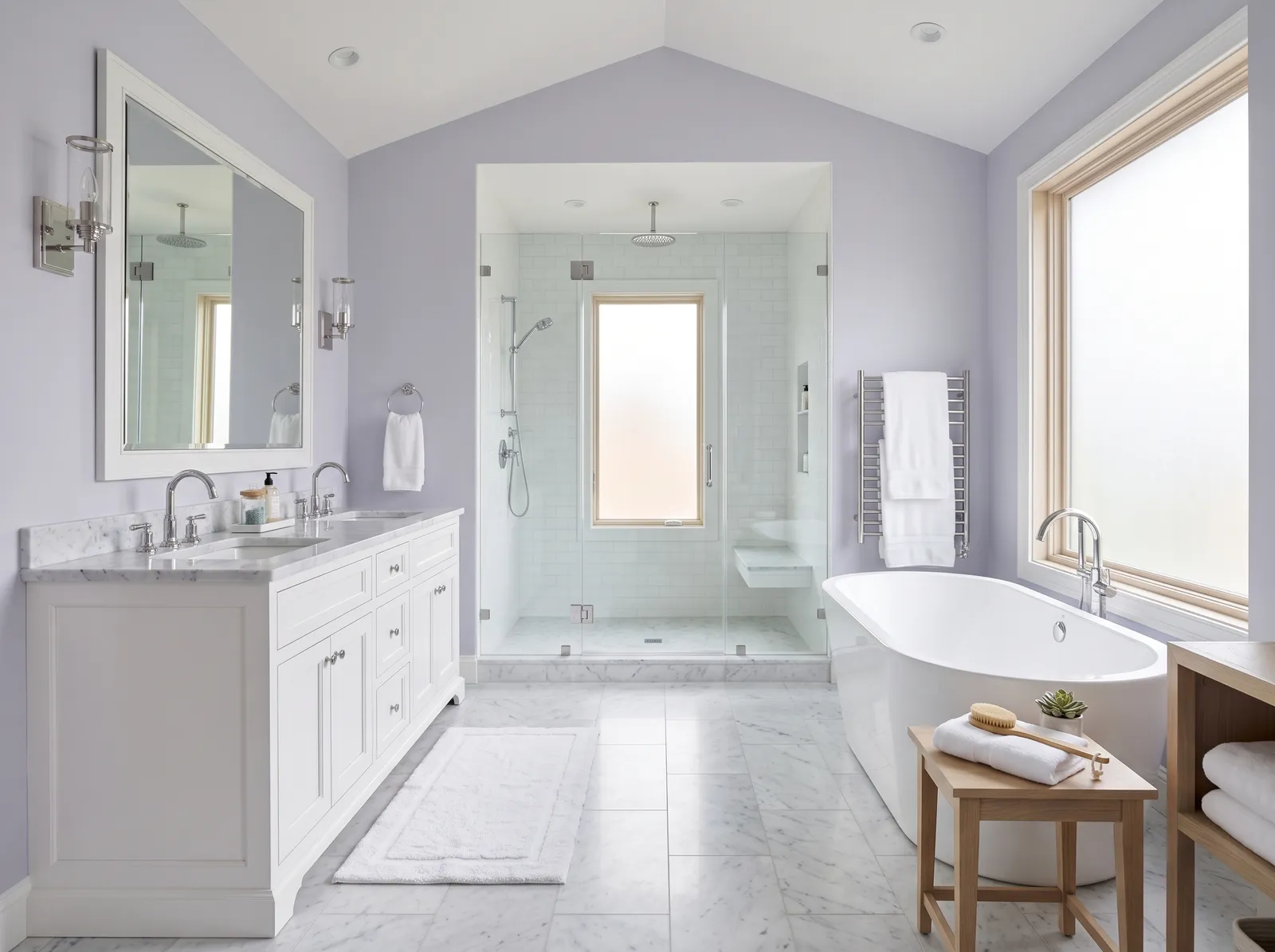
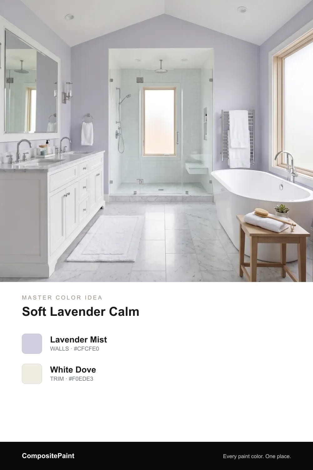
A whisper of lavender-gray settles a large primary bath into something quiet and restful, gentle enough to relax in from morning to night.
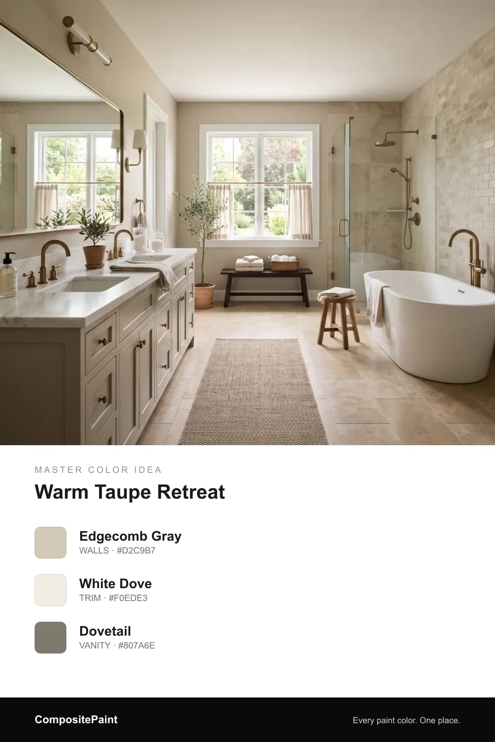
Warm taupe walls and a deeper greige double vanity give a master bath grounded, easy warmth that feels both spa-like and lived-in.
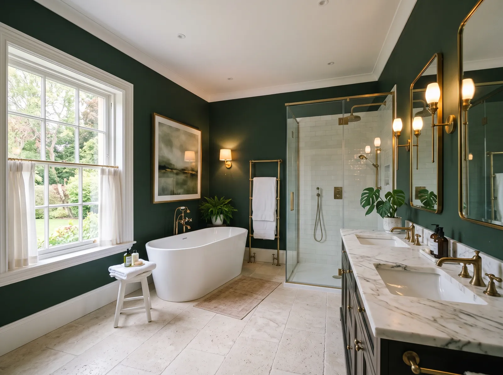
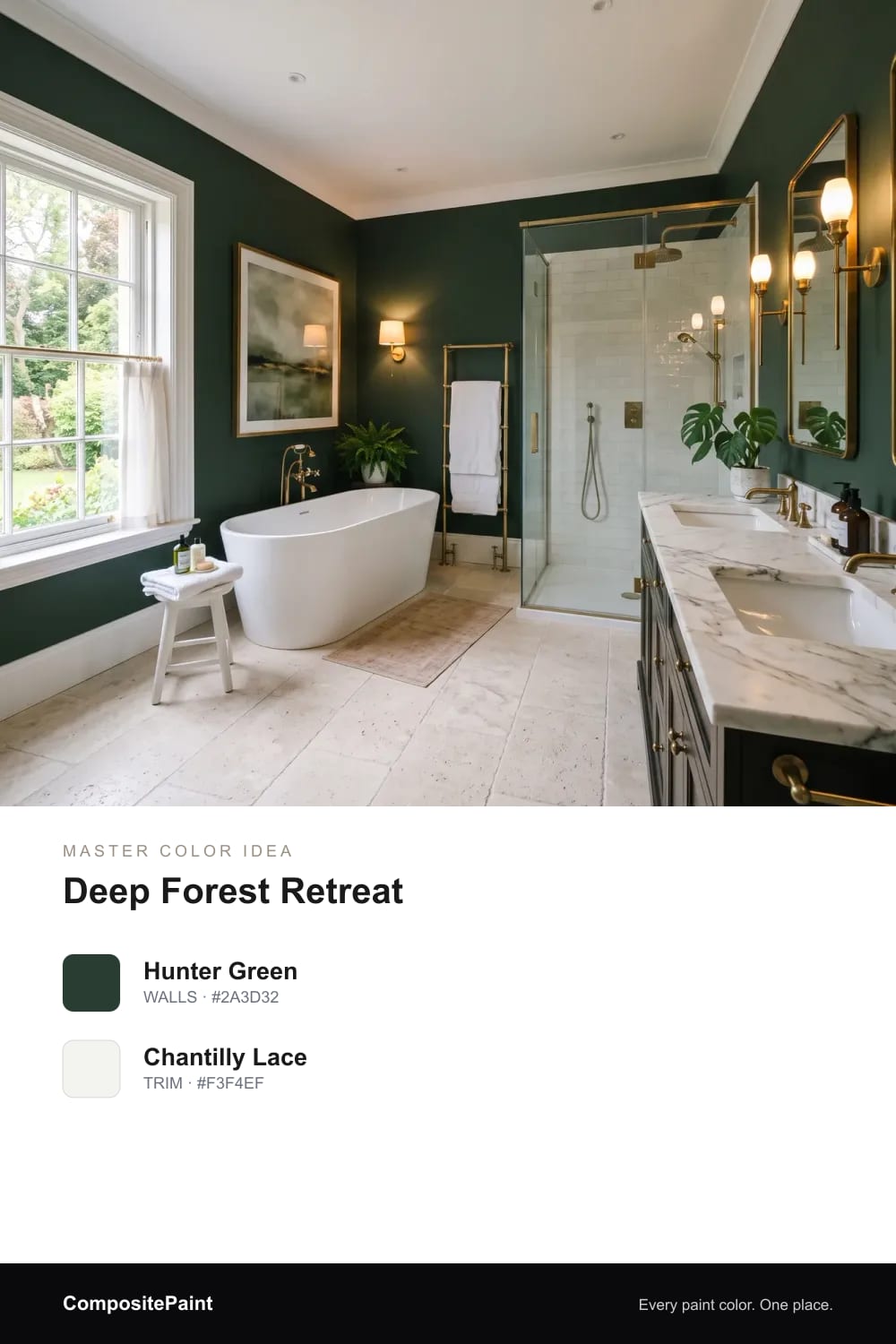
Deep forest green turns a big primary bath into a calm, enveloping retreat, rich and restful against crisp white trim and warm brass.
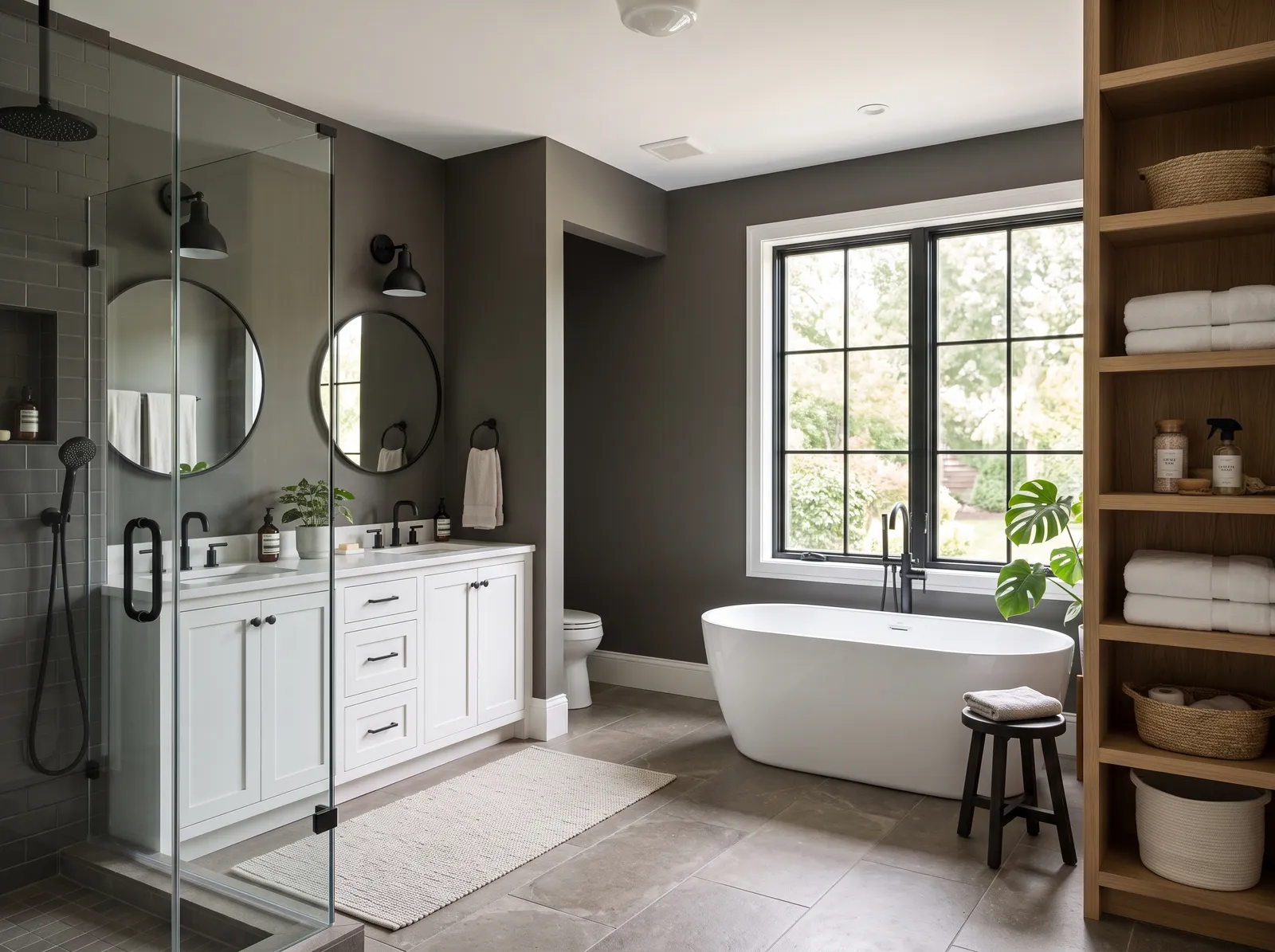
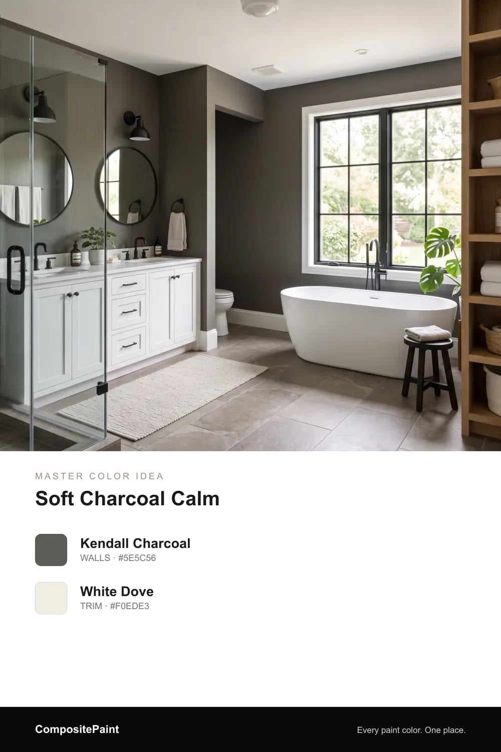
Soft charcoal walls wrap a large primary bath in quiet, cocooning depth that still feels gentle next to white trim and warm wood.
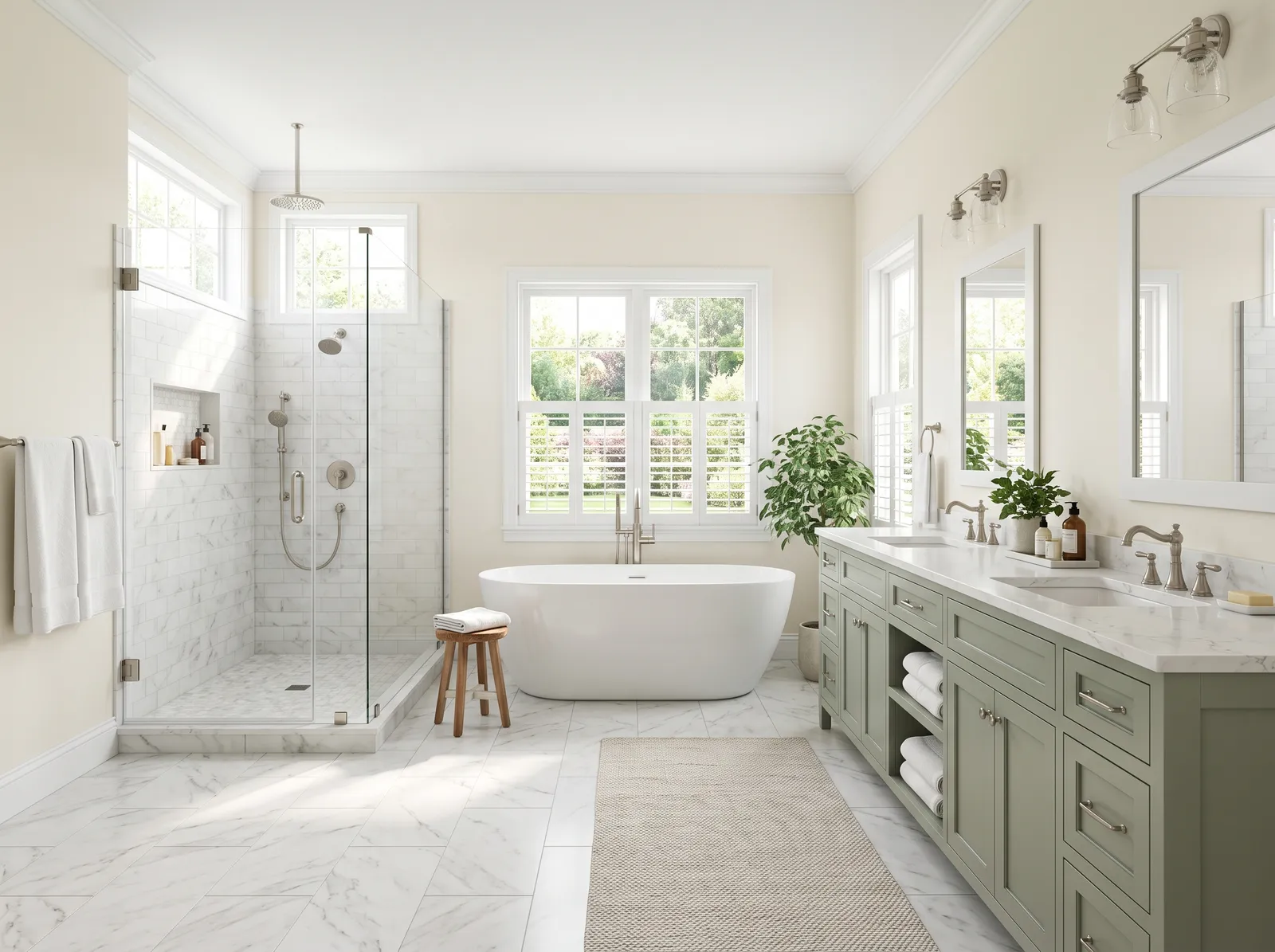
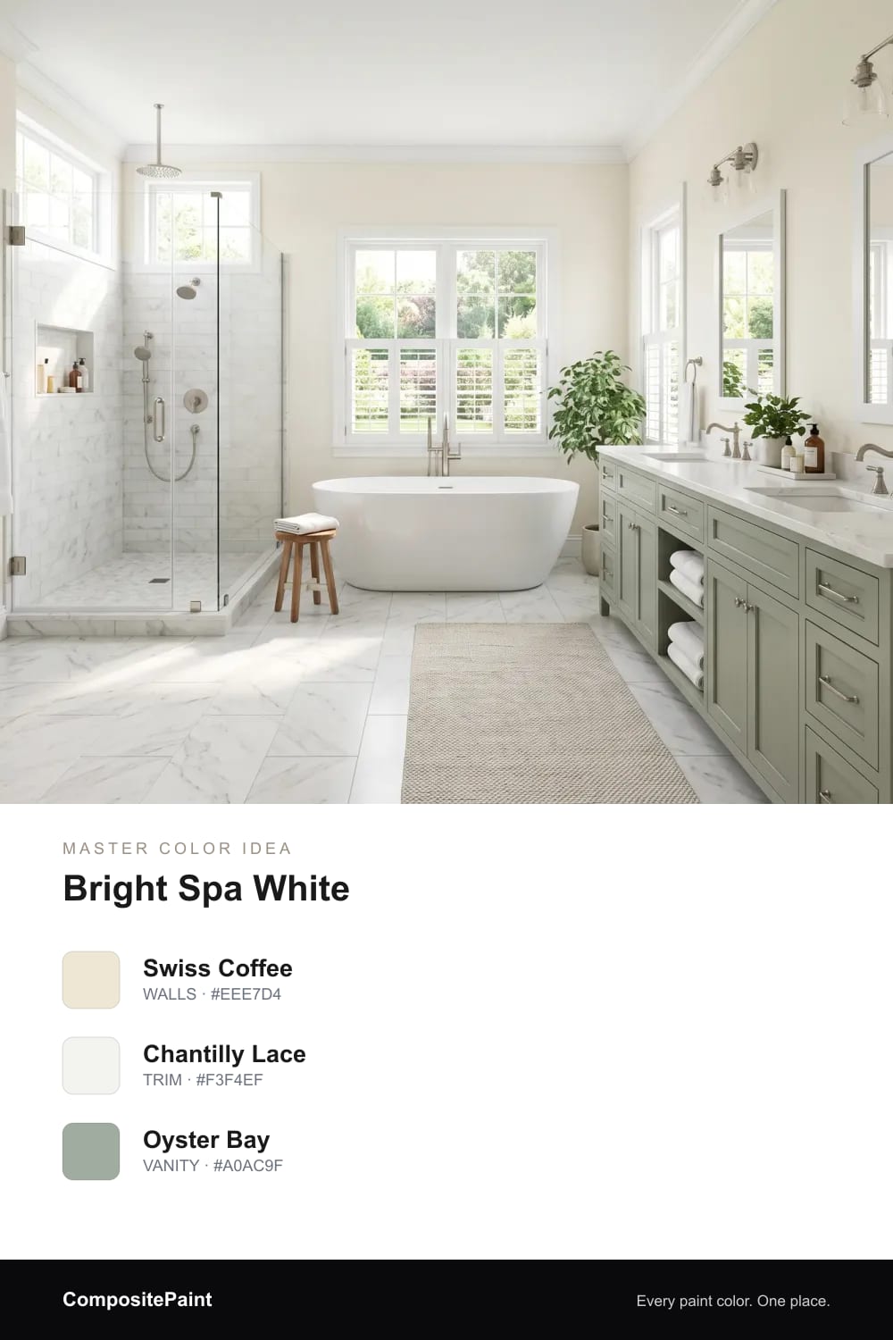
Creamy white walls keep a large primary bath light and airy, while a soft sage double vanity adds just enough restful color.
Upload a photo of your master and the visualizer paints your walls in any of these colors — in seconds.
UPLOAD YOUR PHOTO →Smaller baths ask you to play it safe. A master bath gives you space, daylight, and a wall or two to be braver with.
Think of it as a retreat, not a utility room. You can choose a color you'd want to wake up to slowly, not just one that hides toothpaste splashes.
Warm greige is the easy yes here. It reads soft and clean, leans neither cold nor beige, and lets towels and wood feel cozy against it.
If you want a little more life, a quiet sage green or a soft spa blue both feel like a deep breath. They're gentle on tired eyes first thing in the morning.
A spa feels calm because nothing fights for your attention. Pick one main color and let it wrap the room, then keep everything else close in tone.
Soft blue-greens and misty greens do this best. Pair them with warm wood, plenty of white towels, and a little greenery, and the whole room starts to slow down.
More space means you can afford to go deep. A moody navy or a rich forest green turns a master bath into something that feels grown-up and a little glamorous, especially by lamplight.
Keep the floor and ceiling lighter so the dark walls feel like a choice, not a cave. Brass or matte black fixtures and a soft white tub stop it from going heavy.
A long double vanity is a chance to add color low in the room. A deep green or soft navy vanity under pale walls feels rich without taking over.
Let your tile lead the way too. Pull a warm greige or soft white off the tile for the walls so the two read as one calm whole, not two rooms stitched together.
A master bath often has a window, so the color shifts all day. Morning light cools things down; evening light warms them up, so always test on more than one wall.
Watch the hidden undertone. A greige can turn pink or purple, a soft blue can go icy, and a sage can read gray. Live with a big sample for a few days before you commit.
Bathrooms get steam, so the finish matters as much as the color. A soft eggshell or satin wipes clean and shrugs off moisture better than a flat finish.
For a luxe, warm terracotta or a deep vanity, a low-sheen satin gives a gentle glow without looking shiny. Save flat for ceilings, where you want light to settle soft.
Warm greige is the most reliable choice because it feels clean, calm, and works with almost any tile or fixture. If you want a little color, a soft sage green or spa blue keeps that same restful feel.
Soft blue-greens and misty greens are the most relaxing because they remind us of water and quiet. They're easy to wake up to and they make a room feel like a deep breath.
Spa colors are gentle and watery: soft spa blue, sage green, and warm greige. Keep the whole room close in tone and add white towels and wood for that calm, hotel-bath feeling.
Yes, especially in a larger master bath with good light. A moody navy or deep green looks rich and grown-up, just keep the floor, ceiling, and tub lighter so it feels intentional.
Pull your wall color straight from the tile, matching its warmth or coolness so the two read as one. A warm greige or soft white usually settles busy tile down.
An eggshell or satin finish is best because it handles steam and wipes clean. Use it on the walls and save flat finishes for the ceiling.