Natural Linen
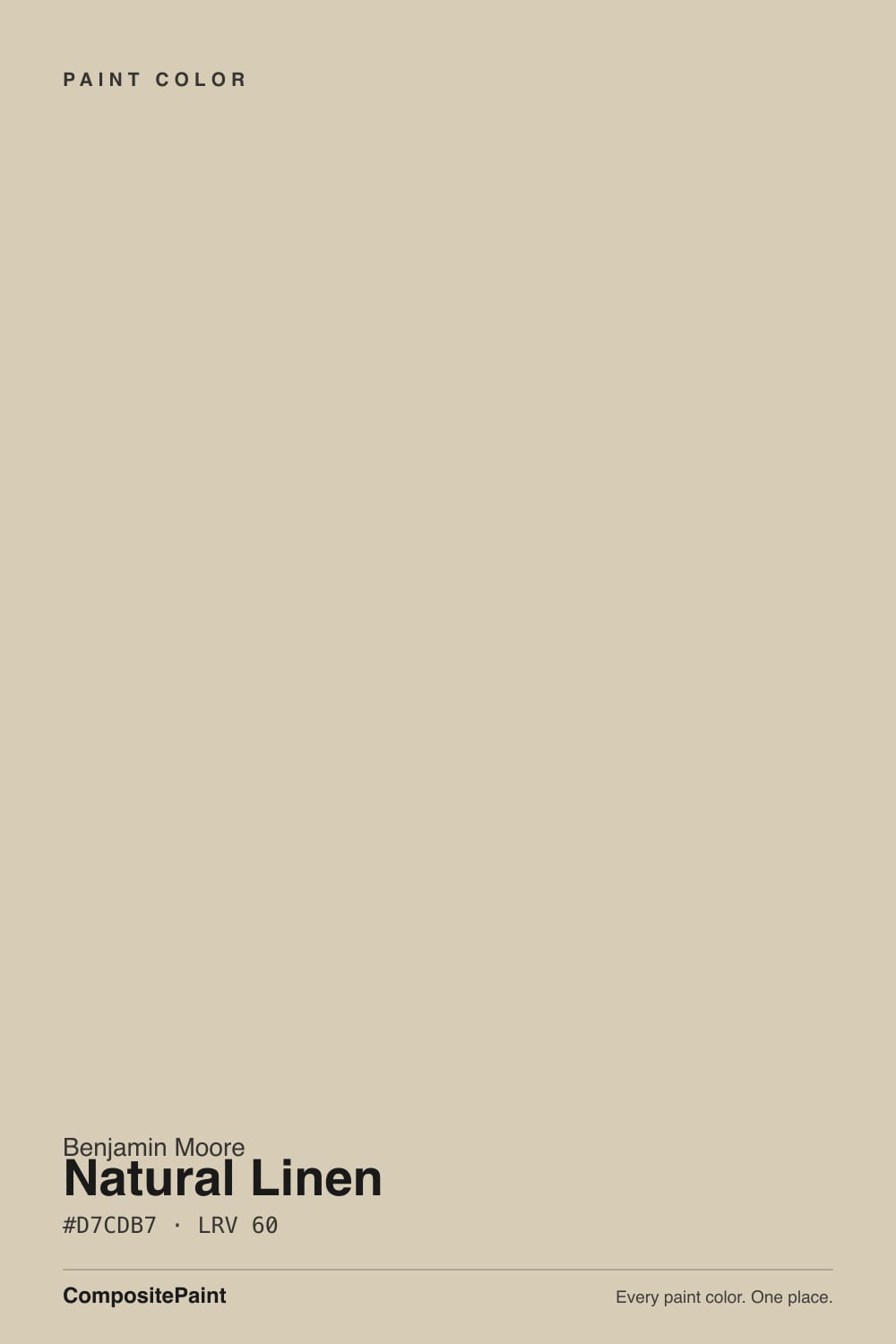
A sandy oatmeal beige at LRV 60, reviewed honestly: the rooms where it reads like linen, the light that turns it green-gray, and why it is not the Sherwin-Williams color of the same name.

Jessica has spec'd whites and neutrals for more than 300 rooms and keeps a sample wall of painted drawdowns in her studio. Every color review is checked against real reader rooms in the comments and re-tested when a formula changes. About the testing process →
- 1Mindful Gray48
- 2Revere Pewter55
- 3Natural Linen60
- 4Pale Oak69
- 5Shoji White74
The Fast Verdict
Natural Linen is oatmeal beige with a faint green-gray in the mix — the drop that keeps it off-pink when other beiges go peach. At LRV 60 it has more body than a whole-house off-white, which is why it holds in south sun and why it can feel a step too heavy in a gray-floor new build. Give it oak, limestone, and 2700K lamps and it behaves like linen. Give it cool LEDs and gray LVP and the green comes forward as mud.
Bedrooms and baths · wood-floor living rooms · offices that should feel calm · anyone who wants beige that will not go pink
Your floors are cool gray LVP · you wanted a light whole-house off-white · cream cabinets sit next to it · you actually meant the peachier Sherwin-Williams namesake
- Green-gray mix keeps it off-pink — the usual beige failure
- LRV 60 holds in south sun without washing to cream
- Flatters oak, walnut, limestone, brass, and real greenery
- Bedrooms and baths feel cozy without going 2000s tan
- A Classics color — predates the beige revival, so it is not a timestamp
- Darker and more pigmented than people expect for whole-house walls
- Cool gray floors pull the green-gray into muddy olive
- Can flash peach in hard west sun, especially next to cream
- Not a greige — it will never look modern-gray
What Color Is Natural Linen, Really?
A soft oatmeal beige — sandy, grayed, and quietly warm — with a faint green-gray in the mix that is the whole trick. Most light beiges are built on peach or yellow oxide, so they go pink or butter the moment the light changes. Natural Linen carries enough earthy green to stay grounded instead, which is why designers reach for it when a client says they want warmth without the pink cast that sinks Sherwin-Williams Natural Linen SW 9109. It sits in Benjamin Moore's Classics collection (966, also sold as CC-90), which tells you it is not a beige invented for this year's mood board. It was a workhorse through the Tuscan-decor 2000s, when the deck was full of heavier golds and taupes, and it is coming back now as a lighter, quieter version of that warmth.
At LRV 60 it reflects a fair amount of light but it is clearly not a white, and it is darker than the whole-house beiges people have been sampling since 2020. Put it next to Pale Oak (LRV 69) and Natural Linen suddenly has body; put it next to Accessible Beige (LRV 58) and they sit in the same depth band, with Natural Linen sandier and less gray. That middle weight is useful: south sun does not wash it to cream the way a paler beige will, and a north bedroom still feels friendly instead of cold. It is also the reason designers keep saying it is a little strong for an entire open main floor — you feel the pigment in a big room.
Undertone in one line: warm green-gray first, oatmeal second — never pink. In cool light the green-gray comes forward; in west sun it can flash peach for an hour. If your sample looks yellow, look at the floor and the trim white before you blame the can.
Where It Shines
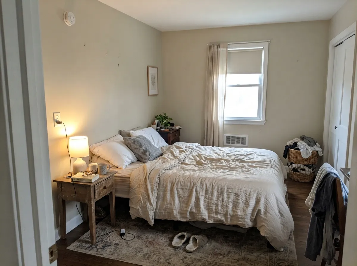
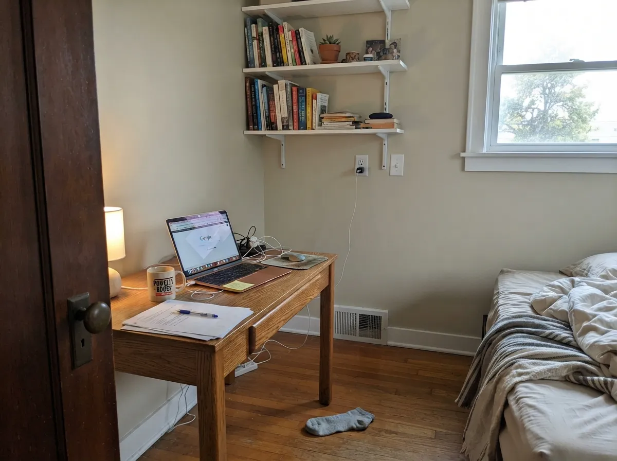
Give it real wood, limestone, and decent daylight and it is one of the easiest warm beiges in the Benjamin Moore deck. Bedrooms are its best room: restful, slightly enveloping, never candy-beige. Bathrooms with tan tile and wood vanities are a close second, and a small office with oak shelves looks expensive without trying. The green in it is also why it loves actual plants and muted sages — October Mist, Clary Sage, Evergreen Fog — in a way peachier beiges do not.
Where It Fails
Almost every regret story about Natural Linen follows one of three scripts, and all three are visible before the first coat. None of them are a bad batch — but if your room matches one, sampling bigger will only confirm it.
Gray LVP, blue-gray tile, and 4000K bulbs sit at the opposite temperature, so the green-gray in Natural Linen comes forward as muddy olive. Readers call it dingy. The paint did not change; the room wants a greige. Edgecomb Gray or Agreeable Gray is what that floor was asking for.
At LRV 60 this is a real color, not an off-white. On four walls of an open main floor it reads a step deeper and more oatmeal than the chip, and people who sampled it hoping for airy cream call it heavy. If you need the whole house to stay light, Pale Oak or Ballet White is the quieter job; keep Natural Linen for the bedrooms.
The green usually wins, which is why this one does not go pink — but in hard late-day sun it can flash peach, and cream cabinets or creamy trim sitting next to it make both sides look dirty. Trim it with White Dove or Cloud White, not a yellow-cream. If the cream cabinets are staying, pick a deeper, quieter beige for the walls.
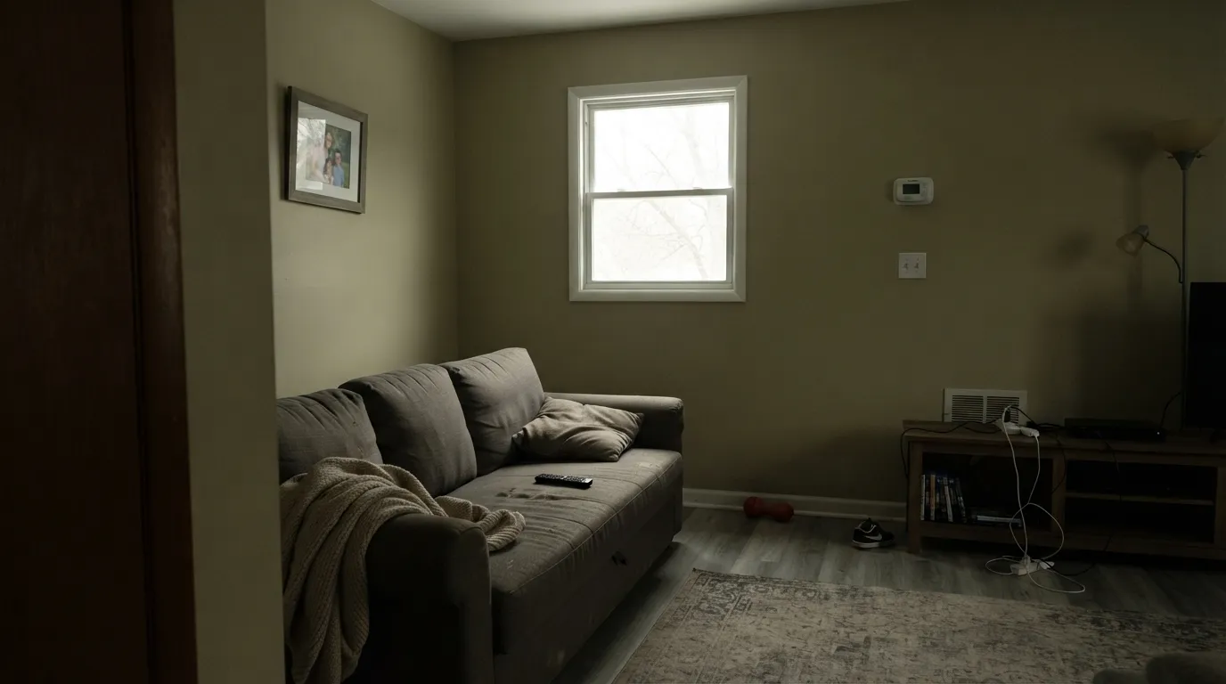
Room by Room
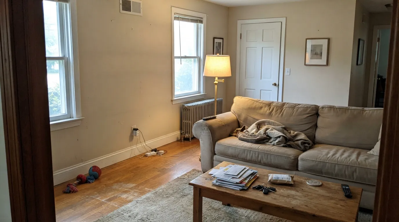
Consultants keep putting it here for a reason: restful, warm, and slightly enveloping without going tan. Matte or eggshell; White Dove trim. Under 2700K lamps it turns into the linen the name promised. North bedrooms still read friendly — this is one beige that does not go cold overnight.
On a wood-floor main room with real daylight it is a calm oatmeal backdrop that makes oak, walnut, and brass look deliberate. Riskier in a gray-sofa, gray-LVP open plan, where the green-gray has nothing warm to land on. Eggshell; same-family trim in semi-gloss.
Natural Linen walls over stained oak or Alabaster cabinets are excellent; limestone and unlacquered brass love it. As a cabinet color it gives a soft sand that still wipes clean in satin. Skip it beside cream or antique-white boxes — the peach flash and the cream yellow fight. Satin urethane enamel on the doors.
Beautiful with travertine, tan porcelain, wood vanities, and brass. Against cool gray tile or a blue-gray tub surround the oatmeal goes yellow-green. Satin sheen in a wet room, and put a warm bulb over the mirror.
A small office with oak shelves is one of its quiet best uses — calm enough to work in, warm enough not to feel rented. Hallways connecting wood-floor rooms carry it without a color change. If the hall is windowless and the floor is gray, test a big sample at night before you commit.
Full sun reads it as a warm creamy beige, light enough to pass for a body color on a limestone or cedar house. Pair it with Kendall Charcoal or Wrought Iron trim so the facade does not wash out. The shaded north side will look a full step deeper and greener — walk the sample around the house. Most houses still do better with a dedicated exterior beige.
Your Light Is the Risk
Warm south daylight is the linen read: sandy, oatmeal, neither pink nor yellow. The green-gray sits quietly underneath and the wall looks finished.
Cool north daylight plus gray floors is the trap. The green-gray comes forward and the oatmeal goes muddy olive. Fine in a wood-floor north bedroom; disappointing over gray LVP.
East morning is quieter and slightly greener. West afternoon turns creamier. Late golden hour can flash peach for an hour — sample at 6pm if peach is your dealbreaker.
2700K lamps: cozy oatmeal, the bedroom version of the color. Cool 4000K LEDs flatten it and push the yellow-green family. Swap the bulbs before you repaint.
Most complaints about Natural Linen are a light mismatch. Upload a photo of your actual room and see it on your walls — then ask for the same wall in north light or evening lamps before you buy a single sample.
Need It From Another Brand?
Any paint counter can custom-tint Benjamin Moore 966 directly. If you would rather stay in one brand's own deck, these are the closest stock matches, measured as ΔE2000. Under 2 is a difference you will not see on the wall.
| Brand | Closest color | ΔE | LRV | |
|---|---|---|---|---|
| Sherwin-Williams | Warm OatsSW 9511 · Sherwin-Williams | 0.7 | 63 | Color page → |
| Behr | Bell TowerMQ3-15 · Behr | 1.0 | 62 | Color page → |
| Valspar | Rattan Basket3007-10C · Valspar | 2.1 | 61.4 | Color page → |
| PPG / Glidden | Summer WheatPPG14-10 · PPG / Glidden | 0.9 | 61 | Color page → |
| Glidden | Summer WheatPPG14-10 · Glidden | 1.0 | 62 | Color page → |
| Dutch Boy | Sugar Scrub419-1DB · Dutch Boy | 0.6 | 63 | Color page → |
Similar Benjamin Moore Colors
The nearest shades to Natural Linen within Benjamin Moore's own range, ranked by perceptual color distance — useful when you want the same look a touch lighter, darker, or warmer.
WCAG 2.1: AA is 4.5 : 1 for normal text, 3 : 1 for large text, AAA is 7 : 1.
Natural Linen vs the Colors You're Also Considering
Every Natural Linen sample board has the same rivals on it. The numbers show the real lightness gap — then it comes down to which risk you would rather live with.
Pick this when you need the beige that will not go pink: darker, sandier, and greener in the mix.
Sherwin-Williams SW 9109 · LRV 67Natural LinenPick this if you want it lighter and more gold-tan — knowing it has a loud yellow afternoon in west sun.
Pick this when you want more oatmeal body and a color that will not wash out in south sun.
Benjamin Moore HC-81 · LRV 63Manchester TanPick this for the lighter cousin in the same green-beige family — airier on a whole main floor, with its own green-flash risk.
Inside Benjamin Moore, Natural Linen CC-90 shares the exact hex #D7CDB7 and the same LRV of 60, so it is the same paint under a second deck name. Timson Sand CW-140 and Lace Handkerchief CSP-220 both sit at LRV 60 and differ only by a whisper. Clay Beige OC-11 and Temporal Spirit 965 at LRV 62 are marginally lighter.
Across brands the field is crowded. Dunn-Edwards Vintage Ephemera DET670 at LRV 62 and deltaE 0.47, Dutch Boy Sugar Scrub 419-1DB at deltaE 0.63, and Sherwin-Williams Warm Oats SW 9511 at LRV 63 and deltaE 0.67 are all the same color for practical purposes. PPG Summer Wheat PPG14-10 at LRV 61 and deltaE 0.9 belongs in that group too.
Farrow and Ball Joa's White No. 226 at LRV 63 and deltaE 1.59 is visually identical in normal room light. Valspar Rattan Basket 3007-10C at LRV 61.4 and deltaE 2.12 is very close but worth sampling, while Clare Flatiron PNT100-LT-17 at LRV 61 and deltaE 4.5 is close but visibly cooler side by side.
Natural Linen Coordinating Colors
Stay on the warm, slightly green side of the fence. Natural Linen flatters soft whites, muted sages, deep navy, and near-blacks, and it argues with icy whites, cool greys, and blue-gray stone. These are the partners that keep showing up in rooms that work:
Two Colors Named Natural Linen
The search results are a mess because Sherwin-Williams sells a different beige under the same name. SW Natural Linen (SW 9109, LRV 67) is the Instagram one: lighter, gold-tan, almost no gray, and a known yellow afternoon in west sun. Homeowners keep writing the same sentence — they did not expect it to look so peachy. Benjamin Moore Natural Linen (966, LRV 60) is darker, sandier, and built on green-gray instead of orange, which is exactly why it stays off-pink.
They are not substitutes. If a Pinterest photo is tagged Natural Linen, check the brand before you buy a gallon. A store color-match from one to the other will miss the undertone, and undertone is the entire difference. Sample both on the same wall at noon and at 6pm if you are still deciding.
Natural Linen With Wood Tones and Floors
This decision gets made at the floor. Medium oak, walnut, and limestone are the easy yes — the oatmeal meets the wood and both look more expensive. Honey oak is safer here than it is next to a peach beige, because the green-gray in 966 cuts the orange instead of amplifying it. Cedar, butcher block, and unlacquered brass all sit in the same warm family.
Cool gray LVP, gray-washed oak, and blue-gray tile are the honest no. Gray pulls the green-gray forward until the wall reads muddy olive, which is the number-one fail in new builds that already have gray floors. A large rug can hide a small clash; it will not save a whole main floor. If the gray floor is staying, look at Edgecomb Gray or Agreeable Gray and keep the warmth without the fight.
Metals are simple: unlacquered brass, aged bronze, and matte black all work. Polished chrome is the one that leans cold against it.
Three Ready Palettes Built on Natural Linen
A color is never alone on the wall. These are complete combinations in the 60-30-10 pattern, with the reason each one holds together. Every one opens in the visualizer.
The green in Natural Linen is why a muted sage belongs here instead of a random accent: October Mist reads like the same house getting quieter, not a color change. White Dove keeps the edges soft — a gallery white would shove the walls toward yellow.
Try this palette in your roomAlabaster is a cabinet white that still sits on the warm side, so the wall-to-box handoff stays clean without the dingy cream fight. Pewter Green takes the green already hiding in Natural Linen and makes it intentional on the island; brass hardware finishes the argument.
Try this palette in your roomThis is the scheme for a wood-floor house that wants one oatmeal on the walls and nothing clever. White Dove is the trim that does not make the beige look dirty; Hale Navy is the single dark note the front door needs so the sandy body color does not float.
Try this palette in your roomNatural Linen FAQ
Is Natural Linen warm or cool?
Warm — but the quiet kind. The warmth comes from earthy green-gray, not from yellow or peach, which is why it stays off-pink. In cool light it drifts toward a muted beige-green; it never reads icy.
Does Benjamin Moore Natural Linen look pink?
It should not. That complaint belongs to Sherwin-Williams Natural Linen SW 9109, which is lighter (LRV 67) and peachier. The Benjamin Moore version leans green enough to stay oatmeal. The honest exception is a peach flash in hard west sun, especially next to cream trim — sample at 6pm before you commit.
Is it the same color as Sherwin-Williams Natural Linen?
No. Same name, different paint. SW 9109 is lighter, more gold-tan, and famous for a yellow afternoon in west rooms. BM 966 is darker, sandier, and greener. They cannot be used interchangeably, and a store color-match will not save you.
What trim white goes with Natural Linen?
A soft warm white — White Dove is the default, Cloud White if you want the trim a touch cleaner. A stark bright white like Chantilly Lace (LRV 90) makes the walls look yellow by comparison. Cream trim is the other mistake: two warm yellows side by side look dingy. Semi-gloss on the trim, eggshell on the walls.
Is it a good whole-house color?
In a wood-floor house with decent daylight, it can carry bedrooms, halls, and a living room without a color change. It is a little strong for a big open main floor if you were picturing airy cream — at LRV 60 you will feel the pigment. Many designers keep it for secondary rooms (bedrooms, baths, offices) and go lighter on the main floor with Pale Oak or Ballet White.
Does it work with oak floors?
Warm oak, walnut, and limestone are its best friends — the green-gray meets the wood halfway and both look intentional. Honey oak is fine; the color is not so peachy that it amps the orange. The one honest no is cool gray LVP or gray-washed wood, which pulls the green forward as mud. Test a large sample over the actual floor.
Have you painted with Natural Linen?
Rate it — one tap helps the next reader decide.
Ask a Question