Plum Study Palette — Dusk Plum & Warm Oak
A grounded five-color study scheme led by deep plum with warm oak, soft greige, and crisp white — every color matched to real paint you can buy.
By Emily Roberts · DIY Editor & First-Timer's Guide
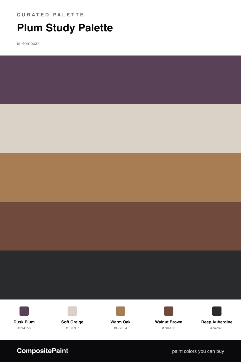
A study is one of those rooms where a deeper color really earns its place. Dusk Plum on the walls wraps the space in something quiet and grown-up, the kind of backdrop that helps you concentrate instead of fidget.
To keep it from closing in, I lean on Soft Greige for the trim and ceiling so the light stays soft, then bring in Warm Oak on a built-in or desk for a little honey-toned warmth. Walnut Brown underfoot ties the wood tones together.
For the finishing touch, a Deep Aubergine accent — think a reading chair, a shelf back, or a painted door — gives the plum somewhere even darker to lean against. It is a cozy, slightly moody 2026 take that still feels fresh and easy to live with.
Buy These Colors
Each color matched to the closest real paint in every brand, by ΔE2000. Kompozit first; take any SKU to the store — these mix on demand.
Questions
Plum is calm and a little serious, which suits a room where you want to settle in and focus. It feels cozy at night under a lamp and still looks rich in daylight.
Not if you balance it. Keep the trim and ceiling in soft greige to bounce light around, and let the warm oak and walnut add glow so the room reads snug rather than gloomy.
Similar Palettes
Closest schemes by color — not by label.