Plum Study Palette — Deep Plum & Antique Brass
A grounded five-color study scheme led by deep plum walls and layered with warm putty, soft white, walnut, and an inky accent — every color matched to real paint you can buy.
By Maya Patel · Reviews Editor & Product Tester
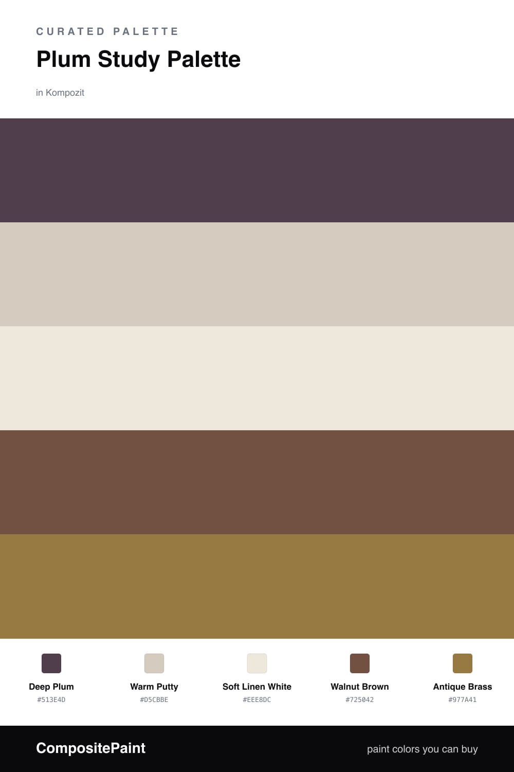
A study is the one room where you can commit to a real color, and Deep Plum earns the lead. It is dusty, grown-up, and a little moody, the kind of shade that makes a wall of books look intentional rather than cluttered. This is the contemporary read on plum for 2026 — muted and warm, not the cool grape tones of a decade ago.
To keep it from closing in, I run Warm Putty across the trim and ceiling and bring Soft Linen White to the cabinets or vanity so the storage stays crisp against all that depth. Walnut Brown on the floor and shelving ties the warmth together and keeps the plum from feeling cold.
The finishing move is Antique Brass — a lamp, a pull, a picture frame. Used in small doses it catches the light and lifts the whole scheme. Lead with the plum, let the neutrals carry the quiet, and save the brass for the spark.
Buy These Colors
Each color matched to the closest real paint in every brand, by ΔE2000. Kompozit first; take any SKU to the store — these mix on demand.
Questions
It makes the room feel cocooned, not cramped. Keep the ceiling and trim in a warm putty or soft white to lift the top of the space, and let the brass accent and lamplight do the work after dark.
A matte or eggshell finish is best here. Matte hides wall flaws and reads rich and velvety, which suits a study you sit in for long stretches rather than a high-traffic hallway.
Similar Palettes
Closest schemes by color — not by label.