CP

Emerald Study Palette — Emerald Reserve & Antique Brass

A rich five-color study scheme led by deep emerald, softened with warm stone and crisp white and grounded by walnut and ink — every color matched to real paint you can buy.

By Jessica Williams · Color Stylist & Interior Editor

Emerald Reserve
Walls
Kompozit Cute Pixie · 0711
#1A5445
LRV 7
Warm Stone
Cabinets or Vanity
Kompozit Sandstone Palette · 0273
#D9CCB6
LRV 61
Quiet White
Trim & Ceiling
Kompozit Twinkle Twinkle · 0355
#F3F2E8
LRV 88
Walnut Brown
Wood & Floors
Kompozit Hideaway · 0137
#654637
LRV 7
Antique Brass
Accent
Kompozit Gold Estate · 0886
#977A41
LRV 21
View palette in

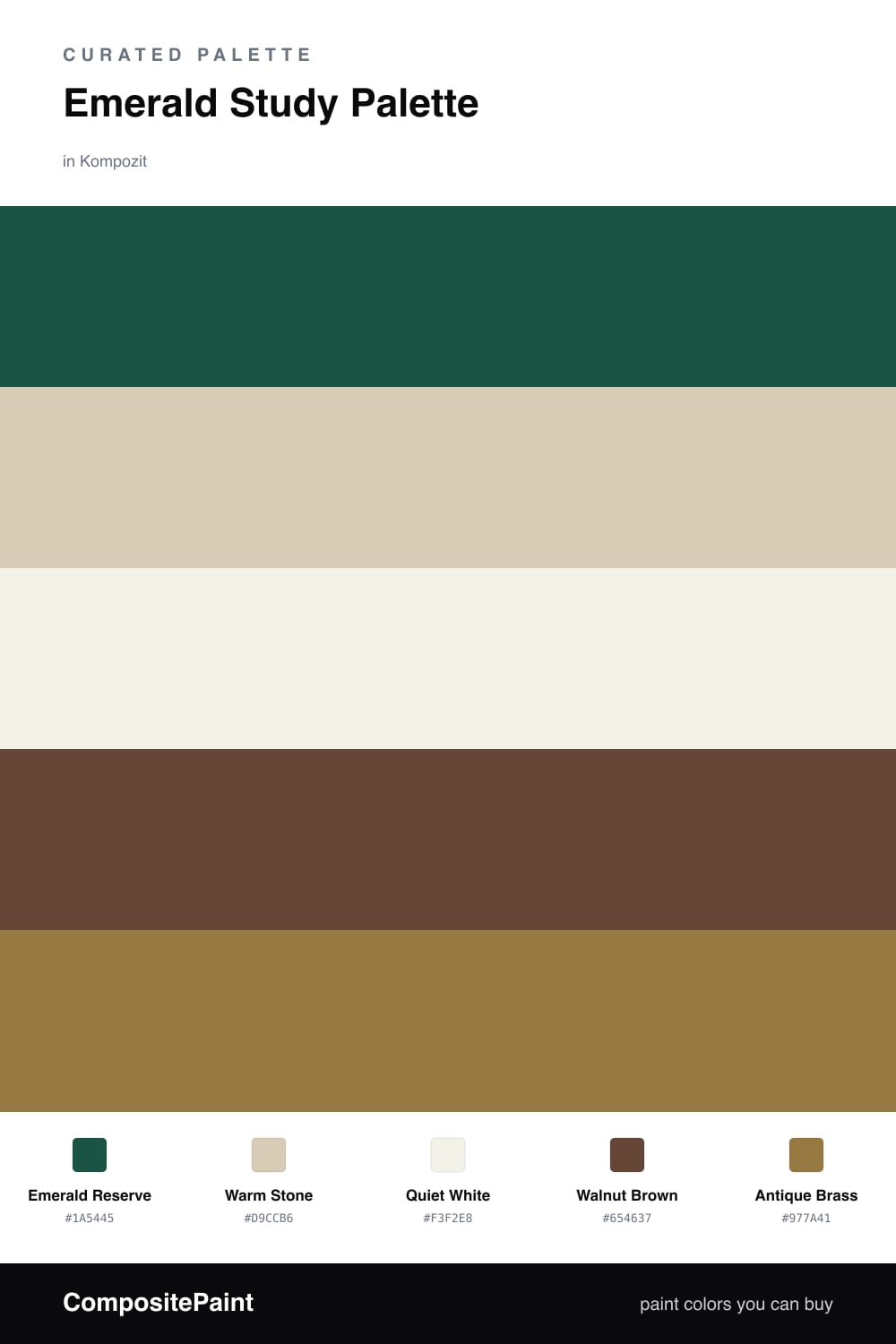
There is something about a deep green room that makes you sit up a little straighter. Emerald Reserve is that color here — saturated, slightly bottle-glass, the kind of green that pulls a study inward and makes the light from a single lamp feel intentional. It is moody, but it is the warm sort of moody, never chilly.

To keep it from closing in, I lean on Quiet White for the trim and ceiling and Warm Stone on the cabinetry or built-in shelves. That soft stone is the breath between the green and the wood, and it stops the scheme from feeling heavy. Walnut Brown on the floor or a desk grounds everything with real warmth.

The spark is Antique Brass — a hint of aged gold for hardware, a picture light, or the base of a lamp. Use the emerald everywhere you can, the neutrals to let it rest, and the brass in the smallest doses. It reads quietly luxe and very much of this moment.

Buy These Colors

Each color matched to the closest real paint in every brand, by ΔE2000. Kompozit first; take any SKU to the store — these mix on demand.

Emerald Reserve
#1F4A3D · LRV 6 · Walls
Kompozit Cute Pixie · 0711 ΔE 3.7
Backdrop North End · BD-NE ΔE 7.83
Behr Sycamore Tree · 480F-7 ΔE 2.47
Benjamin Moore Forest Green · 2047-10 ΔE 2.96
Clare Blackish · PNT100-DP-54 ΔE 17.21
Dunn-Edwards Deep Pine · DEA180 ΔE 5.2
Farrow & Ball Off-Black · No. 57 ΔE 17.07
Magnolia Home Arches · JG-97 ΔE 16.79
PPG / Glidden Dark As Night · 14-05 ΔE 12.69
Sherwin-Williams Country Squire · SW 6475 ΔE 2.85
Valspar Peacock House · 5010-4 ΔE 4.63
Warm Stone
#D8CDB8 · LRV 62 · Cabinets or Vanity
Kompozit Sandstone Palette · 0273 ΔE 0.9
Backdrop Real Real · BD-RR ΔE 2.05
Behr Bell Tower · MQ3-15 ΔE 0.48
Benjamin Moore Timson Sand · CW-140 ΔE 0.4
Clare Flatiron · PNT100-LT-17 ΔE 4.02
Dunn-Edwards Heather · DEC773 ΔE 2.26
Farrow & Ball Joa's White · No. 226 ΔE 1.89
Magnolia Home Plaster · JG-156 ΔE 1.46
PPG / Glidden Summer Wheat · 14-10 ΔE 1.05
Sherwin-Williams Wool Skein · SW 6148 ΔE 0.65
Valspar Rattan Basket · 3007-10C ΔE 1.45
Quiet White
#F4F0E6 · LRV 87 · Trim & Ceiling
Kompozit Twinkle Twinkle · 0355 ΔE 1.5
Backdrop Tabula Rasa · BD-TR ΔE 1.23
Behr Nude W-f-210 · W-F-210 ΔE 0.99
Benjamin Moore Pink Damask · 890 ΔE 1.24
Clare Wing It · PNT100-LT-24 ΔE 2.83
Dunn-Edwards Antique Paper · DE6218 ΔE 0.92
Farrow & Ball Pointing · No. 2003 ΔE 1.7
Magnolia Home Silos White · JG-107 ΔE 1.46
PPG / Glidden Crumb Cookie · 18-01 ΔE 0.99
Sherwin-Williams White Flour · SW 7102 ΔE 0.52
Valspar Crisp Cotton · 7007-4 ΔE 1.2
Walnut Brown
#5A4334 · LRV 6 · Wood & Floors
Kompozit Hideaway · 0137 ΔE 3.72
Backdrop It's a Date · BD-IT ΔE 0.61
Behr Breakfast Blend · 280F-7 ΔE 2.62
Benjamin Moore Deep Taupe · 2111-10 ΔE 0.48
Clare Blackish · PNT100-DP-54 ΔE 11.66
Dunn-Edwards Northern Territory · DEA158 ΔE 3.02
Farrow & Ball Mahogany · No. 36 ΔE 7.34
Magnolia Home Wooded Acres · JG-122 ΔE 6.44
PPG / Glidden Racy Raisin · 16-24 ΔE 5.81
Sherwin-Williams Van Dyke Brown · SW 7041 ΔE 3.04
Valspar Piano Brown · 1004-9A ΔE 5.27
Antique Brass
#9C7A3C · LRV 21 · Accent
Kompozit Gold Estate · 0886 ΔE 1.75
Backdrop Old Soul · BD-OS ΔE 13
Behr Hazel · S280-6 ΔE 2.42
Benjamin Moore Corduroy · 2153-20 ΔE 1.59
Clare Dirty Chai · PNT100-DP-52 ΔE 15.8
Dunn-Edwards Golden Harmony · DE6168 ΔE 2.32
Farrow & Ball Mouse's Back · No. 40 ΔE 12.95
Magnolia Home Vintage Crown · JG-152 ΔE 7.33
PPG / Glidden Sugar Maple · 1090-7 ΔE 4.35
Sherwin-Williams Fervent Brass · SW 6405 ΔE 2.13
Valspar Ginseng · 8002-24G ΔE 2.35

Questions

Why does emerald work so well in a study?

Deep green reads calm and focused without feeling cold, so it quiets a small working room. Paired with warm wood and a touch of brass, it feels grounded and a little timeless rather than flashy.

How much emerald is too much?

In a study you can go bold and wrap most of the walls in emerald, then let the white trim and warm stone breathe. Keep the brass to small doses on hardware or a lamp so it stays a spark, not the story.

Similar Palettes

Closest schemes by color — not by label.