Navy Study Palette — Dusk Navy & Aged Brass
A focused five-color study scheme built on deep dusk navy with a soft greige backdrop, crisp ceiling white, warm walnut, and an aged brass accent — every color matched to real paint you can buy.
By David Chen · Formulation Lead & Resident Chemist
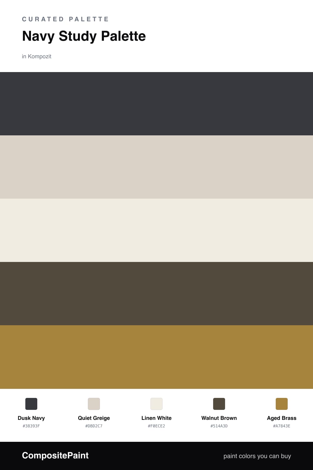
A study is the one room where you want depth, not brightness. Dusk Navy on the walls does that quiet work — it softens reflections, holds the corners of the room, and makes a desk feel like its own pocket of calm. It is dark enough to feel serious but still has a trace of warmth, so it never tips into cold.
Around it, Quiet Greige on the trim and ceiling keeps the edges soft instead of stark white, and Linen White on built-in cabinets or a vanity lifts the navy so shelves and storage still read clean. Walnut Brown floors and wood tie everything to something natural and grounded.
The spark is Aged Brass — a single warm metal note for a lamp, hardware, or picture frames. Used in small doses, it catches the light against all that navy and gives the room a contemporary, lived-in glow rather than a showroom shine.
Buy These Colors
Each color matched to the closest real paint in every brand, by ΔE2000. Kompozit first; take any SKU to the store — these mix on demand.
Questions
Navy reads as deep and steady, so it pulls your eye inward and quiets a room without going fully black. Think of it as the dark theme on a screen — easier to settle into for long stretches of focused work.
Let navy lead on the walls and keep the rest light or warm. A rough 60/30/10 split — navy, neutrals, then small hits of walnut and brass — keeps the space deep but never cave-like.
Similar Palettes
Closest schemes by color — not by label.