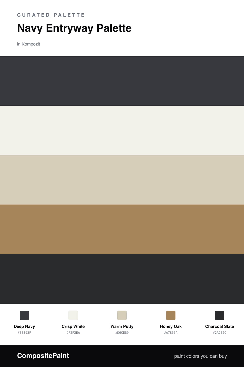
Navy Entryway Palette — Deep Navy & Warm Putty
A confident five-color entryway scheme led by deep navy, softened with warm putty and crisp white, grounded by oak and a charcoal accent — every color matched to real paint you can buy.
By Maya Patel · Reviews Editor & Product Tester
A navy entryway sets the tone the moment someone walks in. Deep Navy does the heavy lifting on the walls — it reads polished and current without trying too hard. The trick is to keep it from going cave-like, which is where Crisp White earns its keep on the trim and ceiling, lifting the whole space and sharpening every edge.
Warm Putty is the quiet hero on cabinets, a built-in bench, or a console, bridging the cool navy with the warm tones underfoot. Honey Oak floors or a wood console add the natural warmth that stops the scheme from feeling stiff, and a little Charcoal Slate on a door, a runner, or hardware grounds the look.
My advice — let navy lead and use the warm tones in generous but smaller doses. This is a 2026-friendly take on a timeless color, more layered and lived-in than the all-navy moment we saw a few years back.
Buy These Colors
Each color matched to the closest real paint in every brand, by ΔE2000. Kompozit first; take any SKU to the store — these mix on demand.
Questions
Not if you balance it. Keep the navy on the lower walls or one feature wall, run crisp white on the trim and ceiling, and let the putty and oak bounce light back. A small space can actually feel richer and more intentional in deep navy than in flat beige.
Brushed brass and matte black both look great here. Brass warms the navy and plays off the oak, while matte black echoes the charcoal accent for a cleaner, more contemporary read.
Similar Palettes
Closest schemes by color — not by label.