Navy Dining Room Palette — Midnight Harbor & Warm Oak
A five-color dining room scheme led by a deep midnight navy, softened with warm white and oak and grounded by a charcoal accent — every color matched to real paint you can buy.
By David Chen · Formulation Lead & Resident Chemist
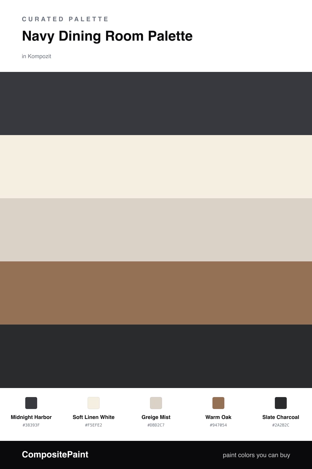
Think of navy in a dining room the way you would a dark roast in a small cup — concentrated, warm, and best enjoyed in the evening. Midnight Harbor wraps the walls in that deep tone, and because most dining happens after sunset, lamplight turns it from formal into welcoming.
To keep it from going flat, Soft Linen White lifts the trim and ceiling, while Greige Mist gives cabinets or a sideboard a calm, slightly contemporary neutral that bridges the navy and the wood. Warm Oak then brings in honest grain through the table and floors, which is what stops the whole scheme from feeling cold.
The last move is restraint. A touch of Slate Charcoal on chair legs, a frame, or a light fixture sharpens the edges without competing with the navy. Let Midnight Harbor lead, give the wood and white plenty of room to breathe, and use the charcoal in small doses.
Buy These Colors
Each color matched to the closest real paint in every brand, by ΔE2000. Kompozit first; take any SKU to the store — these mix on demand.
Questions
A dining room is a room you mostly use after dark, so a deep tone like Midnight Harbor reads rich and intimate under warm light instead of feeling closed in. The candle glow and lamps do the lifting, and the navy makes plated food and wood furniture look great.
A little, but in a dining room that is the goal — you want it to feel cozy. Keep the trim and ceiling in Soft Linen White and let the oak and greige break up the navy, and the room stays balanced rather than heavy.
Similar Palettes
Closest schemes by color — not by label.