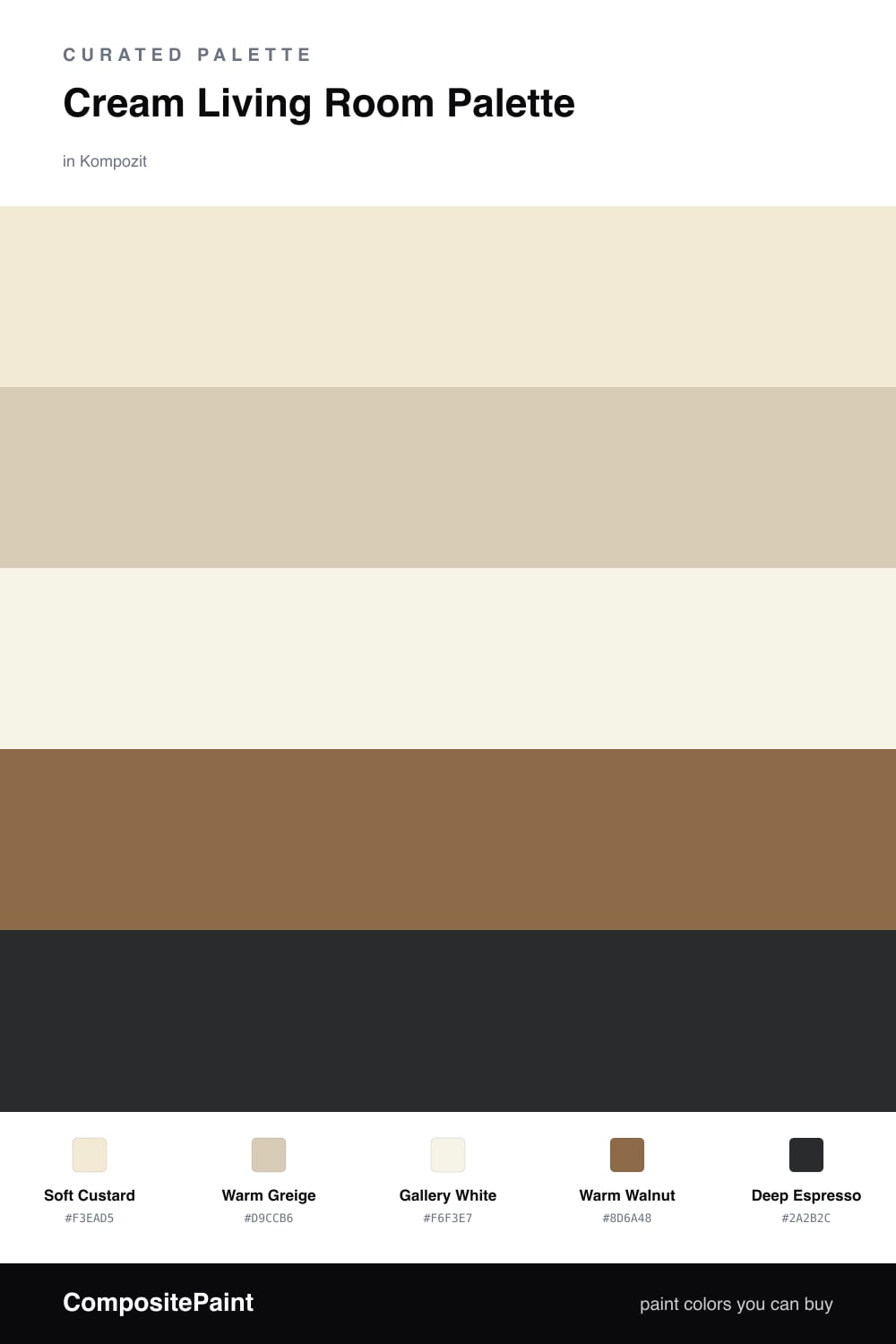
Cream Living Room Palette — Soft Custard & Warm Walnut
A calming five-color cream living room scheme that layers a soft custard wall with a greige backdrop, crisp white trim, warm walnut wood, and a deep espresso accent — every color matched to real paint you can buy.
By Jessica Williams · Color Stylist & Interior Editor
Cream is having a quiet moment in 2026, and a living room is where it feels most at home. Soft Custard leads on the walls — a creamy, low-yellow tone that glows in afternoon light and stays gentle after dark. It is the kind of color you stop noticing in the best way, the way you stop noticing a comfortable sweater.
To keep it from feeling like one flat wash, I lean on Warm Greige for built-ins or a media wall, and pull Gallery White up onto the trim and ceiling so the edges stay crisp and clean. That small step up in brightness is what makes the cream feel intentional rather than dingy.
Then I let the wood do the heavy lifting. Warm Walnut floors or a coffee table add a grounded, honeyed weight, and a few hits of Deep Espresso — a frame, a lamp base, a low shelf — give your eye somewhere to rest. Keep the espresso to small doses and the room stays soft, layered, and easy to live in.
Buy These Colors
Each color matched to the closest real paint in every brand, by ΔE2000. Kompozit first; take any SKU to the store — these mix on demand.
Questions
Cream carries a soft yellow undertone, so the light it bounces back feels golden instead of cool. That little bit of warmth makes the whole room read cozy rather than clinical, especially in the evening.
Layer your tones — let the soft custard lead on the walls, bring in greige on built-ins, and ground everything with walnut wood and a few espresso touches. The contrast between light and deep is what gives the room depth.
Similar Palettes
Closest schemes by color — not by label.