Beige Study Palette — Linen Beige & Walnut Brown
A warm five-color study scheme led by soft linen beige with a putty backdrop, crisp trim white, walnut wood tone, and a deep espresso accent — every color matched to real paint you can buy.
By Emily Roberts · DIY Editor & First-Timer's Guide
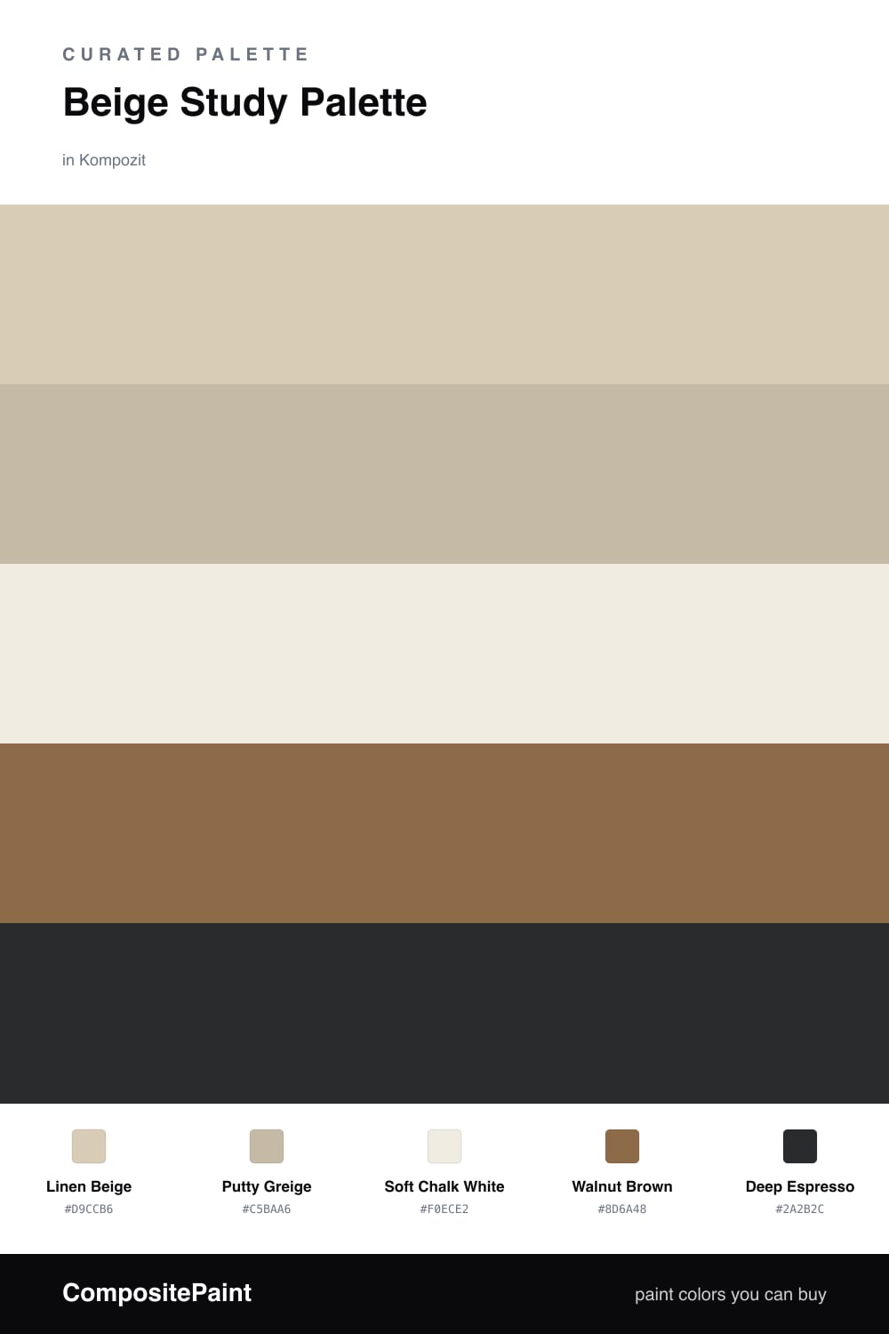
A study is where you want your eyes to relax, so this scheme keeps things warm and low-key. Linen Beige covers the walls with a soft, sandy glow, and Soft Chalk White on the trim and ceiling keeps the edges clean and bright without going stark.
For the built-ins and any cabinets, Putty Greige sits just a step deeper than the walls — close enough to feel calm, different enough to give the room some shape. It is a very 2026 move to layer neutrals this way instead of reaching for a bold contrast.
Then the wood does the heavy lifting. Walnut Brown on a desk, floor, or shelving adds that grounded, lived-in feeling, and a touch of Deep Espresso — think a reading chair, picture frames, or door hardware — gives your eye one rich place to land. Keep the beige and white as your big calm surfaces, and let the browns show up in smaller doses.
Buy These Colors
Each color matched to the closest real paint in every brand, by ΔE2000. Kompozit first; take any SKU to the store — these mix on demand.
Questions
Beige sits in the warm-neutral family, so it reflects soft light without grabbing your attention. That keeps a study quiet and easy on the eyes during long reading or work sessions.
Lean on contrast in the small things — bring in the walnut wood tone for desks and shelves, then add the deep espresso on a chair, a frame, or hardware so the room has a clear anchor.
Similar Palettes
Closest schemes by color — not by label.