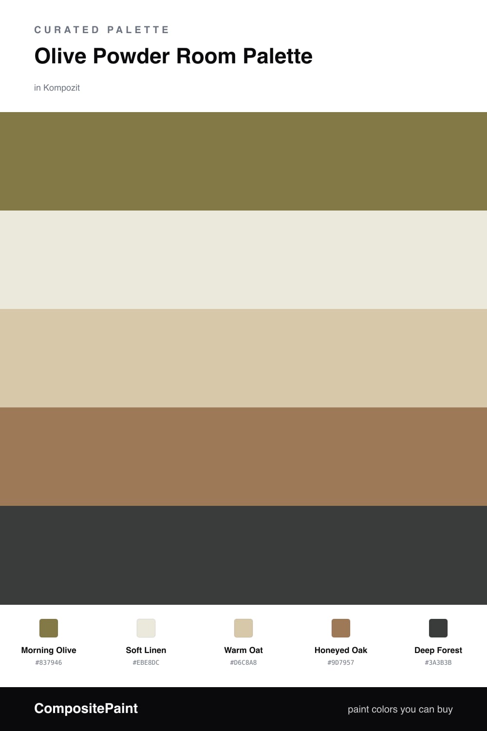
Olive Powder Room Palette — Morning Olive & Soft Linen
A calm five-color powder room scheme led by soft olive, balanced with warm linen, crisp white, oak, and a deep forest accent — every color matched to real paint you can buy.
By Emily Roberts · DIY Editor & First-Timer's Guide
A powder room is the one spot where you can be a little braver with color, and olive is a lovely place to start. Morning Olive on the walls feels soft and grown-up — it is green, but the gray in it keeps things quiet, which is exactly what you want in a room this size.
To keep it from feeling heavy, I lean on light, warm neutrals. Soft Linen on the trim and ceiling brightens everything up, while Warm Oat on the vanity adds a gentle creamy layer. Honeyed Oak for any wood or flooring brings in a touch of warmth so the olive does not feel cold.
The fun part is Deep Forest. Use it in small doses — a vanity, a mirror frame, maybe the door — and it gives the whole space a little depth and a modern, of-the-moment feel without taking over.
Buy These Colors
Each color matched to the closest real paint in every brand, by ΔE2000. Kompozit first; take any SKU to the store — these mix on demand.
Questions
Olive is a soft, grayed-down green, so it feels grounded instead of loud — even in a tiny space it reads as calm and a little earthy rather than overwhelming.
Save the deep forest tone for one small dose, like the vanity or a framed mirror, and let the linen and oat tones carry the light around the room.
Similar Palettes
Closest schemes by color — not by label.