Olive Dining Room Palette — Olive Grove & Warm Oat
A grounded five-color dining room scheme led by soft olive walls, warmed with oat, white, oak, and a deep bronze accent — every color matched to real paint you can buy.
By Maya Patel · Reviews Editor & Product Tester
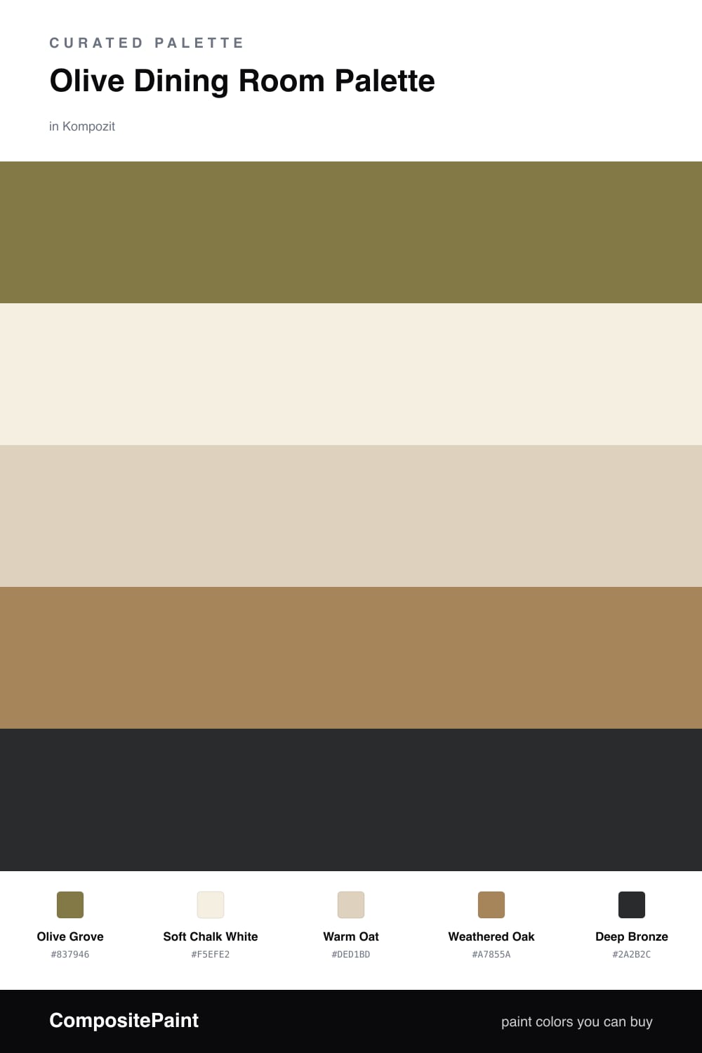
Olive is the dining room color of the moment, and for good reason. It’s a green that behaves like a neutral — quiet, earthy, and forgiving — so Olive Grove on the walls sets a relaxed mood without shouting. It’s the shade that makes candlelight and a set table look intentional.
To keep it fresh rather than heavy, I balance the olive against Soft Chalk White on the trim and ceiling and Warm Oat on cabinets or a sideboard. Those two lighten the whole room and stop the green from closing in. Weathered Oak ties in real wood — a table, flooring, or open shelving — so the palette feels collected instead of painted-on.
The move that makes it 2026 is restraint with the dark. Deep Bronze belongs in small doses — a picture frame, a pendant, the legs of a chair — where it sharpens everything around it. Let olive lead, let the neutrals breathe, and use the bronze like punctuation.
Buy These Colors
Each color matched to the closest real paint in every brand, by ΔE2000. Kompozit first; take any SKU to the store — these mix on demand.
Questions
Olive is a soft, grounded green that reads calm under both daylight and warm evening light — exactly the swing a dining room sees. It flatters wood, brass, and skin tones, so people and food look good at the table.
Lean on the lighter neutrals to open it up. Use the chalk white on trim and ceiling, bring in the oat on cabinets or a buffet, and save the deep bronze for small accents like a frame or light fixture.
Similar Palettes
Closest schemes by color — not by label.