CP

Olive Living Room Palette — Dried Olive & Warm Linen

A grounded five-color living room scheme led by soft olive walls, balanced by warm linen, crisp trim white, oak earth, and a deep forest accent — every color matched to real paint you can buy.

By Maya Patel · Reviews Editor & Product Tester

Dried Olive
Walls
Kompozit Austere · 0354
#726848
LRV 14
Soft Chalk White
Trim & Ceiling
Kompozit Bunny Cake · 0012
#F5EFE2
LRV 87
Warm Linen
Cabinets or Vanity
Kompozit Mineral Water · 0272
#DED1BD
LRV 65
Toasted Oak
Wood & Floors
Kompozit Prince Paris · 0241
#9D7957
LRV 22
Deep Forest
Accent
Kompozit Black Licorice · 0529
#3A3B3B
LRV 4
View palette in

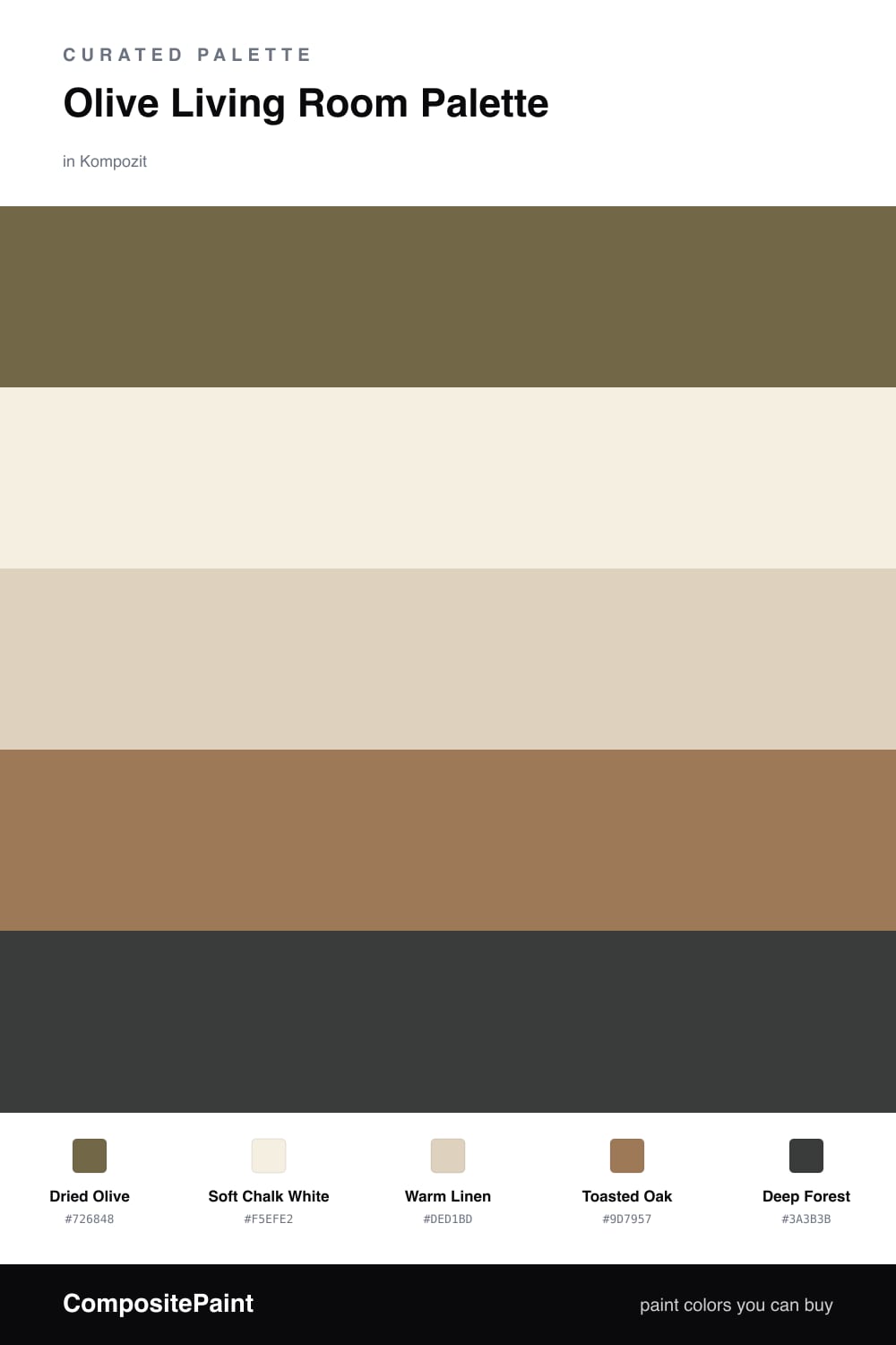
Olive is the green I keep reaching for in 2026, and a living room is where it earns its keep. Dried Olive on the walls is soft and a little dusty, so it feels calm instead of loud. It shifts nicely through the day, leaning warm in morning light and grounded by evening.

Around it, Soft Chalk White keeps the trim and ceiling clean and bright, while Warm Linen carries the bigger pieces like a sofa or built-in shelving without fighting the walls. Toasted Oak is your floor and wood tone, and it makes the olive look intentional rather than accidental.

The one to use sparingly is Deep Forest. It is the richest color here, so save it for an accent chair, a media cabinet, or a single painted door. A little of it sharpens the whole scheme; too much and the room loses its easy, sunlit feel.

Buy These Colors

Each color matched to the closest real paint in every brand, by ΔE2000. Kompozit first; take any SKU to the store — these mix on demand.

Dried Olive
#6E6A4A · LRV 14 · Walls
Kompozit Austere · 0354 ΔE 2.97
Backdrop Buenos Aires · BD-BA ΔE 13.64
Behr Butternut Wood · 710D-6 ΔE 0.48
Benjamin Moore Sterling Forest · 518 ΔE 2.19
Clare Coffee Date · PNT100-DP-53 ΔE 15.47
Dunn-Edwards Spruce Woods · DE6238 ΔE 2.87
Farrow & Ball Bancha · No. 298 ΔE 2.95
Magnolia Home Landscape · JG-49 ΔE 1.18
PPG / Glidden Olive Orchard · 11-08 ΔE 0.65
Sherwin-Williams Oakmoss · SW 6180 ΔE 3.69
Valspar Vineyard View · 8003-27F ΔE 2.63
Soft Chalk White
#F2EEE3 · LRV 86 · Trim & Ceiling
Kompozit Bunny Cake · 0012 ΔE 1.11
Backdrop Jane · BD-JA ΔE 1
Behr Snowy Pine · PPU10-13 ΔE 1.12
Benjamin Moore Moonlight White · 2143-60 ΔE 1.48
Clare Wing It · PNT100-LT-24 ΔE 3.26
Dunn-Edwards Trite White · DE6204 ΔE 0.94
Farrow & Ball Pointing · No. 2003 ΔE 1.49
Magnolia Home Silos White · JG-107 ΔE 1.81
PPG / Glidden Atrium White · 1020-1 ΔE 0.56
Sherwin-Williams Westhighland White · SW 7566 ΔE 0.5
Valspar Wings of an Angel · V153 ΔE 0.55
Warm Linen
#DDD2BC · LRV 65 · Cabinets or Vanity
Kompozit Mineral Water · 0272 ΔE 1.48
Backdrop Real Real · BD-RR ΔE 2.34
Behr Natural Almond · PPU4-12 ΔE 0.48
Benjamin Moore Berber White · 955 ΔE 0.97
Clare Turbinado · PNT100-LT-21 ΔE 1.62
Dunn-Edwards Quicksand · DEC754 ΔE 3.14
Farrow & Ball Joa's White · No. 226 ΔE 1.98
Magnolia Home Ella Rose · JG-24 ΔE 8.04
PPG / Glidden Sourdough · 1084-3 ΔE 2.29
Sherwin-Williams Maison Blanche · SW 7526 ΔE 1.83
Valspar Quill · V094-1 ΔE 0.48
Toasted Oak
#9C7A53 · LRV 22 · Wood & Floors
Kompozit Prince Paris · 0241 ΔE 2.02
Backdrop Old Soul · BD-OS ΔE 13.28
Behr Ancient Pottery · N250-5 ΔE 1.59
Benjamin Moore Caramel Apple · 1042 ΔE 1.72
Clare Dirty Chai · PNT100-DP-52 ΔE 12.25
Dunn-Edwards Pyramid · DE6153 ΔE 2.26
Farrow & Ball Mouse's Back · No. 40 ΔE 9.08
Magnolia Home Vintage Crown · JG-152 ΔE 4.61
PPG / Glidden Caramelized Pecan · 1089-7 ΔE 2.03
Sherwin-Williams Cardboard · SW 6124 ΔE 0.95
Valspar Haute Hickory · 8004-17F ΔE 0.95
Deep Forest
#33402F · LRV 5 · Accent
Kompozit Black Licorice · 0529 ΔE 11.54
Backdrop After Hours · BD-AH ΔE 8.04
Behr Deep Forest · BXC-12 ΔE 2.03
Benjamin Moore Waller Green · CW-510 ΔE 6.41
Clare Blackish · PNT100-DP-54 ΔE 11.91
Dunn-Edwards Black · DEA187 ΔE 12.65
Farrow & Ball Pitch Black · No. 256 ΔE 12.68
Magnolia Home Moments · JG-150 ΔE 16.09
PPG / Glidden Black Magic · 1001-7 ΔE 12.68
Sherwin-Williams Roycroft Bottle Green · SW 2847 ΔE 4.29
Valspar Aged Pine · 6011-5 ΔE 3.44

Questions

Why does olive work so well in a living room?

Olive is a muted green with a touch of gray and brown in it, so it reads as a soft neutral rather than a bold color. That makes it easy to live with all day and easy to pair with wood, cream, and warm metals.

How do I keep the room from feeling too dark?

Put the olive only on the walls, then use the chalk white on the trim and ceiling and the warm linen on larger furniture. Keep the deep forest for small doses — a chair, a throw, or one painted door.

Similar Palettes

Closest schemes by color — not by label.