Forest Color Palette — Forest Quartz
A grounding five-color scheme led by deep forest green, softened with quartz-pale neutrals and one warm clay accent — every color matched to real paint you can buy.
By Jessica Williams · Color Stylist & Interior Editor
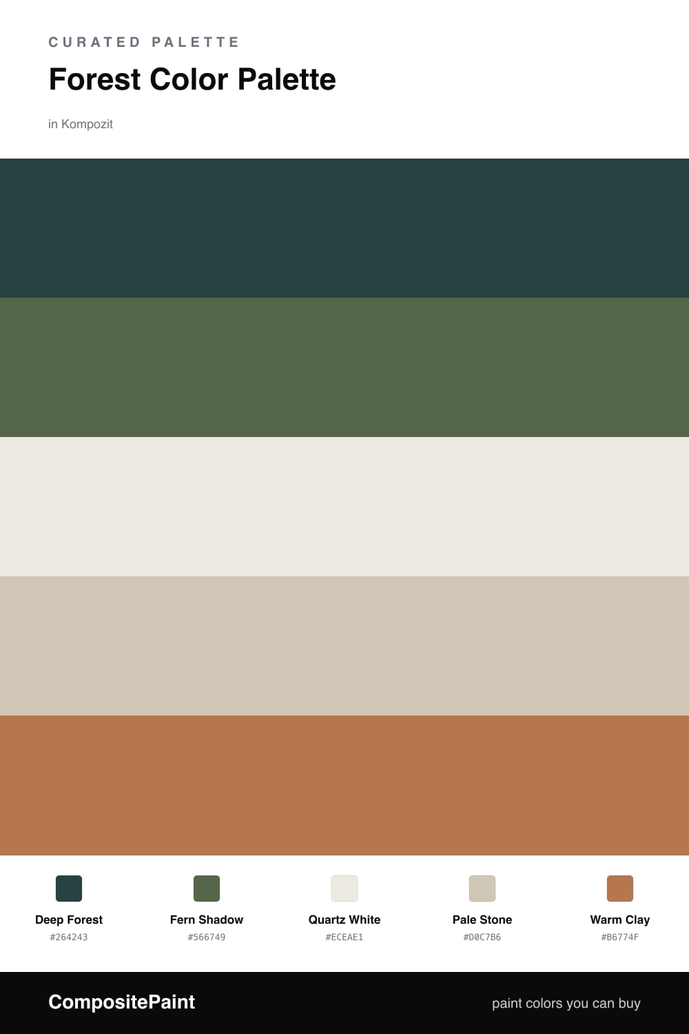
Forest Quartz starts where the woods get quiet. Deep Forest leads the whole scheme, a green so saturated it almost reads as a soft black in low light, then opens back into color as the sun moves across it. It is the kind of shade that makes a room feel held.
Fern Shadow carries that green into the mid-tones, a touch grayer and easier to live with on a large wall. Against it, Quartz White and Pale Stone do the quiet work — chalky, warm-leaning neutrals that keep everything light and current rather than dim.
The spark is Warm Clay, a soft terracotta that feels pulled straight from the forest floor. Use it sparingly — a chair, a throw, a single painted door — and let the green stay in charge. That 2026 balance of deep nature green and pale earthy neutral is exactly where calm, grown-up rooms are landing right now.
Buy These Colors
Each color matched to the closest real paint in every brand, by ΔE2000. Kompozit first; take any SKU to the store — these mix on demand.
Questions
Green is the color we read as rest, the shade of leaves and quiet woods. A deep forest tone holds that feeling while still reading as rich and modern, so a room feels settled rather than sleepy.
Lean on the pale neutrals. Quartz White and Pale Stone open the space up and let the green breathe, while a small touch of warm clay adds the spark that keeps the whole scheme from going flat.
Similar Palettes
Closest schemes by color — not by label.