CP

Forest Color Palette — Forest Vale

A five-color scheme led by deep forest green, layered with mossy mid-tones, warm linen, and a soft clay accent — every color matched to real paint you can buy.

By Jessica Williams · Color Stylist & Interior Editor

Deep Pine
Dominant
Kompozit Black Licorice · 0529
#3A3B3B
LRV 4
Mossy Sage
Secondary
Kompozit Bowling Green · 0437
#717B61
LRV 19
Warm Linen
Base
Kompozit Bleached Meadow · 0376
#EAE5D5
LRV 78
Soft Stone
Support
Kompozit Oak Tone · 0217
#D0C7B6
LRV 58
Faded Clay
Accent
Kompozit Semolina · 1011
#B6774F
LRV 24
View palette in

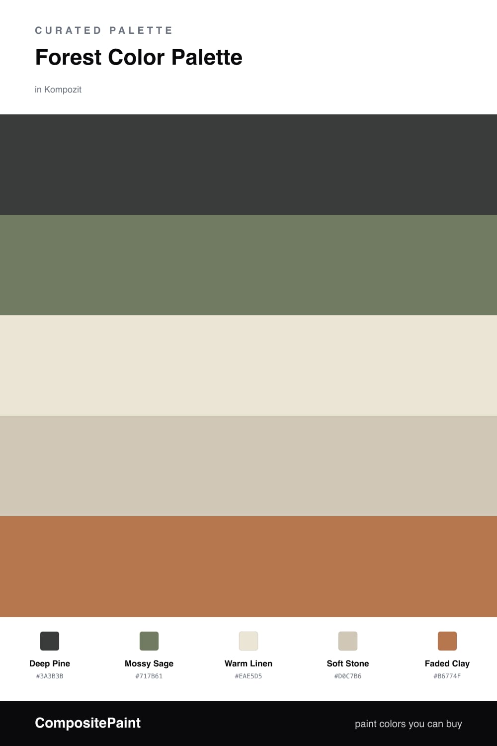
There is a particular hush to standing deep in a forest, and that is what this palette is built to hold. Deep Pine leads everything — a rich, shadowy evergreen that feels grounded and quietly luxurious, the kind of green that reads almost as a neutral once it is on the wall.

Around it, Mossy Sage softens the mood and bridges the deep green to the lighter tones, while Warm Linen and Soft Stone bring in the pale, sun-bleached feeling of bark and stone. These two keep the scheme breathable so the dark green never closes the room in.

Then a touch of Faded Clay — earthy, warm, a little weathered — gives the whole thing a heartbeat. For 2026, this is the way to do green: deep and confident, balanced by honest, organic neutrals rather than stark white.

Buy These Colors

Each color matched to the closest real paint in every brand, by ΔE2000. Kompozit first; take any SKU to the store — these mix on demand.

Deep Pine
#2C3B30 · LRV 4 · Dominant
Kompozit Black Licorice · 0529 ΔE 10.28
Backdrop After Hours · BD-AH ΔE 7.2
Behr Thorny Branch · S-H-780 ΔE 3.7
Benjamin Moore Waller Green · CW-510 ΔE 5.67
Clare Blackish · PNT100-DP-54 ΔE 11.62
Dunn-Edwards Black · DEA187 ΔE 11.53
Farrow & Ball Pitch Black · No. 256 ΔE 11.67
Magnolia Home Blackboard · JG-05 ΔE 13.02
PPG / Glidden Black Magic · 1001-7 ΔE 11.84
Sherwin-Williams Jasper · SW 6216 ΔE 5.21
Valspar Aged Pine · 6011-5 ΔE 3.2
Mossy Sage
#6E7B5F · LRV 18 · Secondary
Kompozit Bowling Green · 0437 ΔE 1.35
Backdrop Old Soul · BD-OS ΔE 6.54
Behr Spanish Galleon · 760D-6 ΔE 3.66
Benjamin Moore Cambridge Green · 468 ΔE 3.14
Clare Daily Greens · PNT100-DP-61 ΔE 1
Dunn-Edwards Greenland · DE6286 ΔE 3.69
Farrow & Ball Green Smoke · No. 47 ΔE 6.5
Magnolia Home Celery Seeds · JG-58 ΔE 3.86
PPG / Glidden Dark Sage · 1124-6 ΔE 2.25
Sherwin-Williams Jadite · SW 6459 ΔE 6.87
Valspar Greenwich Green · P023 ΔE 5.42
Warm Linen
#EDE6D5 · LRV 79 · Base
Kompozit Bleached Meadow · 0376 ΔE 0.97
Backdrop Don't Eat the Yellow Snow · BD-DS ΔE 2.63
Behr Rye Flour · HDC-FL13-5 ΔE 1.83
Benjamin Moore Navajo White · 947 ΔE 0.44
Clare Like Buttah · PNT100-LT-62 ΔE 1.83
Dunn-Edwards Antique White · DEW351 ΔE 0.49
Farrow & Ball Dimity · No. 2008 ΔE 2.19
Magnolia Home Carter Crème · JG-16 ΔE 0.44
PPG / Glidden Little Lamb · 1112-1 ΔE 1.43
Sherwin-Williams Restful White · SW 7563 ΔE 0.62
Valspar Double Scoop · V176 ΔE 1.2
Soft Stone
#CFC6B4 · LRV 57 · Support
Kompozit Oak Tone · 0217 ΔE 0.5
Backdrop Real Real · BD-RR ΔE 2.32
Behr Pecan Sandie · 700C-3 ΔE 1
Benjamin Moore Inner Balance · 1522 ΔE 1.91
Clare All The Sage · PNT100-LT-70 ΔE 6.48
Dunn-Edwards Riverbed · DEC767 ΔE 2.16
Farrow & Ball Old White · No. 4 ΔE 1.83
Magnolia Home Southern Grown · JG-104 ΔE 1
PPG / Glidden Synchronicity · 1021-2 ΔE 1.55
Sherwin-Williams Accessible Beige · SW 7036 ΔE 1.59
Valspar Rippling Stone · V146-2 ΔE 1.51
Faded Clay
#B07A57 · LRV 24 · Accent
Kompozit Semolina · 1011 ΔE 2.23
Backdrop Old Soul · BD-OS ΔE 19.65
Behr Campfire Blaze · HDC-AC-06 ΔE 4.16
Benjamin Moore Lenape Trail · 1222 ΔE 2.16
Clare Fire Sign · PNT100-DP-74 ΔE 8.72
Dunn-Edwards Saddle Brown · DE5264 ΔE 0.75
Farrow & Ball Red Earth · No. 64 ΔE 8.38
Magnolia Home Work Worn Wood · JG-35 ΔE 5.64
PPG / Glidden Cowboy Hat · 1082-6 ΔE 3.29
Sherwin-Williams Spiced Cider · SW 7702 ΔE 2.67
Valspar Terra Cotta Trail · 2005-7B ΔE 1.27

Questions

Why does this palette feel so calming?

It draws on the colors you see on a real walk through the woods — deep evergreen, soft moss, and pale bark — so your eye reads it as restful and familiar. Nothing competes; each shade settles into the next.

Where should the clay accent go?

Use Faded Clay sparingly — a single chair, a throw, or a piece of art. It warms up all that green and keeps the room from feeling cold, but a little goes a long way.

Similar Palettes

Closest schemes by color — not by label.