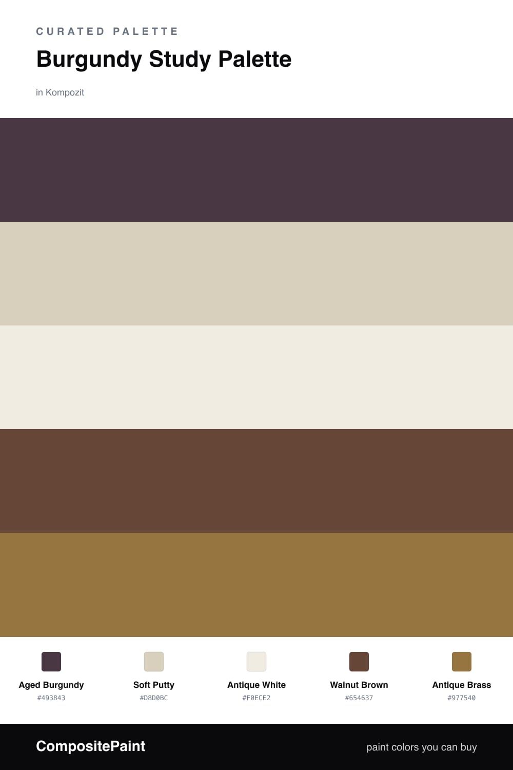
Burgundy Study Palette — Aged Burgundy & Antique Brass
A warm five-color study scheme led by deep burgundy walls, softened with a putty neutral, a crisp white, walnut wood, and an antique-brass accent — every color matched to real paint you can buy.
By Emily Roberts · DIY Editor & First-Timer's Guide
A study is the one room where going dark really pays off, and Aged Burgundy is my favorite way to do it. It is a deep, dusty red-brown that feels grown-up and quiet, perfect for the walls of a room where you want to read or think without distraction.
To keep all that depth from closing in, I lean on Soft Putty for the trim and ceiling and Antique White on the cabinets or built-ins. Those two lighter tones give your eyes somewhere to breathe, so the burgundy reads cozy instead of cave-like. Walnut Brown ties in naturally through the floor and any wood furniture.
The piece that makes it feel current is the Antique Brass accent — think a desk lamp, picture frames, or a single painted shelf. It catches the light and warms everything up, which is exactly the soft, lived-in look that is showing up in 2026 studies. Let the burgundy lead, keep the neutrals quiet, and use the brass in small doses.
Buy These Colors
Each color matched to the closest real paint in every brand, by ΔE2000. Kompozit first; take any SKU to the store — these mix on demand.
Questions
Burgundy is a deep, calm color that wraps a room and helps you focus. Because the walls are dark, the lighter putty and white give your eyes a place to rest, so the space feels rich instead of heavy.
Not if you keep the trim and ceiling light and add the brass accent for a little glow. The contrast actually adds depth, so a small study reads cozy and tucked-in rather than tight.
Similar Palettes
Closest schemes by color — not by label.