CP

Blush Dining Room Palette — Powder Blush & Clay Rose

A soft five-color dining room scheme led by warm blush, balanced by greige, a creamy white, walnut wood, and a deep clay accent — every color matched to real paint you can buy.

By Jessica Williams · Color Stylist & Interior Editor

Powder Blush
Walls
Kompozit Pout · 0125
#E4CCC3
LRV 64
Soft Greige
Cabinets or Vanity
Kompozit Pebblebrook · 0224
#D8D0BC
LRV 63
Creamy White
Trim & Ceiling
Kompozit Bunny Cake · 0012
#F5EFE2
LRV 87
Warm Walnut
Wood & Floors
Kompozit Hideaway · 0137
#654637
LRV 7
Deep Clay Rose
Accent
Kompozit The Ego Has Landed · 1096
#A75455
LRV 15
View palette in

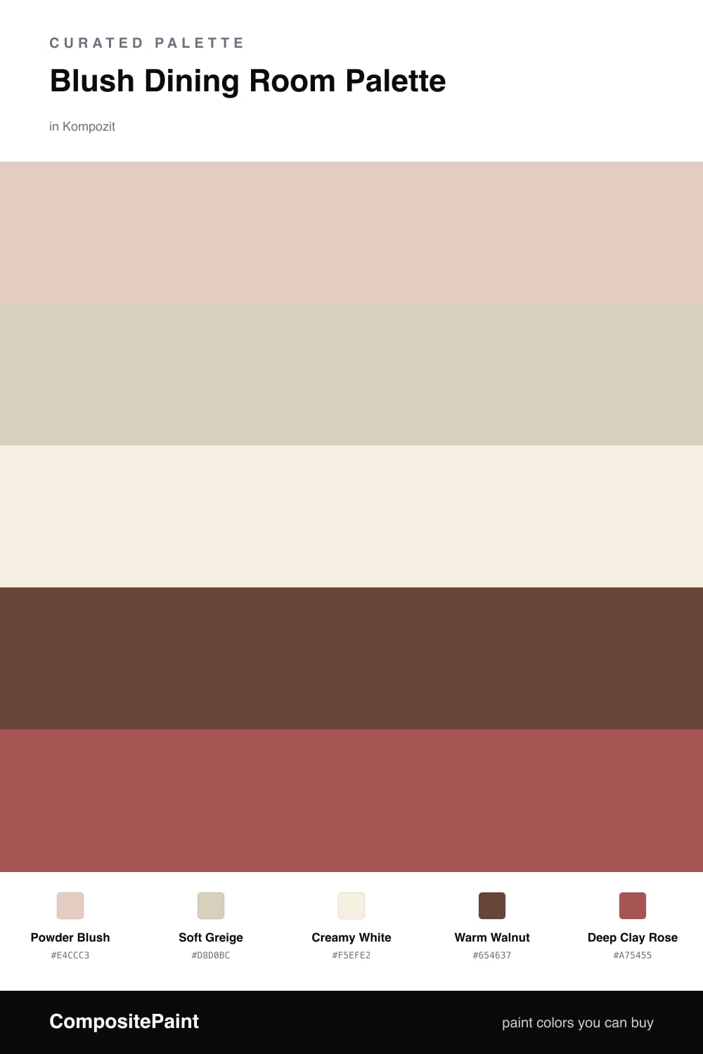
A dining room is where you slow down, so I wanted a blush that feels warm on the skin under candlelight, not cool or chalky. Powder Blush does exactly that on the walls — it is a dusty, clay-leaning pink that glows at dinner and stays soft in daylight. To keep it from tipping into anything too sweet, I grounded it with Soft Greige on a built-in or sideboard, a quiet earthy tone that lets the blush feel intentional.

Creamy White on the trim and ceiling keeps everything fresh and stops the warm tones from closing in. Then I leaned into wood — Warm Walnut on the floor or table brings depth and a little contemporary edge that feels right for 2026.

The spark is Deep Clay Rose, a richer cousin of the wall color. Use it sparingly on chairs, a feature wall, or velvet seat cushions. It makes the blush look like a choice, not an accident, and ties the whole room together.

Buy These Colors

Each color matched to the closest real paint in every brand, by ΔE2000. Kompozit first; take any SKU to the store — these mix on demand.

Powder Blush
#E8CFC6 · LRV 66 · Walls
Kompozit Pout · 0125 ΔE 0.84
Backdrop August · BD-AU ΔE 3.73
Behr Soft Shoe · MQ3-37 ΔE 3.35
Benjamin Moore Rose Accent · 1177 ΔE 1.03
Clare Neutral Territory · PNT100-LT-20 ΔE 6.43
Dunn-Edwards Pale Berries · DE6051 ΔE 2.04
Farrow & Ball Calamine · No. 230 ΔE 1.72
Magnolia Home Ella Rose · JG-24 ΔE 2.39
PPG / Glidden Honeysweet · 1065-3 ΔE 1.12
Sherwin-Williams Romance · SW 6323 ΔE 1.42
Valspar Tender Shell · 1006-10C ΔE 2.18
Soft Greige
#D8CEC0 · LRV 63 · Cabinets or Vanity
Kompozit Pebblebrook · 0224 ΔE 3.04
Backdrop Real Real · BD-RR ΔE 2.32
Behr Aged Beige · PPU7-09 ΔE 1.01
Benjamin Moore Cedar Key · 982 ΔE 0.79
Clare Flatiron · PNT100-LT-17 ΔE 1.45
Dunn-Edwards Fine Grain · DE6213 ΔE 0.53
Farrow & Ball Shaded White · No. 201 ΔE 2.43
Magnolia Home Stoneware Pieces · JG-55 ΔE 4.83
PPG / Glidden Crushed Silk · 1024-3 ΔE 1.57
Sherwin-Williams Grecian Ivory · SW 7541 ΔE 1.57
Valspar Gentle Shadows · 8005-5A ΔE 0.57
Creamy White
#F4EEE4 · LRV 86 · Trim & Ceiling
Kompozit Bunny Cake · 0012 ΔE 1.34
Backdrop Jane · BD-JA ΔE 2.03
Behr Flurries · HDC-WR14-1 ΔE 1.44
Benjamin Moore Alabaster · 876 ΔE 1.68
Clare Wing It · PNT100-LT-24 ΔE 2.1
Dunn-Edwards White Zin · DEW315 ΔE 1.82
Farrow & Ball Pointing · No. 2003 ΔE 1.84
Magnolia Home Silos White · JG-107 ΔE 2.03
PPG / Glidden Atrium White · 1020-1 ΔE 1.5
Sherwin-Williams Westhighland White · SW 7566 ΔE 0.78
Valspar Wings of an Angel · V153 ΔE 1.17
Warm Walnut
#5C4435 · LRV 7 · Wood & Floors
Kompozit Hideaway · 0137 ΔE 3.14
Backdrop It's a Date · BD-IT ΔE 0
Behr Moose Trail · N190-7 ΔE 2.3
Benjamin Moore Deep Taupe · 2111-10 ΔE 1.04
Clare Blackish · PNT100-DP-54 ΔE 11.98
Dunn-Edwards Northern Territory · DEA158 ΔE 2.69
Farrow & Ball Mahogany · No. 36 ΔE 7.46
Magnolia Home Wooded Acres · JG-122 ΔE 6.75
PPG / Glidden Racy Raisin · 16-24 ΔE 5.83
Sherwin-Williams Well-Bred Brown · SW 7027 ΔE 3.29
Valspar Incognito · V084-6 ΔE 1.67
Deep Clay Rose
#9C5A52 · LRV 15 · Accent
Kompozit The Ego Has Landed · 1096 ΔE 4.22
Backdrop Buenos Aires · BD-BA ΔE 13.72
Behr Perfect Penny · S180-6 ΔE 1.4
Benjamin Moore Southwest Pottery · 048 ΔE 2.3
Clare Big Apple · PNT100-DP-30 ΔE 3.05
Dunn-Edwards BBQ · DE5118 ΔE 3.77
Farrow & Ball Picture Gallery Red · No. 42 ΔE 2.28
Magnolia Home Home At Last · JG-30 ΔE 3.19
PPG / Glidden Fire Weed · 1056-6 ΔE 0.97
Sherwin-Williams Bold Brick · SW 6327 ΔE 1.29
Valspar Savannah Red · 1008-7B ΔE 1.55

Questions

Does a blush dining room feel too pink?

Not when the blush is warm and dusty rather than candy bright. This Powder Blush leans toward soft clay, so in evening light it reads cozy and grown-up instead of girlish.

What metals and woods go with this palette?

Aged brass and warm walnut are the easy wins here. Both pick up the earthy side of the blush and the clay accent, which keeps the whole room feeling collected rather than sweet.

Similar Palettes

Closest schemes by color — not by label.