Peach Study Palette — Soft Peach & Walnut Brown
A warm five-color study scheme led by soft peach walls, balanced with a greige backdrop, a clean white, walnut wood, and a deep terracotta accent — every color matched to real paint you can buy.
By Emily Roberts · DIY Editor & First-Timer's Guide
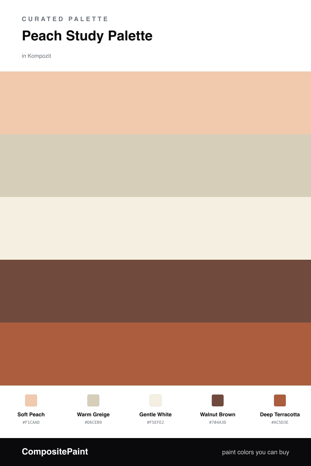
A study should feel calm but still wake your brain up a little, and that is exactly what peach does. Here Soft Peach leads on the walls — warm and gentle, the kind of color that looks lovely in morning light and stays easy on the eyes all afternoon.
To keep it from feeling too sweet, I leaned on Warm Greige for the trim and ceiling and a clean Gentle White for cabinets or a built-in. Those quiet neutrals let the peach breathe instead of taking over the whole room.
The grown-up part comes from Walnut Brown on the floors and shelves, plus a few hits of Deep Terracotta as your accent — a lamp, a chair, the spine of a row of books. That earthy, slightly contemporary mix is what turns a pretty color into a room you actually want to work in.
Buy These Colors
Each color matched to the closest real paint in every brand, by ΔE2000. Kompozit first; take any SKU to the store — these mix on demand.
Questions
Peach is soft and warm without being sleepy, so it keeps the room feeling calm but awake. That balance helps you focus for long stretches while still feeling cozy when you sit down to read or write.
Ground it with the walnut wood and the deep terracotta accent. Those darker, earthier tones pull the peach toward grown-up and contemporary instead of cute, and the greige and white keep everything fresh.
Similar Palettes
Closest schemes by color — not by label.