Navy Home Office Palette — Midnight Navy & Warm Walnut
A focused five-color home office scheme led by deep midnight navy, warmed with walnut and grounded by soft greige, ivory trim, and a charcoal accent — every color matched to real paint you can buy.
By Jessica Williams · Color Stylist & Interior Editor
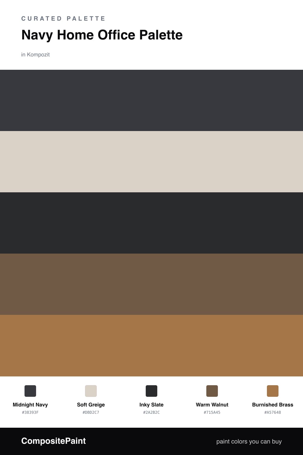
A home office should help your mind narrow in, and few colors do that as well as a deep navy. Midnight Navy wraps the walls in a calm, focused dark that feels current for 2026 — moody but never heavy. It draws your attention inward and lets the screen and the work take center stage.
To keep the room breathing, I pull Soft Greige up onto the trim and ceiling so the navy has a soft edge to land against, and I save Inky Slate for built-in cabinets or a desk surround, just deep enough to read as its own layer. The contrast is quiet, which is exactly what you want when you are staring at the same four walls for hours.
The warmth comes from wood and metal. Warm Walnut on a desktop or flooring grounds the whole scheme in something natural and tactile, and a small dose of Burnished Brass in a lamp or drawer pulls keeps the navy feeling rich rather than flat. Let the navy lead, the neutrals settle, and the warm tones do the welcoming.
Buy These Colors
Each color matched to the closest real paint in every brand, by ΔE2000. Kompozit first; take any SKU to the store — these mix on demand.
Questions
Not when you balance it. A deep navy on the walls feels enclosing in a good way — it quiets distraction and helps you settle into work, while the greige trim and brass accent keep the room from going gloomy.
Lean on the wood tones. Warm walnut on the desk or floor and a touch of burnished brass in lighting or hardware add the heat that navy alone lacks, so the room reads cozy rather than corporate.
Similar Palettes
Closest schemes by color — not by label.