CP

Mauve Color Palette — Mauve Smoke

A soft five-color scheme led by smoky mauve, balanced with warm greige, soft white, and a deep plum accent — every color matched to real paint you can buy.

By Maya Patel · Reviews Editor & Product Tester

Mauve Smoke
Dominant
Kompozit Cut Heather · 1303
#9E909E
LRV 30
Dusty Mauve
Secondary
Kompozit Pansy Posie · 1212
#BCA3B4
LRV 40
Warm Greige
Base
Kompozit Coconut Macaroon · 0138
#DACAC0
LRV 61
Soft White
Support
Kompozit Little Pinky · 1174
#F4EDEC
LRV 86
Deep Plum
Accent
Kompozit Crowd Pleaser · 1208
#5B4459
LRV 7
View palette in

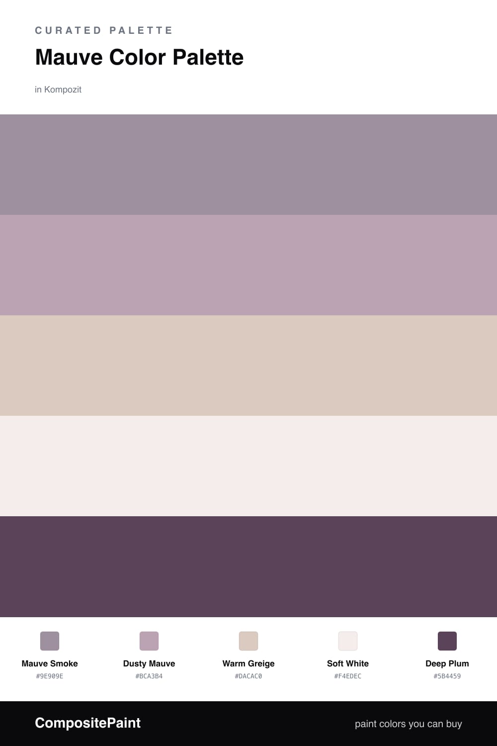
Mauve is having a real moment in 2026, and Mauve Smoke is the version I keep reaching for — a grayed-down, grown-up mauve that never looks fussy. It leads here as the dominant color, with Dusty Mauve layered just a shade lighter to give the scheme depth without a hard jump.

Warm Greige and Soft White do the quiet work, opening things up and keeping the mauves from feeling heavy. Think of them as the breathing room that lets the color read as serene rather than saturated.

The one I would not skip is Deep Plum. Used in small amounts — a piece of trim, a door, a single piece of furniture — it gives this gentle palette a backbone. Keep the mauves leading and the plum as your accent, and you get a room that feels soft and current without ever going saccharine.

Buy These Colors

Each color matched to the closest real paint in every brand, by ΔE2000. Kompozit first; take any SKU to the store — these mix on demand.

Mauve Smoke
#A38B96 · LRV 28 · Dominant
Kompozit Cut Heather · 1303 ΔE 3.98
Backdrop Anita · BD-AN ΔE 15.81
Behr Blackberry Mocha · 120F-4 ΔE 1.73
Benjamin Moore Hazy Lilac · 2116-40 ΔE 4.24
Clare Shade · PNT100-MD-14 ΔE 16
Dunn-Edwards Ashen Plum · DE6396 ΔE 6.77
Farrow & Ball Charleston Gray · No. 243 ΔE 12.49
Magnolia Home Homebody · JG-136 ΔE 10.2
PPG / Glidden Gothic Amethyst · 1046-5 ΔE 1.26
Sherwin-Williams Thistle · SW 6283 ΔE 1.9
Valspar Mellow Mauve · 1004-7C ΔE 2.23
Dusty Mauve
#BBA3AC · LRV 40 · Secondary
Kompozit Pansy Posie · 1212 ΔE 3.13
Backdrop Rosita · BD-RO ΔE 9.99
Behr Object Of Desire · MQ1-36 ΔE 4.85
Benjamin Moore Magic Potion · 1250 ΔE 3.75
Clare Subrosa · PNT100-MD-76 ΔE 10.82
Dunn-Edwards Magical Mauve · DE6011 ΔE 1.33
Farrow & Ball Cinder Rose · No. 246 ΔE 4.58
Magnolia Home Vintage Collection · JG-99 ΔE 8.49
PPG / Glidden Lighthearted Rose · 1049-4 ΔE 4.39
Sherwin-Williams Intuitive · SW 6017 ΔE 4.5
Valspar Bedroom Plum · 1004-8A ΔE 1.32
Warm Greige
#D6CCC4 · LRV 61 · Base
Kompozit Coconut Macaroon · 0138 ΔE 2.51
Backdrop Real Real · BD-RR ΔE 4.93
Behr Granite Dust · MQ3-6 ΔE 0.94
Benjamin Moore Portland Gray · 2109-60 ΔE 1.67
Clare Flatiron · PNT100-LT-17 ΔE 1.76
Dunn-Edwards Miner's Dust · DEC786 ΔE 2.73
Farrow & Ball Cornforth White · No. 228 ΔE 2.02
Magnolia Home Stoneware Pieces · JG-55 ΔE 6.01
PPG / Glidden River Rock · 18-02 ΔE 0.6
Sherwin-Williams Popular Gray · SW 6071 ΔE 1.26
Valspar March Ice · 1001-10B ΔE 1.23
Soft White
#F2EDE8 · LRV 85 · Support
Kompozit Little Pinky · 1174 ΔE 2.57
Backdrop Jane · BD-JA ΔE 3.21
Behr Timid White · PR-W12 ΔE 0.96
Benjamin Moore Vintage Taupe · 2110-70 ΔE 0
Clare Wing It · PNT100-LT-24 ΔE 1.6
Dunn-Edwards Windmill · DE6064 ΔE 1.9
Farrow & Ball Wevet · No. 273 ΔE 1.77
Magnolia Home Silos White · JG-107 ΔE 2.07
PPG / Glidden Summer Lily · 1191-1 ΔE 0.97
Sherwin-Williams Ibis White · SW 7000 ΔE 0.6
Valspar Bistro White · 7006-4 ΔE 1.27
Deep Plum
#5A4452 · LRV 7 · Accent
Kompozit Crowd Pleaser · 1208 ΔE 2.84
Backdrop Last Call · BD-LC ΔE 12.29
Behr Grand Plum · N120-7 ΔE 2.48
Benjamin Moore Grappa · 1393 ΔE 3.09
Clare Night Groove · PNT100-DP-77 ΔE 2.64
Dunn-Edwards Mulberry · DEA194 ΔE 3.8
Farrow & Ball Pelt · No. 254 ΔE 3.43
Magnolia Home Moody Fig · JG-155 ΔE 6.26
PPG / Glidden Purple Basil · 1046-7 ΔE 1.2
Sherwin-Williams Mature Grape · SW 6286 ΔE 4.14
Valspar Plummy Rouge · 8003-2G ΔE 1.89

Questions

Why does this palette feel calm instead of cold?

The mauve here is warmed with a touch of gray-brown, so it reads soft rather than pink or chilly. Pairing it with greige and a warm white keeps the whole scheme grounded and easy to live with.

How do I keep mauve from looking too sweet?

Let the smoky mauve lead and use the deep plum sparingly as your darkest note. A small dose of that plum on trim or one feature piece adds weight and stops the palette from tipping into anything too soft.

Similar Palettes

Closest schemes by color — not by label.