CP

Dusty Rose Bedroom Palette — Muted Pink & Soft Greige

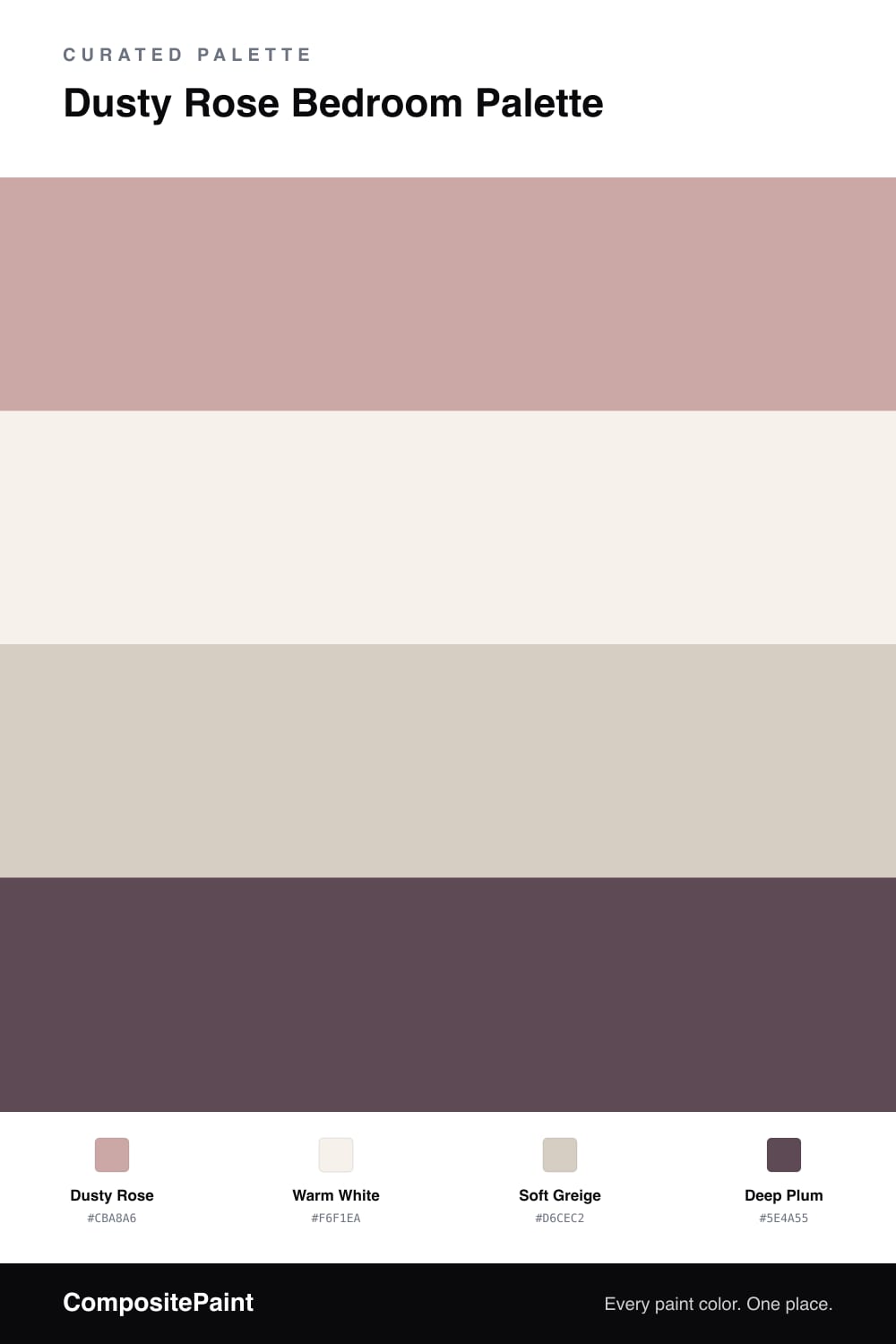
A grown-up pastel bedroom in dusty rose, soft greige, warm white, and a deep plum accent — restful, a little moody, and easy to live with. Every color matched to real paint you can buy.

By Jessica Williams · Color Stylist & Interior Editor

A dusty rose bedroom is the easiest way to get color without losing calm. The rose here is soft and a little gray, so it never feels sweet — it just warms the room and softens the light. On the walls it reads almost like a neutral, which is exactly what you want in a space meant for rest.

Around it, a warm white keeps the trim crisp without going cold, and a soft greige carries through built-ins, a dresser, or a quiet rug. Those two do the steady work so the rose can stay relaxed.

Then a touch of deep plum brings the moody side out. Keep it small — a headboard, bedding, or one painted nook — and the room feels layered and grown-up rather than pastel and plain. Soft pink leads, neutrals support, plum gives it depth.

View palette in
Dusty Rose
Walls
PPG / Glidden Parfait · PPG1059-4
#C8A6A2
LRV 42
Warm White
Trim
Glidden Crisp Linen White · 61YY 89/040
#F6F1E9
LRV 89
Soft Greige
Built-ins
Sherwin-Williams Modern Gray · SW 7632
#D6CEC3
LRV 62
Deep Plum
Accent
Clare Night Groove · PNT100-DP-77
#604B56
LRV 8

Buy These Colors

Each color matched to the closest real paint in every brand, by ΔE2000. Tap a swatch for its full guide or + to save it — take any SKU to the store, they mix on demand.

Dusty Rose
#CBA8A6 · LRV 43 · Walls
Sherwin-Williams · SW 6023 · ΔE 4.13
Behr · MQ1-04 · ΔE 2.97
Benjamin Moore · 2102-50 · ΔE 2.08
Valspar · 1005-10B · ΔE 3.28
PPG / Glidden · PPG1059-4 · ΔE 1.18
Glidden · PPG1059-4 · ΔE 1.57
Dutch Boy · 201-3DB · ΔE 4.99
HGTV Home by Sherwin-Williams · HGSW 3016 · ΔE 4.13
Dunn-Edwards · DET416 · ΔE 2.84
Magnolia Home · JG-154 · ΔE 7.41
Farrow & Ball · NO. 246 · ΔE 3.53
Diamond Vogel · 0071 · ΔE 2.65
Hirshfield's · 0071 · ΔE 3.25
Rodda · R122 · ΔE 4.89
C2 Paint · C2-813 · ΔE 8.88
Clare · PNT100-MD-76 · ΔE 5.47
Portola Paints · HAVANA · ΔE 7.76
Annie Sloan · PALOMA · ΔE 9.39
Backdrop · BD-RO · ΔE 4.45
Rust-Oleum · 285143 · ΔE 15.34
Kompozit · 0071 · ΔE 3.25
Warm White
#F6F1EA · LRV 88 · Trim
Sherwin-Williams · SW 9503 · ΔE 1.65
Behr · RD-W09 · ΔE 1.25
Benjamin Moore · 879 · ΔE 1.15
Valspar · 8007-6E · ΔE 1.94
PPG / Glidden · PPG0998-1 · ΔE 2.23
Glidden · 61YY 89/040 · ΔE 0.48
Dutch Boy · 004W · ΔE 1.25
HGTV Home by Sherwin-Williams · HGSW 4002 · ΔE 1.58
Dunn-Edwards · DE6225 · ΔE 0.96
Magnolia Home · JG-107 · ΔE 1.6
Farrow & Ball · NO. 239 · ΔE 2.71
Diamond Vogel · 0355 · ΔE 1.73
Hirshfield's · 0411 · ΔE 2.67
Rodda · CA002 · ΔE 2.18
C2 Paint · C2-820 · ΔE 0.85
Clare · PNT100-LT-24 · ΔE 1.46
Portola Paints · ORIGAMI · ΔE 1.33
Annie Sloan · OLD OCHRE · ΔE 13.1
Backdrop · BD-TR · ΔE 2.71
Rust-Oleum · 285140 · ΔE 4.87
Kompozit · 0411 · ΔE 2.67
Soft Greige
#D6CEC2 · LRV 62 · Built-ins
Sherwin-Williams · SW 7632 · ΔE 0.46
Behr · MQ3-06 · ΔE 1.23
Benjamin Moore · CSP-95 · ΔE 1.52
Valspar · V146-1 · ΔE 2.22
PPG / Glidden · PPG1023-2 · ΔE 0.87
Glidden · PPG18-02 · ΔE 2.44
Dutch Boy · 440-1DB · ΔE 0.53
HGTV Home by Sherwin-Williams · HGSW 2477 · ΔE 1.48
Dunn-Edwards · DE6213 · ΔE 0.87
Magnolia Home · JG-55 · ΔE 4.05
Farrow & Ball · NO. 201 · ΔE 1.93
Diamond Vogel · 0560 · ΔE 0.7
Hirshfield's · 0560 · ΔE 1.12
Rodda · CA032 · ΔE 0.95
C2 Paint · C2-912 · ΔE 2.73
Clare · PNT100-LT-17 · ΔE 1.04
Portola Paints · FIGUEROA · ΔE 1.56
Annie Sloan · OLD OCHRE · ΔE 7.75
Backdrop · BD-RR · ΔE 2.4
Rust-Oleum · 285142 · ΔE 9.21
Kompozit · 0560 · ΔE 1.12
Deep Plum
#5E4A55 · LRV 8 · Accent
Sherwin-Williams · SW 9575 · ΔE 8.32
Behr · UL100-23 · ΔE 1.52
Benjamin Moore · CC-4 · ΔE 1.9
Valspar · 1001-7A · ΔE 2.5
PPG / Glidden · PPG1046-7 · ΔE 1.91
Glidden · 90RB 08/113 · ΔE 1.78
Dutch Boy · 345-6DB · ΔE 5.64
HGTV Home by Sherwin-Williams · HGSW 2431 · ΔE 6.05
Dunn-Edwards · DESS01 · ΔE 3.58
Magnolia Home · JG-155 · ΔE 5.39
Farrow & Ball · NO. 222 · ΔE 4.08
Diamond Vogel · 1222 · ΔE 1.45
Hirshfield's · 1227 · ΔE 5.01
Rodda · R120 · ΔE 4.94
C2 Paint · C2-805 · ΔE 6.24
Clare · PNT100-DP-77 · ΔE 0.57
Portola Paints · FUTURE LEGEND · ΔE 3.27
Annie Sloan · RODMELL · ΔE 5.29
Backdrop · BD-IT · ΔE 13.6
Rust-Oleum · 391445 · ΔE 29.69
Kompozit · 1227 · ΔE 5.01

Questions

is dusty rose too feminine for a shared bedroom?

Not the way it works here. This rose is muted and grayed, so it reads as a soft neutral rather than a sweet pink. Pairing it with greige and a deep plum keeps the whole room grown-up and calm instead of girly.

where should the deep plum go?

Use it on the smallest things — a headboard wall, a stack of throw pillows, or the inside of an open bookcase. The plum is there to add depth and a little moodiness, so a little of it goes a long way.

KEEP EXPLORING

Similar Palettes

Closest schemes by color — not by label.