CP

Lilac Color Palette — Lilac Pearl

A soft five-color scheme led by gentle lilac, warmed with pearl and greige and finished with a smoky plum accent — every color matched to real paint you can buy.

By Jessica Williams · Color Stylist & Interior Editor

Soft Lilac
Dominant
Kompozit Plum Cake · 1233
#D1BFDC
LRV 56
Dusty Mauve
Secondary
Kompozit Pansy Posie · 1212
#BCA3B4
LRV 40
Pearl White
Base
Kompozit Little Pinky · 1174
#F4EDEC
LRV 86
Warm Greige
Support
Kompozit Power Lunch · 0572
#D4D1C7
LRV 64
Smoky Plum
Accent
Kompozit Vivid Vision · 1227
#5E4B62
LRV 8
View palette in

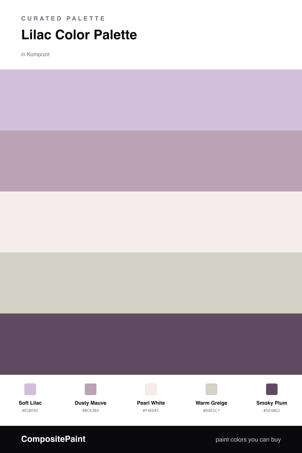
Lilac is having a quiet moment, and Soft Lilac is exactly the kind of grown-up version I keep reaching for. It is hazy and a little gray, the color of dusk in early spring, and it never tips into candy territory.

I let Dusty Mauve shadow it for warmth, then float everything on Pearl White so the lilac stays the star. Warm Greige is the steadying hand here, keeping the cool tones from feeling chilly.

A small dose of Smoky Plum is what makes the whole thing feel current. Use it on a single chair, a frame, or a length of trim, and the softness suddenly has a spine.

Buy These Colors

Each color matched to the closest real paint in every brand, by ΔE2000. Kompozit first; take any SKU to the store — these mix on demand.

Soft Lilac
#C9BBD6 · LRV 53 · Dominant
Kompozit Plum Cake · 1233 ΔE 1.91
Backdrop Lost in the 80s · BD-LO ΔE 20.18
Behr Iris Pink · 690E-3 ΔE 1.62
Benjamin Moore Wishing Well · 1389 ΔE 2.3
Clare Cloud Watching · PNT100-MD-73 ΔE 16.08
Dunn-Edwards Soft Purple · DE5954 ΔE 0.43
Farrow & Ball Calluna · No. 270 ΔE 9.74
Magnolia Home Cement Pots · JG-93 ΔE 12.15
PPG / Glidden Purple Dragon · 1247-4 ΔE 2.61
Sherwin-Williams Free Spirit · SW 6973 ΔE 3.85
Valspar Frosted Orchid · M241 ΔE 1
Dusty Mauve
#B7A2B0 · LRV 39 · Secondary
Kompozit Pansy Posie · 1212 ΔE 1.83
Backdrop Nuevo · BD-NU ΔE 18.66
Behr Plum Taupe · N130-4 ΔE 4.03
Benjamin Moore Dusk to Dawn · 1446 ΔE 5.43
Clare Set In Stone · PNT100-LT-15 ΔE 13.99
Dunn-Edwards Magical Mauve · DE6011 ΔE 3.36
Farrow & Ball Cinder Rose · No. 246 ΔE 6.71
Magnolia Home Vintage Collection · JG-99 ΔE 8.91
PPG / Glidden Lighthearted Rose · 1049-4 ΔE 5.9
Sherwin-Williams Obi Lilac · SW 6556 ΔE 3.48
Valspar Bedroom Plum · 1004-8A ΔE 3.32
Pearl White
#F2EEF1 · LRV 86 · Base
Kompozit Little Pinky · 1174 ΔE 2.19
Backdrop Jane · BD-JA ΔE 7.1
Behr Phantom Mist · 720A-1 ΔE 0.21
Benjamin Moore Wedding Veil · 2125-70 ΔE 4.53
Clare Wing It · PNT100-LT-24 ΔE 5.01
Dunn-Edwards Crystal Bell · DEW392 ΔE 1.96
Farrow & Ball Cabbage White · No. 269 ΔE 6.74
Magnolia Home Silos White · JG-107 ΔE 5.64
PPG / Glidden Snowy Mount · 1049-1 ΔE 3.34
Sherwin-Williams Extra White · SW 7006 ΔE 5.5
Valspar Naivete · 7001-21 ΔE 3.75
Warm Greige
#D8D0C7 · LRV 64 · Support
Kompozit Power Lunch · 0572 ΔE 2.75
Backdrop Real Real · BD-RR ΔE 3.83
Behr Old Map · N230-2 ΔE 0.5
Benjamin Moore Sea Froth · 2107-60 ΔE 0.84
Clare Beigeing · PNT100-LT-18 ΔE 1.79
Dunn-Edwards Muslin · DE6227 ΔE 2.54
Farrow & Ball Shaded White · No. 201 ΔE 3.81
Magnolia Home Stoneware Pieces · JG-55 ΔE 4.68
PPG / Glidden Gray Beige · 14-30 ΔE 0.92
Sherwin-Williams Modern Gray · SW 7632 ΔE 1.09
Valspar Goose Feathers · 8006-2B ΔE 1.93
Smoky Plum
#5C4A5E · LRV 8 · Accent
Kompozit Vivid Vision · 1227 ΔE 1.28
Backdrop We Three Kings · BD-WK ΔE 17.66
Behr Mata Hari · PPU17-01 ΔE 2.06
Benjamin Moore Purple Lotus · 2072-30 ΔE 1.63
Clare Night Groove · PNT100-DP-77 ΔE 4.05
Dunn-Edwards Purple Potion · DE5958 ΔE 3.69
Farrow & Ball Pelt · No. 254 ΔE 5.26
Magnolia Home Aspen Stone · JG-145 ΔE 9.86
PPG / Glidden Pansy Petal · 1177-7 ΔE 3.85
Sherwin-Williams Mature Grape · SW 6286 ΔE 5.42
Valspar Sweet Currant · 1001-7A ΔE 6.19

Questions

Why does lilac feel so calm on a wall?

Lilac sits between cool blue and soft pink, so it reads quiet rather than sweet. Pairing it with pearl and greige keeps it grounded and modern instead of nursery-soft.

How much lilac should I actually use?

Let the lilac lead, roughly three-fifths of what you see, with pearl and greige as the calm backdrop and just a touch of smoky plum to add depth.

Similar Palettes

Closest schemes by color — not by label.