CP

Mauve Color Palette — Mauve Frost

A soft five-color scheme led by cool mauve and warmed by greige, oat, and a deep plum accent — every color matched to real paint you can buy.

By Emily Roberts · DIY Editor & First-Timer's Guide

Frosted Mauve
Dominant
Kompozit Pansy Posie · 1212
#BCA3B4
LRV 40
Dusty Lilac
Secondary
Kompozit So Dainty · 1309
#CDC0C9
LRV 55
Soft Greige
Base
Kompozit Venetian Wall · 0544
#E3DCD6
LRV 72
Warm Oat
Support
Kompozit Hint of Vanilla · 0001
#EEE8DC
LRV 81
Deep Plum
Accent
Kompozit Crowd Pleaser · 1208
#5B4459
LRV 7
View palette in

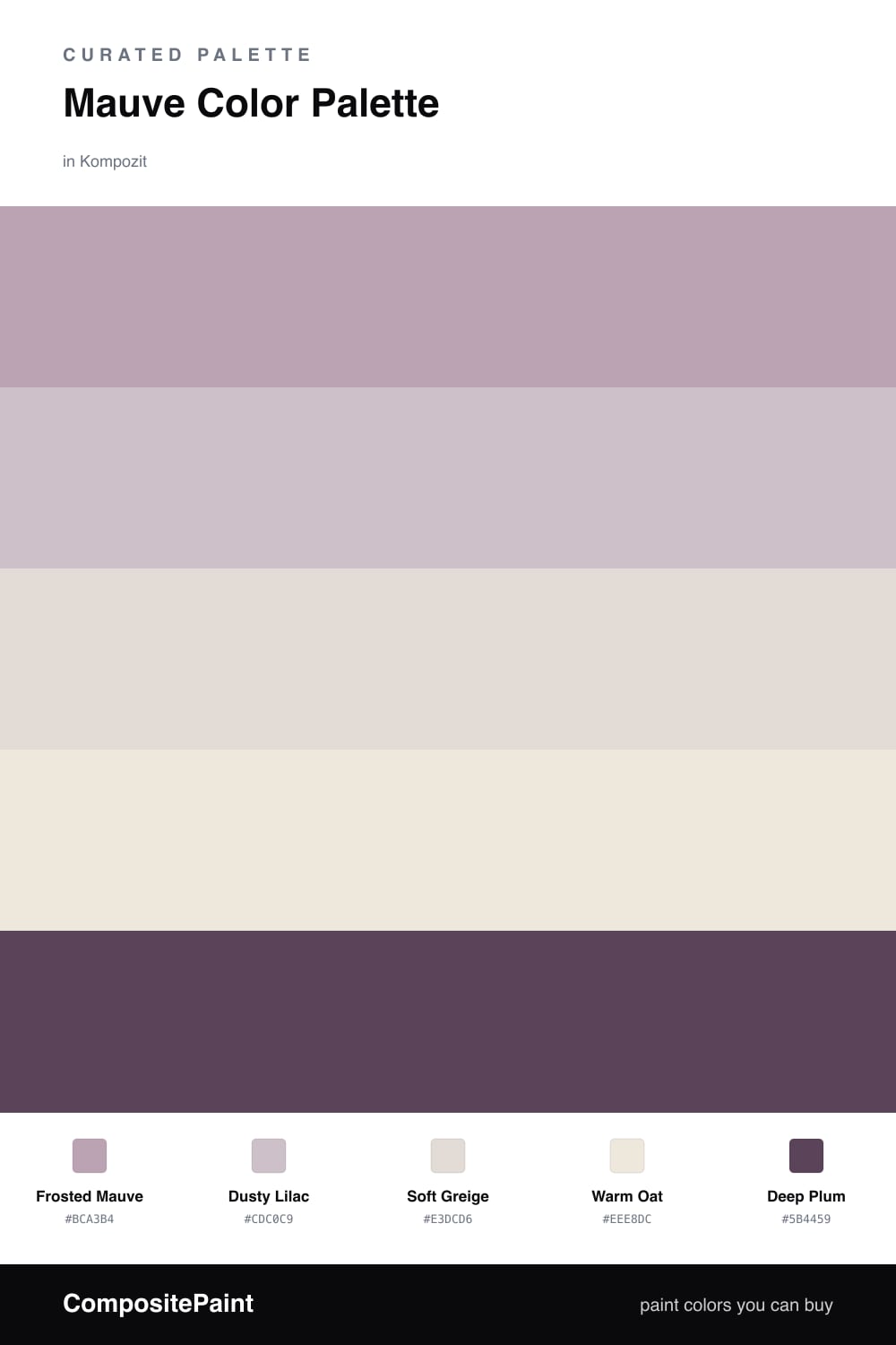
Mauve is having a real moment, and it is easy to see why. This scheme puts a cool, hazy Frosted Mauve in the lead, with a slightly lighter Dusty Lilac stepping in as a second layer so the look feels soft instead of one-note.

The neutrals do the calming work here. Soft Greige and Warm Oat keep everything quiet and bright, which is exactly what you want behind a color as moody as mauve. Think of them as the breathing room.

Then there is Deep Plum, your one little anchor. A touch of it — in a cushion, a lamp base, a piece of art — gives the whole palette some backbone and stops the soft tones from drifting. Let the mauve dominate and keep the plum to small, deliberate moments.

Buy These Colors

Each color matched to the closest real paint in every brand, by ΔE2000. Kompozit first; take any SKU to the store — these mix on demand.

Frosted Mauve
#B9A2AE · LRV 39 · Dominant
Kompozit Pansy Posie · 1212 ΔE 2.07
Backdrop Nuevo · BD-NU ΔE 18.63
Behr Plum Taupe · N130-4 ΔE 4.04
Benjamin Moore Dusk to Dawn · 1446 ΔE 5.5
Clare Set In Stone · PNT100-LT-15 ΔE 14.43
Dunn-Edwards Magical Mauve · DE6011 ΔE 2.5
Farrow & Ball Cinder Rose · No. 246 ΔE 5.68
Magnolia Home Vintage Collection · JG-99 ΔE 8.9
PPG / Glidden Lighthearted Rose · 1049-4 ΔE 4.99
Sherwin-Williams Obi Lilac · SW 6556 ΔE 4.49
Valspar Bedroom Plum · 1004-8A ΔE 2.32
Dusty Lilac
#CDBCC6 · LRV 53 · Secondary
Kompozit So Dainty · 1309 ΔE 1.81
Backdrop Boy Meets Girl · BD-BG ΔE 11.78
Behr Plymouth Notch · 180E-3 ΔE 2.89
Benjamin Moore Homespun Charm · 1249 ΔE 3.66
Clare Motor City · PNT100-LT-09 ΔE 12.11
Dunn-Edwards Antique Heather · DE5975 ΔE 2.89
Farrow & Ball Pavilion Gray · No. 242 ΔE 11.05
Magnolia Home Anatolian · JG-127 ΔE 11.04
PPG / Glidden Rose Marble · 1179-4 ΔE 1.61
Sherwin-Williams Mauve Finery · SW 6282 ΔE 1.45
Valspar Mischief · V076-2 ΔE 0.66
Soft Greige
#E3DCD6 · LRV 72 · Base
Kompozit Venetian Wall · 0544 ΔE 0
Backdrop Cookies & Cream · BD-CC ΔE 7.43
Behr Castle Beige · N230-1 ΔE 0.84
Benjamin Moore Pampas Grass · 2110-60 ΔE 2.14
Clare No Filter · PNT100-LT-19 ΔE 4.49
Dunn-Edwards Studio White · DE6065 ΔE 2.2
Farrow & Ball Great White · No. 2006 ΔE 2.16
Magnolia Home Soft Linen · JG-108 ΔE 2.91
PPG / Glidden Shark · 1006-2 ΔE 2.25
Sherwin-Williams Cultured Pearl · SW 6028 ΔE 0.96
Valspar Ballroom Belle · 7001-9 ΔE 0.91
Warm Oat
#EFE8DD · LRV 81 · Support
Kompozit Hint of Vanilla · 0001 ΔE 0.78
Backdrop Jane · BD-JA ΔE 2.53
Behr Ivory Palace · PPU10-14 ΔE 1.23
Benjamin Moore Candle White · 2164-70 ΔE 1.46
Clare Like Buttah · PNT100-LT-62 ΔE 2.9
Dunn-Edwards Abstract White · DE6232 ΔE 1.7
Farrow & Ball James White · No. 2010 ΔE 3.33
Magnolia Home Antique Rose · JG-23 ΔE 1.17
PPG / Glidden Sugar Soap · 1084-1 ΔE 0.45
Sherwin-Williams Downy · SW 7002 ΔE 0
Valspar Shell White · 7007-12 ΔE 1
Deep Plum
#5A4451 · LRV 7 · Accent
Kompozit Crowd Pleaser · 1208 ΔE 3.27
Backdrop It's a Date · BD-IT ΔE 14.32
Behr Grand Plum · N120-7 ΔE 2.63
Benjamin Moore Chambourd · AF-645 ΔE 3.3
Clare Night Groove · PNT100-DP-77 ΔE 2.47
Dunn-Edwards Mulberry · DEA194 ΔE 4.05
Farrow & Ball Pelt · No. 254 ΔE 3.3
Magnolia Home Moody Fig · JG-155 ΔE 5.83
PPG / Glidden Purple Basil · 1046-7 ΔE 0.91
Sherwin-Williams Mature Grape · SW 6286 ΔE 4.4
Valspar Plummy Rouge · 8003-2G ΔE 2.08

Questions

What makes mauve feel cool instead of pink?

Mauve is a grayed-down purple, so it has a soft hazy edge that reads calm rather than sweet. The gray is what keeps it grown-up and easy to live with.

How do I keep this palette from feeling flat?

Lean on the deep plum accent in small doses — a chair, a frame, a throw — so the lighter mauves have something to push against. That little bit of depth makes the soft tones look intentional.

Similar Palettes

Closest schemes by color — not by label.