CP

Lilac Color Palette — Lilac Tide

A soft five-color scheme led by a tide of cool lilac, settled with warm greige and dove neutrals and lifted by one plum accent — every color matched to real paint you can buy.

By Jessica Williams · Color Stylist & Interior Editor

Lilac Tide
Dominant
Kompozit Plum Cake · 1233
#D1BFDC
LRV 56
Misty Periwinkle
Secondary
Kompozit Royal Proclamation · 1297
#AAA0BC
LRV 37
Soft Dove
Base
Kompozit Winged Victory · 1300
#EBE4E2
LRV 79
Warm Greige
Support
Kompozit Sheepskin · 0566
#CFC7BD
LRV 58
Deep Plum
Accent
Kompozit Royal Velvet · 1306
#513E4D
LRV 6
View palette in

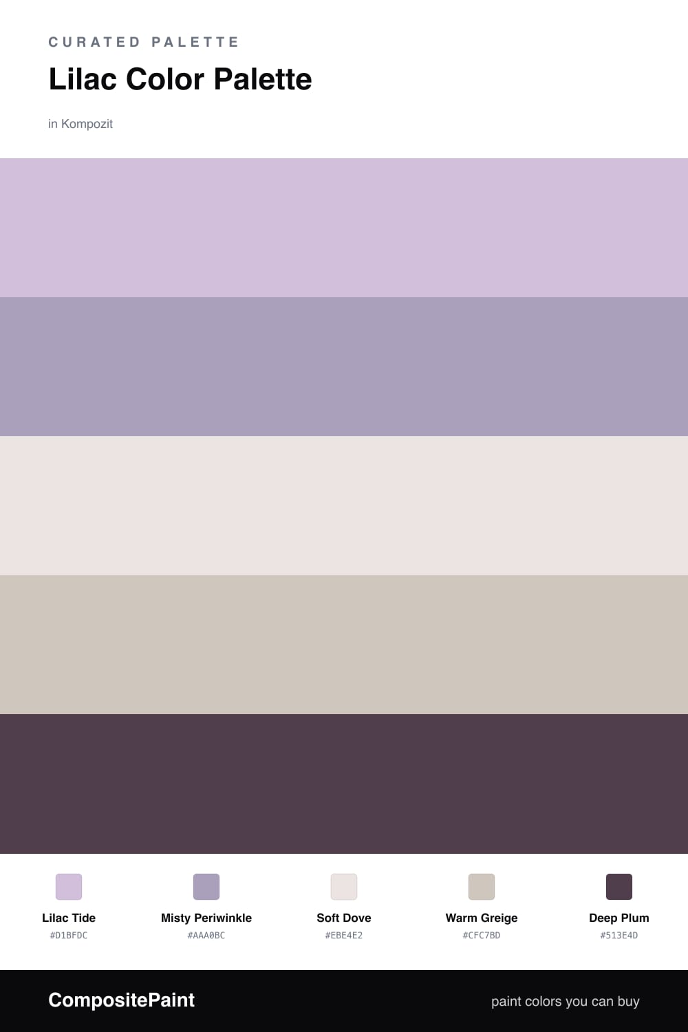
There is a moment at dusk when the sky turns a soft, washed violet, and that is the feeling this palette chases. Lilac Tide leads the whole scheme — a cool, dusty lilac that feels airy on a wall and shifts gently with the light, reading almost gray at noon and bluer by evening.

To keep it modern rather than nostalgic, I lean on quiet neutrals. Misty Periwinkle deepens the lilac without competing with it, while Soft Dove and Warm Greige act as a calm, slightly warm backdrop that stops the cool tones from feeling chilly. This is the balance that makes lilac feel current in 2026 — soft, but never sugary.

Then comes the Deep Plum, used sparingly. A single saturated note like this gives the eye somewhere to land and makes the lilac look more intentional, more designed. Keep it to small doses and let the tide of lilac do the talking.

Buy These Colors

Each color matched to the closest real paint in every brand, by ΔE2000. Kompozit first; take any SKU to the store — these mix on demand.

Lilac Tide
#C7BCD8 · LRV 53 · Dominant
Kompozit Plum Cake · 1233 ΔE 2.66
Backdrop Lost in the 80s · BD-LO ΔE 19.01
Behr Iris Pink · 690E-3 ΔE 2.61
Benjamin Moore Wishing Well · 1389 ΔE 3.41
Clare Cloud Watching · PNT100-MD-73 ΔE 15.13
Dunn-Edwards Soft Purple · DE5954 ΔE 1.34
Farrow & Ball Calluna · No. 270 ΔE 9.6
Magnolia Home Cement Pots · JG-93 ΔE 11.58
PPG / Glidden Purple Dragon · 1247-4 ΔE 1.54
Sherwin-Williams Free Spirit · SW 6973 ΔE 4.69
Valspar Frosted Orchid · M241 ΔE 0.81
Misty Periwinkle
#A9A7C4 · LRV 40 · Secondary
Kompozit Royal Proclamation · 1297 ΔE 3.53
Backdrop Underdog · BD-UD ΔE 14.81
Behr Upscale · MQ5-13 ΔE 4.63
Benjamin Moore Central Mauve · 1412 ΔE 2.41
Clare Set In Stone · PNT100-LT-15 ΔE 11.93
Dunn-Edwards Sapphire Fog · DE5899 ΔE 6.84
Farrow & Ball Lulworth Blue · No. 89 ΔE 13.18
Magnolia Home Vintage Collection · JG-99 ΔE 11.53
PPG / Glidden Lilac Time · 1168-4 ΔE 5.75
Sherwin-Williams Forever Lilac · SW 9067 ΔE 3.4
Valspar Purple Freedom · 4002-7C ΔE 3.23
Soft Dove
#E9E5E4 · LRV 79 · Base
Kompozit Winged Victory · 1300 ΔE 1.36
Backdrop Jane · BD-JA ΔE 5.13
Behr Patience · PR-W11 ΔE 0.51
Benjamin Moore Feathered Violet · 882 ΔE 1.31
Clare Penthouse · PNT100-LT-05 ΔE 2.24
Dunn-Edwards Cold Morning · DE6365 ΔE 1.5
Farrow & Ball Wevet · No. 273 ΔE 1.08
Magnolia Home Cloudy Gray · JG-115 ΔE 4.27
PPG / Glidden Gray Whisper · 1014-2 ΔE 1.03
Sherwin-Williams Ice Cube · SW 6252 ΔE 3.07
Valspar Winter Dawn · 7004-1 ΔE 0.55
Warm Greige
#CFC6BC · LRV 57 · Support
Kompozit Sheepskin · 0566 ΔE 0.54
Backdrop Real Real · BD-RR ΔE 4.12
Behr Wheat Bread · 720C-3 ΔE 0.88
Benjamin Moore London Fog · 1541 ΔE 2.03
Clare Windy City · PNT100-LT-08 ΔE 4.47
Dunn-Edwards Desert Rock · DE6066 ΔE 3.07
Farrow & Ball Pavilion Gray · No. 242 ΔE 2.19
Magnolia Home Earl Gray · JG-117 ΔE 3.4
PPG / Glidden Intuitive · 1022-2 ΔE 0
Sherwin-Williams Worldly Gray · SW 7043 ΔE 0.82
Valspar Perfect Backdrop · 8005-8B ΔE 2.1
Deep Plum
#4E3B54 · LRV 5 · Accent
Kompozit Royal Velvet · 1306 ΔE 4.13
Backdrop Last Call · BD-LC ΔE 10.84
Behr Oriental Eggplant · PPU17-02 ΔE 3.12
Benjamin Moore Plum Royale · 2070-20 ΔE 4.3
Clare Blackish · PNT100-DP-54 ΔE 16.61
Dunn-Edwards Preserve · DEA193 ΔE 2.59
Farrow & Ball Pelt · No. 254 ΔE 6.17
Magnolia Home Plum Suede · JG-102 ΔE 5.09
PPG / Glidden Blackberry · 1172-7 ΔE 6
Sherwin-Williams Concord Grape · SW 6559 ΔE 3.91
Valspar Bon Vivant · 8002-48G ΔE 1.86

Questions

Why does lilac feel so calm in a room?

Lilac sits between blue and pink, so it carries the quiet of blue with a little warmth from the pink. Pairing it with soft greige and dove keeps it grounded instead of sweet, which is why it reads as restful rather than girlish.

How much lilac is too much?

Let lilac lead but give it room to breathe. Use it on the largest planes, lean on the dove and greige neutrals to settle it, and save the deep plum for small moments — a chair, a frame, a band of trim.

Similar Palettes

Closest schemes by color — not by label.