CP

Lilac Color Palette — Lilac Quartz

A soft five-color scheme led by gentle lilac, grounded by warm greige and soft white with a smoky plum accent — every color matched to real paint you can buy.

By Jessica Williams · Color Stylist & Interior Editor

Quartz Lilac
Dominant
Kompozit Plum Cake · 1233
#D1BFDC
LRV 56
Dusty Wisteria
Secondary
Kompozit Royal Proclamation · 1297
#AAA0BC
LRV 37
Soft Linen White
Base
Kompozit White Shoulders · 1265
#F1F0EC
LRV 87
Warm Greige
Support
Kompozit Hearthstone · 0567
#C7BEB2
LRV 52
Smoky Plum
Accent
Kompozit Vivid Vision · 1227
#5E4B62
LRV 8
View palette in

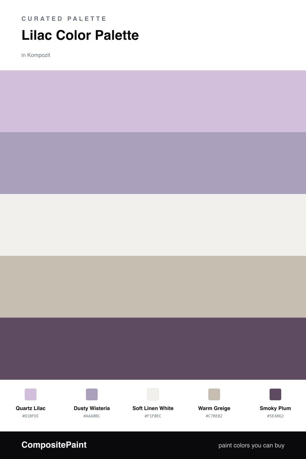
Lilac is having a quiet moment right now, and this scheme shows why. Quartz Lilac leads, a soft, slightly cool mauve that feels like morning light through sheer curtains. Dusty Wisteria sits just beneath it, a deeper relative that adds shadow and depth so the lilac never feels flat.

The neutrals are where this palette earns its calm. Soft Linen White keeps everything bright and breathable, while Warm Greige brings a grounding earthiness that stops the lilacs from drifting too sweet. That warmth is the trick, it makes the whole thing feel current rather than precious.

Finish with Smoky Plum in small, deliberate doses, a chair, a frame, a single painted door. It anchors the softness and gives the eye somewhere to rest. Let the lilac dominate, lean on the neutrals for quiet, and save the plum for the moments you want to feel deliberate.

Buy These Colors

Each color matched to the closest real paint in every brand, by ΔE2000. Kompozit first; take any SKU to the store — these mix on demand.

Quartz Lilac
#C9BBD6 · LRV 53 · Dominant
Kompozit Plum Cake · 1233 ΔE 1.91
Backdrop Lost in the 80s · BD-LO ΔE 20.18
Behr Iris Pink · 690E-3 ΔE 1.62
Benjamin Moore Wishing Well · 1389 ΔE 2.3
Clare Cloud Watching · PNT100-MD-73 ΔE 16.08
Dunn-Edwards Soft Purple · DE5954 ΔE 0.43
Farrow & Ball Calluna · No. 270 ΔE 9.74
Magnolia Home Cement Pots · JG-93 ΔE 12.15
PPG / Glidden Purple Dragon · 1247-4 ΔE 2.61
Sherwin-Williams Free Spirit · SW 6973 ΔE 3.85
Valspar Frosted Orchid · M241 ΔE 1
Dusty Wisteria
#B0A0C2 · LRV 38 · Secondary
Kompozit Royal Proclamation · 1297 ΔE 2.76
Backdrop Underdog · BD-UD ΔE 19.35
Behr Highland Thistle · S110-4 ΔE 3.29
Benjamin Moore Hydrangea · 1390 ΔE 3.85
Clare Cosmic Vibes · PNT100-LT-32 ΔE 11.14
Dunn-Edwards Purple Springs · DE5955 ΔE 1.54
Farrow & Ball Cinder Rose · No. 246 ΔE 13.18
Magnolia Home Vintage Collection · JG-99 ΔE 13.75
PPG / Glidden Puturple · 1248-5 ΔE 3.61
Sherwin-Williams Berry Frappé · SW 9068 ΔE 1.12
Valspar Izzy's Mittens · V038-4 ΔE 3.52
Soft Linen White
#F3EFEA · LRV 87 · Base
Kompozit White Shoulders · 1265 ΔE 1.44
Backdrop Tabula Rasa · BD-TR ΔE 3.28
Behr Pearl Drops · 700C-1 ΔE 1.19
Benjamin Moore White Zinfandel · 880 ΔE 0.5
Clare Wing It · PNT100-LT-24 ΔE 1.87
Dunn-Edwards Light Beige · DE6211 ΔE 1.13
Farrow & Ball Wimborne White · No. 239 ΔE 2.92
Magnolia Home Silos White · JG-107 ΔE 1.62
PPG / Glidden Snowy Mount · 1049-1 ΔE 1.01
Sherwin-Williams Arcade White · SW 7100 ΔE 0.97
Valspar Du Jour · 7002-6 ΔE 1.26
Warm Greige
#CBC0B4 · LRV 54 · Support
Kompozit Hearthstone · 0567 ΔE 1.17
Backdrop Boy Meets Girl · BD-BG ΔE 10.6
Behr Armadillo · N230-3 ΔE 1.87
Benjamin Moore Ashen Tan · 996 ΔE 1.5
Clare Motor City · PNT100-LT-09 ΔE 6.71
Dunn-Edwards Birchwood · DEC752 ΔE 2.5
Farrow & Ball Elephant's Breath · No. 229 ΔE 0.98
Magnolia Home Anatolian · JG-127 ΔE 3.07
PPG / Glidden Great Gray · 15-28 ΔE 0.83
Sherwin-Williams Bungalow Beige · SW 7511 ΔE 1.52
Valspar Clay Figurine · M341 ΔE 2.54
Smoky Plum
#5E4C5E · LRV 8 · Accent
Kompozit Vivid Vision · 1227 ΔE 1.98
Backdrop We Three Kings · BD-WK ΔE 17.73
Behr Berry Wine · UL100-23 ΔE 4.48
Benjamin Moore Purple Lotus · 2072-30 ΔE 2.15
Clare Night Groove · PNT100-DP-77 ΔE 3.27
Dunn-Edwards Purple Potion · DE5958 ΔE 4.15
Farrow & Ball Preference Red · No. 297 ΔE 10.61
Magnolia Home Coffee Nook · JG-96 ΔE 13.72
PPG / Glidden Magic Spell · 1173-7 ΔE 5.72
Sherwin-Williams Perle Noir · SW 9154 ΔE 10.34
Valspar Passionate · T502 ΔE 4.73

Questions

Why does lilac feel so calming in a room?

Lilac carries the softness of pink with the cool quiet of blue, so it reads gentle rather than sweet. Pairing it with warm neutrals keeps it grown-up and restful instead of nursery-soft.

How do I keep a lilac scheme from looking too pastel?

Let one deep tone do the grounding. Here the smoky plum anchors everything, so the soft lilacs read as intentional and modern rather than washed out.

Similar Palettes

Closest schemes by color — not by label.