Lavender Color Palette — Lavender Drift
A soft five-color scheme led by a gentle lavender, balanced by warm greige, soft white, and a smoky plum accent — every color matched to real paint you can buy.
By Maya Patel · Reviews Editor & Product Tester
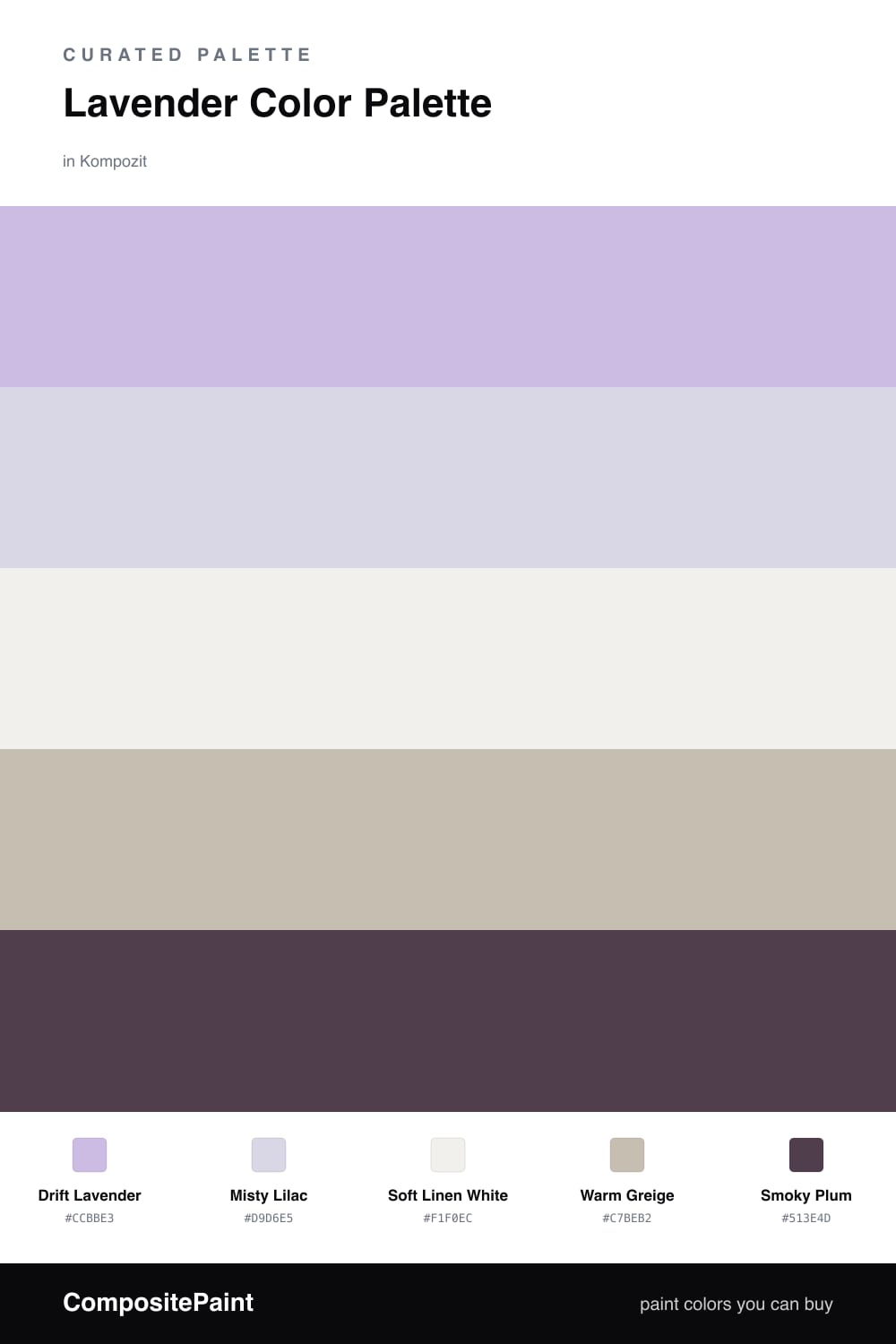
Lavender is having a real moment in 2026, but the version that lasts is the muted, slightly gray one. This scheme puts Drift Lavender front and center and backs it with a paler Misty Lilac so the look has depth without ever feeling flat or one-note.
The neutrals are where this palette earns its keep. Soft Linen White keeps everything light and breathable, while Warm Greige adds just enough warmth to stop the lavender from reading cold. That warm-cool tension is the whole trick here — it is what makes the scheme feel current instead of dated.
Then there is Smoky Plum, the accent that ties it all together. Use it sparingly and it grounds the softness with a little weight and confidence. Lead with the lavender, let the neutrals do the quiet work, and bring in the plum only where you want the eye to land.
Buy These Colors
Each color matched to the closest real paint in every brand, by ΔE2000. Kompozit first; take any SKU to the store — these mix on demand.
Questions
Lavender reads soft and modern without going babyish when you keep it muted and gray-leaning. Paired with warm neutrals instead of cool ones, it feels grown-up and calm rather than sweet.
Let lavender lead at roughly two-thirds of the space, keep the whites and greige as the quiet backdrop, and save the smoky plum for small moments — a door, trim, or a single piece of furniture.
Similar Palettes
Closest schemes by color — not by label.