CP

Lavender Color Palette — Lavender Cove

A calming five-color scheme led by soft lavender with greige, warm white, and a deep plum accent — every color matched to real paint you can buy.

By Maya Patel · Reviews Editor & Product Tester

Cove Lavender
Dominant
Kompozit Collensia · 1281
#BDB7CD
LRV 49
Misty Lilac
Secondary
Kompozit Perfection · 1245
#D9D6E5
LRV 69
Warm White
Base
Kompozit White Shoulders · 1265
#F1F0EC
LRV 87
Soft Greige
Support
Kompozit Hearthstone · 0567
#C7BEB2
LRV 52
Deep Plum
Accent
Kompozit Petunia Patty · 1228
#4A3C4A
LRV 5
View palette in

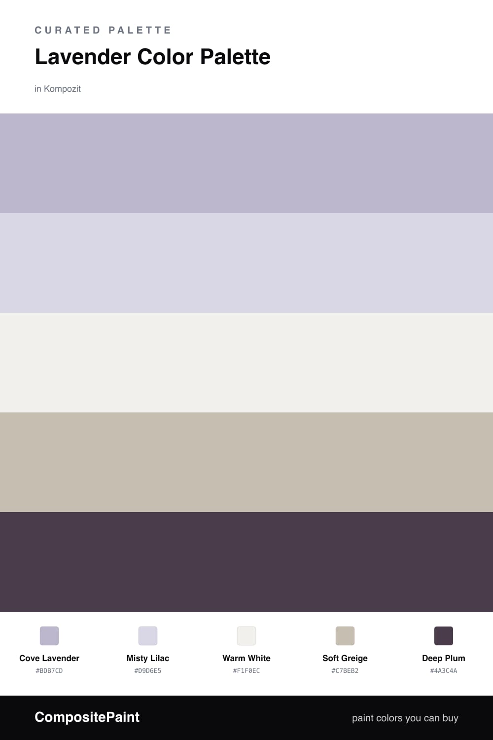
Lavender is having a real moment in 2026, and Cove Lavender is the kind of soft, slightly grayed purple that carries a whole room without shouting. It leads here, with Misty Lilac as a lighter echo so the look has depth instead of one flat wash of color.

The neutrals do the steadying. Warm White keeps everything bright and clean, while Soft Greige adds just enough warmth to pull the lavender away from feeling cold or icy. Together they make the purple read calm and grown-up.

Then comes the part most people skip — the Deep Plum accent. Use it sparingly, on a door or a single furniture piece, and it sharpens the entire palette. Without that dark note the scheme drifts pastel, so let the plum do the grounding while lavender stays in charge.

Buy These Colors

Each color matched to the closest real paint in every brand, by ΔE2000. Kompozit first; take any SKU to the store — these mix on demand.

Cove Lavender
#C3B5D6 · LRV 50 · Dominant
Kompozit Collensia · 1281 ΔE 4.68
Backdrop Lost in the 80s · BD-LO ΔE 20.11
Behr Courtly Purple · S100-3 ΔE 4.45
Benjamin Moore Wishing Well · 1389 ΔE 3.49
Clare Cloud Watching · PNT100-MD-73 ΔE 16.41
Dunn-Edwards Tinted Iris · DE5961 ΔE 0.58
Farrow & Ball Parma Gray · No. 27 ΔE 17.05
Magnolia Home Cement Pots · JG-93 ΔE 13.49
PPG / Glidden Windsor Purple · 1249-4 ΔE 3.83
Sherwin-Williams Wisteria · SW 6822 ΔE 1.82
Valspar Frosted Orchid · M241 ΔE 1.92
Misty Lilac
#DDD3E6 · LRV 68 · Secondary
Kompozit Perfection · 1245 ΔE 3.44
Backdrop Real Real · BD-RR ΔE 17.97
Behr Brook Trout · 110E-2 ΔE 3.17
Benjamin Moore Lavender Ice · 2069-60 ΔE 4.1
Clare Wink · PNT100-LT-31 ΔE 9.71
Dunn-Edwards Alpine Moon · DE5953 ΔE 0.39
Farrow & Ball Borrowed Light · No. 235 ΔE 12.42
Magnolia Home In Bloom · JG-98 ΔE 7.29
PPG / Glidden Misty Violet · 1247-3 ΔE 3.63
Sherwin-Williams Inspired Lilac · SW 6820 ΔE 3.87
Valspar Simply Lavender · 4001-9B ΔE 2.9
Warm White
#F3EFE9 · LRV 87 · Base
Kompozit White Shoulders · 1265 ΔE 1.54
Backdrop Tabula Rasa · BD-TR ΔE 2.82
Behr Falling Snow · PPU18-07 ΔE 2.19
Benjamin Moore Alabaster · 876 ΔE 0.81
Clare Wing It · PNT100-LT-24 ΔE 1.87
Dunn-Edwards Light Beige · DE6211 ΔE 0.94
Farrow & Ball Pointing · No. 2003 ΔE 3.45
Magnolia Home Silos White · JG-107 ΔE 1.25
PPG / Glidden Snowy Mount · 1049-1 ΔE 1.46
Sherwin-Williams Arcade White · SW 7100 ΔE 0.6
Valspar Du Jour · 7002-6 ΔE 1.01
Soft Greige
#C9C0B6 · LRV 53 · Support
Kompozit Hearthstone · 0567 ΔE 1.11
Backdrop Boy Meets Girl · BD-BG ΔE 11.18
Behr Armadillo · N230-3 ΔE 1.29
Benjamin Moore Cumulus Cloud · 1550 ΔE 2.43
Clare Motor City · PNT100-LT-09 ΔE 5.68
Dunn-Edwards Gray Pearl · DEC795 ΔE 3.19
Farrow & Ball Elephant's Breath · No. 229 ΔE 1.77
Magnolia Home Anatolian · JG-127 ΔE 2.04
PPG / Glidden Ashen · 1023-3 ΔE 1.33
Sherwin-Williams Twilight Gray · SW 54 ΔE 0.26
Valspar Clay Figurine · M341 ΔE 2.11
Deep Plum
#4A3A52 · LRV 5 · Accent
Kompozit Petunia Patty · 1228 ΔE 4.24
Backdrop Last Call · BD-LC ΔE 9.87
Behr Deep Aubergine · 100F-7 ΔE 2.64
Benjamin Moore Plum Royale · 2070-20 ΔE 3.2
Clare Blackish · PNT100-DP-54 ΔE 15.97
Dunn-Edwards Preserve · DEA193 ΔE 1.79
Farrow & Ball Pelt · No. 254 ΔE 5.92
Magnolia Home Plum Suede · JG-102 ΔE 4.65
PPG / Glidden Blackberry · 1172-7 ΔE 5.24
Sherwin-Williams Concord Grape · SW 6559 ΔE 3.43
Valspar Virtuoso · M215 ΔE 3.55

Questions

Why does lavender work as the lead color?

Lavender reads soft and a little cool, so it calms a space without going cold. Letting it dominate keeps the mood quiet while the greige and warm white stop it from feeling sweet or childish.

How do I keep this scheme from looking too pastel?

Add the deep plum in small doses, on a door, a frame, or a single piece of furniture. That one dark note grounds all the lighter tones and makes the lavender look intentional rather than washed out.

Similar Palettes

Closest schemes by color — not by label.