CP

Lavender Color Palette — Lavender Wren

A soft five-color scheme led by gentle lavender, warmed with greige and cream and lifted by a slate-plum accent — every color matched to real paint you can buy.

By Emily Roberts · DIY Editor & First-Timer's Guide

Lavender Wren
Dominant
Kompozit Lavender Bliss · 1252
#CEC3DD
LRV 57
Misty Greige
Secondary
Kompozit Mossy Shade · 0195
#DBD2C7
LRV 65
Soft Cream
Base
Kompozit Queen Anne's Lace · 0558
#F0ECE2
LRV 84
Warm Stone
Support
Kompozit Light Lichen · 0211
#BFB6A9
LRV 47
Slate Plum
Accent
Kompozit Vivid Vision · 1227
#5E4B62
LRV 8
View palette in

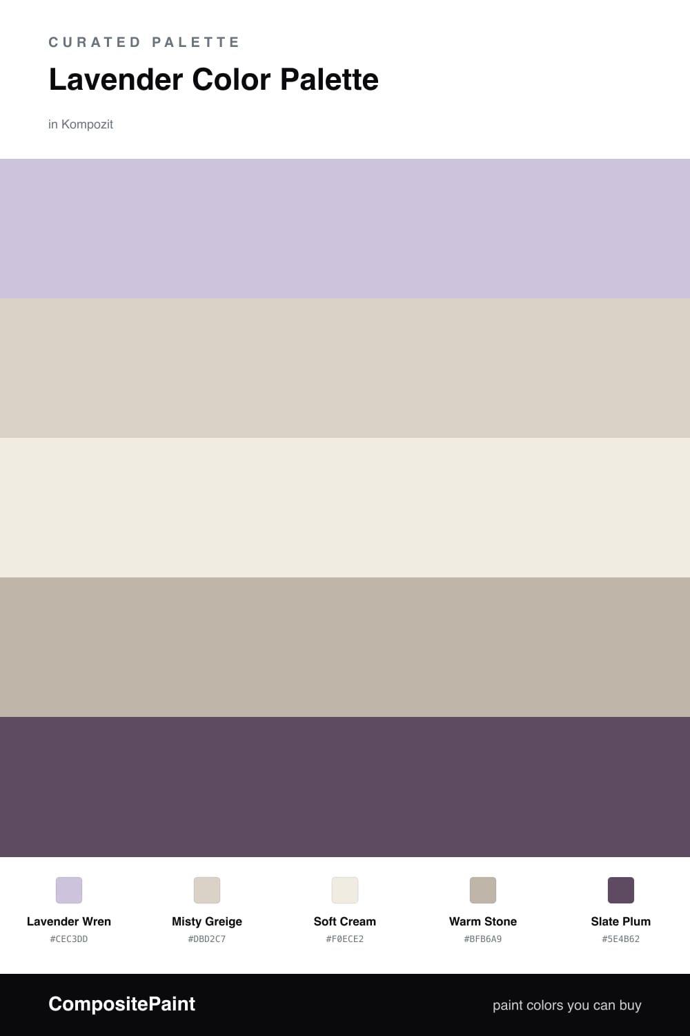
Lavender is having a quiet moment in 2026, and this scheme leans into the soft, grown-up side of it. Lavender Wren is the star here, a muted purple with just enough gray to feel calm rather than sweet, so it works in a bedroom, an office, or a reading nook.

To keep it from feeling cold, I paired it with Misty Greige and a clean Soft Cream. Those two do the quiet work, warming the lavender up and giving your eyes a place to rest. Warm Stone adds a little depth in between, so the soft colors do not all blur together.

The one bit of drama is Slate Plum, a deep dusty purple. Use it in small doses (think a single door, a window frame, or a few accents) and it pulls the whole palette together without shouting. Start with lavender on your walls, let the neutrals carry the rest, and add the plum last.

Buy These Colors

Each color matched to the closest real paint in every brand, by ΔE2000. Kompozit first; take any SKU to the store — these mix on demand.

Lavender Wren
#C9C1DC · LRV 56 · Dominant
Kompozit Lavender Bliss · 1252 ΔE 1.34
Backdrop Lost in the 80s · BD-LO ΔE 17.79
Behr Mulberry Stain · N110-2 ΔE 2.64
Benjamin Moore French Lilac · 1403 ΔE 2.45
Clare Motor City · PNT100-LT-09 ΔE 14.44
Dunn-Edwards Soft Purple · DE5954 ΔE 2.69
Farrow & Ball Calluna · No. 270 ΔE 8.75
Magnolia Home Cement Pots · JG-93 ΔE 10.52
PPG / Glidden Purple Dragon · 1247-4 ΔE 1.49
Sherwin-Williams Agapanthus · SW 9066 ΔE 7.86
Valspar Purple Hibiscus · 8001-48C ΔE 2.35
Misty Greige
#D8D2C8 · LRV 65 · Secondary
Kompozit Mossy Shade · 0195 ΔE 1.4
Backdrop Real Real · BD-RR ΔE 3.03
Behr Old Map · N230-2 ΔE 0.91
Benjamin Moore Bruton White · CW-710 ΔE 1.07
Clare Beigeing · PNT100-LT-18 ΔE 1.85
Dunn-Edwards Muslin · DE6227 ΔE 1.39
Farrow & Ball Shaded White · No. 201 ΔE 2.92
Magnolia Home Stoneware Pieces · JG-55 ΔE 3.44
PPG / Glidden Gray Beige · 14-30 ΔE 1.4
Sherwin-Williams Crushed Ice · SW 7647 ΔE 1.72
Valspar Goose Feathers · 8006-2B ΔE 1.13
Soft Cream
#F2EEE6 · LRV 86 · Base
Kompozit Queen Anne's Lace · 0558 ΔE 1.03
Backdrop Jane · BD-JA ΔE 1.58
Behr Flurries · HDC-WR14-1 ΔE 1.25
Benjamin Moore Alabaster · 876 ΔE 0.6
Clare Wing It · PNT100-LT-24 ΔE 2.27
Dunn-Edwards Cotton Field · DE6253 ΔE 1.05
Farrow & Ball Pointing · No. 2003 ΔE 2.58
Magnolia Home Silos White · JG-107 ΔE 0.98
PPG / Glidden Cow's Milk · 1053-1 ΔE 0.21
Sherwin-Williams Arcade White · SW 7100 ΔE 0.81
Valspar Wooly Lamb · V156 ΔE 0.81
Warm Stone
#BCB2A6 · LRV 45 · Support
Kompozit Light Lichen · 0211 ΔE 1.3
Backdrop Underdog · BD-UD ΔE 13.2
Behr Smokestack · N220-3 ΔE 1.06
Benjamin Moore Silver Fox · 2108-50 ΔE 1.51
Clare Money Moves · PNT100-MD-48 ΔE 8.36
Dunn-Edwards Drifting · DEC770 ΔE 0.55
Farrow & Ball Dove Tale · No. 267 ΔE 3.04
Magnolia Home Sunday Stroll · JG-19 ΔE 2.25
PPG / Glidden City Street · 1018-3 ΔE 2.28
Sherwin-Williams Requisite Gray · SW 7023 ΔE 1.64
Valspar Soulful Grey · 6004-1B ΔE 2.91
Slate Plum
#5A4F66 · LRV 9 · Accent
Kompozit Vivid Vision · 1227 ΔE 3.15
Backdrop We Three Kings · BD-WK ΔE 14.55
Behr Illusionist · MQ5-38 ΔE 1.46
Benjamin Moore Purple Lotus · 2072-30 ΔE 3.81
Clare Night Groove · PNT100-DP-77 ΔE 6.51
Dunn-Edwards Purple Potion · DE5958 ΔE 1.67
Farrow & Ball Stiffkey Blue · No. 281 ΔE 13.86
Magnolia Home Coffee Nook · JG-96 ΔE 12.15
PPG / Glidden Magic Spell · 1173-7 ΔE 2.56
Sherwin-Williams Mineral Gray · SW 2740 ΔE 10.55
Valspar When Worlds Collide · 8003-48F ΔE 7.04

Questions

Why does lavender work with these warm neutrals?

Lavender can read cold on its own, so the warm greige and cream gently balance it and keep the whole room feeling cozy instead of chilly.

How much lavender is too much?

Let lavender lead on the big surfaces, then keep the slate plum to small doses like a door or trim so the contrast stays soft and easy to live with.

Similar Palettes

Closest schemes by color — not by label.