Pewter Patter
A mid-depth Dunn-Edwards greige, reviewed honestly: browner than the pewter name, a step deeper than Revere, and the light that turns it muddy.

Jessica has spec'd whites and neutrals for more than 300 rooms and keeps a sample wall of painted drawdowns in her studio. Every color review is checked against real reader rooms in the comments and re-tested when a formula changes. About the testing process →
- 1Anonymous20
- 2Dorian Gray39
- 3Pewter Patter46
- 4Agreeable Gray60
- 5Pale Oak69
The Fast Verdict
Pewter Patter is a workhorse greige, not a pewter gray. At LRV 46 it sits a full step deeper than Revere Pewter and Agreeable Gray, with a warm beige-brown cast that reads tailored in California daylight and khaki-muddy when the room goes dim. Buy it for daylit walls and Southwest exteriors. Do not buy it hoping for cool metal.
Daylit living rooms and hallways · Southwest exteriors · rooms that want a greige with more body than Revere · oak, walnut, and brass
You actually want gray · the room faces north and stays dim · you need a lighter whole-house greige · your stone or LVP is cool gray
- Tailored mid greige with real body — not a washed-out rental beige
- Flatters oak, walnut, brass, and warm stone
- A step deeper than Revere Pewter, so rooms feel finished
- Holds up as an exterior body color in strong sun
- Quiet enough to run living rooms, halls, and bedrooms together
- Not pewter, not gray — the beige-brown is the color
- Goes khaki-muddy in dim north rooms at LRV 46
- Looks dingy next to a crisp cool white
- Too deep and too earthy for a cool, gallery-modern scheme
What Color Is Pewter Patter, Really?
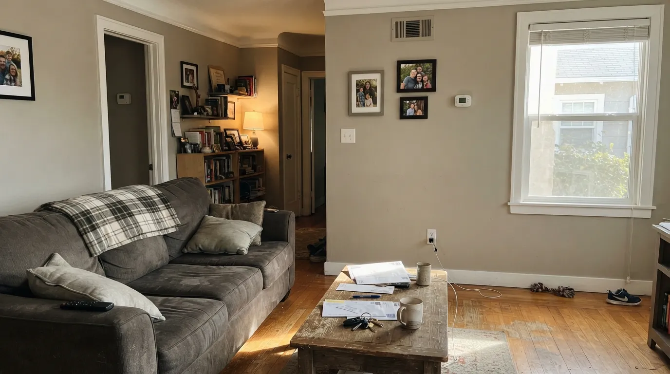
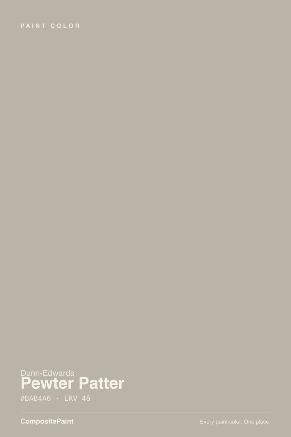
A warm beige-gray — greige, not pewter — and the name is the first thing that misleads. Dunn-Edwards DET627 is a low-chroma yellow-beige on the wall: almost no hue, just a dusty earth cast. On Houzz, shoppers hunting a Dunn-Edwards stand-in for Revere Pewter have said the quiet part out loud: Pewter Patter comes out more brown than grey. If you wanted a cool metallic gray, this is the wrong paint.
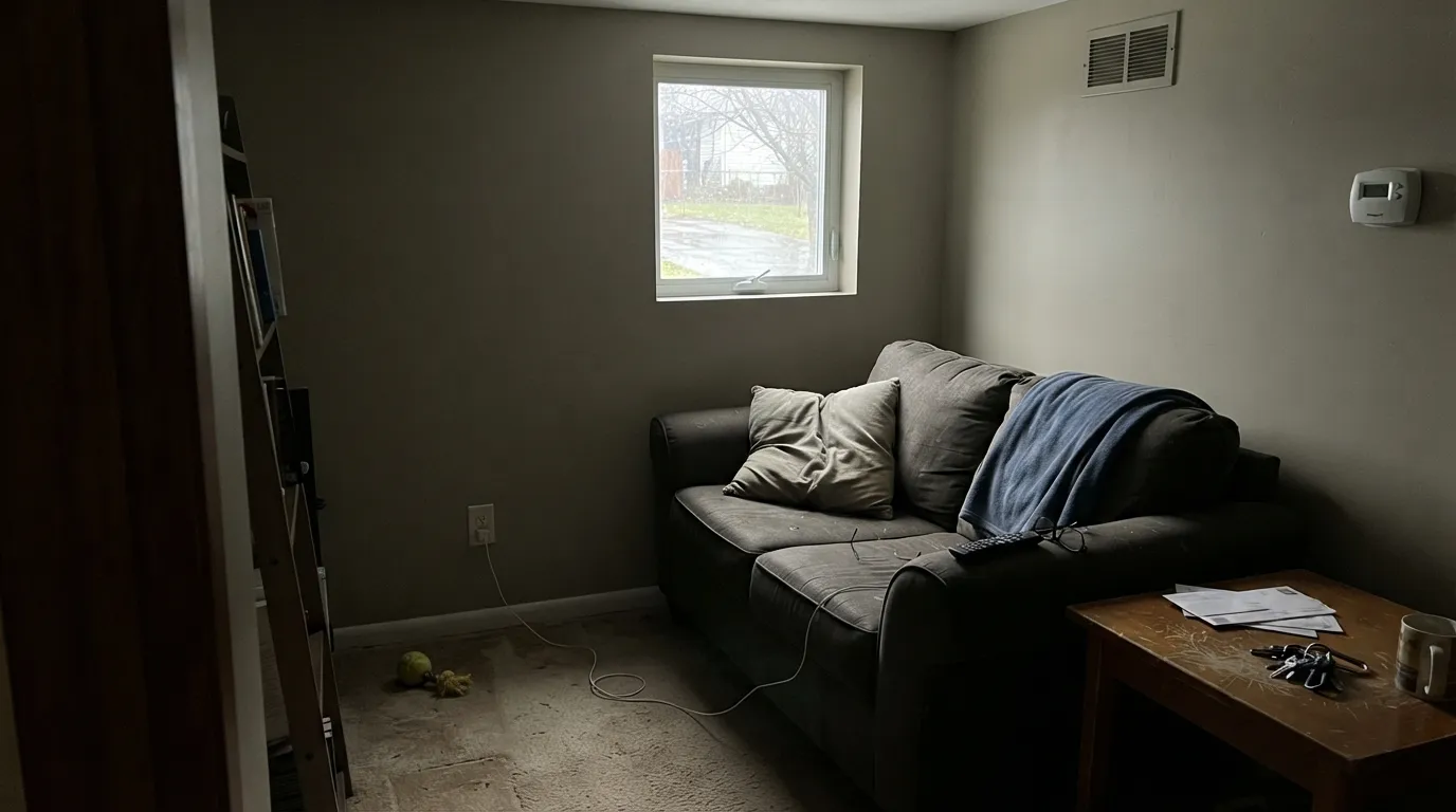
At LRV 46 it is a true mid-tone, a full step deeper than Revere Pewter (LRV 56) and Agreeable Gray (LRV 60). That depth is the useful part and the trap. In a bright living room it holds as a tailored taupe-greige with real body — not a washed-out rental beige. In a dim hallway or a north bedroom it drops toward muddy khaki, because there is not enough bounce to keep the beige alive. Plan for the wall to read a notch deeper and browner than the chip, especially on all four walls.
Undertone in one line: warm beige-gray with an earthy yellow-brown cast — never blue, never green, never true pewter. If your sample looks cooler, you are seeing it next to a creamier beige or a hot accent, not the paint turning gray. If it looks dirty, the light is too weak for an LRV-46 greige.
Where It Shines
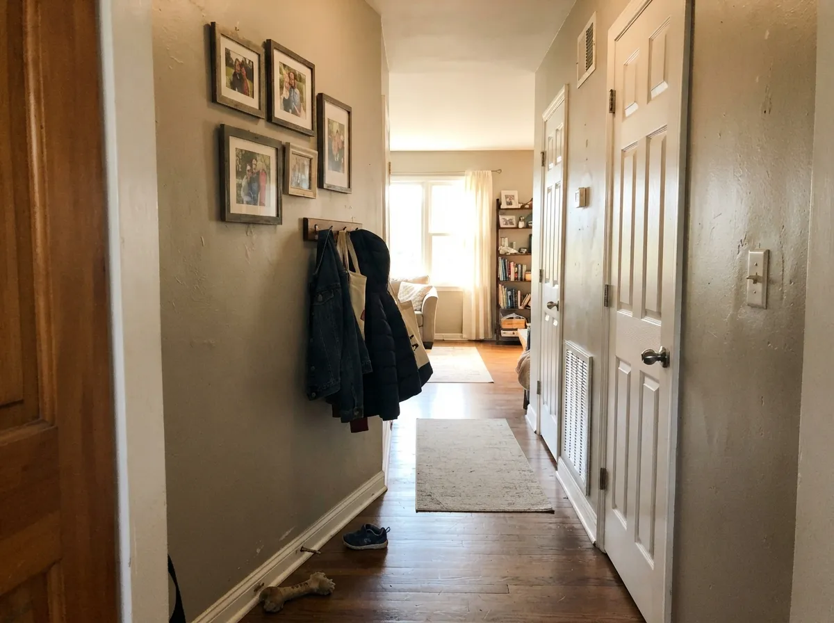
Give it real daylight and warm materials and it is quietly excellent. South and west rooms in the Southwest — Dunn-Edwards' home turf — are where it earns the tailored look: enough depth to feel finished, enough beige to flatter oak, walnut, and brass. Hallways that borrow light from open rooms carry it well. Its second job is exterior body color, where desert sun keeps the greige from collapsing into khaki.
Where It Fails
Almost every regret about Pewter Patter follows one of three scripts, and all three are visible on the sample wall before you buy a gallon. None of them are a mixing error — but if your room matches one, this is not your greige.
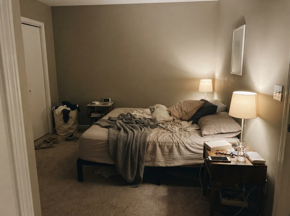
At LRV 46 there is not enough bounce for weak light. Cool north daylight strips the beige and leaves a drab khaki-gray that readers of similar greiges call muddy. The color did not fail; the light did. Go lighter (Agreeable Gray, Edgecomb Gray) or commit to lamps.
The name says pewter. The wall says beige-brown. On the chip it can pass for a warm gray; on four walls the earth comes forward. If your goal is a true gray, look at Repose Gray and accept its cool shift — Pewter Patter will never get you there.
A gallery white like Chantilly Lace makes Pewter Patter look dingy and yellowed, the same pairing mistake that sinks every mid greige. Soft whites — White Dove, Swiss Coffee, Alabaster — keep the temperature honest. Cool gray marble and gray LVP do the same trick: they push this paint toward beige.
Room by Room
Its best interior room. Eggshell on the walls, White Dove or Swiss Coffee on trim. With oak floors, a worn sofa, and afternoon sun it reads calm and finished. In a closed north living room with one window, skip it.
Works as walls behind cream or Alabaster cabinets, brass, and warm quartz. A full kitchen of Pewter Patter cabinets is a heavy bet at LRV 46. Cool gray stone argues; satin on cabinets if you do them.
Under 2700K bulbs it turns softer and slightly more beige, which most people want at night. If the bedroom faces north and stays dim, this greige goes khaki — pick a lighter one.
Borrowed light from adjacent rooms is enough; a dark interior hall is not. This is where an LRV-46 greige either knits the house together or looks like builder beige in a cave. Sample the actual hall.
Daytime dining rooms with wood tables and brass love the earthy cast. A home office by a west window is a good test: the afternoon warmth is the color at its most honest.
KUD Properties used it as the body color on a Palm Springs Desert Eichler, which is the right climate for it: hard sun keeps LRV 46 from going muddy. Pair with a dark door and brown or charcoal trim. The shaded north elevation will read a step browner — walk the sample around the house.
Your Light Is the Risk
The beige stays alive and the gray keeps it from going tan. This is the light the color was mixed for — especially in the Southwest.
Cool weak daylight kills the beige and leaves drab khaki. Sample on the darkest wall before you commit.
Cooler and more gray early; warmer and browner as the sun drops. The shift is real but it is still the same greige, not a new color.
2700K bulbs cream it slightly — most owners like that. Cool white LEDs flatten it toward dirty gray; swap bulbs before you blame the paint.
Most complaints about Pewter Patter are a light mismatch. Upload a photo of your actual room and see it on your walls — then ask for the same wall in north light or evening lamps before you buy a single sample.
Need It From Another Brand?
Any paint counter can custom-tint Dunn-Edwards DET627 directly. If you would rather stay in one brand's own deck, these are the closest stock matches, measured as ΔE2000. Under 2 is a difference you will not see on the wall.
| Brand | Closest color | ΔE | LRV | |
|---|---|---|---|---|
| Sherwin-Williams | PachydermSW 9596 · Sherwin-Williams | 0.8 | 45 | Color page → |
| Behr | Arid PlainsPPU25-07 · Behr | 2.1 | 45 | Color page → |
| Benjamin Moore | Northern Cliffs1536 · Benjamin Moore | 0.6 | 46 | Color page → |
| Valspar | Sandy Sage5008-1C · Valspar | 0.9 | 46.6 | Color page → |
| PPG / Glidden | City StreetPPG1018-3 · PPG / Glidden | 3.1 | 45 | Color page → |
| Glidden | Dry Goods Neutral40YY 44/095 · Glidden | 1.5 | 44 | Color page → |
Similar Dunn-Edwards Colors
The nearest shades to Pewter Patter within Dunn-Edwards's own range, ranked by perceptual color distance — useful when you want the same look a touch lighter, darker, or warmer.
WCAG 2.1: AA is 4.5 : 1 for normal text, 3 : 1 for large text, AAA is 7 : 1.
Pewter Patter vs the Colors You're Also Considering
Every Pewter Patter sample board has the same rivals on it. The numbers show the real lightness gap — then it comes down to which risk you would rather live with.
Pick this when you are already in Dunn-Edwards and want more body than Revere on the wall.
Benjamin Moore HC-172 · LRV 56Revere PewterPick this if you want the famous lighter greige with more gray in it — Pewter Patter is a step deeper and clearly browner.
Pick this when Agreeable would wash out and you want a mid-tone that actually sits on the wall.
Sherwin-Williams SW 7029 · LRV 60Agreeable GrayPick this for a lighter, safer whole-house greige that still goes cool in north light.
Pewter Patter Coordinating Colors
Stay on the warm side. Soft whites, muted sage, navy, and charcoal all sit comfortably next to this greige; icy whites, cool blue-grays, and blue-gray stone push it toward dirty beige. These are the partners that keep the temperature honest:
Pewter Patter on Exteriors
Dunn-Edwards is a Southwest brand, and this is a Southwest exterior greige. Hard sun keeps LRV 46 from collapsing; the same color on a tree-shaded north wall in a cloudy climate is a different, muddier paint. KUD Properties put it on the body of a Palm Springs Desert Eichler — the right climate, the right amount of sun, a midcentury body that wants a quiet taupe-greige rather than a cool gray.
Pair it with a dark door and charcoal or brown trim so the body reads tailored instead of builder-beige. Walk a big sample around the house: the south elevation will look a notch lighter and cleaner than the north. That is expected, not a bad batch.
Pewter Patter With Wood Tones and Floors
Warm wood is the easy pairing. Walnut, medium oak, butcher block, and pale white oak all meet the yellow-brown in this greige halfway, which is why it behaves in living rooms that still have original floors. Brass and antique bronze belong; matte black is fine; polished chrome is the metal that starts to look cold against it.
The floors that need a large sample are the extremes. Orange honey-oak can get louder — beige-brown paint plus yellow floor is more orange, not less. Cool gray LVP or gray-washed wood does the opposite: it pulls the warmth into relief and the wall can read beige-yellow. Neither is automatic failure, but both are reasons to tape an 8-inch sample above the actual floor before you paint the room.
Three Ready Palettes Built on Pewter Patter
A color is never alone on the wall. These are complete combinations in the 60-30-10 pattern, with the reason each one holds together. Every one opens in the visualizer.
Soft warm trim keeps Pewter Patter from looking dingy; the navy door is the one dark note an LRV-46 greige house needs. This is the scheme for a south- or west-facing main floor with wood floors.
Try this palette in your roomAlabaster cabinets carry the light; Pewter Patter walls sit behind them as a warm greige, not a competing beige. Evergreen Fog on the island adds one muted sage note that still belongs with brass and wood.
Try this palette in your roomSwiss Coffee is creamier than a stark trim white, so the greige stays soft at night instead of looking dirty. Kendall Charcoal gives one grounded dark without cooling the room into gray.
Try this palette in your roomPewter Patter FAQ
Is Pewter Patter gray or beige?
Beige-gray — greige — with the beige winning on four walls. The pewter name is marketing; the undertone is a warm yellow-brown earth. If gray is what you actually want, this is the wrong color, and that mismatch is the main way people talk themselves into a sample they will not like.
Is it a match for Revere Pewter?
No. Revere Pewter is lighter (LRV 56 vs 46) and reads more gray-green; Pewter Patter is deeper and browner. Houzz threads looking for a Dunn-Edwards Revere equivalent have said as much. Use it if you like Revere's warmth but want more body, not if you want a copy.
What trim white goes with Pewter Patter?
A soft warm white — White Dove is the default, Swiss Coffee if you want a creamier edge, Alabaster on cabinets. A crisp cool white (Chantilly Lace territory) makes the walls look dingy. Semi-gloss on trim, eggshell on walls.
Does it work in a north-facing room?
Only if you add warm lamps and accept a flatter, more khaki read. At LRV 46 it does not have the bounce of Agreeable Gray or Edgecomb Gray. In a dim north bedroom, pick a lighter greige or skip greige.
Can I use it on an exterior?
Yes — it is a proven body color in strong sun. A Palm Springs Desert Eichler by KUD Properties used DET627 on the body. Expect the sunny sides to stay greige and the north shade to go browner. Satin or the brand's exterior sheen; sample on every elevation.
Does Pewter Patter work with oak floors?
Warm wood is its natural company: walnut, medium oak, and pale white oak all sit well against the earthy cast. Orange honey-oak can get louder, because the beige-brown in the paint meets the yellow in the floor. A large rug helps; cool gray LVP is the pairing to sample first.
Have you painted with Pewter Patter?
Rate it — one tap helps the next reader decide.
Ask a Question