Burgundy Study Palette — Library Burgundy & Warm Oat
A grounded, cocooning 5-color scheme for a study: deep library burgundy walls, warm oat backdrop, soft trim, walnut wood, and an inky accent, with every color matched to real paint you can buy.
By Jessica Williams · Color Stylist & Interior Editor
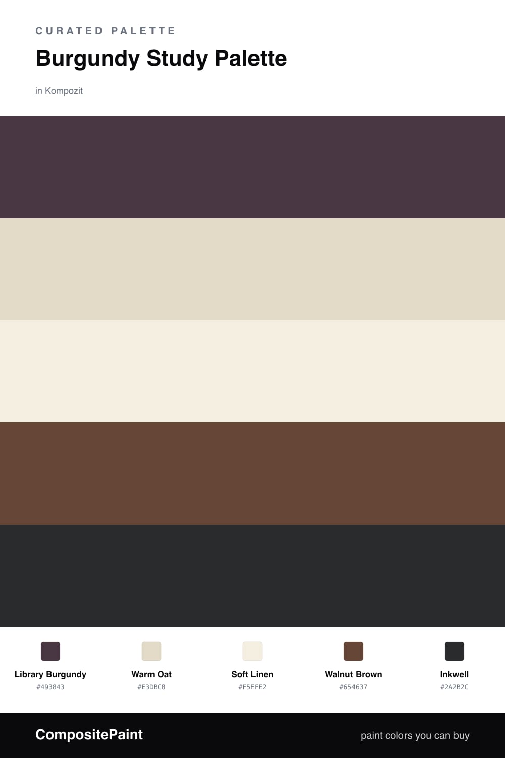
A study is the one room that earns going deep. This palette leads with Library Burgundy, a soft wine red with a brown undertone that turns walls into something you sink into rather than just look at. In low evening light it reads almost like worn leather, which is exactly the feeling you want when you sit down to read or work.
To keep it from swallowing the room, I wrap the burgundy in Warm Oat as a calmer backdrop wall and lift the edges with Soft Linen on the trim and ceiling. Walnut Brown carries through on shelving and the desk, echoing the red in the burgundy so the whole room feels of a piece, warm and a little vintage.
Save Inkwell, the near-black, for the smallest moments: the inside of a bookcase, a single built-in, the back of a niche. Used on one quiet surface it gives your eye a place to rest and makes the burgundy glow that much warmer around it.
Buy These Colors
Each color matched to the closest real paint in every brand, by ΔE2000. Kompozit first; take any SKU to the store — these mix on demand.
Questions
You can, and it is the most cocooning option for a small room. If the study has little daylight or you want it to feel a touch more open, paint three walls in Library Burgundy and the fourth, or the wall behind the desk, in Warm Oat so the deep color still wraps you without closing in.
Lean on the warm neutrals and wood. Soft Linen on the trim and ceiling lifts the top of the room, Warm Oat keeps things breathing, and Walnut Brown shelving picks up the red undertone so the burgundy feels intentional rather than gloomy. Add a lamp or two for warm pools of light and the depth becomes the point.
Similar Palettes
Closest schemes by color — not by label.