CP

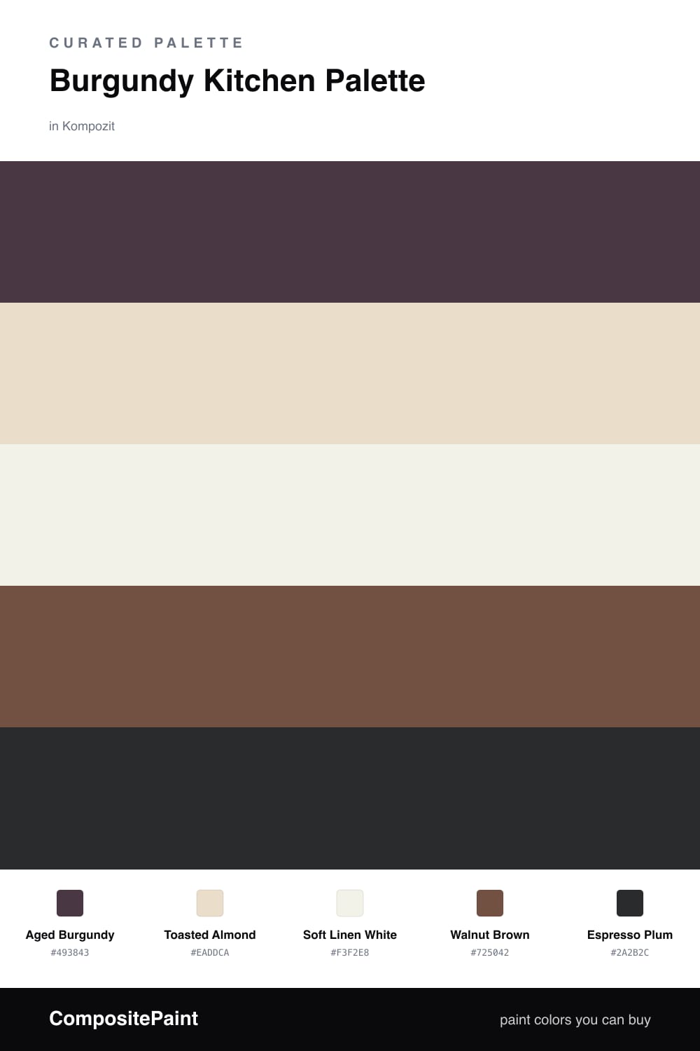
Burgundy Kitchen Palette — Aged Burgundy & Toasted Almond

A warm, grounding 5-color scheme for kitchens: deep burgundy cabinets, toasted almond walls, soft trim white, walnut wood, and an espresso accent, with every color matched to real paint you can buy.

By Jessica Williams · Color Stylist & Interior Editor

Aged Burgundy
Cabinets
Kompozit Purple Shadow · 1215
#493843
LRV 5
Toasted Almond
Walls
Kompozit Pale Gingersnap · 0173
#EADDCA
LRV 73
Soft Linen White
Trim & Ceiling
Kompozit Twinkle Twinkle · 0355
#F3F2E8
LRV 88
Walnut Brown
Wood & Floors
Kompozit Coffee Shop · 0151
#725042
LRV 10
Espresso Plum
Island Accent
Kompozit Silent Sea · 0515
#2A2B2C
LRV 2
View palette in

A burgundy kitchen feels like the warmest room in the house — low light, good food, deep color you want to sink into. This palette leans on Aged Burgundy for the cabinets, a softened wine red with brown in it, so it grounds the room rather than shouting at you.

To keep it from going dark, the walls wear a Toasted Almond and the trim a slightly cleaner Soft Linen White, both warm enough to flatter the red instead of cooling it. Walnut Brown on the floors and open shelving picks up the earthy side of 2026, the year color went brown and clay and cozy.

For the island, reach for Espresso Plum, a near-black with a whisper of the burgundy still in it. Use it on one surface only — the island, or a single tall cabinet — so it anchors the scheme without crowding the warmth out of the room.

Buy These Colors

Each color matched to the closest real paint in every brand, by ΔE2000. Kompozit first; take any SKU to the store — these mix on demand.

Aged Burgundy
#5C2230 · LRV 4 · Cabinets
Kompozit Purple Shadow · 1215 ΔE 12.88
Backdrop Stage Beauty · BD-SB ΔE 11.42
Behr Cimarron · BXC-69 ΔE 2.3
Benjamin Moore Bewitched · CSP-450 ΔE 6.28
Clare Blackish · PNT100-DP-54 ΔE 22.4
Dunn-Edwards Mulberry · DEA194 ΔE 11.07
Farrow & Ball Brinjal · No. 222 ΔE 8.25
Magnolia Home By The Fireplace · JG-29 ΔE 6.26
PPG / Glidden Gooseberry · 1048-7 ΔE 9.75
Sherwin-Williams Rookwood Red · SW 2802 ΔE 6.81
Valspar Royal Garnet · 1011-5 ΔE 4.18
Toasted Almond
#E8DDCB · LRV 73 · Walls
Kompozit Pale Gingersnap · 0173 ΔE 0.87
Backdrop Cookies & Cream · BD-CC ΔE 2.86
Behr Aged Parchment · UL150-10 ΔE 0.78
Benjamin Moore Natural Wicker · 950 ΔE 1.48
Clare No Filter · PNT100-LT-19 ΔE 3.25
Dunn-Edwards Stucco Tan · DE6205 ΔE 0.81
Farrow & Ball Lime White · No. 1 ΔE 1.46
Magnolia Home Castle Cream · JG-153 ΔE 1.37
PPG / Glidden Navajo White · 1101-2 ΔE 2.21
Sherwin-Williams Aged White · SW 9180 ΔE 0.53
Valspar Cream in My Coffee · 3003-10C ΔE 0.81
Soft Linen White
#F6F1E7 · LRV 88 · Trim & Ceiling
Kompozit Twinkle Twinkle · 0355 ΔE 1.97
Backdrop Tabula Rasa · BD-TR ΔE 1.67
Behr White Flour · OR-W10 ΔE 0.21
Benjamin Moore Pink Damask · 890 ΔE 0.8
Clare Wing It · PNT100-LT-24 ΔE 2.4
Dunn-Edwards Wishful White · DE6260 ΔE 0.95
Farrow & Ball Wimborne White · No. 239 ΔE 0.85
Magnolia Home Silos White · JG-107 ΔE 1.76
PPG / Glidden Crumb Cookie · 18-01 ΔE 1.52
Sherwin-Williams Cotton White · SW 7104 ΔE 1.46
Valspar Crème de la Crème · T660 ΔE 1.95
Walnut Brown
#7A5236 · LRV 10 · Wood & Floors
Kompozit Coffee Shop · 0151 ΔE 5.6
Backdrop Buenos Aires · BD-BA ΔE 5.38
Behr Leather Work · S240-7 ΔE 1.26
Benjamin Moore Cordwainer · 2164-10 ΔE 1.32
Clare Vintage · PNT100-DP-67 ΔE 12.31
Dunn-Edwards Cellar Door · DEA157 ΔE 4.97
Farrow & Ball Salon Drab · No. 290 ΔE 11.16
Magnolia Home Cognac · JG-164 ΔE 4.45
PPG / Glidden Molasses · 1079-7 ΔE 3.43
Sherwin-Williams Umber Rust · SW 9100 ΔE 1.32
Valspar Château Mantle · V085-6 ΔE 0.67
Espresso Plum
#3A2026 · LRV 2 · Island Accent
Kompozit Silent Sea · 0515 ΔE 14.6
Backdrop Hocus Pocus · BD-HP ΔE 13.89
Behr Deep Garnet · 110F-7 ΔE 7.51
Benjamin Moore Velvet Cloak · CSP-480 ΔE 5.34
Clare Blackish · PNT100-DP-54 ΔE 17.57
Dunn-Edwards Black · DEA187 ΔE 14.62
Farrow & Ball Pitch Black · No. 256 ΔE 14.3
Magnolia Home Blackboard · JG-05 ΔE 15.56
PPG / Glidden Black Magic · 1001-7 ΔE 15.54
Sherwin-Williams Raisin · SW 7630 ΔE 6.29
Valspar Antique Burgundy · 1011-8 ΔE 2.62

Questions

Where should the burgundy go in a kitchen?

Put it on the lower cabinets or a full base run where it grounds the room and hides everyday wear. Keep upper cabinets and walls lighter so the burgundy reads rich instead of heavy, and let it cover no more than about one-third of what your eye sees.

What countertop and metal finish work with burgundy cabinets?

A warm cream or honed stone keeps the burgundy from going dark, and brass or aged bronze hardware brings out its red warmth. Skip cool chrome and bright white quartz, which fight the earthy tone and make the cabinets look purple.

Similar Palettes

Closest schemes by color — not by label.