CP

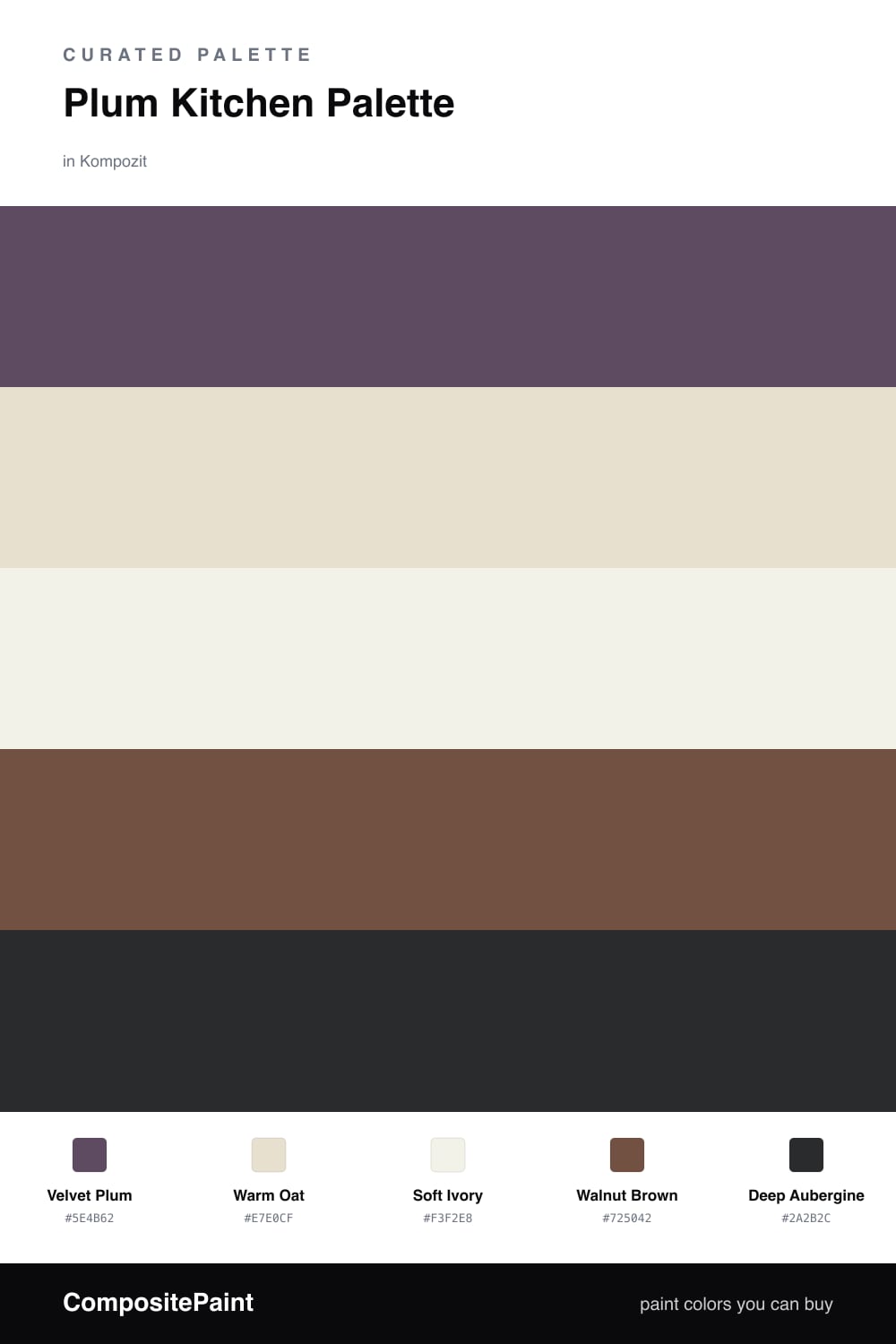
Plum Kitchen Palette — Velvet Plum & Warm Oat

A moody, cocooning 5-color scheme for kitchens: velvet plum cabinets, warm oat walls, soft trim, grounding walnut, and a deep aubergine anchor, with every color matched to real paint you can buy.

By Jessica Williams · Color Stylist & Interior Editor

Velvet Plum
Cabinets
Kompozit Vivid Vision · 1227
#5E4B62
LRV 8
Warm Oat
Walls
Kompozit Sedona · 0334
#E7E0CF
LRV 75
Soft Ivory
Trim & Ceiling
Kompozit Twinkle Twinkle · 0355
#F3F2E8
LRV 88
Walnut Brown
Wood & Floors
Kompozit Coffee Shop · 0151
#725042
LRV 10
Deep Aubergine
Island Accent
Kompozit Silent Sea · 0515
#2A2B2C
LRV 2
View palette in

A plum kitchen should feel like the last warm hour of the day — soft, a little moody, the kind of room you want to linger in. This palette leans on a velvet plum for the cabinets, a dusty, grayed purple that turns almost brown in low light and glows when the morning comes through.

Around it sits warm oat on the walls and a gentler soft ivory on the trim and ceiling, both with enough warmth to keep the plum from feeling cold. Walnut brown on the floors and open shelving ties the whole thing to real wood, the way 2026 rooms want to feel grounded and layered.

For the anchor, keep deep aubergine for one small surface — an island, or the inside of a glass-front cabinet. Used on more than about one-fifth of the room it stops being a quiet accent and starts taking over. One surface is all you need.

Buy These Colors

Each color matched to the closest real paint in every brand, by ΔE2000. Kompozit first; take any SKU to the store — these mix on demand.

Velvet Plum
#6B4A5C · LRV 9 · Cabinets
Kompozit Vivid Vision · 1227 ΔE 5.37
Backdrop It's a Date · BD-IT ΔE 16.8
Behr Purplestone · 110F-6 ΔE 1.11
Benjamin Moore Eggplant · 1379 ΔE 1.84
Clare Night Groove · PNT100-DP-77 ΔE 4.81
Dunn-Edwards Purple Trinket · DE5979 ΔE 4.77
Farrow & Ball Preference Red · No. 297 ΔE 7.03
Magnolia Home Mountain Currant · JG-171 ΔE 11.95
PPG / Glidden Positively Purple · 13-08 ΔE 1.24
Sherwin-Williams Mature Grape · SW 6286 ΔE 3.95
Valspar Passionate · T502 ΔE 0.93
Warm Oat
#E6DECE · LRV 74 · Walls
Kompozit Sedona · 0334 ΔE 0.84
Backdrop Cookies & Cream · BD-CC ΔE 3.01
Behr Canvas Luggage · N300-2 ΔE 1.9
Benjamin Moore Maritime White · 963 ΔE 0.5
Clare No Filter · PNT100-LT-19 ΔE 1.91
Dunn-Edwards Stucco Tan · DE6205 ΔE 0.98
Farrow & Ball School House White · No. 291 ΔE 0.84
Magnolia Home Castle Cream · JG-153 ΔE 0
PPG / Glidden Southern Breeze · 1097-2 ΔE 1.43
Sherwin-Williams Aged White · SW 9180 ΔE 0.9
Valspar Cream in My Coffee · 3003-10C ΔE 1.05
Soft Ivory
#F6F1E7 · LRV 88 · Trim & Ceiling
Kompozit Twinkle Twinkle · 0355 ΔE 1.97
Backdrop Tabula Rasa · BD-TR ΔE 1.67
Behr White Flour · OR-W10 ΔE 0.21
Benjamin Moore Pink Damask · 890 ΔE 0.8
Clare Wing It · PNT100-LT-24 ΔE 2.4
Dunn-Edwards Wishful White · DE6260 ΔE 0.95
Farrow & Ball Wimborne White · No. 239 ΔE 0.85
Magnolia Home Silos White · JG-107 ΔE 1.76
PPG / Glidden Crumb Cookie · 18-01 ΔE 1.52
Sherwin-Williams Cotton White · SW 7104 ΔE 1.46
Valspar Crème de la Crème · T660 ΔE 1.95
Walnut Brown
#7A5236 · LRV 10 · Wood & Floors
Kompozit Coffee Shop · 0151 ΔE 5.6
Backdrop Buenos Aires · BD-BA ΔE 5.38
Behr Leather Work · S240-7 ΔE 1.26
Benjamin Moore Cordwainer · 2164-10 ΔE 1.32
Clare Vintage · PNT100-DP-67 ΔE 12.31
Dunn-Edwards Cellar Door · DEA157 ΔE 4.97
Farrow & Ball Salon Drab · No. 290 ΔE 11.16
Magnolia Home Cognac · JG-164 ΔE 4.45
PPG / Glidden Molasses · 1079-7 ΔE 3.43
Sherwin-Williams Umber Rust · SW 9100 ΔE 1.32
Valspar Château Mantle · V085-6 ΔE 0.67
Deep Aubergine
#3B2A33 · LRV 3 · Island Accent
Kompozit Silent Sea · 0515 ΔE 11.54
Backdrop Hocus Pocus · BD-HP ΔE 11.07
Behr Rich Bordeaux · BXC-87 ΔE 4.03
Benjamin Moore Velvet Cloak · CSP-480 ΔE 1.43
Clare Blackish · PNT100-DP-54 ΔE 14.13
Dunn-Edwards Black · DEA187 ΔE 11.13
Farrow & Ball Pitch Black · No. 256 ΔE 11.01
Magnolia Home Blackboard · JG-05 ΔE 11.45
PPG / Glidden Black Magic · 1001-7 ΔE 11.93
Sherwin-Williams Raisin · SW 7630 ΔE 4.07
Valspar Rare Wine · 1011-9 ΔE 3.25

Questions

Where should the plum go in a kitchen?

Put velvet plum on the cabinets, where it covers a real surface but still reads as the lead color. If that feels like too much, paint just the lower run and keep the uppers in warm oat so the plum grounds the room instead of closing it in.

Will plum cabinets make the kitchen feel dark?

Not with this mix. The warm oat walls and soft ivory trim bounce light back, and the plum itself has warmth in it, so the room feels cocooning rather than gloomy. Save the deep aubergine for one small surface like the island.

Similar Palettes

Closest schemes by color — not by label.