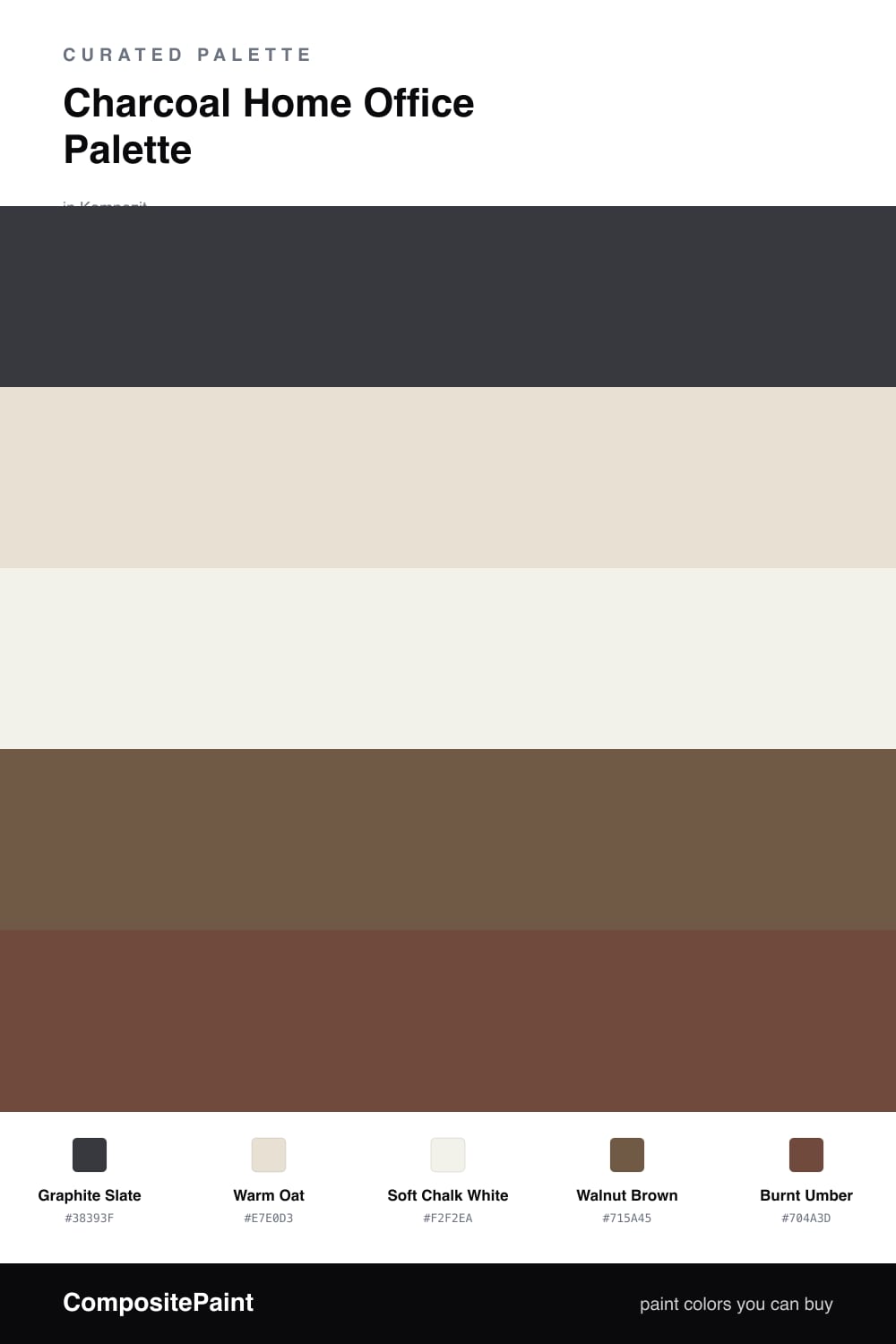
Charcoal Home Office Palette — Graphite Slate & Warm Oat
A focused, grounding 5-color scheme for home offices: charcoal feature walls, warm oat backdrop, soft white trim, walnut wood, and a burnt-umber accent — every color matched to real paint you can buy.
By David Chen · Formulation Lead & Resident Chemist
A home office wants two things at once: enough calm to think and enough contrast to stay alert. Graphite Slate does the heavy lifting here — a charcoal with a faint warm-gray undertone, dark enough to anchor the room but never flat or industrial. Keep it to the wall behind your desk, where it frames your work and shows up cleanly on camera.
The other three walls take Warm Oat, a soft beige-leaning neutral that keeps the space from tipping cold. Against it the charcoal stops looking heavy and starts looking deliberate. Soft Chalk White on the trim and ceiling adds the crisp edge that holds the whole thing together and bounces daylight back down.
For grounding, lean on real material. Walnut Brown is your bookshelves and floating shelves — that warm midtone wood that makes charcoal feel like a study rather than a server room. Then save the Burnt Umber for one small surface, a desk, a drawer front, or a single painted nook. It is the deepest, earthiest note in the scheme, and a little of it goes a long way.
Buy These Colors
Each color matched to the closest real paint in every brand, by ΔE2000. Kompozit first; take any SKU to the store — these mix on demand.
Questions
Put the charcoal behind your desk, on the wall you face the least during video calls. It frames the room and sits behind your head on camera, so it reads as a backdrop instead of a shadow over your screen.
Not if you keep it to one wall and let the warm oat carry the other three. Charcoal absorbs light, so pair it with good task lighting and the soft white trim to bounce daylight back into the room.
Similar Palettes
Closest schemes by color — not by label.